
.png)
Top Examples of Good Design to Inspire You in 2025
- shems sheikh
- May 3, 2025
- 17 min read

Good Design: More Than Just Looks
This listicle showcases seven diverse examples of good design, demonstrating how thoughtful design solutions improve functionality and user experience. Discover how iconic designs like the Apple iPhone, Braun products, the London Underground map, OXO Good Grips kitchen tools, the Norwegian passport, the Aeron chair, and LEGO bricks exemplify these principles. Understanding these examples of good design helps product managers, designers, developers, and marketing teams create impactful and user-centered products and services.
1. Apple iPhone
The Apple iPhone stands as a prime example of good design, significantly impacting the smartphone industry and beyond. Its success stems from a meticulous blend of hardware and software, prioritizing user experience and a minimalist aesthetic. This approach, focusing on intuitive interaction and a cohesive design language, has made the iPhone a benchmark for mobile devices since its 2007 debut. The iPhone's design isn't just about aesthetics; it's about creating a seamless and enjoyable user experience, which is a core principle of good design.
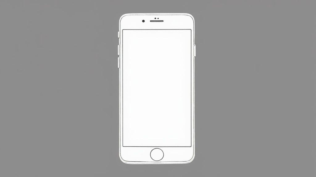
The iPhone's design philosophy revolves around several key features: an intuitive touch-based interface requiring minimal learning curve, minimalist hardware crafted from premium materials, tight integration between its hardware and software ecosystems, a consistent design language maintained across product generations, and a strong focus on accessibility features. This cohesive approach has resulted in a product that feels both premium and user-friendly. This integration of form and function is why the iPhone deserves its place on this list of examples of good design.
For product managers, UX/UI designers, web developers, and marketing teams, the iPhone offers invaluable lessons. Its seamless user experience demonstrates how simplicity can be a powerful tool. Complex functionalities are masked by a visually simple interface, making the technology accessible to a broad audience. This is a crucial takeaway for anyone involved in product development. Observing how consistent design elements, from icons to typography, contribute to brand recognition offers a masterclass in building a strong brand identity. Learn more about Apple iPhone
Pros:
Seamless user experience with a minimal learning curve
High-quality materials and construction
Strong brand identity and recognition
Regular software updates extending product lifespan
Seamless ecosystem integration with other Apple products
Cons:
Higher price point compared to competitors
Limited customization options
Closed ecosystem potentially limiting interoperability
Occasional controversial design choices (e.g., removing the headphone jack)
Examples of successful implementation:
The iPhone X's introduction of the notch and gesture-based navigation, a bold move that pushed the industry towards bezel-less displays.
The iPhone 12's revival of the flat-edge design demonstrates how cyclical design trends can be reinterpreted and successfully reintroduced.
The iPhone’s overarching influence on competitor smartphone designs globally underscores its impact as an example of good design.
Tips for incorporating iPhone's design principles:
Balance form and function: Study how the iPhone prioritizes both aesthetics and usability.
Simplify complexity: Note how visual simplicity effectively masks complex underlying functionality.
Build brand recognition: Observe how consistent design elements, like the iconic app icons and typography, create a strong and recognizable brand identity.
The iPhone's design legacy was significantly shaped by figures like Jonathan Ive (former Apple Chief Design Officer) and Steve Jobs (Apple co-founder), alongside the dedicated Apple Design Team. Their vision continues to influence the tech world, proving the enduring power of good design. The iPhone’s design principles remain highly relevant for anyone striving to create user-centered products with a strong brand presence, solidifying its status as a powerful example of good design.
2. Dieter Rams' Braun Products
Dieter Rams' work for Braun is a prime example of good design, demonstrating how thoughtful consideration of form and function can create timeless and impactful products. From the 1950s through the 1990s, Rams served as Braun's chief design officer, creating numerous iconic products embodying his "less but better" philosophy. This approach prioritized functional minimalism, focusing on user needs and stripping away unnecessary embellishments. His influence resonates deeply in modern industrial design, notably in Apple's product aesthetic, solidifying his designs as exemplary models for aspiring designers. Rams' work demonstrates how good design can transcend fleeting trends, creating objects that remain relevant and desirable for decades.
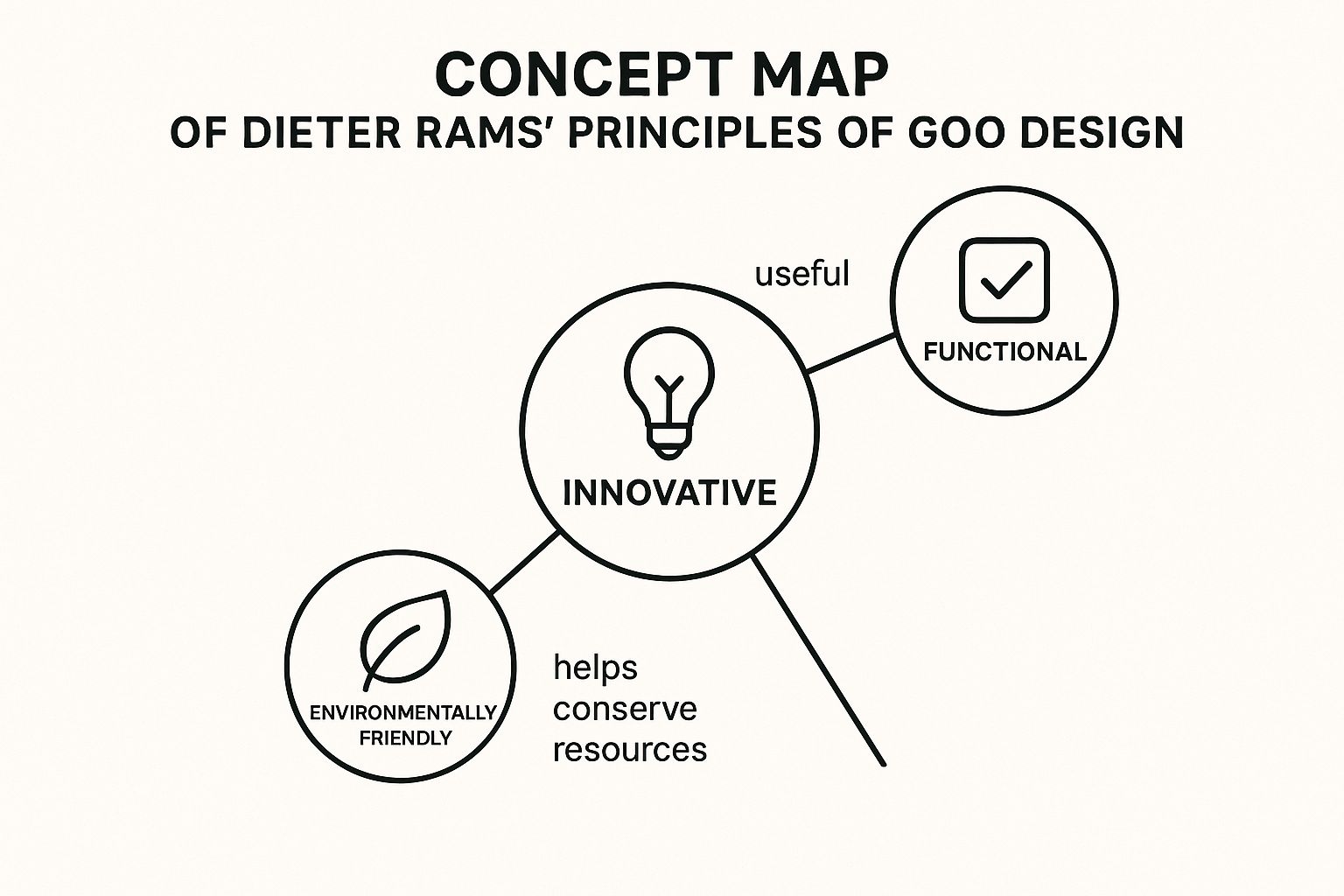
This infographic visualizes the key principles behind Dieter Rams' design philosophy, connecting his "less but better" ethos to its practical manifestations in Braun products. The central concept, "Good Design," is linked to ten supporting principles, including "Innovative," "Useful," "Aesthetic," "Long-lasting," "Thorough down to the last detail," "Honest," "Environmentally friendly," "As little design as possible," "Unobtrusive," and "Understandable."
The infographic clearly illustrates how these principles contribute to the overall quality and longevity of Rams' designs. The strong connection between "As little design as possible" and "Unobtrusive" highlights Rams' minimalist approach, while the link between "Long-lasting" and "Environmentally friendly" underscores the sustainability inherent in his design philosophy. The visualization emphasizes that good design is not just about aesthetics, but a holistic approach encompassing usability, longevity, and ethical considerations. This holistic approach is what makes Dieter Rams’ work such a strong example of good design.
Rams’ design philosophy is further exemplified by specific features including a focus on user needs, honest expression of materials and construction, a modular and systematic approach to design, a clear hierarchy of elements and controls, and a significant reduction of unnecessary details. These features manifest in products like the Braun ET66 calculator (1987), which notably influenced the iOS calculator design; the Braun SK4 record player (1956), nicknamed "Snow White's Coffin"; the Braun T3 pocket radio (1958); and the Braun RT20 table radio. These products, while diverse in function, share a common design language: a clear visual hierarchy, honest use of materials, and a focus on core functionality.
The benefits of adopting this design philosophy are numerous. Pros include a timeless aesthetic resistant to trend cycles, intuitive usability through visual clarity, durable construction focused on longevity, a consistent design language across product lines, and an ethical approach to sustainable design. This makes Rams' work a particularly relevant example of good design in today’s world. However, some potential drawbacks exist. Cons sometimes include prioritizing aesthetics over ergonomics, higher manufacturing costs due to stringent quality standards, and a perceived coldness or clinical feel by some users.
When striving for examples of good design, consider Rams' ten principles as a checklist. Focus on removing non-essential elements rather than adding features, and think about the entire lifecycle of products during the design phase. Prioritize honest expression of materials and functionality. Applying these principles can help designers create products that are not only visually appealing but also user-friendly, durable, and sustainable. This approach, exemplified by Rams' Braun products, represents a timeless approach to good design, offering valuable lessons for designers across various disciplines. Rams’ influence, notably through Jonathan Ive’s work at Apple, reinforces the enduring impact of his “less but better” philosophy. While no website dedicated solely to Rams’ Braun designs exists, numerous online resources document and analyze his work and its enduring influence on the design world.
3. London Underground Map
The London Underground Map, redesigned in 1933 by Harry Beck, stands as a prime example of good design, specifically within the realm of information design. Before Beck's intervention, the map attempted to represent the geographically accurate layout of the Underground lines. This resulted in a convoluted mess, difficult for riders to decipher and ultimately unhelpful for navigating the system. Beck, an engineering draftsman, recognized that geographic accuracy was secondary to user comprehension. His ingenious solution was to prioritize clarity and ease of use over literal representation. He transformed the map into a simplified diagram, employing horizontal, vertical, and 45-degree diagonal lines to depict the network's connections.
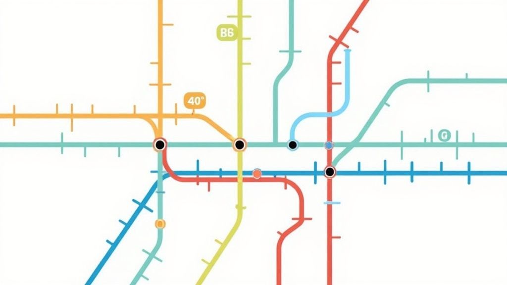
This topological approach, focusing on the relationships between stations rather than their precise locations, revolutionized transit map design. Color-coding differentiates the various lines, standardized spacing between stations provides visual balance, and clear typography ensures easy identification of station names. The map omits most above-ground geographical features, with the notable exception of the River Thames, further streamlining the information presented to the user. This design philosophy, prioritizing user needs over strict geographical accuracy, is a powerful demonstration of how simplification can dramatically improve usability and comprehension. This is why the London Underground map is a classic example of good design, and deserves its place on this list.
Beck's design has had a profound impact on transit maps globally, serving as a template for systems worldwide. The New York City Subway map, for instance, gradually evolved towards Beck's principles, moving away from geographical accuracy to a more schematic representation. Similarly, the Tokyo Metro map adapted Beck's approach to manage the complexities of a multi-company system. Even digital navigation tools like Google Maps utilize similar schematic principles in their transit views. Learn more about London Underground Map
Features and Benefits:
Topological representation: Focuses on connections, not precise geography.
Color-coding: Distinguishes different lines at a glance.
Standardized spacing: Creates visual harmony and improves readability.
Clear typography and symbols: Facilitates quick station identification.
Pros:
Dramatically improved usability and comprehension for riders.
Created a scalable system adaptable to network expansion.
Established an iconic visual language instantly recognizable worldwide.
Prioritized user needs over literal accuracy, resulting in a more effective design.
Cons:
Can lead to misconceptions about actual distances between stations.
Requires periodic redesigns as the system grows and becomes more complex.
Can be initially confusing for users unfamiliar with schematic maps.
Tips for Applying These Principles:
Identify essential information: Focus on what users truly need to know.
Prioritize clarity over accuracy: Be willing to sacrifice literal accuracy for functional clarity.
Maintain visual consistency: Use a consistent visual language throughout complex systems.
User testing is crucial: Test your designs with real users to ensure comprehension.
This approach is particularly valuable for product managers, UX/UI designers, web developers, and marketing teams working on complex systems or large amounts of information. By prioritizing user needs and simplifying complex data, you can create designs that are both aesthetically pleasing and highly effective. For remote teams, particularly those working across different geographical locations, adopting these principles can facilitate clearer communication and a shared understanding of complex projects.
4. OXO Good Grips Kitchen Tools: A Case Study in Universal Design
OXO Good Grips kitchen tools serve as a prime example of good design, specifically demonstrating the power of Universal Design. This approach focuses on creating products usable by the widest range of people, regardless of age, ability, or circumstance. OXO's success story highlights how prioritizing inclusivity can lead to both commercial success and improved user experience for everyone, making it a compelling example of good design. This is particularly relevant for product managers, UX/UI designers, and anyone involved in creating products for a diverse audience.
OXO's journey began when founder Sam Farber observed his wife struggling with arthritis while using common kitchen tools. This sparked the idea to design tools that were easier to grip and manipulate. Partnering with Smart Design, they applied Universal Design principles, resulting in a line of kitchen utensils characterized by ergonomic, high-friction rubber grips and user-centered features. This makes OXO a strong example of good design, demonstrating how solving a problem for a specific group can lead to broader market appeal.
How OXO's Good Grips Exemplify Good Design:
OXO Good Grips tools demonstrate several key design principles that contribute to their success:
Ergonomic Handles: The signature oval cross-section of the handles provides a more comfortable and secure grip, especially for users with limited hand strength or dexterity. This feature, born from addressing a specific need, benefits all users, making kitchen tasks easier and more enjoyable.
Non-Slip Materials: The use of soft, non-slip rubber ensures a secure grip even when wet, improving safety and user confidence. This thoughtful detail addresses a common pain point in the kitchen.
High-Contrast Markings: Clear, high-contrast measurements and indicators on measuring cups and other tools enhance visibility, making them easier to read for everyone, including those with visual impairments.
Modular Design: OXO utilizes a modular design approach across its product line, ensuring a consistent user experience. This consistency makes it easier for users to learn and use different OXO tools.
User-Centered Design: OXO's dedication to user testing and iterative design is central to its success. This approach ensures that the tools are truly designed to meet user needs.
Examples of Successful Implementation:
OXO Swivel Peeler: This redesigned peeler showcases OXO's commitment to improved ergonomics and ease of use. The swiveling blade and comfortable grip make peeling easier for everyone.
Angled Measuring Cups: OXO’s measuring cups feature angled surfaces allowing users to read measurements from above, eliminating the need to stoop or lift the cup to eye level.
Pop Containers: These airtight food storage containers feature a one-button sealing mechanism, providing a simple and effective solution for keeping food fresh.
Pros and Cons:
Pros:
Inclusive design benefits all users.
Premium materials and construction.
Design based on user testing, not assumptions.
Distinct brand identity through consistent design language.
Demonstrated the market value of Universal Design.
Cons:
Higher price point than traditional kitchen tools.
Rubber components may deteriorate over time.
Design approach has been widely copied, sometimes with lower quality.
Tips for Applying OXO's Principles:
Observe users interacting with existing products: Identify pain points and opportunities for improvement.
Design for edge cases: Addressing the needs of users with limitations often leads to a better experience for all.
Use high-contrast elements: Improve visibility and accessibility.
Test prototypes with diverse user groups: Include people with varying abilities and backgrounds.
Why OXO Deserves its Place on this List:
OXO Good Grips kitchen tools are a testament to the power of Universal Design. By focusing on inclusivity and user-centered design, OXO has created products that are not only functional and aesthetically pleasing but also accessible and enjoyable to use for a wide range of people. This approach showcases how good design can be both commercially successful and socially responsible, making it a valuable example for anyone involved in product development. OXO's success proves that designing for everyone isn't just good ethics—it's good business. You can explore their product line on the OXO website.
5. Norwegian Passport Design: A Benchmark in Identity Document Design
Norway's 2014 passport redesign, a collaboration between Neue Design Studio and the Norwegian Police Directorate, serves as a prime example of good design, demonstrating how functional requirements and aesthetic excellence can be seamlessly integrated. This innovative approach elevates a mundane identity document into a beautiful object that expresses national identity with subtle sophistication. It has rightfully earned its place on this list by showcasing how design thinking can transform even the most stringent of constraints into opportunities for creativity. This example is particularly relevant for product managers, UX/UI designers, and web developers seeking to understand the power of design in conveying complex information effectively and elegantly.
The passport's success lies in its meticulous attention to detail and its clever use of design principles. The minimalist exterior features the national crest embossed on a solid-colored cover, with a color-coding system differentiating citizen passports (red), diplomatic passports (blue), and immigrant passports (pale). This clean aesthetic immediately communicates a sense of modernity and efficiency. The modern typography employed throughout the document ensures a clear information hierarchy, making the passport user-friendly and easily navigable.
However, the true brilliance of the design lies within its pages. Landscape illustrations depict iconic Norwegian scenery, which, under UV light, transform to reveal the ethereal beauty of the Northern Lights. This ingenious integration of security features as design elements elevates the passport beyond mere functionality, imbuing it with a sense of national pride and wonder. The hidden UV feature also showcases how security concerns can be transformed into delightful design elements, a key takeaway for anyone working on projects with similar constraints.
Examples of Successful Implementation:
UV-revealed Northern Lights effect on landscape pages: This feature demonstrates a beautiful and unexpected security measure, seamlessly integrated with the overall design.
Typographic system balancing multiple languages: The passport handles multiple languages with grace and clarity, ensuring readability and usability for a diverse audience.
Minimal yet distinctive cover design: The simple yet elegant cover uses color and embossing to create a strong visual identity without being overly ornate.
Pros:
Successfully combines functional requirements with aesthetic excellence.
Security features that double as meaningful design elements.
Clear information architecture improving usability.
Expresses national identity through subtle, sophisticated means.
Won numerous international design awards and recognition.
Cons:
Higher production costs than conventional passport designs.
Complex printing requirements for special features.
Sets high expectations for future identity document designs.
Tips for Applying These Principles:
Consider how security requirements can become design opportunities: The Norwegian passport demonstrates how constraints can inspire creativity.
Use constraints (like standardized passport dimensions) to drive creativity: Limitations can often lead to innovative solutions.
Balance national identity expression with international functionality: The passport successfully caters to both national pride and international usability.
Design systems that work across multiple variants (citizen, diplomatic, etc.): The color-coding system ensures clear differentiation while maintaining a cohesive overall design.
Popularized By:
Neue Design Studio
The Norwegian Police Directorate (commissioning body)
International design press
The Norwegian passport is a shining example of good design. It demonstrates that even essential, functional documents can be elevated through thoughtful design choices. This approach is highly relevant for anyone involved in creating products or experiences, highlighting how to prioritize both aesthetics and usability while also leveraging limitations to spark innovation. This is a powerful example of how good design can transform something ordinary into something extraordinary, making it a worthy inclusion in any list of "examples of good design."
6. Aeron Chair by Herman Miller
The Aeron Chair exemplifies good design by seamlessly blending form and function, proving that ergonomic and sustainable design can also be aesthetically pleasing and commercially successful. This chair, designed by Bill Stumpf and Don Chadwick for Herman Miller in 1994, deserves its place on this list of examples of good design because it revolutionized office seating and continues to influence design today. Learn more about Aeron Chair by Herman Miller It demonstrates how a commitment to user needs, innovative materials, and a forward-thinking approach can create a truly iconic product.
Instead of following the traditional route of padded executive chairs, the Aeron Chair embraced a then-revolutionary pellicle mesh suspension system. This innovative material provides breathability and dynamic support, conforming to the user's body and promoting better posture. Further enhancing its ergonomic design is the PostureFit lumbar support system, which adapts to the natural curvature of the spine, reducing back pain and promoting long-term comfort. This focus on ergonomics wasn't just a design choice; it was a response to the growing awareness of workplace injuries and the need for healthier office environments.
The Aeron Chair’s designers didn’t stop at ergonomics. They also understood the importance of inclusivity. By offering three sizes (A, B, and C), the chair accommodates a wider range of body types than the typical one-size-fits-all approach. Highly adjustable components, from armrests to tilt mechanisms, allow for further personalization, ensuring optimal support and comfort for each individual user.
Furthermore, the Aeron Chair demonstrates a commitment to sustainability. The latest versions use 94% recyclable materials, reflecting a growing awareness of environmental responsibility in product design. Its durability and repairability also contribute to a longer product lifespan, reducing waste and maximizing value.
Examples of Successful Implementation:
The original 1994 design became part of MoMA's permanent collection, solidifying its status as a design icon.
The 2016 remastered version updated the chair's materials and mechanisms, demonstrating Herman Miller's commitment to continuous improvement and adaptation.
Widespread adoption in tech companies, particularly during the dot-com boom, helped set new industry standards for office seating.
Pros:
Exceptional ergonomic support, reducing workplace injuries and promoting well-being.
Breathable materials improving comfort, particularly during long work hours.
Inclusive sizing accommodating diverse body types, enhancing usability for a wider audience.
Durability and repairability extending product lifespan, making it a sustainable investment.
Strong resale value due to its quality, reputation, and enduring design.
Cons:
Premium price point can limit accessibility for some individuals and businesses.
Multiple adjustment options may require a learning curve for users to find their ideal settings.
The distinctive appearance may not suit all office aesthetics or design preferences.
Tips for Applying These Principles:
Consider the full range of potential users: Design for diverse needs and body types to maximize inclusivity and usability.
Prioritize function while finding aesthetic expression through technical elements: Let the functionality of your design inform the aesthetics, creating a harmonious blend of form and function.
Design for longevity through material choices and repair options: Choose durable, sustainable materials and design products that can be easily repaired, extending their lifespan and minimizing environmental impact.
Challenge established categories with research-backed innovations: Don't be afraid to disrupt conventional thinking with new ideas supported by thorough research and user testing.
The Aeron Chair is a powerful example of good design, demonstrating how a thoughtful and user-centered approach can result in a product that is not only functional and aesthetically pleasing but also commercially successful and culturally significant. It serves as a timeless reminder that good design is an investment in both people and the planet.
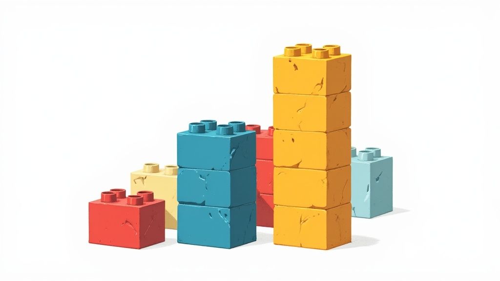
7. LEGO Building System
The LEGO building system stands as a prime example of good design, specifically showcasing the power of modularity. This iconic toy demonstrates how a simple, yet robust, system can foster limitless creativity and maintain relevance across generations. From its humble beginnings in 1932, LEGO's interlocking brick system has become a global phenomenon, offering a tangible example of how effective design principles can lead to enduring success. This system is a testament to thoughtful design, providing a platform for open-ended play and complex creations alike, making it a deserving entry on this list of examples of good design.
At the heart of LEGO's success lies the ingenious stud-and-tube coupling system. This deceptively simple mechanism ensures secure connections between bricks, enabling the construction of robust and complex structures. Precise manufacturing tolerances (within 0.01mm) guarantee reliable connectivity, crucial for maintaining structural integrity and ensuring a consistent user experience across different sets and even across decades. The standardized connection system fosters both backward compatibility (maintained meticulously since 1958) and forward compatibility, allowing seamless integration of older and newer sets. This interoperability is a key element of good design, maximizing the value and longevity of the product for consumers.
The LEGO system's modularity, paired with a standardized color-coding system, empowers users with infinite creative possibilities using a finite set of components. This elegant simplicity allows for intuitive learning – no manual required – making it accessible to users of all ages and skill levels. This scalability is another hallmark of good design, allowing the system to grow with the user, from building basic towers to constructing complex robotic systems via platforms like MINDSTORMS.
Examples of Successful Implementation:
The timeless 2×4 brick: A testament to the system's longevity, this fundamental component remains compatible with bricks produced over 60 years ago.
LEGO MINDSTORMS: This platform extends the building system into the realm of programmable robotics, showcasing the system's adaptability and potential for complex applications.
LEGO Architecture: This series translates famous buildings into brick form, demonstrating the versatility and educational potential of the system.
Pros:
Infinite creative possibilities from a finite set of components
Intuitive learning curve with no manual required
Exceptional durability and longevity of pieces
Scalable complexity, from basic bricks to technical components
Educational benefits, developing spatial reasoning and creativity
Cons:
Environmental impact of ABS plastic production
Higher cost compared to less durable toy alternatives
The infamous pain of stepping on a stray brick
Tips for Applying LEGO's Design Principles:
Design components as part of a system: Think beyond individual products and consider how they can interact within a larger ecosystem.
Prioritize backward compatibility: This builds user loyalty and extends the lifespan of your product.
Balance constraints with creative freedom: A limited set of well-designed components can actually enhance creativity.
Consider scalability: Design your system to accommodate users of different skill levels and evolving needs.
The LEGO building system provides invaluable lessons for designers across various disciplines. Whether you're a product manager developing a new software platform, a UX/UI designer crafting user interfaces, or a web developer building websites, the principles of modularity, scalability, and backward compatibility exemplified by LEGO can inspire the creation of truly effective and enduring designs. This system provides a clear example of good design principles that resonate with a wide audience, making it a worthy model for anyone striving to create products or systems that are both functional and engaging.
7 Iconic Design Concepts Compared
Design Concept | 🔄 Implementation Complexity | 🛠️ Resource Requirements | 📊 Expected Outcomes | 💡 Ideal Use Cases | ⭐ Key Advantages |
|---|---|---|---|---|---|
Apple iPhone | Medium - integration of hardware and software | High - premium materials, software ecosystem | High-quality user experience, strong brand | Consumer electronics, luxury smartphones | Seamless UX, ecosystem integration, consistent design |
Dieter Rams' Braun Products | Medium-High - demands quality materials and details | Medium-High - durable materials, careful build | Timeless aesthetic, intuitive usability | Industrial design, sustainable product lines | Functional minimalism, longevity, ethical design |
London Underground Map | Medium - complex information design and testing | Low-Medium - graphic design, user testing | Highly usable transit maps, scalable system | Public transit navigation and information design | Clear visual language, user-centric, scalable |
OXO Good Grips Kitchen Tools | Medium - ergonomic design and universal design focus | Medium - quality materials, user testing | Inclusive tools, premium user comfort | Everyday tools focusing on accessibility | Inclusive design, user-tested comfort, distinct branding |
Norwegian Passport Design | High - security and aesthetic integration | High - advanced printing and security tech | Secure, award-winning document | Identity documents balancing security & design | Security as design, national identity expression |
Aeron Chair by Herman Miller | High - ergonomic engineering and adjustable parts | High - premium materials and manufacturing | Exceptional ergonomics and durability | Office seating focusing on ergonomics | Ergonomic innovation, breathability, inclusivity |
LEGO Building System | Medium - modular standardized component system | Medium - precision manufacturing, plastic use | Infinite creative possibilities, educational use | Toys, educational tools, modular systems | Backward compatibility, scalable creativity, durability |
Beyond the Surface: The Power of Design
From the sleek lines of the iPhone to the intuitive layout of the London Underground map, the examples explored in this article demonstrate the profound impact of good design. These diverse examples of good design aren't just visually appealing; they solve problems, improve functionality, and enhance user experience. Key takeaways include the importance of user-centered design, a focus on simplicity and clarity, and a commitment to innovation and quality craftsmanship. Whether it's a physical product like the Aeron Chair or a system like LEGO, good design elevates the mundane and enriches our lives.
Mastering these design principles is invaluable for anyone involved in creating products or experiences. By understanding how form and function intertwine, product managers, UX/UI designers, web developers, and marketing teams can create offerings that resonate with their target audience. Good design isn't just about aesthetics; it's about creating something functional and user-friendly. If you're looking to apply these principles to a digital platform, consider exploring resources on how to create a membership website. Ultimately, impactful design fosters positive connections between people and the objects and systems they interact with daily.
Good design is a continuous journey of learning, iterating, and refining. By embracing the principles highlighted in these examples, you can elevate your work and create designs that are both beautiful and meaningful. Looking for a tool to streamline your team's communication and collaboration around design projects? Check out Beep, a platform built with a focus on intuitive design and user experience to help teams bring their best ideas to life.
Comments