
.png)
Your Ultimate Guide to Website Usability Testing
- shems sheikh
- Jan 2
- 17 min read

Let’s get one thing straight: website usability testing isn't some fancy, optional add-on. It’s the simple practice of watching real people try to use your website to see where they get stuck, confused, or just plain frustrated. Think of it as your secret weapon for uncovering the hidden flaws in your design by observing actual human behavior, not just guessing based on your own opinions.
Why Website Usability Testing Is Not Optional
Imagine designing a brand-new car but never letting anyone actually take it for a test drive. You might think the steering is perfect and the dashboard is a work of art, but you won't know for sure until a real driver gets behind the wheel. Launching a website without usability testing is pretty much the same gamble—you're shipping a product based entirely on your team's perspective.
This process is the single most effective way to understand how your website truly performs. It cuts through internal debates and gut feelings, giving you direct, actionable feedback from the only people who really matter: your users.
The Business Case for a Digital Test Drive
Watching users interact with your site isn't just about catching minor bugs. It’s about finding those hidden friction points that kill conversions and chip away at your brand's reputation. A solid website usability testing plan reveals the roadblocks that are costing you money.
The benefits are clear and directly impact your bottom line:
Higher Conversion Rates: When you remove obstacles in the user journey, it's just plain easier for people to sign up, buy something, or do whatever it is you want them to do.
Improved Customer Loyalty: A website that’s easy and enjoyable to use builds trust. It encourages people to come back, turning casual visitors into loyal fans.
Reduced Development Waste: Finding design flaws early on saves countless hours and resources that you’d otherwise spend fixing a live product that’s already failing.
"Every dollar invested in UX results in a return of $100. That’s an ROI of 9,900%."
That staggering return on investment tells a powerful story. Users form an opinion about your website in just 50 milliseconds, and a whopping 94% of those first impressions are tied directly to design. What's more, 75% of people judge a company's credibility based on its web design alone. This makes a great user experience a non-negotiable business asset.
For a deeper look into the numbers, check out this great breakdown of user experience statistics. And if you're ready to get your hands dirty, this complete guide on how to conduct usability testing is an excellent resource that covers all the nuts and bolts.
Choosing the Right Testing Method for Your Goals
Picking the right website usability testing method is a lot like being a chef choosing the right knife. You wouldn't use a cleaver for delicate garnishes, right? The same logic applies here. Your choice has to perfectly match your budget, your timeline, and most importantly, what you’re trying to learn. There's no single "best" method, only the one that fits your current project like a glove.
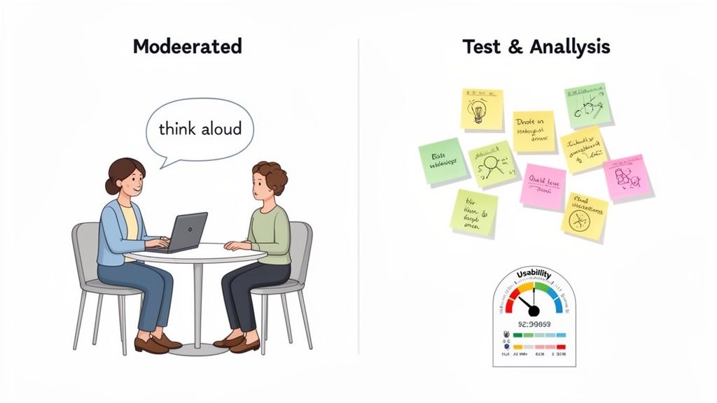
First up, you’ve got to decide between a moderated or unmoderated test. Think of it as the difference between having a personal tour guide versus exploring a new city with just a map.
Moderated vs Unmoderated Testing
A moderated test is that personal tour guide. You have a facilitator guiding the participant, asking smart follow-up questions, and digging deeper into why they're doing what they're doing. It’s perfect when you need to get to the heart of the "why" behind user actions or untangle a really complex workflow.
On the flip side, an unmoderated test is like letting someone explore on their own. Participants complete tasks independently, usually from their own home or office. This approach is way faster, easier to scale up, and fantastic for seeing how people behave naturally without someone looking over their shoulder.
Qualitative vs Quantitative Data
Next, you need to figure out if you're hunting for stories or stats. This choice completely shapes the kind of answers you'll get.
Qualitative Testing is all about the stories. It focuses on watching what people do and understanding their motivations. You're trying to answer questions like, "Why on earth are users getting stuck at the checkout page?" Methods like user interviews and moderated sessions give you rich, descriptive feedback that numbers alone can't provide.
Quantitative Testing is purely about the numbers. It's focused on things you can measure and analyze statistically. It answers questions like, "What percentage of users managed to complete this task?" This is where A/B tests, surveys, and first-click tests shine, giving you hard data on user performance.
If you’re not sure whether you even need to test, this flowchart can help you decide. If you already have live users, you have a golden opportunity to get direct feedback.
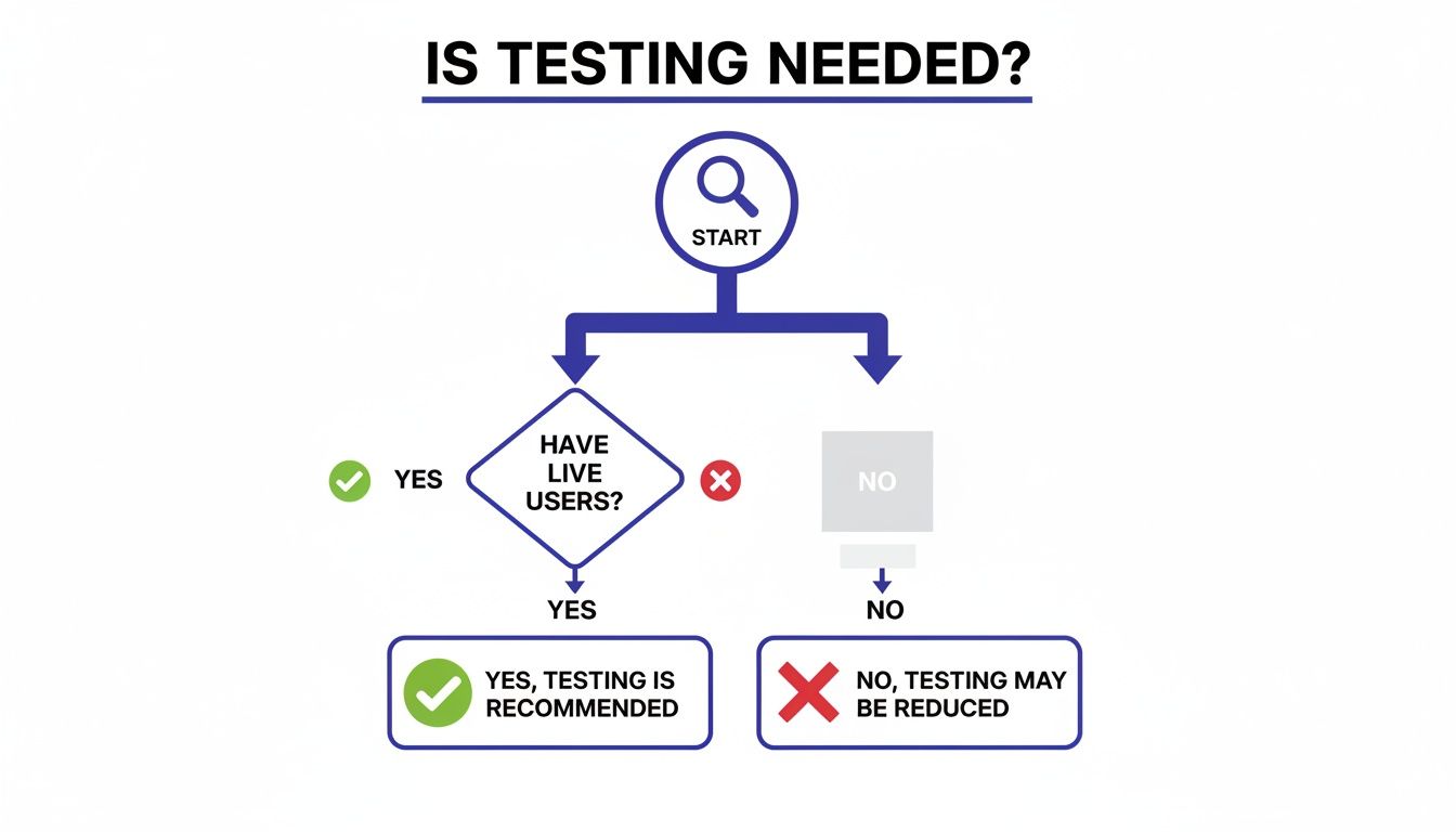
As you can see, having real people using your site opens the door to direct testing, which is always the most reliable way to figure out what's working and what's not.
Remote vs In-Person Sessions
The last big decision is where the testing happens. Both remote and in-person sessions have their own perks, and the right choice depends on your situation.
Remote testing lets you recruit people from anywhere in the world, which is usually cheaper and faster. I love it because you get to see users in their natural habitat—using their own messy desks, slow Wi-Fi, and distraction-filled rooms. It adds a layer of realism you just can't fake.
In-person testing, however, gives you more control. You can set up the environment perfectly and, more importantly, watch for subtle cues like body language or a frustrated sigh. It's a must-have for testing physical products or complex prototypes, and it's great for participants who aren't super comfortable with technology.
Choosing the right method means you get the right answers. An early-stage concept might benefit from a moderated, qualitative test to explore ideas, while a live site might need an unmoderated, quantitative test to benchmark performance.
Think about click testing, for example. It's a go-to for evaluating a site's layout and can be a pretty good predictor of what will happen on the live version. The numbers don't lie: while only 55% of companies conduct any UX testing at all, a shocking 1% of e-commerce sites meet user expectations every single time. That’s a huge opportunity for anyone willing to put in the work.
Making a thoughtful decision on these three fronts—moderation, data type, and location—sets you up for a study that delivers exactly the insights you need.
To help you get a better handle on the options, here's a quick comparison table breaking down some of the most common methods.
Comparison of Usability Testing Methods
This table compares common website usability testing methods to help teams choose the right approach based on their project needs and resources.
Method | Best For | Primary Data | Pros | Cons |
|---|---|---|---|---|
Moderated In-Person | Deeply understanding user behavior, testing complex prototypes, observing non-verbal cues. | Qualitative | High-quality insights, allows for follow-up questions, builds rapport with users. | Expensive, time-consuming, geographically limited, potential for moderator bias. |
Moderated Remote | Exploring complex user flows with a geographically diverse audience. | Qualitative | Cheaper than in-person, flexible scheduling, captures user's natural environment. | Can be prone to tech issues, misses some non-verbal cues. |
Unmoderated Remote | Gathering large-scale data, validating designs, benchmarking performance. | Quantitative & Qualitative | Fast, scalable, low cost, observes natural behavior without bias. | No opportunity for follow-up questions, tasks can be misinterpreted. |
A/B Testing | Comparing two versions of a design to see which performs better on a specific metric. | Quantitative | Provides statistically significant data, removes guesswork from design decisions. | Only tests one variable at a time, doesn't explain the "why." |
Card Sorting | Understanding how users categorize information to inform site architecture. | Qualitative | Helps create intuitive navigation, reveals user mental models. | Can be subjective, requires careful analysis. |
Choosing a method from this list (or combining a few) will put you on the right track.
If you want to dive deeper into the different approaches, check out our guide on the top user testing methods to refine your UX. It’ll help you build a solid strategy that gets real results.
How to Plan a Test That Delivers Actionable Insights
Let's be real: successful usability testing doesn't just happen. It's the result of a solid plan, a blueprint that guides your entire study. Think about it—you wouldn't build a house without architectural plans, right? The same goes for testing. Winging it is a surefire way to get messy, biased results.
A good plan turns what could be a casual observation into a more scientific process. It makes sure every task, question, and interaction is designed to pull out those golden nuggets of insight that lead to real product improvements.
Start with Clear Objectives and Questions
Before you even think about recruiting people, you need to nail down one simple question: “What are we actually trying to learn here?” Everything else you do will be built on the answer to this. Vague goals like “see if the site is easy to use” are pretty much useless. You need sharp, specific objectives you can actually measure.
I've found the best way to frame this is to start with a problem statement. For example: "Users are adding items to their cart but not checking out, leading to a 70% cart abandonment rate. We need to figure out what's causing friction in our checkout flow so we can fix it."
See how clear that is? From there, you can break it down into more specific research questions:
Can people easily find and understand the shipping costs?
Do they feel confident and secure when entering their payment details?
Are there confusing steps or weird errors popping up during checkout?
These focused questions will keep your study on track and stop you from getting lost in a sea of irrelevant data.
Define What Success Looks Like
Once you know what you're looking for, you have to decide how you'll measure success. Vague feedback is interesting, but hard data is what gets things done. Setting up success criteria, or metrics, is how you turn subjective observations into concrete evidence that can drive decisions.
Think about the key performance indicators (KPIs) that really matter for the tasks you're testing.
Task Completion Rate: This is the big one. What percentage of users can actually complete the task successfully?
Time on Task: How long does it take an average user to get it done? Faster usually means a smoother design.
Error Rate: How many times do people mess up while trying a task? This helps you zero in on confusing parts of your interface.
Subjective Satisfaction: After the test, you can ask users to rate their experience on a scale (the System Usability Scale or SUS is a classic for a reason). This captures how easy they felt it was.
Defining these metrics upfront creates a clear benchmark. It's the difference between saying "some users struggled" and "only 30% of users completed the purchase, and it took them twice as long as our target." One is an opinion; the other is a fact you can't ignore.
Craft Realistic Scenarios and Tasks
With your goals and metrics sorted, it's time for the fun part: creating the user scenarios and tasks. A scenario gives the user some context and a reason to be there, while the task is the specific action you want them to perform. The key word here is realism.
A weak task is just a direct command: "Click on the 'Products' menu and find the blue running shoes." This basically tells the user exactly how to do it, which defeats the whole purpose.
A strong, scenario-based task is way better: "You've decided to start running and need new shoes. Use the website to find a pair of blue running shoes in your size and add them to your cart."
This approach mirrors what a real customer would do. It doesn't spoon-feed them interface terms ("click here," "use the filter"). Instead, it encourages them to think and act naturally, which shows you how they really navigate your site to solve their own problems.
Write a Neutral and Consistent Script
The final piece of your plan is the test script. This is your moderator's cheat sheet, and it’s critical for making sure every session is run consistently and without bias. A good script is more than a list of tasks; it includes everything the moderator needs to say and do from start to finish.
Here’s what your script should absolutely include:
A Welcoming Intro: Explain the purpose of the session (you're testing the site, not them!), get their consent to be recorded, and really encourage them to "think aloud."
Background Questions: A few easy warm-up questions to understand their experience with similar websites. This helps build rapport.
The Task Scenarios: Your well-crafted tasks, presented one at a time.
Probing Questions: A list of open-ended follow-up questions to have on hand, like "What did you expect to happen when you clicked that?" or "Tell me more about why that was confusing."
A Closing Wrap-Up: Thank the participant for their valuable time and handle any compensation or final questions they might have.
Sticking to a script is your best defense against moderator bias. When you ask the same questions in the same way to every participant, you can be confident that the data you're collecting is comparable and reliable. Trust me, this methodical planning is the foundation of any usability test that actually gets results.
Finding the Right People for Your Usability Study
You can have the most brilliant test plan in the world, but it's completely useless if you're testing it on the wrong people. Imagine running a focus group for a hardcore new video game, but the room is filled with people who have never even held a controller. The feedback you'd get wouldn't just be unhelpful—it could steer you in a disastrously wrong direction.
It’s that simple. The insights you get from website usability testing are only as good as the people you recruit. Getting this right is the difference between collecting random noise and gathering powerful feedback that actually improves your site.
Defining Who to Recruit
Before you can start finding people, you need a crystal-clear picture of who you're looking for. This is where user personas come in handy. Don't worry, these aren't exhaustive biographies; they're quick sketches of your ideal users, focusing on their goals, behaviors, and how comfortable they are with tech.
Let’s say you run an e-commerce site selling high-end kitchen gadgets. A persona might be "The Weekend Chef"—a 35-year-old who loves cooking, follows food blogs, and has no problem shopping online. Just like that, you have a profile to focus your recruiting efforts on.
With your persona in mind, the next step is to build a screener questionnaire. Think of this as a short survey that filters out the wrong people and lets the right ones through.
Behavioral Questions: "How often do you purchase kitchen supplies online?" (This confirms they have relevant experience.)
Demographic Questions: "What is your age range?" (This helps you match your persona.)
Tech Usage Questions: "Which devices do you typically use for online shopping?" (This ensures they use the tech you care about.)
These questions are your gatekeeper, making sure only qualified candidates make it to the study.
How Many Users Do You Really Need?
One of the biggest myths I see is that you need a massive group of participants for a usability test. The truth is much more encouraging. For most qualitative studies, where the goal is to find problems, you can uncover the vast majority of issues with just a handful of people.
The Nielsen Norman Group popularized the "five-user rule," which suggests that testing with just five participants will reveal about 85% of the usability problems. After the fifth person, you start seeing the same issues over and over, and your return on investment drops off.
This is great news because it makes iterative testing totally manageable. Instead of one huge, expensive study, you can run a small test, fix the problems you find, and then test again. Easy.
Finding and Compensating Participants
Alright, you know who you're looking for. Now, where do you find them? You've got a few solid options, each with its own pros and cons:
Professional Recruiting Services: Platforms like UserTesting or UserZoom have massive panels of pre-screened testers ready to go. This is the fastest route, but it's also usually the priciest.
Your Own Customer Base: Got an email list or a CRM? Tapping into your existing customers can give you access to super relevant participants who already know your brand.
Social Media and Online Communities: Posting in relevant LinkedIn groups, subreddits, or Facebook groups can be a surprisingly effective and cheap way to find niche audiences.
No matter where you find them, always compensate participants for their time. It shows you value their input and encourages them to give honest, thoughtful feedback. For a typical one-hour remote session, an incentive in the $50-$100 range is pretty standard, though it can vary.
And one last tip: avoid recruiting friends, family, or your own employees. Their built-in biases and familiarity with your product will muddy the waters. You're looking for fresh, objective eyes.
Running Your Test and Making Sense of the Results
All that meticulous planning and careful recruitment has led you here. This is the moment your preparation pays off, and you finally get to see real people interact with your website. Running a smooth test and then turning those observations into a compelling story are the last two hurdles to jump.
From Raw Data to a Coherent Story
For moderated tests, the facilitator's role is part art, part science. Your main job is to make the participant feel comfortable enough to act naturally and share their unfiltered thoughts. Start by building a quick rapport, reminding them you're testing the website—not them—so there are no right or wrong answers.
The most powerful tool you have is the "think-aloud" protocol. Gently encourage participants to narrate their thought process as they move through the site. Simple prompts like, "What are you thinking now?" or "What did you expect to happen there?" can unlock a goldmine of insights. Your goal is to be a neutral observer—guide them when needed, but fight the urge to help or lead them to the "correct" answer.
Once the sessions wrap up, you’ll be sitting on a mountain of raw data: pages of notes, hours of recordings, and a bunch of user quotes. The real challenge is finding the patterns hidden within this messy collection of observations. This is where the analysis truly begins.
A fantastic technique for this is affinity mapping (or affinity diagramming). It’s a dead-simple but incredibly effective way to organize everything visually.
Extract Observations: Go through your notes and write every single observation, user quote, or pain point on an individual sticky note.
Group Similar Items: Start clustering the sticky notes into logical groups based on common themes. You might get a cluster for "Checkout Confusion," another for "Navigation Issues," and a third for "Unclear Product Descriptions."
Name Your Groups: Once you have your clusters, give each one a descriptive name that nails the core problem.
Identify Key Insights: Take a step back and look at your named groups. These clusters represent the biggest, most common issues your users ran into.
This process helps you go from dozens of individual comments to a handful of high-level, evidence-backed themes. It’s a lifesaver.
Measuring and Benchmarking Performance
While qualitative insights tell you why users are struggling, quantitative metrics tell you how much they're struggling. Trust me, calculating a few key metrics can add serious weight to your findings and help you benchmark performance over time.
A widely used metric is the System Usability Scale (SUS). It’s a quick, ten-item questionnaire that spits out a single score representing the overall perceived usability of your site. It’s a brilliant way to get a standardized measure of user satisfaction.
A SUS score of 68 is considered average. Scores above this are good, while scores below mean you've got work to do. This simple number can be a powerful way to communicate the state of your site's usability to stakeholders.
These benchmarks are especially critical when you start thinking about accessibility. One review of over 2,100 sessions with assistive technology users found an average Accessibility Usability Score (AUS) of 65. That suggests most websites offer a mediocre, D-grade experience for users with disabilities. This really highlights why testing with diverse user groups isn't just a nice-to-have, but an absolute must. You can find more details in this in-depth review of usability and accessibility benchmarking.
Creating Actionable Recommendations
The final step is translating your findings into a prioritized list of recommendations your team can actually act on. Your analysis showed you the problems; now you need to propose the solutions.
For each major issue you found through affinity mapping, create a crystal-clear recommendation. Don't just point out the problem; explain its impact and suggest a specific fix.
Here's a simple structure I like to use for recommendations:
Observation: "Four out of five users couldn't find the return policy."
Impact: "This creates uncertainty and is probably contributing to our high cart abandonment rate."
Recommendation: "Add a prominent link to the return policy in the website footer and on the checkout page."
By structuring your report this way, you create a clear, evidence-based case for change that stakeholders can’t ignore. You're not just sharing opinions—you're presenting a data-driven roadmap for building a better website. I’ve found that using a structured approach, like this helpful user testing feedback template, can make organizing your insights much more effective.
Turning Feedback into Action with the Right Tools
Let's be honest, the real magic of website usability testing isn't just about finding problems—it's about crushing them, fast. A beautifully detailed report packed with insights is just a digital paperweight if it gets buried in a crowded inbox or lost in a never-ending email chain.
The biggest hurdle is often closing the gap between a user pointing something out and a developer actually fixing it. This is where modern tools completely change the game, building a direct bridge from the user's screen to your team's to-do list. Say goodbye to scattered notes and endless summary meetings.
Streamlining Feedback with Visual Context
Imagine a tester clicks a button and nothing happens. Instead of writing a vague note like, "the checkout button is weird," what if they could just point to it and leave a comment right there on the live website? That's the simple but powerful idea behind visual feedback tools.
Tools like Beep completely eliminate the guesswork. They let everyone on your team—from designers to stakeholders—pin comments directly onto any webpage element. Better yet, every piece of feedback automatically grabs a screenshot and crucial technical data, like the browser version and screen size.
This visual-first approach is a game-changer. Developers don't have to decipher confusing descriptions anymore. They see exactly what the user saw, in the right context, which cuts down debugging time dramatically.
Here’s a perfect example of what it looks like to leave a contextual comment directly on a live site using a tool like Beep.
When feedback is tied directly to the visual element, it becomes instantly clear and actionable. No more back-and-forth trying to figure out what someone meant.
Integrating Feedback into Your Existing Workflow
Getting the feedback is only half the battle. The next move is to turn those insights into trackable tasks without adding a bunch of clumsy, manual steps to your process. The best tools don't force you to change how you work; they slide right into the project management systems your team already relies on.
For instance, Beep can connect with platforms your team likely uses every day:
Jira: A user's comment can instantly become a new Jira ticket, automatically populated with the screenshot and all the technical details. No copy-pasting required.
Slack: The moment new feedback is submitted, a notification can pop up in the relevant Slack channel, keeping the entire team in the loop.
Notion: You can sync feedback directly into your Notion databases to keep all your project notes and user insights perfectly organized.
This kind of seamless integration means feedback doesn't just sit in a report waiting to be read. It lands directly in your development pipeline as a structured, ready-to-go task. This empowers your team to move faster and manage the entire improvement cycle from one central place. Of course, there are tons of great options out there, and you can explore some of the best website feedback tools to enhance user experience to see what fits your team best.
Once you’ve acted on this feedback, the next step is often implementing design and structural changes. To ensure these improvements are executed flawlessly, consider exploring professional web design and hosting services to bring your team's vision to life effectively.
Your Top Usability Testing Questions, Answered
Jumping into usability testing can feel a bit like learning a new language. You hear all these terms and "rules," and it's easy to get tangled up. Let's clear the air and tackle some of the most common questions I hear all the time.
How Many Users Do I Really Need for a Usability Test?
This is the big one, and the answer is probably fewer than you think. For most qualitative tests—where you're trying to spot the big, glaring problems—the magic number is five.
Seriously, testing with just five users is enough to uncover about 85% of the most common issues. It's the perfect approach for getting quick, actionable feedback without blowing your budget.
But hold on. If you're running a quantitative study, where you need hard numbers and stats to benchmark performance, you'll need to aim higher. For those, you'll want at least 20 or more participants to make sure your data is solid.
How Much Is This Going to Cost Me?
The price tag for usability testing can swing wildly. On one end, you can do it yourself with an unmoderated testing platform for just a few hundred bucks. This is a fantastic option for teams on a tight budget who need fast validation.
On the other end, a fully moderated study with a professional recruiter and moderator can run into the thousands. The final cost really boils down to how complex your test is, the moderator's experience, and how tough it is to find your specific target audience.
The key difference is control and depth. DIY is fast and cheap for surface-level validation, while professional moderation provides deeper, more nuanced insights that can justify the higher investment.
What's the Difference Between Usability Testing and A/B Testing?
I see people mix these up all the time, but they solve completely different problems. It's actually pretty simple when you break it down.
Usability Testing is qualitative. It answers the "why." You're watching a small group of people to figure out why they're getting stuck or confused.
A/B Testing is quantitative. It answers the question "which one?" You show two different designs to a huge audience to see which version hits a specific goal, like getting more sign-ups.
Think of it like this: You use usability testing to find the problems and brainstorm solutions. Then, you use A/B testing to prove which of your solutions actually works best in the real world.
Turn your website feedback into clear, actionable tasks. With Beep, you can leave contextual comments directly on any live webpage, eliminating confusion and speeding up your entire workflow. Get started for free at Beep.
Comments