
.png)
How to Measure Team Productivity Without Micromanaging
- shems sheikh
- Jan 16
- 16 min read

If you want to measure team productivity, you have to stop counting things and start looking at what actually matters: shifting your focus from outputs to outcomes. The formula I've seen work time and again involves a smart mix of quantitative metrics, like cycle time, and qualitative indicators, like team engagement. It's about gathering data ethically and using those insights to drive real business results, not just to track activity for the sake of it.
Rethinking Productivity Beyond Outputs and Hours Logged
For decades, the default way to measure a team's productivity was pretty simple: how many hours did they log, and how many tasks did they check off? In a factory, that makes perfect sense. More widgets per hour means higher productivity. Easy.
But for today's creative, technical, and strategic teams, that old-school model isn't just outdated—it’s actively harmful.

Think about it. Imagine one developer spends 40 hours fixing a minor bug that only affects 0.1% of users. Now, picture another developer who spends just five hours shipping a feature that bumps user retention by 15%. Who was more productive?
The answer is obvious, but traditional metrics would favor the developer who logged more hours and closed more tickets. This is the heart of the problem with focusing on outputs (tasks completed) instead of outcomes (business impact).
The Shift from Busy to Effective
True productivity isn't about being busy; it’s about being effective. A team can look incredibly busy—jumping between meetings, drowning in emails, and constantly pushing code—but still fail to move the needle on key business goals. This is exactly why we need a more balanced approach.
To get a real sense of team productivity today, you need a framework that values:
Tangible Outputs: These are the concrete deliverables—features shipped, articles published, designs completed. They’re still important, but they're only one piece of the puzzle.
Business Outcomes: This is the real-world impact. Did that new feature actually reduce customer churn? Did that marketing campaign generate qualified leads?
Team Health and Collaboration: An engaged, collaborative team is a productive one. Things like employee satisfaction, the quality of feedback, and innovation are all leading indicators of future success.
Why Old Metrics Fail Modern Teams
The nature of knowledge work is completely different from manual labor. A UX designer's best idea might strike during a walk, not while staring at a screen. A product manager could prevent months of wasted work with a single, insightful conversation. These critical contributions are totally invisible to systems that only track time or task volume.
A culture that rewards "looking busy" will inevitably produce busywork. The goal is to build a system that encourages deep thinking, smart shortcuts, and high-impact contributions, even if they don't fit neatly into an eight-hour box.
This is especially true for remote and distributed teams. When you can’t physically see your team working, the temptation to track activity can be strong. But the best strategies on how to manage remote teams without losing your sanity are built on trust and outcomes, not surveillance. By shifting our perspective, we can create a measurement framework that motivates our teams to solve real problems and deliver genuine value. It sets the stage for a healthier, more accurate way to understand their true impact.
Choosing Productivity KPIs That Actually Matter
Picking the right Key Performance Indicators (KPIs) is where most attempts to measure productivity go right—or go completely off the rails. Without the right metrics, you’re just tracking busy work. You end up with a spreadsheet full of data that looks impressive but tells you absolutely nothing about the actual impact on the business. The trick is to ditch the vanity metrics and find KPIs that tell a real story about your team's contribution.
This means you have to sidestep the metrics that are easy to count but offer little value. A classic example I see all the time is tracking "lines of code" for a developer. It just encourages quantity over quality and completely misses the point of elegant, efficient problem-solving. A developer who writes 50 lines of brilliant code to fix a complex issue is way more productive than someone who churns out 500 lines of bloated code to do the same thing.
Balancing Leading and Lagging Indicators
To build a dashboard that actually means something, you need a healthy mix of two kinds of indicators: lagging and leading.
Lagging Indicators are your rearview mirror. They measure past performance—think revenue, customer churn, or projects completed. They’re crucial for confirming your team’s efforts hit the mark, but they won’t help you see what’s coming.
Leading Indicators are your headlights. These are forward-looking metrics that predict future results. They often track the processes and behaviors that drive your lagging indicators, like user feedback velocity, sales pipeline growth, or employee engagement scores.
A team that only tracks lagging indicators is like driving while staring at the road behind you. Sure, you know where you’ve been, but you have no clue what’s ahead. A balanced approach lets you confirm past wins while actively steering toward future success.
Tailoring KPIs To Specific Team Roles
Productivity isn't a one-size-fits-all concept. The metrics that make sense for a marketing team are totally different from what a web development team should be tracking. The goal is to pick KPIs that reflect the unique value each role brings to the project. Honestly, getting this right is half the battle when you're learning how to measure team productivity.
To give you an idea of how this looks in the real world, here’s a breakdown of KPIs I've seen work well for different teams.
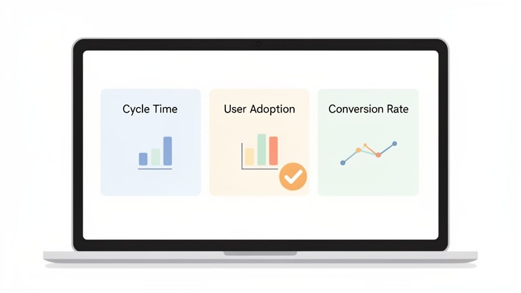
Role-Specific Productivity KPIs
Team Role | Quantitative KPI Example | Qualitative KPI Example | Measures |
|---|---|---|---|
Web Development | Cycle Time: Time from starting a task to deployment. | Peer Code Review Feedback: Quality of feedback given on pull requests. | Efficiency, speed, and code quality. |
Product Management | User Adoption Rate: Percentage of new users using a key feature. | Customer Interview Insights: Number of actionable insights from user interviews. | Product-market fit and user value. |
Marketing | Lead-to-Customer Conversion Rate: Percentage of leads that become paying customers. | Brand Sentiment Score: Positive/negative mentions on social media. | Funnel effectiveness and brand health. |
UI/UX Design | Time on Task: How long it takes users to complete a specific action. | Usability Testing Feedback: Quality and severity of issues found in testing. | User experience and design efficiency. |
Customer Support | First Response Time: Average time to reply to a new ticket. | Customer Satisfaction (CSAT) Score: User-reported satisfaction after an interaction. | Responsiveness and service quality. |
By tailoring your metrics, you ensure that every team member understands how their specific contributions push the company's goals forward. It's about relevance, not just measurement.
Moving Beyond Simple Outputs
The workplace is finally catching on to the idea that people are more than just their immediate output. In fact, a Deloitte survey on Global Human Capital Trends found that 74% of companies see the shift from output to human performance as a top priority. The problem? Only 17% feel they are any good at it.
One fascinating case study from a major energy company used employee badge data to find that simply encouraging more informal chats between dispersed teams led to a 5.3% jump in efficiency. That's a huge insight for web developers and designers who thrive on quick, informal feedback loops. You can dig deeper into these kinds of human-centric performance stats from Select Software Reviews.
The best KPIs don't just measure what a team did; they measure the impact of what they did. This requires a mindset shift from counting tasks to understanding contribution.
Ultimately, picking the right KPIs is about connecting your team’s daily grind to the company's big-picture strategy. When your dashboard reflects real business outcomes, it stops being a report card and starts being a strategic tool that guides decisions, celebrates real wins, and drives constant improvement.
Gathering Data Without Creating a Culture of Fear
You've picked your KPIs. Great. Now comes the tricky part: actually collecting the data. This is where a lot of productivity initiatives fall flat. If you get this wrong, it can feel like you’re spying on your team, which is a surefire way to kill trust and create a culture where everyone’s more focused on looking busy than actually being effective.
The whole point is to make data collection a natural, transparent part of your team's workflow, not another layer of micromanagement. It should feel helpful, not invasive. The best way to do this is by pulling data from the tools your team already uses every day, all while making sure they feel safe and supported.
Automate Data Collection with Existing Tools
Honestly, the easiest place to start is with the systems you already have in place. Your project management software is probably a goldmine of quantitative data just waiting to be tapped.
Jira and Asana: These tools are fantastic for tracking things like Cycle Time (how long a task takes from start to finish) and Throughput (how many tasks get done each week). You can spot bottlenecks in your workflow almost instantly.
Notion and Trello: Even simpler tools can give you a ton of insight. Just watching cards move across a Kanban board gives you a clear visual of progress and helps you measure the flow of work from the "To Do" column to "Done."
By pulling data from these platforms, you automate the heavy lifting of collecting quantitative metrics. Nobody has to fill out extra timesheets or reports, which is a huge win. It respects your team’s time and keeps the focus on the work itself. For a deeper dive, check out this comprehensive guide to tracking employee time to make sure you're doing it effectively and ethically.
Capture Qualitative Feedback Where It Happens
Numbers tell you what is happening, but the stories, comments, and feedback from your team tell you why. That's where the real magic for improvement lies. The problem is, old-school methods like feedback meetings or endless email chains are slow, clunky, and usually result in vague comments you can’t do much with.
This is where modern tools completely change the game. Visual feedback platforms, for example, let team members click directly on a live webpage or a design mockup to leave a comment. You get super precise, contextual insights that you’d never get from a spreadsheet.
Look at that image. A team member can pinpoint an exact element on the page and drop a comment, which then gets logged as a task automatically. This is so much better than getting a vague message like "the button looks weird." Now you have a clear, actionable task tied to a specific visual.
The most powerful data often comes from combining the "what" with the "why." A dip in task completion rates (quantitative) might be explained by a team member's feedback about a confusing design requirement (qualitative).
This isn't just about being more efficient; it's about showing respect. You're telling your team you value their expertise and are giving them tools to provide high-quality feedback without all the usual friction. There are a ton of great remote collaboration tools to boost team productivity that make this kind of communication seamless.
Frame Data Collection Around Improvement, Not Judgment
How you talk about data collection is everything. You have to frame it as a tool for the team to get better together, not as a way to evaluate individual performance.
Make it crystal clear that the data is for:
Finding Blockers: Figuring out what’s slowing the team down so you can clear those hurdles together.
Celebrating Wins: Using numbers to highlight achievements and give credit where it’s due.
Making Processes Better: Spotting patterns that point to a smarter way of working for everyone.
This framing is absolutely essential for building trust. When your team sees that data is being used to help them, they’ll actually want to participate. And that engagement is crucial because, let's face it, disengagement is a massive productivity killer.
Gallup's research is pretty stark: only 21% of employees are engaged at work, which contributes to an estimated $438 billion in lost productivity every year. The same report found that engaged teams have 78% less absenteeism and are 14% more productive. It’s simple, really. A trusted, engaged team is a productive team. By focusing on support and improvement, you create the kind of engagement that drives real results.
Turning Raw Data Into Actionable Team Insights
Let's be real—collecting data is the easy part. A spreadsheet crammed with raw numbers won't tell you anything on its own. The real magic happens when you turn that data into clear, visual stories that help your team make smarter decisions. This is where a simple, effective productivity dashboard comes in, transforming abstract metrics into insights you can actually use.
You don't need some overly complicated business intelligence tool for this. The goal is to create a shared view of progress that everyone understands at a glance. It helps you spot trends, celebrate wins, and tackle bottlenecks before they turn into full-blown disasters. A great dashboard completely changes the conversation from, "So, are you busy?" to "Are we actually making an impact?"
This process is all about ethically tracking project data, gathering honest feedback, and building the trust you need to make the whole system work.
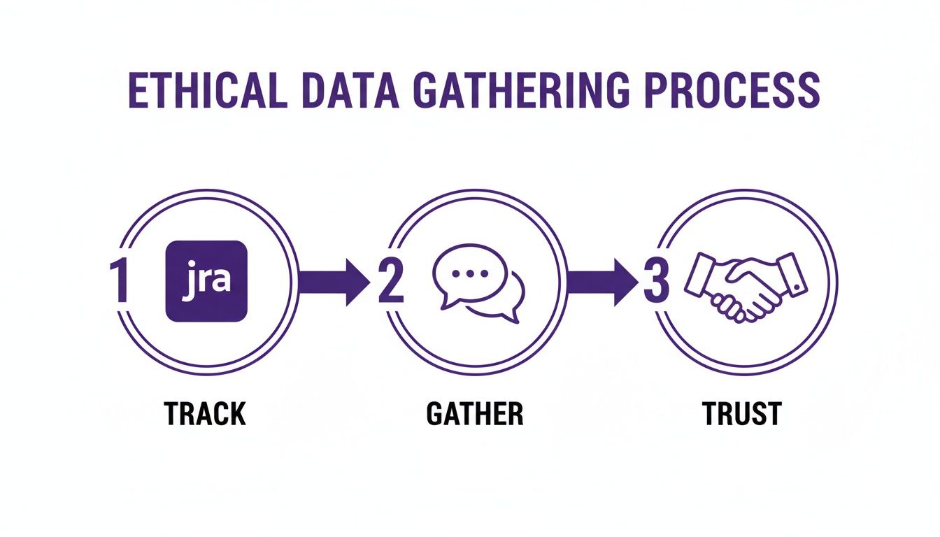
The key takeaway here? Technical tracking and human feedback must be built on a foundation of trust. Without it, you're just collecting empty numbers.
Creating Your Productivity Dashboard
Think of your dashboard as a living document, not some static report you glance at once a quarter. It should bring your chosen KPIs to life in a way that tells a compelling story. For instance, you could plot your development team's Cycle Time on a line graph week-over-week. If you see it creeping up, that’s a clear signal to dig in and figure out what’s causing the slowdown.
Here's a pro tip: combine quantitative data with qualitative insights. Imagine pairing a chart of your Task Completion Rate with a word cloud generated from user feedback. If completion rates are soaring but the word cloud is full of terms like "confusing" or "broken," you know the team is shipping features that just aren't hitting the mark. This combo gives you the full picture in a way a single metric never could.
Want to learn more about connecting your team's work to real-world results? Check out these practical tactics to improve workflow efficiency.
From Insights To Productive Conversations
Ultimately, your dashboard's purpose is to spark constructive dialogue. It's a tool for asking better questions, not for pointing fingers.
Here are a few ways I’ve seen this work wonders:
During weekly syncs: Instead of the classic "go-around-the-room" status update, pull up the dashboard. Frame questions around the data, like, "I see our first response time for support tickets went up by 10%. What challenges did we run into last week?"
In one-on-ones: Use the data to ground your conversations in reality. "I noticed your code review feedback has been incredibly thorough and helpful. It’s making a real difference in our code quality metric."
For strategic planning: Look at longer-term trends to inform your next big moves. "Our user adoption rate for new features has been flat for a month. Should we dedicate a sprint to improving the onboarding experience?"
To really level up, you need to move beyond basic metrics. The importance of adopting people analytics can’t be overstated; it gives you a framework for understanding the human element behind all those numbers.
Your dashboard isn't a report card for judging individuals. It's a compass for the entire team, helping everyone navigate toward the same goals and figure out how to get there together.
Common Productivity Measurement Pitfalls to Avoid
Trying to measure team productivity can feel like walking through a minefield. Seriously. It's littered with hidden traps that can absolutely wreck your efforts, crush team morale, and point you in the completely wrong direction. The goal isn't just to dodge the explosions; it's to build a system that feels healthy, motivating, and actually works.
Getting a handle on these common slip-ups is the first step toward creating a framework that genuinely helps your team get better. I've seen so many managers fall into these traps with the best of intentions, but the outcome is almost always a mess.
Over-Indexing on Individual Metrics
One of the biggest and most tempting mistakes is getting way too focused on individual performance numbers. Sure, tracking what each person is doing has its place, but it often comes at the expense of what really drives success: team collaboration and shared goals.
When you put all the weight on individual stats—like tickets closed per person or features shipped—you can accidentally create a cutthroat, siloed environment. Team members start gaming their own numbers, maybe hoarding information or hesitating to help a coworker because it won't move their personal needle. This completely undermines the collaborative spirit you need for innovation and solving tough problems.
A team of high-performing individuals isn't necessarily a high-performing team. True productivity is a collective effort, and your measurement system has to reflect that.
Instead of only looking at what one person did, shift your focus to team-level wins. Celebrate shared victories, like a killer product launch or a big drop in customer support tickets. This fosters a "we're all in this together" mindset, which is way more powerful.
Choosing Metrics That Are Disconnected from Business Goals
This one's a classic. I've seen teams obsess over KPIs that look great on a chart but have zero connection to what the business actually needs to achieve. This is the world of vanity metrics. Think tracking "lines of code written" for developers or "number of meetings attended" for project managers. These numbers are easy to count, but they tell you absolutely nothing about the value being created.
A developer could write 5,000 lines of clunky code that introduces a bunch of new bugs, while another writes 50 elegant lines that solve a massive customer headache. Who was more productive? It’s obvious, but the vanity metric points the wrong way.
To avoid this, you have to constantly ask yourself: "Does improving this metric directly help our company's strategic goals?" If you can't draw a straight line from the KPI to a core business objective like revenue, customer retention, or market share, it’s probably the wrong thing to be tracking.
Using Productivity Data as a Punitive Tool
This is the absolute fastest way to destroy trust and build a culture of fear. The second your team thinks that productivity data is being used to find fault or punish them, they'll clam up. They'll start focusing on making the numbers look good instead of doing great work.
Metrics should be a flashlight, not a hammer. Use them to shine a light on problems in your process, find bottlenecks, and spot opportunities to get better. They're a tool for diagnosis and support, not for playing the blame game.
Here’s how to reframe the conversation:
Instead of: "Why did your task completion rate drop this week?"
Try: "I noticed our team's completion rate dipped. Are there any blockers I can help remove, or is our process getting in the way?"
That simple shift in language makes a world of difference. It turns data from something that causes anxiety into a reason for a constructive chat. It builds psychological safety, and you can't have a high-performing team without that.
Neglecting the Power of Qualitative Feedback
If you only look at the numbers, you're getting an incomplete—and often misleading—picture. Quantitative data can tell you what happened, but it almost never explains why. Without hearing from your team, you're just guessing.
Imagine your dashboard shows a designer's output has been steadily dropping. The numbers alone might make you think it's a performance issue. But a quick conversation could reveal they’re stuck waiting on critical info from another department. That’s a process bottleneck, not a personal failing.
You need to create ways to get this kind of feedback flowing, both formally and informally:
Regular one-on-ones: This is your chance to ask open-ended questions about what's working and what's not.
Team retrospectives: Talk about the highs and lows of the last sprint as a group.
Visual feedback tools: Using a tool like Beep lets team members drop comments directly on a website or design. This captures contextual feedback that raw numbers could never show.
When you pair the hard data with real human stories, you get a much richer, more accurate picture of what's really going on with your team's productivity.
Productivity Measurement Pitfalls vs. Best Practices
It's easy to get this wrong, but it's also straightforward to get it right if you know what to look for. I've seen both sides of the coin, and the difference is night and day.
Here's a quick comparison of the common traps I see versus the more effective, modern approaches that actually work.
Common Pitfall | Why It's Harmful | Effective Alternative |
|---|---|---|
Focusing solely on individual output | Creates a competitive, siloed culture and discourages collaboration. | Prioritize team-level outcomes and shared goals that encourage a "we win together" mindset. |
Tracking vanity metrics | Measures activity, not impact. Can lead teams to optimize for the wrong things. | Connect every KPI directly to a core business objective. If it doesn't drive value, don't track it. |
Using data as a "gotcha" tool | Destroys psychological safety and encourages gaming the system instead of genuine improvement. | Frame data as a diagnostic tool for process improvement. Use it to start supportive conversations, not to place blame. |
Ignoring qualitative feedback | Provides an incomplete picture, missing the "why" behind the numbers. | Combine quantitative data with regular qualitative feedback through one-on-ones, retrospectives, and contextual tools. |
Steering clear of these pitfalls isn't just about avoiding negative outcomes; it's about actively building a positive, high-trust environment where people feel empowered to do their best work. When you get this right, measurement becomes a source of insight and motivation, not stress.
Got a solid framework? Awesome. But let's be real—the minute you start measuring productivity, a ton of practical questions will pop up. It's one thing to have a plan, and another to make it stick in the real world.
So, let's tackle some of the most common hurdles you'll probably face. Think of this as your cheat sheet for getting it right.
How Does This Work for Remote Teams?
When your team is remote, focusing on outcomes isn't just a good idea—it's everything. You can't see who's at their desk, so you have to trust the metrics. The trick here is to double down on asynchronous communication and crystal-clear documentation.
This means you need tools that give you visibility without you having to constantly ping people for updates. Instead of asking, "Hey, where are we on that feature?" you should be able to just glance at a shared Kanban board.
Visual feedback tools also become your best friend. Trying to explain a UI bug over a video call is a nightmare. A tool that lets you drop a comment directly on the problematic element captures the exact context you need, which is something that easily gets lost in translation otherwise.
How Often Should We Be Looking at These KPIs?
Don't fall into the trap of checking every single metric every single day. The right rhythm really depends on what you're measuring.
Weekly Check-ins: These are perfect for your leading indicators, like Task Completion Rates or Cycle Time. I like to pull these up during our weekly team syncs. They’re great for spotting immediate roadblocks and making quick tweaks on the fly.
Monthly or Quarterly Reviews: Save your lagging indicators for these bigger meetings. Metrics like Customer Satisfaction (CSAT) or User Adoption Rate show you the bigger picture. They tell a story about long-term impact and are perfect for those more strategic, "where are we going?" conversations.
Look, the goal isn't to put your team under a microscope. It's about creating predictable checkpoints to talk about progress. That way, everyone stays aligned without feeling like they're being constantly monitored.
How Do I Get My Team to Actually Buy Into This?
This is the big one, and it's totally non-negotiable. If your team thinks you're just trying to spy on them, this whole thing is dead on arrival. It all boils down to two things: transparency and how you frame it.
You have to make it painfully clear that the goal is collective improvement, not individual judgment.
The best way I've found to do this is to involve them from the very start. Let them help choose the KPIs. When you roll out the framework, say it loud and clear: "We're using this data to find and fix process problems, not to point fingers."
Then, use the data to celebrate wins. When the team crushes a goal, show them the numbers and praise them publicly. Once they see that the system is there to help them win, they won't just accept it—they'll embrace it.
Ready to get the kind of high-quality, actionable feedback that actually makes your team more productive? Beep lets you and your team drop visual comments directly on live web projects, turning vague feedback into clear, trackable tasks. Stop wasting time in endless meetings and start shipping better projects, faster. Get started with Beep for free!
Comments