
.png)
8 Crucial User Flows Examples to Inspire Your Design in 2026
- Henry Barks
- Feb 10
- 18 min read

User flows are the invisible threads that guide users through your product, turning confusion into clarity and friction into conversion. More than just a series of steps, a well-designed flow is a strategic conversation with your user, anticipating their needs and leading them effortlessly toward their goals. A poor flow leads to frustration, abandonment, and churn. An exceptional one, however, creates loyal customers and drives business growth.
This guide moves beyond theory to dissect 8 essential user flows examples from leading products. We'll break down the strategic thinking behind each one, providing actionable insights and replicable patterns you can apply immediately. By integrating key user experience best practices, you can design flows that are not only efficient but also delightful for your audience.
You will learn to deconstruct complex interactions and identify the critical decision points that make or break a user's journey. From seamless e-commerce checkouts to intuitive SaaS onboarding, we'll cover the tactical details that separate mediocre experiences from memorable ones. We’ll analyze what works, why it works, and how you can adapt these strategies for your specific needs.
Expect a deep dive into:
Real-world examples: We'll look at onboarding, checkout, content creation, and subscription management flows.
Strategic analysis: We'll uncover the 'why' behind each design choice.
Actionable takeaways: You’ll get clear, replicable tips to implement right away.
We will also explore how modern collaboration tools can transform how you review and iterate on these critical blueprints for success, ensuring your team is aligned on creating the best possible user journeys. Let's get started.
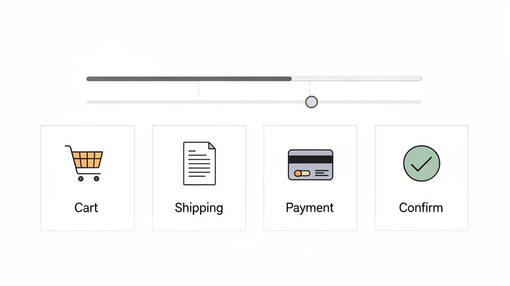
1. E-commerce Checkout Flow
An e-commerce checkout flow is a linear sequence of steps that guides a user from adding a product to their cart to completing a purchase. This is arguably the most business-critical of all user flows examples, as its efficiency directly correlates with revenue and conversion rates. A poorly designed checkout process leads to high cart abandonment, while a streamlined one builds customer trust and encourages repeat business. The flow typically includes cart review, shipping details, payment selection, and final order confirmation.
Strategic Breakdown
The core strategy behind a successful checkout flow is to minimize friction and build trust. Every field, button, and step should be intentional. For instance, Shopify's standardized checkout offers a familiar, multi-step process with clear progress indicators. This transparency reduces user anxiety by showing them exactly where they are in the process and what's next.
In contrast, Amazon’s patented "1-Click" checkout represents a masterclass in reducing friction for returning customers. By securely storing payment and shipping information, it removes nearly every step, catering to impulse buys and maximizing convenience.
Key Insight: The best checkout flows balance simplicity with security. They eliminate unnecessary steps (like forced account creation) while providing clear signals of a secure transaction (e.g., trust badges, HTTPS lock icon).
Actionable Takeaways & Tips
To optimize your checkout flow, focus on iterative improvements based on user feedback.
Provide a Guest Checkout Option: Forcing users to create an account is a major cause of cart abandonment. Always offer a guest checkout path.
Visualize Progress: Use a progress bar or step indicator to manage user expectations and reduce cognitive load.
Optimize Form Fields: Only ask for essential information. Use auto-fill capabilities for addresses and card details, and provide clear, real-time validation for errors.
Incorporate Visual Feedback: When gathering feedback with a tool like Beep, you can have stakeholders leave comments directly on specific form fields or buttons. This helps pinpoint exact friction points, from confusing UX copy on an error message to a poorly placed "Apply Coupon" field. Combining this with various user testing methods can provide a holistic view of user behavior.
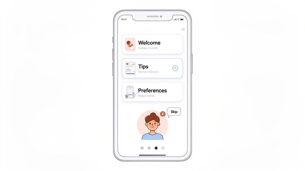
2. User Onboarding Flow
A user onboarding flow is a structured sequence of steps designed to introduce new users to a product, guiding them toward their first "aha!" moment. It's one of the most crucial user flows examples for SaaS platforms and mobile apps, as it directly influences activation, adoption, and long-term retention. A great onboarding flow doesn't just show features; it helps users achieve an initial goal, demonstrating the product's value proposition quickly. The process typically involves welcome screens, interactive tutorials, preference setup, and key action prompts.
Strategic Breakdown
The primary strategy for an effective onboarding flow is to accelerate the time-to-value. It must be educational without being overwhelming, guiding users to a meaningful outcome as efficiently as possible. For instance, Slack's onboarding brilliantly uses the "Slackbot" to create an interactive tutorial. Users learn by doing, sending their first messages and exploring channels in a low-stakes, conversational environment.
In contrast, Notion's flow focuses on personalization and templates. It asks new users about their goals (e.g., "for work," "for personal use") and then provides pre-built templates, immediately making a powerful, blank-slate tool feel accessible and useful. This approach reduces the initial cognitive load and helps users visualize how the product fits into their own workflows.
Key Insight: The best onboarding flows are contextual and goal-oriented. They avoid generic feature tours and instead focus on helping users complete a single, valuable task that aligns with their reason for signing up.
Actionable Takeaways & Tips
To design a high-converting onboarding flow, focus on progressive disclosure and clear, motivational guidance.
Implement a "Learning by Doing" Model: Instead of passive tooltips, create interactive tasks that guide users through a core workflow.
Personalize the Experience: Ask users about their role or goals upfront to tailor the onboarding path and demonstrate relevant features first.
Show Progress Clearly: Use checklists or progress bars to motivate users to complete the setup process, creating a sense of accomplishment.
Gather Contextual Feedback: Using a tool like Beep, you can capture screenshots of each onboarding step and invite team members to leave annotated feedback. This helps pinpoint confusing copy, awkward UI, or steps where users are likely to drop off. Adhering to the best UX design practices during this process ensures the feedback is actionable and impactful.
3. Social Media Content Creation & Publishing Flow
A social media content creation and publishing flow is a comprehensive workflow that guides a user from drafting a post to its final publication across various social networks. This sequence is a core component for SaaS platforms like Buffer, Hootsuite, and Later, as it directly impacts user efficiency and campaign success. A well-designed flow streamlines content ideation, media uploads, captioning, scheduling, and multi-platform distribution. This is one of the more complex user flows examples because it often involves branching paths for different content types (e.g., stories, reels, carousels) and collaboration features like approval queues.
Strategic Breakdown
The central strategy for this flow is to balance creative flexibility with structured control. The interface must be intuitive enough for a solo creator but robust enough for a multi-person marketing team with approval requirements. For instance, Later’s visual planner excels by prioritizing a visual-first approach, allowing users to drag and drop media to plan an aesthetically pleasing Instagram grid. This caters directly to the mental model of its target audience.
In contrast, platforms like Hootsuite provide a more dashboard-centric view, focusing on managing multiple streams and scheduling in bulk. This serves power users who prioritize efficiency over visual planning. The flow must also master the final preview stage, accurately rendering how a single piece of content will appear across the unique UIs of platforms like LinkedIn, Instagram, and X (formerly Twitter).
Key Insight: An effective publishing flow minimizes context switching. By integrating content creation, scheduling, approval, and previewing into one seamless interface, you prevent users from having to jump between different tools and native social media apps.
Actionable Takeaways & Tips
To refine a content publishing flow, you must cater to the diverse needs of different team roles involved in the process.
Visualize the Entire Workflow: Clearly map out steps for content creators, approvers, and schedulers. This ensures that features like draft saving, comment threads for feedback, and "request approval" buttons are placed at logical points in the journey.
Offer Accurate Multi-Platform Previews: Previews are non-negotiable. Provide real-time, high-fidelity mockups of how posts will look on each selected platform, including character-count warnings and image-cropping guides.
Streamline Collaboration: Use a tool like Beep to gather role-specific feedback. A content creator can leave visual annotations on the intuitiveness of the media editor, while an approver can comment directly on the preview screen to flag compliance issues.
Separate Feedback by Role: Track feedback from different roles separately to identify unique friction points. Organizing this feedback in a Kanban board by role (e.g., "Creator Feedback," "Approver Feedback") helps prioritize updates that improve the experience for each key user persona.
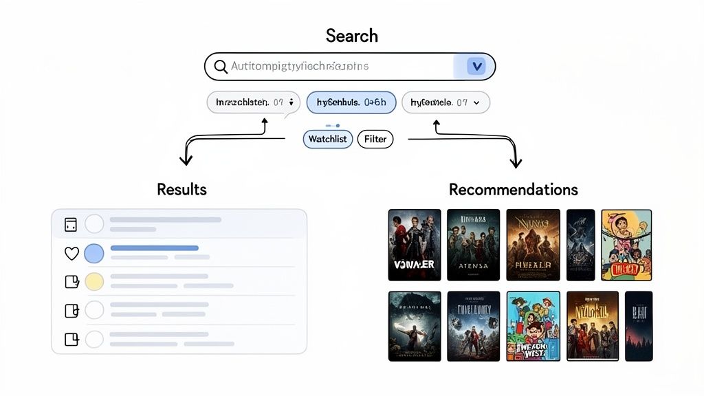
4. Video Streaming Search & Discovery Flow
A video streaming search and discovery flow guides users through a massive content library to find something to watch. This user flow is multifaceted, branching into two primary paths: a direct search for users who know what they want, and a browsing or discovery path for those exploring options. Its effectiveness is crucial for user retention on platforms like Netflix or YouTube, as it directly impacts engagement and perceived value. The flow incorporates search queries, categorical browsing, personalized recommendations, and watchlist management.
Strategic Breakdown
The core strategy is to reduce decision fatigue and increase content consumption. This is achieved by personalizing the experience for both active searchers and passive browsers. For instance, Netflix's homepage is a masterclass in discovery, using curated rows like "Trending Now" and "Because you watched..." to surface relevant content with minimal user effort. Its search function is equally powerful, providing instant auto-suggestions and tolerating typos to quickly connect users with specific titles.
In contrast, YouTube's flow heavily emphasizes algorithmic discovery. Its recommendation engine on the homepage and "Up Next" sidebar are designed to lead users from one video to the next, maximizing session time. This makes it one of the more complex user flows examples because it must balance user intent with platform-driven discovery.
Key Insight: The most successful discovery flows seamlessly blend explicit user actions (search, filtering) with implicit data (watch history, ratings) to create a personalized content journey that feels both intentional and serendipitous.
Actionable Takeaways & Tips
To design an effective search and discovery flow, you must cater to different user mindsets and provide multiple paths to content.
Map Separate User Paths: Clearly diagram the flow for a user who knows exactly what they want (e.g., Search -> Select -> Play) versus a user who is browsing (e.g., Browse Genre -> Preview Titles -> Add to Watchlist).
Prioritize Information on Previews: The small amount of information shown when a user hovers over a title (the preview mechanism) is critical. Use it to display essential data like genre, rating, and a brief synopsis to aid quick decision-making.
Leverage Granular Filters: Go beyond basic genre filters. Allow users to sort and filter by release year, runtime, ratings, or even specific actors to empower them to narrow down vast libraries efficiently.
Gather Segmented Feedback: When collecting feedback with a tool like Beep, it's crucial to differentiate between user segments. A new user's feedback on the initial discovery experience will be vastly different from a power user's feedback on the recommendation algorithm's accuracy. Annotating screenshots of the search results page can help pinpoint where the UI fails to meet the expectations of each group.
5. SaaS Project Management Task Assignment Flow
A SaaS task assignment flow is the set of steps a user takes within a project management tool to create, assign, and manage a piece of work. This is one of the most frequently used user flows examples in collaborative software, serving as the core engine for team productivity. The flow dictates how smoothly information is delegated, tracked, and completed, directly impacting a project's momentum. It typically involves creating a task, assigning it to a team member, setting deadlines, and updating its status.
Strategic Breakdown
The central strategy for an effective task assignment flow is to balance flexibility with clarity. The flow must be simple enough for a quick delegation but robust enough to handle complex project needs with dependencies and subtasks. Tools like Asana and Monday.com excel here by offering a clean initial task creation interface that reveals more advanced options like custom fields and automation rules only when needed.
Trello's card-based system, on the other hand, prioritizes visual simplicity. A user can create and assign a card in two or three clicks, making it highly intuitive. Jira takes a more detailed approach, catering to complex software development cycles by requiring more information upfront, such as issue type and priority, ensuring comprehensive data capture from the start.
Key Insight: The best task assignment flows empower different user roles. A project manager needs a powerful, detailed creation process, while a team member needs a quick and clear way to see what's assigned to them and update its status.
Actionable Takeaways & Tips
To refine your task assignment flow, focus on role-specific needs and clear communication channels.
Design for Different Roles: Create separate flow diagrams for the task creator, the assignee, and a manager/viewer. Each role has different goals and requires a tailored interface.
Prevent Notification Fatigue: Carefully design and annotate notification settings within your flow. Ensure that assignees receive critical updates without being overwhelmed by minor changes.
Prioritize the "Quick Add" Feature: Allow users to create a basic task with just a title from anywhere in the app. Details like assignee and due date can be added later, reducing initial friction.
Integrate Feedback with Your Workflow: When reviewing the assignment UI, use a tool like Beep to capture visual feedback. Annotations on confusing fields or unclear calls-to-action can be sent directly to your project management tool (like Jira or Asana), turning design feedback into an actionable task within the same ecosystem. This creates a powerful loop for continuous improvement.
6. Mobile App User Authentication & Password Recovery Flow
A mobile app authentication flow encompasses the critical steps a user takes to sign up, log in, or recover a forgotten password. This is one of the most fundamental user flows examples because it acts as the primary gateway to an application's features. It must achieve a delicate balance between robust security and a frictionless user experience. A complicated or confusing authentication process can deter users from even completing registration, while a weak one can compromise user data and erode trust. This flow includes credential verification, social logins, password reset mechanisms, and modern options like biometric authentication.
Strategic Breakdown
The core strategy is to secure access without creating frustration. The flow should be intelligent enough to differentiate between new users, returning users, and those needing to recover their accounts, presenting only the necessary steps for each context. For example, Apple's Face ID and Touch ID flows offer a masterclass in seamless security. By integrating biometric authentication, they eliminate the need for users to repeatedly type passwords, reducing login friction to a mere glance or touch.
Similarly, Google’s multi-factor authentication (MFA) process provides layered security that is both strong and user-friendly. Instead of just a password, it uses a second factor, like a push notification to a trusted device, making the process secure yet simple. This approach prioritizes security for sensitive actions while keeping routine logins fast.
Key Insight: The best authentication flows offer multiple paths to entry. Providing options like social login (Google, Apple), email, and biometrics caters to different user preferences and reduces the cognitive load of remembering yet another password.
Actionable Takeaways & Tips
To design an effective authentication and recovery flow, focus on clarity, security, and convenience.
Separate User Paths Clearly: Design distinct, streamlined flows for registration, login, and password recovery. Avoid mixing elements from one path into another, which can confuse users.
Embrace Passwordless Options: Integrate biometric (Face/Touch ID) and social logins to offer faster, more secure alternatives to traditional passwords. This significantly reduces login friction.
Simplify Password Recovery: Make the "Forgot Password" process intuitive. Send a secure link or a one-time code to the user's verified email or phone number, and guide them clearly through the reset steps.
Test Error States Meticulously: Use a tool like Beep to capture screenshots of error messages (e.g., "Incorrect Password," "User Not Found") and share them with your team. This allows designers and copywriters to provide feedback on the clarity and helpfulness of the microcopy without compromising security protocols. You can annotate these states to ensure the recovery options presented are easy to understand and follow.
7. B2B SaaS Subscription & Billing Upgrade Flow
A B2B SaaS subscription upgrade flow is a critical, conversion-focused sequence designed to seamlessly move a user from their current plan to a higher-value tier. This journey is one of the most vital user flows examples for any recurring revenue business, as it directly drives expansion MRR and customer lifetime value. The flow must clearly articulate the value of upgrading, handle billing changes securely, and confirm the new status without causing confusion or friction. It typically involves plan comparison, feature highlighting, payment confirmation, and a success state.
Strategic Breakdown
The core strategy of a successful upgrade flow is to justify the cost with undeniable value. This isn't just about showing a bigger feature list; it's about connecting those features to the user's immediate needs or pain points. For instance, Slack prompts users to upgrade when they hit the 90-day message history limit, framing the upgrade as the solution to a problem they are actively experiencing. Similarly, Notion or Figma might trigger an upgrade prompt when a user tries to access a team-only feature, making the value proposition contextually relevant.
The flow must also build confidence. Clear pricing, prorated charge calculations, and a straightforward payment confirmation step are essential. The goal is to make the user feel smart and empowered for making the decision to invest more into the product, not tricked or confused.
Key Insight: The most effective upgrade flows are triggered by user behavior and context. Instead of just presenting a pricing page, they surface the upgrade opportunity at the exact moment a user needs a premium feature, maximizing conversion intent.
Actionable Takeaways & Tips
To enhance your subscription upgrade flow, focus on clarity, context, and confidence-building.
Highlight Key Value Propositions: Don't just list features. Use a comparison table to visually distinguish between plans and use tooltips or short descriptions to explain why a feature on a higher tier matters.
Provide Transparent Pricing: Clearly show the new cost, whether it's billed monthly or annually, and explain how prorated charges are calculated. Surprising users with unexpected costs is a quick way to lose trust.
Simplify the Payment Step: For existing customers, pre-fill their stored payment information. The upgrade should feel like a one-click confirmation rather than a brand-new checkout process.
Gather Persona-Specific Feedback: Using a tool like Beep, you can get targeted feedback on the clarity of your plan comparison from different user personas. Have your power users annotate what they find most compelling, while asking newer users what they find confusing. This helps refine messaging for all segments.
8. Content Management System (CMS) Publishing & Workflow Approval Flow
A CMS publishing and approval flow is a structured, multi-user process that governs how content moves from creation to publication. This complex user flow is essential for organizations with multiple content contributors, such as news outlets, marketing teams, and large enterprises. It defines roles, permissions, and sequential steps like drafting, editing, legal review, and final approval to ensure content quality and brand consistency. Unlike a simple single-user flow, this system involves branched paths and handoffs between different user types, such as writers, editors, and publishers.
Strategic Breakdown
The core strategy behind a CMS approval flow is to balance creative velocity with organizational control. The goal is to empower creators while implementing necessary checks and balances to prevent errors and maintain a unified voice. For example, WordPress’s editorial workflow allows administrators to define custom user roles (Author, Editor, Contributor) with specific capabilities. An author can write and submit a post for review, but only an editor can approve and publish it, creating a clear and enforceable quality gate.
Platforms like Contentful take this further by allowing teams to build highly customized, multi-stage approval chains. A piece of content might first go to a copy editor, then to a legal reviewer, and finally to a marketing manager for scheduling. This ensures that all stakeholders provide input at the correct stage, preventing bottlenecks and miscommunication.
Key Insight: An effective CMS workflow isn't just a technical process; it’s an operational blueprint. It translates an organization's editorial strategy into a repeatable, scalable, and transparent system within the software.
Actionable Takeaways & Tips
To design a robust CMS publishing flow, focus on clarity, efficiency, and role definition.
Map Workflows to Content Types: Don't use a one-size-fits-all approach. A blog post may only need one editor's approval, while a legal policy page requires multiple departmental sign-offs. Map distinct flows for each critical content type.
Implement Clear Status Indicators: Users at every stage must know the exact status of a content piece (e.g., "Draft," "Pending Review," "Needs Revision," "Approved"). This transparency prevents confusion and redundant communication.
Automate Notifications: Use automated alerts to notify the next person in the chain when a task is ready for their review. This minimizes delays and keeps the content moving through the pipeline efficiently.
Visualize the Entire Process: When designing or refining these flows, use a tool like Beep to capture screenshots of each interface in the approval chain. Annotate specific friction points, like a confusing "Submit for Review" button or an unclear feedback field, to get targeted feedback from writers and editors. This visual documentation is invaluable for identifying and resolving bottlenecks in your chosen approval workflow software.
8 User Flow Examples Comparison
Flow | 🔄 Implementation complexity | ⚡ Resource requirements | ⭐📊 Expected outcomes | 💡 Ideal use cases | Key advantages |
|---|---|---|---|---|---|
E-commerce Checkout Flow | Medium–High — sequential steps + multiple payment paths | Moderate — payment gateways, validation, cross‑platform QA | High conversion impact ⭐⭐⭐⭐; clear drop‑off metrics 📊 | Online stores, marketplaces, high‑volume checkout funnels | Linear testing clarity; direct revenue measurement; easy to locate friction |
User Onboarding Flow | Medium — branching by persona and device | Moderate — content creation, analytics, personalization | Improves adoption & time‑to‑value ⭐⭐⭐; retention gains 📊 | Complex apps, freemium products, enterprise tools | Boosts product adoption; supports A/B tests; clarifies messaging |
Social Media Content Creation & Publishing Flow | High — multi‑platform formats, approval stages | High — media handling, scheduling, collaboration tools | Workflow efficiency & brand consistency ⭐⭐⭐; faster publishing cycles 📊 | Marketing teams, agencies, multi‑channel publishers | Centralizes publishing; reduces context switching; enforces approvals |
Video Streaming Search & Discovery Flow | Very High — personalization, many branching paths | Very High — recommender systems, large content infra | Strong engagement & retention uplift ⭐⭐⭐⭐; increased watch time 📊 | Streaming services, large content libraries, recommendation engines | Supports multiple user intents; data‑driven optimization; rich discovery |
SaaS Project Management Task Assignment Flow | Medium — roles, dependencies, notifications | Moderate — integrations, real‑time updates, permissions | Clear productivity gains ⭐⭐⭐; measurable completion metrics 📊 | Remote teams, PM tools, cross‑functional projects | Core to coordination; multi‑role feedback; clear success KPIs |
Mobile App Authentication & Password Recovery Flow | Medium — security flows + alternative auth methods | Moderate–High — MFA, biometric, secure backend | Trust & account safety improvements ⭐⭐⭐; reduced account friction 📊 | Apps with sensitive data, enterprise apps, fintech | Balances security and UX; critical for retention and trust |
B2B SaaS Subscription & Billing Upgrade Flow | Medium–High — pricing logic, regional rules | High — billing providers, taxes, multi‑currency support | Direct revenue & LTV growth ⭐⭐⭐⭐; clear conversion signals 📊 | SaaS products with tiers, freemium → paid conversion funnels | Directly impacts revenue; supports A/B pricing experiments |
CMS Publishing & Workflow Approval Flow | High — multi‑role approvals, versioning | High — role management, revision history, scheduling | Improved content quality & compliance ⭐⭐⭐; fewer publishing errors 📊 | Newsrooms, enterprise content teams, large websites | Ensures editorial governance; documents approval bottlenecks |
From Examples to Execution: Your Next Steps
We've journeyed through a comprehensive collection of user flows examples, from the deceptively simple e-commerce checkout to the intricate approval workflows within a B2B SaaS platform. Each case study, whether it was social media content creation or mobile app authentication, served to reinforce a central, undeniable truth: a successful user flow is never an accident. It is the direct result of meticulous planning, deep empathy for the user’s goals, and a relentless commitment to clarity and efficiency.
The strategic insights gleaned from these real-world applications form a powerful toolkit. We saw how effective onboarding flows reduce initial friction and increase activation rates, and how streamlined checkout processes directly combat cart abandonment. The best flows anticipate user needs, elegantly handle errors, and make even complex tasks feel manageable and intuitive.
Strategic Insight: The most impactful user flows are those that feel invisible to the user. The journey from point A to point B is so logical and frictionless that the user focuses solely on their goal, not on the interface they are using to achieve it.
This principle holds true across every vertical. A well-designed flow is the backbone of user retention, customer satisfaction, and ultimately, business growth.
Synthesizing the Core Lessons
As you move from analyzing these user flows examples to creating your own, keep these fundamental takeaways at the forefront of your design process:
Clarity Over Cleverness: Always prioritize a clear, direct path. Avoid ambiguous icons, jargon-filled copy, and unnecessary steps that can confuse or frustrate users. The goal is to reduce cognitive load, not add to it.
Context is King: The user's state of mind, device, and environment all matter. A mobile password recovery flow needs to be far more concise and forgiving than a desktop-based subscription upgrade process, which can afford more detail.
Feedback at Every Step: Provide immediate and clear feedback for user actions. Confirmation messages, loading indicators, and validation errors guide the user and build confidence that the system is responding correctly.
Iterate Through Collaboration: User flows are not a "set it and forget it" task. They are living diagrams that must evolve based on user feedback, data analysis, and cross-functional team insights. Getting perspectives from engineering, marketing, and support is non-negotiable.
Your Actionable Roadmap to Better User Flows
Studying examples is the first step; implementation is what drives results. Here is a practical, step-by-step plan to apply what you’ve learned and elevate your product's user experience.
Identify and Prioritize Your Core Flows: Begin by mapping the most critical journeys in your product. Which flows have the biggest impact on your key metrics (e.g., conversion, activation, retention)? Start with one high-impact flow, such as user signup or a primary feature adoption path.
Audit the Existing Experience: Go through the current flow yourself, documenting every single step, click, and screen. Better yet, conduct a simple usability test and watch a real user navigate it. Note every point of friction, confusion, or hesitation.
Create Your "Happy Path" Diagram: Using your preferred tool, diagram the ideal, obstacle-free journey for your user. This is the "happy path" where everything goes perfectly. This serves as your baseline and north star for the design.
Map Out Edge Cases and Error States: Now, layer in the complexities. What happens if a payment fails? What if the user forgets their password mid-flow? What if they lose their internet connection? A robust flow accounts for these scenarios with clear error messages and simple recovery options.
Gather Asynchronous, Contextual Feedback: This is where theory meets reality. Instead of static design reviews in Figma, use a tool like Beep to capture feedback directly on your live website, staging environment, or web app. Invite stakeholders from across the company to click through the flow and leave pinpointed, visual comments. This breaks down silos and ensures the feedback from developers, marketers, and PMs is anchored to the actual user experience.
If you are looking for more diverse patterns and ideas to fuel your brainstorming, analyzing a wider set of flows can be incredibly helpful. For further inspiration and a broader range of applications, explore these 10 Essential User Flow Examples to Guide Your Product Design.
Mastering the art and science of user flow design is a journey of continuous improvement. By moving from passive observation of user flows examples to active creation, auditing, and collaborative refinement, you build more than just a product; you build a seamless and delightful experience that users will return to again and again.
Ready to turn your user flow diagrams into flawless real-world experiences? Beep lets your entire team provide pinpointed, visual feedback directly on your live site or staging environment, making collaborative review and bug reporting faster than ever. Stop guessing and start improving with actionable insights by trying Beep today.
I always enjoy reading articles that provide genuine value instead of overly promotional content. Upgrading entryways can improve both safety and appearance, and professional Doors Installation In Denver, CO services are definitely worth considering. Thanks for publishing such useful information for homeowners.
I found this article genuinely helpful because it explains important points in a simple and practical way. Thanks for sharing valuable information that readers can actually use. I also came across Plumbing In Atherton CA as another useful local resource.
I appreciate articles that explain financial topics in a straightforward and easy-to-follow manner. Credit education is something that benefits almost everyone, especially when planning for future goals. I also came across Credit System Service In El Paso, TX and found it to be a helpful source of additional guidance.
Many construction professionals researching development opportunities come across free construction cpd while exploring ways to keep their knowledge up to date. Conversations often centre on practical learning, industry updates, and professional requirements. The College of Contract Management offers free online events designed around relevant industry topics.
The article does a great job explaining how custom markings improve efficiency in commercial spaces. The information was detailed without being overwhelming. I found the section covering Custom Stenciling especially interesting because it helps businesses create clearer directions and designated areas. Very informative content overall.