
.png)
A Complete Guide to a Usability Test for Websites
- shems sheikh
- Jan 26
- 15 min read

A usability test for your website is pretty straightforward: you watch real people try to do things on your site to see how easy it is for them. It’s not a focus group where you ask if they like the color blue. It's about finding out where they get tripped up, confused, or just plain stuck.
This isn't just a "nice-to-have" step; it's how you avoid expensive redesigns and build something people actually want to use.
Why You Absolutely Cannot Skip Usability Testing
Look, we can't read our users' minds. That simple fact has turned usability testing from an optional extra into a must-do for any serious business. Skipping it is a massive gamble, and I’ve seen it lead to lost sales, trashed reputations, and soul-crushing redesigns that could have been easily avoided.
When you don't test, you're just building on assumptions. And let's be honest, assumptions are a terrible foundation for a successful product.
For product managers, usability testing is your secret weapon. It gives you the hard data you need to back up your roadmap decisions and prioritize what to build next. No more relying on gut feelings. For designers, it’s the ultimate reality check—either proving a layout works brilliantly or showing you exactly what needs to be fixed.
Get Out of the Guessing Game
Imagine you launch a new checkout flow that your team thinks is perfect, only to watch your cart abandonment rate shoot up by 35%. A simple usability test could have shown you that the "apply discount code" field was confusing people. That's a fix that might have taken a few hours, but instead, it cost you thousands in lost revenue. This isn't just a story; I've seen it happen.
When you test with real users, everyone on the team wins:
Product Managers: Can finally build with confidence, backed by real data.
Designers: Get undeniable proof to support their creative choices.
Developers: Stop wasting time on rework for features nobody can figure out how to use.
The point of a usability test isn't just to find what's broken. It's to build empathy. The moment you watch a real person struggle with something you built, your perspective completely changes. It makes you want to build better things.
The good news is that modern tools have made this whole process easier than ever. You can ditch the messy spreadsheets and stop wasting hours scrubbing through long video recordings. With a tool like Beep, you can capture annotated screenshots on the fly and turn feedback directly into tasks for your team.
This shifts usability testing from a chore into a powerful advantage that directly impacts your bottom line.
Laying the Groundwork for a Successful Test
Jumping into a usability test without a plan is like starting a road trip without a map. You might get somewhere, but it probably won’t be where you intended to go. A little bit of thoughtful prep work is what separates vague, unhelpful feedback from those game-changing insights that steer your project to success.
The first move? Define sharp, measurable objectives. Asking "Is the site easy to use?" is just too broad. It won't get you anywhere.
You need to zoom in on specific, verifiable questions about the user journey. A much better objective would be something like: "Can a first-time user add three specific items to their cart and apply a discount code in under two minutes?" Now that's something you can measure. This kind of clarity sets a clear benchmark and keeps your whole team on the same page.
Defining Your Test Objectives and Scope
Before you even think about who you’re going to test with, you need to nail down exactly what you’re testing and why. Are you putting a brand-new checkout flow through its paces? Or are you trying to figure out why so many people bail on the sign-up page? Your objectives are going to shape every other part of the test, from the tasks you create to the metrics you track.
Here are a few examples of strong, concrete objectives:
Task Success Rate: Can users find a specific product and check out its details without getting lost?
Time on Task: How long does it actually take for an average user to create an account from start to finish?
Error Rate: What percentage of users are clicking on things on the homepage that aren't even clickable?
These goals are solid. They give you a clear pass/fail criteria and turn your test from a casual chat into a structured experiment.
This diagram really drives home how a structured usability test prevents expensive rework down the line and gives you data-backed confidence in your design choices.
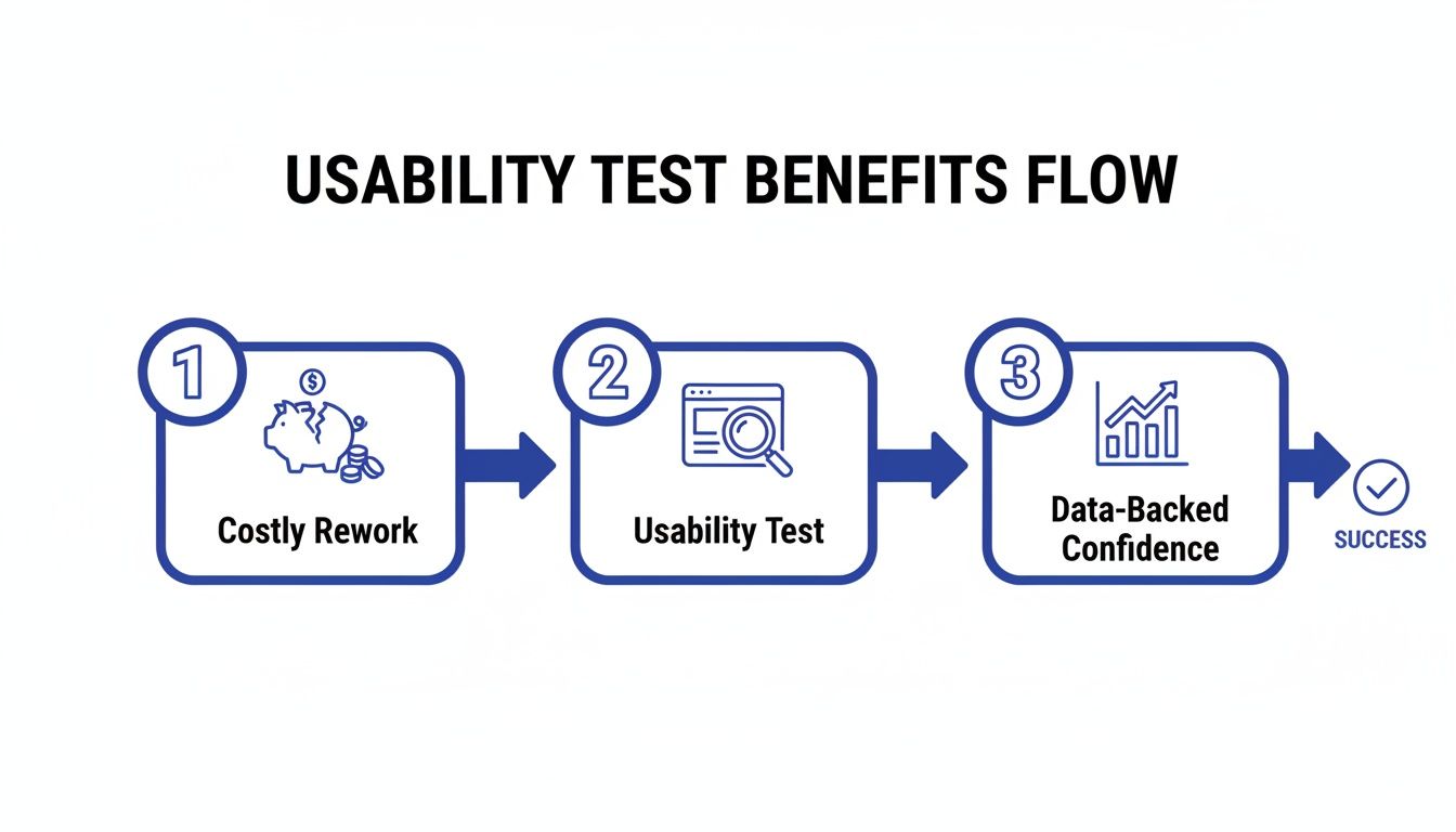
The takeaway here is simple: investing a little time in testing upfront directly translates to saved time, money, and a much better final product.
Crafting Realistic Tasks and Non-Leading Scripts
Once your objectives are locked in, it's time to create realistic tasks for your users. These aren't just a list of instructions; they're scenarios that mirror how someone would actually interact with your site in the real world. You have to avoid overly specific directions like, "Click the red button that says 'Buy Now'."
Instead, frame it as a goal: "You've decided to buy a new pair of running shoes. Find a pair you like in your size and add them to your cart." This approach lets you see the user's natural path, warts and all, including any dead ends or points of confusion they hit along the way.
Your script is just as critical. It needs to guide the participant without leading them to the "right" answer. I always lean on open-ended questions that encourage them to think aloud. Try things like, "What are your initial thoughts on this page?" or "What would you expect to happen if you clicked that?"
A great test script makes the user feel like an expert collaborator, not a subject in a lab. Your job is to create a comfortable environment where they feel safe sharing their honest, unfiltered thoughts.
Finding the Right People for Your Test
Let’s be honest: the insights from your test are only as good as the people you recruit. Testing with the wrong audience can send you chasing fixes for problems your real customers don't have. If you’re selling high-end accounting software, getting feedback from college students just isn’t going to cut it.
Start by sketching out your user persona. Who is your ideal customer? Think about their:
Demographics: Age, location, occupation.
Technical Savvy: Are they power users or digital novices?
Motivations: What problem are they trying to solve with your website?
With a clear profile in hand, you can start recruiting. You don't need a huge budget for this, either. I've found great participants through social media groups, industry forums, and even just by sending a blast to an existing customer email list. Offering a small incentive, like a gift card, is usually more than enough to attract quality candidates.
This whole process is a cornerstone of the UX profession. In fact, a whopping 80% of user researchers conduct usability tests often or always, making it one of the most vital methods in their toolkit. For a deeper dive into the most popular approaches, you can explore the top 10 user testing methods to refine your UX.
Executing the Test and Capturing Quality Feedback
Alright, you've got a solid plan. Now for the fun part: moving from theory to practice. This is where you finally get to see your website through a fresh pair of eyes and uncover the insights that make all the prep work totally worth it.
No matter if you're doing this in person or over a screen share, your number one job is to make your participant feel comfortable enough to be brutally honest. Always kick things off by reminding them you're testing the website, not them, and that there are no wrong answers.
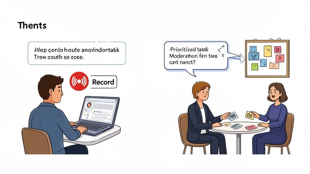
Facilitating a Moderated Test
If you’re running a live, moderated session, think of yourself as part observer, part guide. Your first mission is to build rapport and make the user feel like a co-explorer, not a subject under a microscope. A few light, pre-test questions are great for breaking the ice before you dive into the real tasks.
During the test itself, try to be a neutral observer. I've seen it a hundred times—a facilitator’s body language or tone can accidentally nudge a user one way or another. Resist the urge to jump in and "help" if they start to struggle. That's where the gold is! Instead, use gentle, open-ended questions to get inside their head.
"What are you thinking right now?"
"What did you expect would happen when you clicked that?"
"Can you tell me more about why that was confusing?"
These little prompts encourage people to explain what’s going on in their minds without you leading them to an answer. Remember, your goal is to listen way more than you talk.
The real art of facilitation is knowing when to just be quiet. I've found the most profound insights often pop up in that slightly uncomfortable pause after a user says, "Hmm, that's not what I expected."
Setting Up an Unmoderated Test
When you're running unmoderated tests, your instructions become the facilitator. Since you won’t be there to clear things up, every single task and question has to be crystal clear. Trust me, vague instructions are the fastest way to get back a pile of useless data.
Before you send the test out to your real participants, do a quick pilot test with a colleague. This dry run is a lifesaver. It’ll immediately show you any confusing language or technical glitches in your setup, saving you from having to toss out an entire batch of results.
Also, make sure the testing tools you use are dead simple for the participant. The last thing you want is for them to struggle with the testing software itself—that can completely skew their feedback about your actual website.
Moving Beyond Messy Notes to Actionable Feedback
How you capture feedback during a usability test for websites is just as critical as how you run the session. Let’s be real, traditional note-taking is messy. It often leads to misinterpreted comments and hours spent trying to match scribbled notes to specific moments in a video. This is where modern tools completely change the game.
The real breakthrough is capturing visual context. Imagine a user says, "This button is in a weird spot." If you just jot that down, the feedback is almost useless later on. Which button? Weird how?
This is where a tool like Beep becomes an absolute must-have. Instead of trying to describe the issue, the user (or you) can just click directly on the element, type a comment, and an annotated screenshot is automatically created.
The power here is in the precision. There's zero confusion about what the user was talking about, which totally eliminates the guesswork for your designers and developers.
This direct, visual method bridges the gap between a user's thought and an actionable task for your team. You can turn a user's comment straight into a ticket in your project management tool, complete with the visual proof. It’s a seamless workflow that ensures those golden insights from testing don't get lost in translation. If you're looking to upgrade your setup, check out our guide on the 10 best website feedback tools to find the perfect fit.
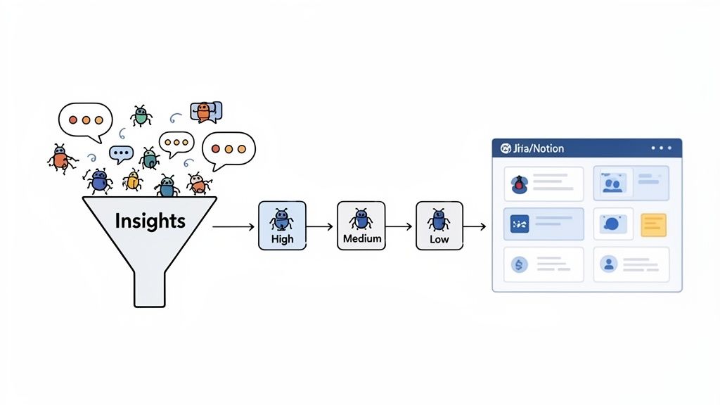
How to Analyze Results and Find Actionable Insights
Once your usability test sessions wrap up, you're left with a mountain of raw data—recordings, notes, user comments, and maybe even some survey responses. This pile of feedback is pure gold, but it's not an action plan. The real magic happens when you turn this qualitative and quantitative data into a clear, prioritized roadmap for improvement.
The first step is to avoid analysis paralysis. Don't try to tackle everything at once. Instead, separate your data into two main buckets: what users did (quantitative) and what users said or felt (qualitative). Each type of data tells a different part of the story, and you need both to see the full picture.
Synthesizing Qualitative Feedback
Qualitative data is all about the "why" behind user actions. It's the frustrated sighs, the moments of confusion, and the "aha!" exclamations. Many usability tests yield this kind of rich, narrative feedback. To make sense of it all, you need a systematic approach; you can explore various qualitative research analysis methods to get a deeper understanding.
One of the most effective techniques I've used is affinity mapping. It's a simple but powerful way to find patterns in the chaos.
Here's how it works:
Extract Observations: Go through your notes and recordings. Write each distinct user comment, pain point, or observation on a separate virtual sticky note.
Group by Theme: Start clustering the notes into natural groups based on themes. You might see a cluster forming around "checkout confusion," another around "navigation issues," and a third on "unclear pricing."
Name the Groups: Once you have your clusters, give each one a descriptive name. These names become your key usability themes.
This process visually organizes dozens or even hundreds of individual comments into a handful of core issues. Suddenly, you can see that three different users struggled to find the shipping information, revealing a recurring problem you need to address.
Measuring the Quantitative Data
While qualitative feedback provides context, quantitative data gives you the hard numbers to measure usability and track improvements over time. It answers the "how many" and "how much" questions.
Here are a few essential metrics to focus on from your usability test for websites:
Task Success Rate: This is the most basic usability metric. Did the user complete the task successfully or not? A low success rate (e.g., only 40% of users could add an item to the wishlist) is a major red flag.
Time on Task: How long did it take users to complete a specific task? A long completion time might indicate a confusing or inefficient workflow.
Error Rate: How many mistakes did users make while trying to complete a task? This could be clicking the wrong link or entering data in the wrong format.
Combining these metrics tells a powerful story. For example, a 90% task success rate looks great on its own. But if the average time on task was five minutes and the error rate was high, it tells you that while users eventually succeeded, the process was probably painful and frustrating.
Benchmarking with the System Usability Scale (SUS)
One of the most trusted tools for quantifying user perception is the System Usability Scale (SUS). It's a quick, ten-question survey that gives you a single score from 0 to 100 representing your website's overall usability.
What’s interesting is that the average SUS score across thousands of studies is just 68. While that might sound okay, it's essentially a C-minus. A score of 56 is equivalent to a 'D' grade—a result no team would be proud of. Thanks to its high reliability, confirmed by metrics like Cronbach’s Alpha at .92, SUS is a rock-solid way to measure usability.
Understanding where your score falls is crucial. A good score isn't just a vanity metric; it tells you how much work you have ahead. Here’s a quick breakdown of what SUS scores generally mean.
System Usability Scale (SUS) Score Benchmarks
Understanding what your SUS score actually means with grade equivalents and user perception.
SUS Score Range | Grade | Adjective Rating |
|---|---|---|
80.3 – 100 | A | Excellent |
68 – 80.2 | C | Good |
51 – 67.9 | D | OK |
25.1 – 50.9 | F | Poor |
0 – 25 | F | Awful |
Using SUS gives you a tangible benchmark. It helps you understand if your usability is just average or genuinely great, and it provides a clear metric to track as you implement the fixes discovered during your test. It’s a fantastic way to prove the value of your improvements over time.
Turning Your Test Insights Into Real Improvements
Let's be real—fantastic insights are worthless if they just sit in a report collecting digital dust. The final, and arguably most important, part of any usability test is turning your hard-won findings into actual, tangible improvements that make your website better.
This is where you bridge the gap between watching someone struggle and actually doing something about it. You’ve listened to your users, and now it’s time to translate their feedback into a clear, prioritized plan your team can actually execute.
Prioritizing What to Fix First
After a good testing session, you'll probably have a long list of issues, from minor typos to critical workflow blockers. It's tempting to jump on the easy, low-hanging fruit first, but that’s rarely the best move. You need a smarter strategy that prioritizes based on impact.
A battle-tested framework for this is plotting each issue on a simple matrix, weighing its severity against its frequency.
Severity: How badly does this problem derail a user? A confusing label is low severity. A broken checkout button is a five-alarm fire.
Frequency: How many of your testers ran into this specific issue? A problem that tripped up 80% of users needs way more attention than one that only affected a single person.
This method quickly shows you what to tackle first: the high-severity, high-frequency issues causing the most pain for the most people. Those are your top priorities. The low-severity, low-frequency stuff can wait.
From Vague Feedback to Clear Action Items
Once you know what to fix, you have to communicate it so your team knows how to fix it. A developer can’t do much with a note that just says "the homepage is confusing." You have to translate that user feedback into crystal-clear bug reports or user stories.
A solid ticket includes a few key things:
A Clear Title: Summarize the problem concisely (e.g., "User cannot apply discount code on mobile").
Steps to Reproduce: Give them a bulleted list of the exact actions needed to see the bug in the wild.
Expected vs. Actual Results: Clearly state what should have happened versus what actually happened.
Visual Evidence: This is non-negotiable. Always include the annotated screenshot or video clip that shows the problem happening.
A well-written ticket with visual proof is the ultimate antidote to ambiguity. It saves developers from wasting time trying to recreate a bug and ensures the right problem gets fixed the first time around.
Closing the Loop with Smart Integrations
The single biggest failure point I've seen in the feedback process is the handoff. Insights from a usability test for websites can easily get lost in messy email threads, chaotic Slack channels, or forgotten spreadsheets. This is where creating a closed-loop system becomes a total game-changer.
Instead of manually copying and pasting feedback, you can plug your feedback tool directly into your project management software. A tool like Beep, for example, lets you push an annotated screenshot and a user comment directly into a Jira or Notion ticket with a single click.
This kind of seamless workflow is powerful for two reasons:
It guarantees every piece of validated user feedback gets captured and tracked as a formal task. Nothing falls through the cracks. Ever.
It saves your team from the soul-crushing admin work of transferring information between different platforms.
You’re essentially creating a direct pipeline from user insight to developer action, making it easier to act on feedback than to ignore it. After all, the whole point of this is to improve your key metrics, and a streamlined process gets you there faster. For ecommerce sites, this can have a massive impact on the bottom line. If that's your world, learning how to improve ecommerce conversion rates is a fantastic next step after clearing these usability roadblocks.
By prioritizing smartly, writing clear tasks, and automating your workflow, you ensure your user insights don’t just get documented—they get resolved. This is how you build a real cycle of continuous improvement. For more on this, check out our guide on unlocking growth with feedback for websites.
Common Questions About Website Usability Testing
Even with a solid plan, a few questions always seem to pop up right when you're ready to get started. I've been there. Let's tackle some of the most common ones I hear so you can get moving with confidence.
How Many Users Do I Really Need for a Usability Test?
You've probably heard the magic number: five. Believe it or not, decades of research from the Nielsen Norman Group backs this up, confirming that testing with just five users can uncover about 85% of the usability problems on your site. The goal isn't to run one massive, expensive test.
Instead, think iteratively. Test with a small group, fix the most glaring issues you find, and then test the improved version with a fresh set of eyes. It’s a much smarter, more efficient, and budget-friendly way to work.
Sure, if you're running a big quantitative study and need statistical confidence, you'd look at a larger sample size (20+ users). But that’s a different game. For finding and fixing user frustrations, which is what most of us are doing, 5-8 users per audience segment is a powerful place to start.
What Is the Difference Between Usability Testing and A/B Testing?
This is a classic point of confusion, but the distinction is actually pretty simple. Both are crucial for making your website better, but they answer totally different questions.
Usability Testing is Qualitative: It answers the "why." You're watching real people interact with your site to understand their thought process, see where they get stuck, and uncover pain points. It’s all about understanding behavior.
A/B Testing is Quantitative: It answers the "which." You show two versions of a page (Version A vs. Version B) to a large audience to see which one performs better against a specific metric, like getting more clicks.
I like to think of it this way: use a usability test to find problems and spark ideas for how to fix them. Then, use an A/B test to prove which of those ideas actually works best at scale.
A/B testing can tell you a red button got more clicks than a green one, but only usability testing can tell you that users couldn't even find the button in the first place because the page layout was a mess.
How Can I Run a Usability Test on a Tight Budget?
You absolutely do not need a fancy lab or a huge budget to get game-changing insights. High-value usability testing is well within reach, even if you’re running on fumes.
Unmoderated testing tools are often way more affordable than paying for moderated sessions. When it comes to finding people, get creative. I've had great success with "guerrilla testing" — just asking friends, family, or colleagues who fit the user profile (but aren't involved in the project) to give things a quick look.
Instead of cash, you can offer small incentives like gift cards or a discount on your product. And modern feedback tools really help cut costs by letting you collect precise, actionable feedback without needing a bloated, expensive software suite. Trust me, a small, scrappy usability test is infinitely better than no test at all.
Ready to turn user feedback into your biggest advantage? Beep lets you capture annotated screenshots and manage feedback directly on your live website, turning insights into actionable tasks in seconds. Streamline your entire workflow and start building better products today. Get started for free at justbeepit.com.
This guide is super helpful! I recently tested a new landing page for a client and watching real users struggle with the discount code field was eye-opening, they kept clicking the wrong area. We fixed it in hours instead of wasting weeks. I was trying to resolve a payment issue with a vendor last week and had to look up Arbiter customer service because their portal wasn't working.