
.png)
A Guide to Usability Testing of Websites That Actually Works
- shems sheikh
- Jan 15
- 16 min read

Usability testing is all about watching real people use your website to see where things go wrong. It’s not about asking what they think of your site; it’s about observing what they actually do. This is how you find those hidden, frustrating roadblocks that are killing your conversions and making your brand look bad.
Why Website Usability Testing Is a Game Changer
Let's be honest—a frustrating website doesn't just annoy users, it tanks your revenue. We've all been there: clicking a button that does nothing, struggling to find a simple piece of information, or abandoning a shopping cart because the checkout process felt like a maze. These aren't just minor hiccups; they're critical business failures.
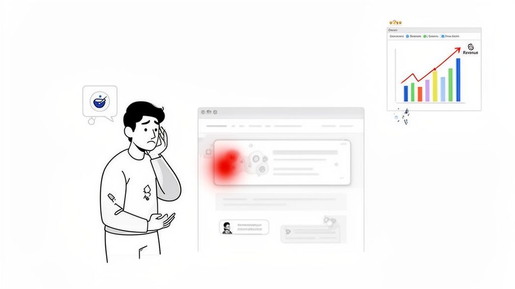
For too long, usability was treated as a last-minute quality check—a box to tick before launch. That mindset is completely outdated and incredibly costly. Today, usability testing of websites has moved from a "nice-to-have" task to an essential, ongoing strategy. It’s your most direct line to understanding how people really behave on your site.
Uncovering the Hidden Costs of Poor Usability
The financial hit from a clunky website is staggering. Here are a few stats that should get your attention:
53% of mobile users will leave a site that takes more than three seconds to load.
This contributes to a mind-blowing $2.6 billion in lost annual revenue worldwide from slow-loading sites alone.
Even a one-second delay can slash conversions by 7%.
For developers and marketing teams, this hits credibility hard. A whopping 75% of people judge a company's trustworthiness by its website design, 94% are likely to distrust an outdated site, and 52% will just leave altogether if they don't like the aesthetics.
"You can't just ask customers what they want and then try to give that to them. By the time you get it built, they'll want something new." - Steve Jobs
This is exactly why observation beats assumption every time. Surveys and feedback forms give you opinions, but usability testing gives you cold, hard behavioral evidence. It shows you precisely where users get stuck, hesitate, or just give up and leave.
From Vague Complaints to Actionable Fixes
Modern tools are changing the game here. Instead of relying on vague notes like "the user was confused by the form," visual feedback platforms let testers pinpoint issues right on the page. A user can click a confusing field, drop a comment, and an annotated screenshot is automatically generated for the dev team.
This simple step transforms subjective complaints into clear, actionable tasks. It closes the loop between user frustration and developer action, making sure your insights lead to immediate improvements.
Ultimately, usability testing isn't an afterthought. It’s a core part of comprehensive website development processes that prioritize user-centric design and peak performance from day one. It’s how you build websites that don’t just look good but actually work for the people using them.
Finding the Right Usability Testing Method
Picking the right way to test your website's usability can feel like you're staring at a giant menu with way too many options. The secret? It's all about matching the method to what you need to learn, how much time you have, and what your budget looks like. There’s no magic bullet; the best approach is the one that answers your specific questions.
First, ask yourself a couple of simple things. Are you trying to understand why people are getting stuck, or do you just need to see what they do? Are you looking for those deep, "aha!" moments from a handful of users, or do you need hard numbers from a big crowd? Nailing this down is the first step toward a test that actually gives you something useful.
Moderated vs Unmoderated Testing
The first big fork in the road is deciding if you need someone to sit in on the test. This choice completely changes the kind of feedback you'll get.
Moderated testing is basically a guided conversation. A facilitator joins the participant, either in person or remotely, to ask questions on the fly and dig deeper into what they're thinking. This is gold when you're exploring tricky tasks or trying to get to the bottom of user confusion. If someone pauses, you can jump in and ask, "What's going through your mind right now?" That real-time chat gives you rich, qualitative insights you just can't get any other way.
On the flip side, unmoderated testing lets users fly solo. They follow a script of tasks on their own time, with their screen and voice being recorded. This method is way faster and cheaper, and it’s brilliant for seeing how people behave naturally without someone looking over their shoulder. It's perfect for checking simple user flows or getting feedback from a lot more people.
Remote vs In-Person Testing
Next up, you have to decide where the test will happen. Both remote and in-person sessions have their perks, and the right choice depends on your research goals.
Doing it in-person means you can see all the non-verbal stuff—body language, a frustrated sigh, a flicker of a smile—that people might not say out loud. This setup is fantastic for testing physical products or when you need a super-controlled environment. The downside? It's usually more expensive and locks you into one geographic area.
Remote testing gives you incredible freedom. You can recruit people from all over the world, which is a huge plus if you need a diverse audience. It’s also way more budget-friendly and convenient for everyone. While you might miss a few subtle physical cues, modern remote testing tools are pretty slick at capturing high-quality feedback. Honestly, for most website usability tests, remote is the way to go.
Here's a key takeaway: remote, unmoderated testing lets you scale up like crazy. You can run tests with hundreds of users in the time it would take for just a few in-person sessions. That gives you a much bigger picture of user behavior patterns.
Guerrilla Testing and A/B Testing
Beyond those core choices, there are a couple of other methods that are great for getting quick answers.
Guerrilla testing is as scrappy as it sounds. You just head to a public place, like a coffee shop, and ask random people to try a few quick tasks on your website. It's perfect for getting fast, informal feedback on early designs without all the hassle of formal recruiting. The insights are quick and dirty, not super scientific, but incredibly useful for gut checks.
A/B testing is all about the numbers. You show two different versions of a webpage to two different groups of users and see which one performs better on a specific goal, like getting more clicks on a button. This is fantastic for settling those endless design debates with cold, hard data. It tells you what works better, but it won't tell you why.
Comparing Website Usability Testing Methods
Choosing the right method can be tricky. This table breaks down the key differences to help you decide which approach fits your project best.
Method | Best For | Pros | Cons |
|---|---|---|---|
Moderated | Deep qualitative insights, complex tasks, understanding the "why." | Rich feedback, ability to ask follow-up questions, can clarify user confusion in real-time. | Time-consuming, expensive, smaller sample sizes. |
Unmoderated | Quantitative data, validating simple flows, gathering feedback at scale. | Fast, affordable, large sample sizes, observes natural user behavior. | Lacks depth, no opportunity for follow-up questions. |
In-Person | Observing non-verbal cues, testing physical products, controlled environments. | High-quality data, captures body language and facial expressions. | Expensive, geographically limited, can be inconvenient for participants. |
Remote | Reaching diverse audiences, cost-effective projects, quick turnarounds. | Flexible, affordable, access to a global user pool. | May miss subtle non-verbal cues, potential for tech issues. |
Guerrilla | Quick feedback on early concepts, validating specific features on a low budget. | Fast, cheap, provides immediate directional insights. | Not representative of target users, lacks scientific rigor. |
A/B Testing | Optimizing specific metrics (e.g., conversion rates), settling design debates. | Data-driven decisions, provides clear quantitative results. | Doesn't explain the "why," requires significant traffic. |
Ultimately, the smartest move is often to mix and match. You might start with a moderated test to really understand your users' pain points, follow up with a larger unmoderated test to see if those issues are widespread, and then use A/B testing to perfect your final design.
For a deeper look into all these techniques and more, check out our guide on the top 10 user testing methods to refine your UX.
How to Plan a Test That Delivers Real Insights
Let's be honest, a successful usability test is all in the prep work. Just jumping into a session without a clear plan is a surefire way to get vague feedback and burn through your budget. To get results you can actually use, you need a solid framework that turns your team's burning questions into a structured, insightful study.
Think of your plan as a roadmap. It guides you from a broad idea to a specific, actionable outcome.
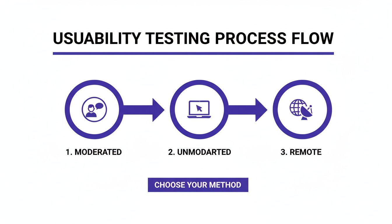
This process really boils down to a few core approaches—moderated, unmoderated, and remote—which will form the foundation of your test plan.
Defining Your Test Objectives
Before you write a single task or think about recruiting, you have to know exactly what you’re trying to learn. A fuzzy goal like "see how users interact with our site" will get you equally fuzzy results. You need objectives that are specific, measurable, and tied to a real business or user problem.
The best way to do this is to frame your goal as a question. For instance, instead of a broad objective, get pointed:
Why is our cart abandonment rate so high on mobile?
Can new users figure out our advanced search feature in under two minutes?
Do people actually understand the value prop on our new pricing page?
A sharply defined objective becomes your North Star. It dictates who you recruit, the tasks you assign, and which metrics will tell you if you've succeeded or failed.
Recruiting the Right Participants
Your test is only as good as the people you test with. Seriously. Testing with folks who don't match your target audience will lead you down a rabbit hole of solving problems your real customers don’t even have. It's like getting feedback on a complex financial dashboard from someone who's never seen a spreadsheet. Useless.
To find the right people, start by creating a clear user profile. Pinpoint the key characteristics:
Demographics: Age, job role, location, and how tech-savvy they are.
Behaviors: How often do they do tasks related to your website? What are they trying to achieve?
Psychographics: What are their motivations and pain points?
Once you have this profile, you can find them through different channels. You could email your existing customers, use a pop-up on your site, or use dedicated platforms that have pools of pre-screened testers. Always, always use a short screener survey to filter out anyone who isn’t a good fit.
Don't get hung up on large numbers. Research has shown time and again that testing with just five users can uncover about 85% of usability issues. It’s so much better to run multiple small, focused tests than one massive, expensive one.
Crafting Effective Task Scenarios
This is where a lot of tests fall apart. If your tasks are poorly written, you might accidentally lead users to the answer or create weird, artificial situations that don't reflect how people behave in the real world. The goal here is to give them context and a goal, then just get out of the way and watch.
A great task scenario is realistic and open-ended. It sets a scene without giving away the steps.
Weak Task: "Click the 'Shop Now' button, find the blue running shoes, add them to your cart, and check out."
Strong Task: "You've decided to start running and need new shoes. Use the website to find a pair that fits what you're looking for and buy them."
See the difference? The second one encourages natural exploration. It lets you see if the user can find the shop, use the filters correctly, and navigate the checkout flow all on their own. That's how you find the real friction points.
Setting Up Success Metrics
To make sure your analysis is grounded in data and not just opinions, you need to define your success metrics before the test starts. These quantitative measures give you objective proof of where users flew through a task or got stuck.
Here are the key metrics to track in your usability test plan:
Task Completion Rate: This is the most basic one. Did they do it? It’s a simple yes or no, which gives you a clear success percentage.
Time on Task: How long did it take them? A longer time can be a red flag for a confusing interface, a complex flow, or other usability hurdles.
Error Rate: Count how many times a user messed up, like clicking the wrong link or entering info incorrectly. This helps you zero in on confusing UI elements.
By locking in these elements—objectives, participants, tasks, and metrics—your plan for usability testing of websites becomes a powerful machine for generating clear, undeniable insights that drive real improvements.
Running Sessions and Gathering Quality Feedback
This is where all your careful planning pays off. Running a usability testing session is part science, part art. You need to create an environment where participants feel comfortable enough to give you their honest, unfiltered thoughts. Honestly, the quality of your insights depends entirely on how well you facilitate these crucial interactions.
For moderated tests, think of yourself as a neutral guide. Your first job is to build rapport. Welcome the participant warmly, walk them through the process, and hammer home the point that there are no wrong answers—they are testing the website, not the other way around. Taking a minute to do this can dramatically reduce their anxiety and lead to much more natural behavior.
The "think-aloud" protocol is probably the most powerful tool in your arsenal here. Just ask participants to voice their thoughts, feelings, and expectations as they work through the tasks you’ve set up.
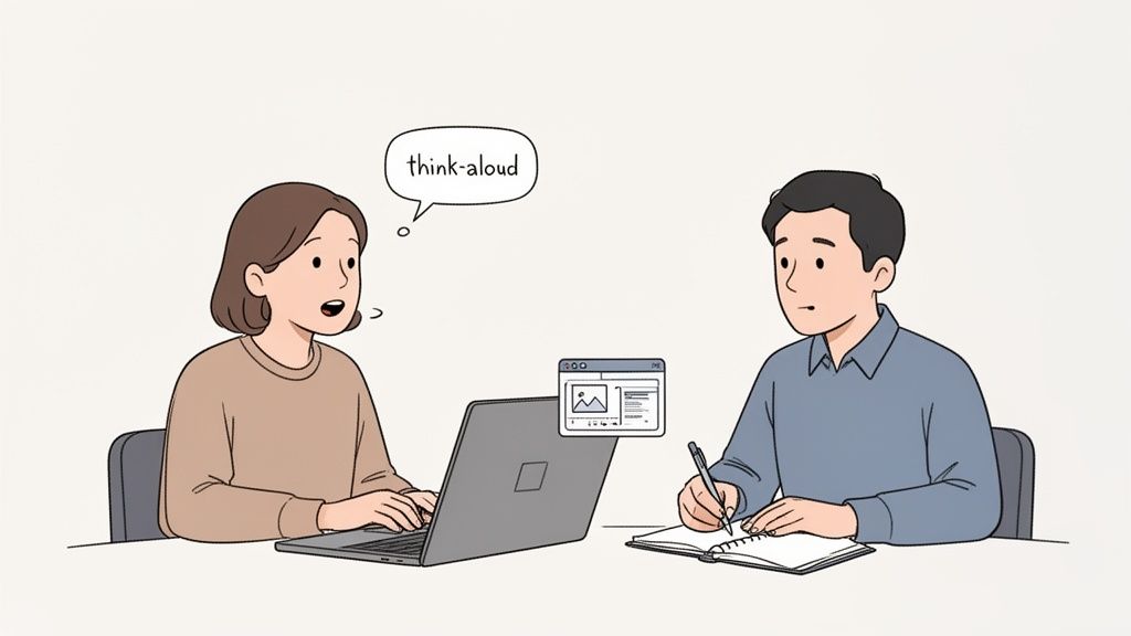
This image really captures the essence of it: a facilitator actively listening as a user explains their thought process, turning simple observation into data you can actually use.
Mastering the Moderated Session
As a facilitator, your main job is to listen more than you talk. Seriously. When a participant goes quiet, fight the urge to jump in right away. Give them a moment. If they stay quiet, use gentle, open-ended prompts to get them sharing again.
Here are a few phrases I keep in my back pocket:
"What's going through your mind right now?"
"What did you expect to happen when you clicked that?"
"Tell me a bit more about what you're looking for here."
Whatever you do, avoid leading questions. Something like, "Was that button easy to find?" nudges the user toward a specific answer. A much better way to phrase it is, "How did you feel about finding what you needed for that task?" The difference is subtle but incredibly important—it keeps the focus on their genuine experience.
Key Takeaway: Your neutrality is your greatest asset. If a user gets stuck, don't give them the answer. Instead, ask something like, "If you were on your own, what would you try next?" This uncovers their mental model and reveals the real usability roadblocks.
Setting Up Unmoderated Tests for Success
With unmoderated tests, you don't have the luxury of clarifying things in real-time. This means your instructions have to be absolutely perfect. If a user misunderstands a task, that whole chunk of data could be useless. Every instruction must be crystal clear, concise, and impossible to misinterpret.
The single most important thing you can do before launching an unmoderated test is to run a pilot test. Grab a colleague or two and have them go through the entire flow. This is your chance to catch confusing wording, broken links, or technical glitches before they derail your study and burn through your budget. Think of it as a dress rehearsal—it’s a small time investment that will save you from major headaches down the road.
A well-structured test doesn't just give you better data; it also makes the reporting process way smoother. If you need a hand structuring your findings, check out our guide on creating a user testing feedback template to improve UX insights.
Integrating Modern Tools into Your Workflow
Taking notes during sessions is vital, but scribbling in a notebook can be slow and imprecise. Modern tools can completely change how you capture and share feedback, especially when you need visual context.
Imagine a participant says, "This part of the form is confusing." Instead of just writing that down, you could use a tool like Beep to instantly capture the specific UI element they're pointing at. With a single click, you get an annotated screenshot that shows exactly what was causing the trouble.
This approach is a game-changer for a few reasons:
Precision: It eliminates all ambiguity. Developers see the exact element that caused the problem, so there's no guesswork.
Speed: It turns a live observation into a shareable bug report or feedback ticket in seconds, right from the webpage.
Efficiency: This captured feedback can be sent straight to project management tools like Jira or Notion, slotting perfectly into your team's workflow.
This method transforms a vague note into a precise, actionable task. It closes the gap between user frustration and developer resolution, making the whole process of usability testing of websites more efficient and impactful. When you combine skilled facilitation with the right tools, you can make sure every valuable insight from your sessions leads to real, tangible improvements.
Turning Raw Data Into Actionable Fixes
Okay, you've done the hard work. You’ve sat through hours of sessions, taken a mountain of notes, and now you’re staring at a pile of raw data—recordings, comments, and metrics. This stuff is gold, but it's unrefined gold. To make it valuable, you have to turn those scattered observations into a compelling story that gets your team and stakeholders excited to make changes.
This is the part where you connect the dots. It’s not about just listing every little thing that went wrong. It's about spotting the patterns, zeroing in on the biggest pain points, and presenting your findings in a way that’s impossible to ignore. A great analysis doesn't just point out problems; it builds a rock-solid business case for solving them.
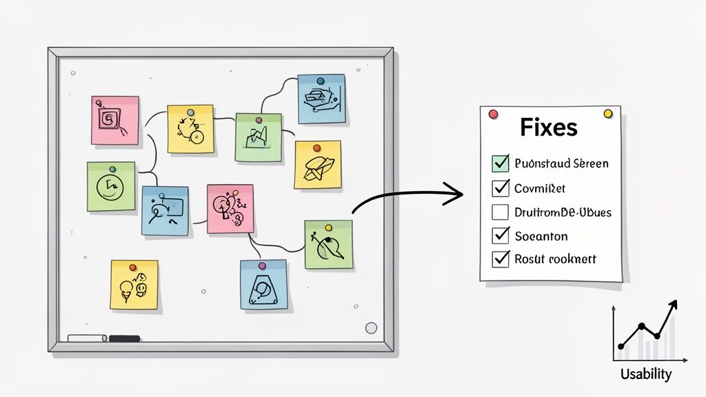
Finding Patterns in Qualitative Feedback
Your qualitative data—all those user quotes, think-aloud moments, and your own observational notes—is where the real insights are hiding. But it can feel overwhelming. To make sense of it all, I swear by a technique called affinity mapping.
Think of it as a giant puzzle with sticky notes. Write down every key observation, quote, or pain point on its own note. Then, get your team in a room (or on a virtual whiteboard) and start grouping them. You'll quickly see themes emerge from the chaos.
For instance, you might end up with clusters like:
Confusing Navigation: "I can't find the contact page anywhere!" pops up over and over.
Checkout Friction: A bunch of notes mention frustration with how many form fields there are.
Unclear Terminology: The term "Resource Hub" clearly meant nothing to most of your participants.
When you see a huge stack of notes all saying the same thing, you know you've struck a nerve. That’s a major issue affecting a lot of people.
Interpreting Your Quantitative Data
While the "what" and "why" come from your qualitative feedback, the numbers tell you how bad the problem is. Metrics like task completion rates and error counts give you the hard evidence you need to convince skeptics. One of the best tools for this is the System Usability Scale (SUS).
SUS is a simple, ten-question survey that spits out a score from 0 to 100. It’s a fantastic benchmark for your site's overall usability. To give you some context, the average SUS score across the web is about 68. It's just... okay. If your score is dipping below that, it’s a red flag that users are struggling.
Other scales offer powerful insights, too. One review of over 2,100 sessions found the average Accessibility Usability Scale (AUS) score was 65, showing just how tied usability and accessibility are. When scores drop to the 25th percentile, they hit a low of 38, with users saying things like, "It was really difficult to find what I was looking for."
A SUS score below 60 points to some serious usability problems that you should probably tackle ASAP. A score above 80 is excellent—you’re in the top 10% of websites.
Creating a Report That Drives Action
Let’s be real: no one is going to read a 50-page report. Your final summary needs to be concise, visual, and focused entirely on what to do next. The goal is to make it dead simple for anyone to grasp the problem, its impact, and how to fix it.
I've found a structure like this works wonders:
Executive Summary: A one-pager with the most critical findings and your top three recommendations. Get straight to the point.
Key Findings: Dive into the biggest issues. Back them up with powerful user quotes, short video clips, and screenshots. Show, don't just tell.
Prioritized Recommendations: This is your action plan. List your proposed fixes and rank them by severity (e.g., critical, major, minor).
For each recommendation, spell it out: here's the problem, here's the proof, and here's what we should do about it. The whole point is to improve website user experience in tangible ways.
Finally, don't let that report just sit in a folder. Immediately translate your findings into your team’s daily workflow. Create tickets in Jira, Asana, or whatever you use. Each ticket should link back to the report, giving developers all the context they need to start building. If you need some tips here, our guide on how to write bug reports that get fixed has some great, practical advice. This is how you make sure your insights actually lead to a better website.
Common Questions About Website Usability Testing
When you're first dipping your toes into usability testing, it's totally normal to have a million questions. It can seem like a complex world, but trust me, the core ideas are pretty simple. I've been there. Let's tackle some of the most common questions and clear up the confusion so you can get started with confidence.
Think of this as your personal cheat sheet for getting the fundamentals right. Nail these, and your whole testing process will run a lot smoother.
How Many Users Do I Really Need to Test With?
This is the big one, the question I hear all the time. The answer is almost always fewer than you think. You don't need some massive, statistically significant sample size to get eye-opening insights.
The Nielsen Norman Group did some groundbreaking research on this years ago and found something that still holds true: testing with just five users will uncover roughly 85% of the usability problems on your site. The goal here isn’t to publish a scientific paper; it’s to find where real people are getting stuck.
Look, the biggest mistake you can make is not testing at all. It's way better to run a few small tests with 5-8 people throughout your process than to do one huge, expensive study at the very end. By then, changes are a nightmare to implement.
For most projects, this small-batch approach gives you the biggest bang for your buck. You'll spot the patterns of confusion and frustration fast, without getting bogged down in weeks of recruitment and data crunching.
What Is the Difference Between Usability Testing and UAT?
Okay, this is a critical one. They sound alike, but usability testing and User Acceptance Testing (UAT) are two totally different animals serving completely different purposes. Mixing them up is a classic rookie mistake that can lead to launching a product that technically works but is a pain to actually use.
Here's how I think about it:
Usability Testing is all about observing behavior. It answers the question, "Can people figure this out easily?" You're hunting for confusing navigation, unclear instructions, and design flaws. It's all about the human experience.
User Acceptance Testing (UAT) is about validation. It happens right before you go live and answers the question, "Does this thing work the way we said it would?" You're looking for bugs and confirming that it meets all the business requirements.
Simply put, usability testing checks if the site is user-friendly. UAT confirms it's functionally complete. You absolutely need both, but they solve different problems at different times.
How Can I Do This on a Shoestring Budget?
You don't need a fat wallet to get incredible feedback. In fact, some of the most effective ways to do usability testing of websites are dirt cheap—or even free. It's all about being a little scrappy.
My favorite low-cost method is guerrilla testing. Seriously, just go where the people are. Head to a coffee shop or a local library, offer to buy someone a latte, and ask them to try out your site for five minutes. You’d be amazed at what you can learn.
Here are a few other budget-friendly moves I’ve used:
Recruit Internally: Grab colleagues from sales, marketing, or HR who have no idea what your project is about. Their fresh eyes are invaluable.
Use Your Network: Put a call out to your email list or social media followers. People who already like your brand are often happy to help out for a little recognition or a small gift card.
Leverage Freemium Tools: Lots of remote testing platforms have free plans that are perfect for running a few simple, unmoderated tests.
The most important thing is to just start. Don't wait for the perfect budget or the perfect plan. A handful of quick, informal tests will always beat no testing at all. Always.
Ready to stop guessing what your users are thinking? Beep makes gathering visual feedback simple and fast. Get clear, actionable insights by letting users comment directly on your live website. Start your free trial today and see what you've been missing. Find out more at https://www.justbeepit.com.
Comments