
.png)
A Practical Guide to Heuristic Evaluation UX Design
- shems sheikh
- Dec 2, 2025
- 16 min read

Ever heard of a heuristic evaluation? Think of it as a usability inspection method where a few experts take a fine-tooth comb to your interface, checking it against a list of tried-and-true design principles, or "heuristics." It's a seriously quick and budget-friendly way to find common usability hiccups without having to roll out a full-blown user testing session.
What Is Heuristic Evaluation and Why It Matters for UX

I like to think of a heuristic evaluation like bringing in a seasoned building inspector before you buy a house. They aren't going to live there, but their trained eyes can spot problems a mile away—a leaky pipe, a dodgy foundation—all based on established principles of good construction.
It's the same idea in heuristic evaluation ux design. We bring in UX pros who use a checklist of principles to find those little (and sometimes big) friction points in a website or app.
This whole process is a fast and efficient diagnostic tool. Instead of spending time and money recruiting, scheduling, and observing real users, you get actionable feedback in a fraction of the time. Trust me, it's a must-have in any UX toolkit because it helps you catch obvious design flaws early, saving you a ton of headaches and resources down the line.
The Origins of Modern Usability Inspection
This method isn't some new fad; it's built on a solid foundation of research that goes way back. Heuristic evaluation was officially introduced to the world in 1990 by usability pioneers Jakob Nielsen and Rolf Molich.
By 1994, Nielsen had polished their work into the famous 10 usability heuristics that have pretty much become the gold standard for interface design everywhere.
A heuristic evaluation is a quick and relatively inexpensive way to identify usability problems. It allows teams to find and fix issues before they impact a wider audience, making it a powerful proactive measure rather than a reactive one.
Integrating Heuristic Evaluation into Your Workflow
So, where does this actually fit into your project timeline? That's the beauty of it—it's incredibly versatile.
You can run a heuristic evaluation at almost any stage. I've done them on everything from early-stage wireframes and interactive prototypes to live products that have been out in the wild for years. It’s a key piece of any solid UX research process, giving you expert insights that perfectly complement data from actual user testing. It's just one of the 10 essential user experience testing methods for mobile apps, but it's a powerful one.
Here’s why I swear by it:
Cost-Effectiveness: It demands way fewer resources than a full usability study. No lab, no recruiting, no stipends.
Speed: You can get findings back fast, often in just a couple of days. Perfect for tight deadlines.
Early Detection: It helps you spot problems in the design phase when changes are still cheap and easy to make.
Actionable Insights: The output is a clear, prioritized list of issues tied directly to specific usability principles, making them much easier for designers and devs to tackle.
The 10 Usability Heuristics in Action
Look, understanding the theory behind a heuristic evaluation is one thing. But seeing those principles pop up in the apps you use every day? That’s where it all clicks. These 10 heuristics, first laid out by the legendary Jakob Nielsen, aren't just abstract rules. They're the invisible framework that holds up the most intuitive products we love.
Let's break them down with some real-world examples you've definitely seen.
1. Visibility of System Status
Users need to know what's going on. Simple as that. The system should always keep people in the loop with clear and timely feedback. It builds trust and stops them from wondering if they broke something.
Think about ordering from DoorDash. The second you place your order, you’re on a journey: "Order Placed," "Preparing Your Order," "Out for Delivery." Then you get that live map of the driver. It's a masterclass in keeping the user informed and managing their expectations. No guesswork needed.
2. Match Between System and the Real World
Your product should speak your user's language—not developer-speak. Use words, concepts, and icons that feel familiar. When you mirror the real world, you flatten the learning curve.
The trash bin icon on every Mac and Windows machine is the perfect example. We all get it instantly. You drag a file to the trash to get rid of it. If you make a mistake, you can still pull it out. It works just like a physical trash can, so no one needs a manual to figure it out.
3. User Control and Freedom
We all mess up. We click the wrong button, go down the wrong path, and immediately want a way out. A good interface provides a clearly marked "emergency exit" to undo an action without a fuss.
Ever sent an email and instantly regretted it? Gmail’s “Undo Send” is a lifesaver. For a few crucial seconds after you hit send, you have an escape hatch. That one little button has prevented countless moments of panic and frustration for millions of people.
4. Consistency and Standards
Don’t make users guess. Different words, icons, or actions shouldn't mean the same thing in different places. Stick to established conventions, both within your own product and across your industry.
Microsoft Office has this down to a science. Whether you open Word, Excel, or PowerPoint, the ribbon menu feels familiar. The "File," "Home," and "Insert" tabs do pretty much what you expect them to. Once you learn one app, you've got a huge head start on the others.
A consistent design is a learnable design. When people can predict where something is or how it will behave, they feel confident and in control. That’s a huge win.
5. Error Prevention
Good error messages are nice. But you know what's way better? A design that prevents the error from ever happening.
When you're booking a trip on Google Flights and try to select a return date before your departure date, the interface simply won't let you. The impossible dates are grayed out. It’s a smart, silent way to guide the user away from a mistake, which is far more elegant than letting them fail and then showing an error.
6. Recognition Rather Than Recall
Our brains are lazy. Don't force users to remember information from one screen to the next. Make objects, options, and actions visible so they can recognize them instead of having to recall them from memory.
Spotify’s home screen is great at this. Your "Recently Played" artists and playlists are right there, waiting for you. You don’t have to dig through your memory to find that one album you were jamming to yesterday. It's a small touch that makes slipping back into the experience feel effortless.
7. Flexibility and Efficiency of Use
Your interface should work for both rookies and pros. New users need a clear, easy path, while experienced users will crave accelerators to speed up their workflow.
Keyboard shortcuts are the ultimate example. In a tool like Figma, a beginner can hunt through the menus to duplicate an object. An expert just hits Ctrl+D (or Cmd+D). The system gracefully handles both, allowing people to get more efficient as they get more familiar with the tool.
8. Aesthetic and Minimalist Design
Every single element on a screen competes for the user's attention. Don't clutter your interface with information that isn't absolutely necessary. Less is almost always more.
The Google search page is the undisputed champion here. There's a logo, a search bar, and two buttons. That's it. Nothing distracts from its one core purpose. This radical simplicity is why it's so fast and easy to use.
9. Help Users Recognize, Diagnose, and Recover from Errors
When an error does happen, the message needs to be human. No cryptic error codes. Tell the user what went wrong in plain language and—most importantly—tell them how to fix it.
Think of a typical login screen. A bad one says "Error 401." A good one says, "Incorrect password. Did you forget your password?" It clearly states the problem and immediately offers a constructive solution. It guides, it doesn't blame.
10. Help and Documentation
Ideally, your product is so intuitive that nobody ever needs a help file. But we don't live in an ideal world. So when documentation is necessary, make it easy to find, focused on the task at hand, and not a massive wall of text.
Notion handles this beautifully. If you’re stuck on something, you can just type to see a searchable menu of commands with short descriptions. If you need more, their help center offers clean, step-by-step guides with visuals that walk you through exactly what you need to do.
How to Run a Successful Heuristic Evaluation
Knowing the principles is half the battle. Putting them into practice is where you’ll actually see results. Running a heuristic evaluation isn’t about following rigid rules, but it does require a structured workflow to turn expert opinions into real, actionable improvements.
Let's walk through how to plan and execute an evaluation from start to finish.
This visual flow shows how user-centric design principles show up in apps we use every day—from starting an action like a Google search, to getting clear feedback like a Spotify track playing, or having an escape hatch like Gmail's "undo" button.
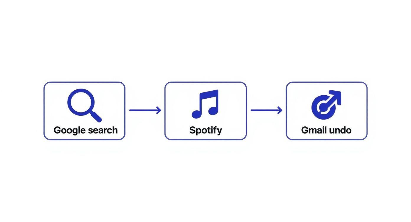
You can see how fundamental heuristics—like visibility of system status and user control—are woven right into the user flows of major digital products, which is a big part of what makes them feel so intuitive.
Define Your Scope and Objectives
Before you dive in, you need a clear map. What, exactly, are you evaluating? A vague goal like "check the website for issues" is a recipe for a messy, unfocused report. Get specific.
Your scope could be:
A critical user flow: The entire checkout process, from adding an item to the cart to seeing the order confirmation.
A new feature: The recently launched user profile customization options.
A specific user segment: The onboarding experience for a first-time user.
By defining a tight scope, you make sure your evaluators focus their energy where it matters most. You also need to be crystal clear about your objectives. Are you trying to reduce cart abandonment? Increase feature adoption? Or just clean up lingering usability debt? Clear goals give your evaluation a real purpose.
It’s also crucial to think about different platforms. For example, understanding the nuances of mobile website optimization best practices is essential if you're assessing usability on smaller screens.
Assemble Your Evaluation Team
Next up: choosing your experts. But how many is the right number?
The classic recommendation is to use 3 to 5 evaluators. Interestingly, industry data shows that only 35% of teams actually follow this guideline. 38% use just two evaluators, and 15% rely on a single person. This just goes to show how flexible the method is—it works for companies of all sizes and budgets.
So why is the 3-to-5 range considered the sweet spot? A single evaluator will probably find around 35% of the usability issues. Adding a second and third person brings in fresh perspectives, helping you uncover problems the first person might have missed. After five evaluators, you hit a point of diminishing returns where you get a lot of overlapping findings without much new insight.
Pro Tip: Your evaluators don't all have to be seasoned UX researchers. I’ve found that a diverse team of designers, product managers, and even front-end developers can bring unique viewpoints to the table, leading to a much richer set of findings.
Execute the Evaluation Independently
This part is absolutely critical: each evaluator must conduct their review independently. This is the only way to prevent "groupthink," where one person's opinion starts to influence everyone else. The goal here is to collect a wide range of unbiased observations first, then bring them all together later.
Make sure every evaluator gets the same package of materials:
A clear brief: This should outline the scope, objectives, and target user persona.
Access to the product: Whether it's a live site, a prototype, or a set of wireframes.
The list of heuristics: Make sure everyone is working from the exact same set of principles.
A simple template for logging issues: This keeps the feedback structured and consistent, which makes your life way easier later on.
As your experts go through the interface, they need to document every potential usability problem they find. A good finding always includes the issue itself, the heuristic it violates, its location, and a quick description of the problem.
Use a Severity Rating Scale
Not all usability issues are created equal. A typo is an annoyance; a broken checkout button is a catastrophe. To prioritize effectively, you need your evaluators to assign a severity rating to every issue they find.
This rating system is a game-changer. It transforms a long, subjective list of complaints into a prioritized roadmap for your design and development teams. It helps answer that all-important question: "Okay, what do we fix first?"
Here's a standard scale I've used on many projects to keep ratings consistent across the team:
Usability Issue Severity Rating Scale
Rating | Description | Example |
|---|---|---|
0 - Minor | A cosmetic issue that doesn't hinder task completion. | A button is slightly misaligned on one page. |
1 - Low | A minor usability problem, but users can overcome it. | Inconsistent terminology used for the same action. |
2 - Medium | A significant issue that can cause user frustration. | The "back" button doesn't work as expected in a multi-step form. |
3 - High | A major usability problem that will stop some users. | Key information needed to make a decision is hidden or unclear. |
4 - Critical | A usability catastrophe that prevents task completion. | The "Add to Cart" button is completely non-functional. |
This kind of structured approach makes the synthesis phase so much smoother and ensures you’re tackling the most impactful problems right away.
Remember, a heuristic evaluation is an expert review, but it's not a substitute for seeing how real users interact with your product. It’s often a fantastic precursor to more in-depth research. If you're wondering what comes next, you might be interested in our guide on how to conduct usability testing to validate your findings with real-world data.
Turning Findings Into an Actionable Report

Let's be real: the true magic of a heuristic evaluation ux design isn't the giant list of problems you find. It’s what you do with that list. After your evaluators have done their thing, you're sitting on a pile of notes, screenshots, and ratings. Now comes the most important part—turning all that raw data into a report that actually gets people excited to make changes.
The first job is to bring all those individual observations together into one single source of truth.
Consolidating and Debriefing Your Findings
Get everyone in a room (or a Zoom call) for a debrief session. This is non-negotiable. You’ve got multiple experts looking at the same thing, so you're going to have overlaps, different severity scores, and maybe even a few disagreements. That’s not just okay; it's exactly what you want.
In the meeting, walk through every finding. I find that a shared spreadsheet or a digital whiteboard works great for this. As you review each issue, start grouping similar ones. Maybe three different people flagged a confusing icon, vague button text, and a hidden menu, all on the same screen. Boom—cluster those into a larger theme like "Poor discoverability in the user profile section."
This debrief is incredibly valuable because it helps you:
Spot the big themes: When multiple people point to the same problem area, that's a huge red flag you can't ignore.
Agree on severity: It’s a chance to discuss why one person called an issue "critical" while another saw it as "medium." You'll land on a more accurate, unified score.
Weed out false alarms: Sometimes, one person flags something that another evaluator can clarify, explaining the design intent or a specific constraint.
The point of the debrief isn't to get perfect agreement on every tiny detail. It's about building a shared understanding of the biggest roadblocks for your users and aligning on what needs to be fixed first.
Prioritizing What to Fix Now vs. Later
With a tidy, consolidated list, the next question is obvious: where do we even start? You can't tackle everything at once. This is where your severity ratings, paired with a rough estimate of the effort to fix each issue, become your best friends.
A simple prioritization matrix is my go-to tool here. Just plot each issue on a grid with Impact (Severity) on one axis and Effort (Development Time) on the other. This instantly sorts your list into four buckets:
Quick Wins (High Impact, Low Effort): These are your no-brainers. Get them fixed ASAP for the biggest bang for your buck.
Major Projects (High Impact, High Effort): These are the big, important initiatives that need proper planning and will likely get slotted into future sprints.
Fill-In Tasks (Low Impact, Low Effort): Nice-to-haves that developers can pick up when they have a bit of downtime between bigger tasks.
Reconsider (Low Impact, High Effort): These usually get pushed way down the backlog or even shelved completely unless they're tied to a bigger strategic goal.
Using a matrix like this gives your stakeholders a crystal-clear, data-backed reason for your roadmap. The conversation shifts from "Here's what's broken" to "Here's our plan to fix it."
Crafting a Report Stakeholders Will Actually Read
Okay, final step. You need to package all this up into a report that's clear, punchy, and convincing. Nobody has time to read a 50-page document. Your goal is clarity and action.
For each issue, I recommend a simple, structured format. It makes everything scannable and easy to digest.
The Problem: What’s the issue? Describe it in one clear sentence.
Location: Where does it happen? Add screenshots or even a quick screen recording. Context is everything.
Heuristic Violated: Which rule did it break (e.g., "Visibility of system status")? A brief explanation goes a long way.
Evidence: Note how many evaluators found it and what the final severity rating is.
Recommendation: This is crucial. Don't just point out what's wrong—suggest a concrete fix.
This structure makes it dead simple for designers, devs, and PMs to grasp the problem and see the path forward. By the way, our guide on how to write bug reports that get fixed has some great tips that are super relevant here. When you present your findings this way, your report becomes less of a critique and more of a practical playbook for making the product better.
Common Mistakes and How to Avoid Them
Even with the best intentions and a solid plan, a heuristic evaluation can go sideways if you're not careful. Let’s get real about the common tripwires that can mess with your results and, more importantly, how you can sidestep them.
Frankly, knowing these pitfalls is what separates an okay heuristic evaluation ux design process from a truly effective one.
One of the biggest issues I’ve seen is the dreaded "false alarm." This is when an expert flags something as a usability problem, but in the real world, your users wouldn't even blink an eye at it. This usually happens because experts are viewing the interface through a very specific lens of best practices, which can sometimes be a world away from the messy, unpredictable reality of actual user behavior.
Don't just take my word for it; statistical research has looked into this exact thing. On average, a heuristic evaluation will only catch about 30% to 50% of the usability issues you’d find in a user test with real people. Even more telling is that around 34% of the problems flagged by experts are not problems at all for users. You can dig into the full research about these heuristic evaluation findings to get the complete picture.
Mistaking Evaluation for User Testing
Look, it’s tempting to think of a heuristic evaluation as a quick and cheap replacement for user testing, but they’re two completely different tools for different jobs. A heuristic evaluation is an inspection, a diagnostic check-up. It's fantastic for finding clear violations of established usability principles and answering the question, "Does our design follow the rules?"
User testing, on the other hand, is all about watching what people do. It answers the question, "Can real people actually use this thing to get their tasks done?"
A heuristic evaluation tells you what experts think might be a problem. User testing tells you what is a problem for your users. The two methods work best when used together, not as replacements for each other.
Letting Evaluator Bias Creep In
Every single person, no matter how seasoned, brings their own baggage to an evaluation. Their biases, their personal preferences, their past experiences—it all comes with them. I've seen designers who worship minimalism flag any hint of visual clutter as a five-alarm fire, while a developer on the team might be totally fine with a bit of technical jargon.
So, how do you keep it in check?
Bring in a Mixed Crew: Don't just grab a bunch of designers. Assemble a diverse team of evaluators with different backgrounds—designers, product managers, developers, and QA folks. Their varied points of view will help balance out any one person's biases.
Give Them a Persona: Don’t just let them evaluate from their own perspective. Hand your team a well-defined user persona to act as. This forces them to step out of their own shoes and see the interface through the user's eyes.
Keep the Scope Tight: Give them a specific, focused task flow to review, like "sign up for a new account." This keeps everyone on a narrow path and reduces the chance of personal taste clouding their judgment.
Overlooking the Method's Limitations
Heuristic evaluation is a powerful tool, but it has its limits. It’s absolutely brilliant at spotting surface-level usability problems—things like inconsistent button labels, confusing navigation, or terrible error messages.
What it won’t do, however, is uncover the deeper, more strategic problems.
For instance, a heuristic evaluation isn't going to tell you that you've built the wrong product entirely or that a key feature completely misses a core user need. It can't tell you if your value proposition is compelling or if the product even fits into a user's day-to-day life. That's why you have to pair it with methods like user interviews and contextual inquiry to get the full story.
A Few Common Questions I Get Asked
Once you start digging into heuristic evaluations, a few questions always seem to come up. I've been there, so let me clear up some of the common points of confusion with some quick, practical answers.
Heuristic Evaluation vs. Cognitive Walkthrough: What's the Difference?
Ah, the classic question! It’s easy to mix these two up, but they solve different problems.
Think of a heuristic evaluation as a broad, expert-led inspection. You've got a set of proven usability principles—your heuristics—and you're checking the entire interface against them. It’s like a building inspector walking through a house, checking the foundation, plumbing, and electrical all at once.
A cognitive walkthrough, on the other hand, is super focused. You're not looking at the whole system; you're simulating a first-time user's journey through one specific task, step-by-step. The goal is to see if the path is clear and if the user can figure out what to do next without getting stuck.
So, in short: a heuristic evaluation asks, "Is this design solid and user-friendly overall?" A cognitive walkthrough asks, "Can a brand new user achieve this specific goal without a headache?" Both are incredibly valuable, but you use them to answer different things.
Can I Do a Heuristic Evaluation if I'm Not a UX Pro?
Absolutely. Look, while getting seasoned UX folks to run the show will give you the most bang for your buck, you don't need "Senior UX Guru" in your title to get real value here. The most critical part is that you truly understand the 10 usability heuristics before you dive in.
If you're a designer, PM, or developer on the team, you have a huge advantage: you know the product inside and out. The trick is to be hyper-aware of your own biases (we all have them!). A great way to balance this out is to get a few people from different roles to participate. Trust me, an imperfect evaluation is almost always better than no evaluation at all.
How Long Does This Whole Thing Actually Take?
This is a classic "it depends" situation. The time you'll need is tied directly to the scope of what you're reviewing.
Here’s a rough idea from my experience:
A single user flow or one specific feature: An evaluator will probably spend about 1-2 hours doing the actual review.
An entire website or a complex application: This can easily jump to 4-8 hours per evaluator.
But don't forget to factor in the before and after! Planning the scope, prepping materials, and then—most importantly—synthesizing all the findings and writing a useful report can add several more hours, or even a couple of days, to your total timeline.
Tired of juggling spreadsheets and endless meetings to manage feedback? Beep lets you drop visual comments right on your live website, track every issue on a built-in Kanban board, and push tasks to tools like Jira and Slack. Speed up your review process and start shipping better products, faster. Give Beep a try for free and see for yourself.
Comments