
.png)
A Practical Guide to Usability Testing Web Experiences
- Henry Barks
- Feb 6
- 17 min read

At its core, web usability testing is pretty simple: you watch real people use your website to see what works and where they get stuck. Think of it as a direct line into your users' minds, letting you uncover those frustrating friction points and confirm your design choices actually make sense. This simple process is your best defense against lost sales and a crummy user experience.
Why Usability Testing Is a Non-Negotiable for Modern Websites
Skipping usability testing is like building a car without ever taking it for a spin. You might end up with a beautiful machine, but you have no clue if it's actually drivable. In the web world, that oversight leads to real, tangible losses.
When users run into confusing navigation, broken links, or a checkout process that feels like solving a riddle, they don't bother filing a support ticket. They just leave. And chances are, they're not coming back.
These seemingly small issues can quickly snowball into major business headaches:
Lost Revenue: Every single person who abandons their shopping cart because of a confusing form is money walking out the door.
Damaged Reputation: A frustrating website experience chips away at brand trust and makes you look amateur.
Wasted Development Cycles: Without user feedback, it’s shockingly easy for teams to spend weeks building features that nobody wants or can even figure out how to use.
The Direct Line Between Usability and Success
On the flip side, committing to regular usability testing creates a powerful feedback loop. Watching actual users interact with your site gives you unfiltered insights that analytics data alone could never provide. To really get why this is so critical, you have to understand the core user experience best practices that guide every successful digital product.
This user-first approach directly boosts the metrics that matter, like conversion rates and customer loyalty. It’s no surprise, then, that the industry is taking notice. The global Usability Testing Tools market hit a staggering $1 billion USD in 2023 and is on track to double to $2 billion by 2030. This explosion shows just how vital user-centered design has become for staying competitive. If you're curious, you can dig into the numbers in a recent industry report.
Modern Tools for Faster Insights
Today’s visual feedback platforms are completely changing the game, helping teams spot issues way faster and with more accuracy than ever before.
Take a tool like Beep, for instance. The screenshot above shows how it lets you drop contextual comments directly onto a live webpage. No more vague notes in a spreadsheet or trying to describe "that button on the top right." The feedback is tied to the exact visual element, which kills the guesswork and dramatically speeds up the entire fix-and-improve cycle. This is the kind of practical, actionable approach we're going to dive into next.
Building a Solid Foundation for Your Usability Tests
Effective web usability testing starts long before you ever sit down with a user. I've seen it time and time again: the most successful tests are built on a rock-solid plan that takes all the guesswork out of the equation. Without that foundation, you just end up with a pile of vague feedback that’s impossible to act on.
The very first thing you need to do is swap out those fuzzy, ambiguous goals for sharp, measurable objectives. So many teams kick off with something like, "Let's make the checkout process better." While the intention is good, that goal gives you zero direction. What are you testing? How will you know if you've succeeded?
Instead, you’ve got to reframe it. A much stronger, more actionable goal would be: "Decrease cart abandonment by 15% by simplifying the shipping address form." See the difference? Now you have a clear purpose and a concrete benchmark for success.
Defining Your Key Success Metrics
Once you’ve got that laser-focused objective, you need to figure out which metrics will prove you’ve hit your target. These are the hard numbers, the quantitative data points that validate your design changes and really show the impact of your work.
Here are a few essential metrics you'll want to track:
Task Completion Rate: The percentage of users who actually manage to complete a specific task. It’s the most fundamental sign of whether your design is working or not.
Time on Task: How long does it take someone to get the job done? Generally, a shorter time points to a more intuitive and efficient user experience.
Error Rate: This one tracks how many mistakes users make along the way. A high error rate is a huge red flag, often pointing to confusing instructions or a busted workflow.
A huge part of the whole UX research process is about translating what you see people do into these hard numbers. This is how you build a powerful case for change and demonstrate real ROI from your testing efforts.
These metrics form the backbone of your analysis, turning raw user behavior into data you can actually use. You can get a better sense of how this all fits together by checking out our guide on how to master the UX research process for better design.
To help you get started, here's a quick rundown of some of the most critical usability metrics I've come to rely on over the years.
Essential Usability Testing Metrics and Their Purpose
Metric | What It Measures | Why It's Important |
|---|---|---|
Task Success Rate | The percentage of users who successfully complete a defined task. | It's the ultimate pass/fail test for a feature's core functionality. |
Time on Task | The average time it takes for users to complete a task. | Efficiency is key. A shorter time usually indicates a more intuitive design. |
Error Rate | The number of mistakes a user makes while attempting a task. | Highlights specific points of confusion or friction in the user journey. |
System Usability Scale (SUS) | A 10-question survey measuring a user's subjective perception of usability. | Provides a standardized score for overall satisfaction and ease of use. |
Single Ease Question (SEQ) | A single question asked after a task, rating its difficulty on a 7-point scale. | Offers immediate, task-specific feedback on how difficult users found an action. |
These aren't the only metrics out there, of course, but tracking this combination gives you a really powerful, well-rounded view of both performance and perception.
Measuring User Satisfaction
Beyond just tracking performance, it’s absolutely critical to understand how users feel about the experience. Someone might finish a task quickly, but if they found the whole thing frustrating and annoying, that’s a major problem you need to fix. This is where qualitative feedback really shines.
The System Usability Scale (SUS) is my go-to for this. It’s a tried-and-true questionnaire for measuring perceived usability. It’s just ten simple statements that users rate, which generates a standardized score from 0 to 100. A SUS score gives you a reliable way to gauge overall satisfaction and even compare it across different versions of your site.
This infographic shows exactly what’s at stake when you don't address user friction.
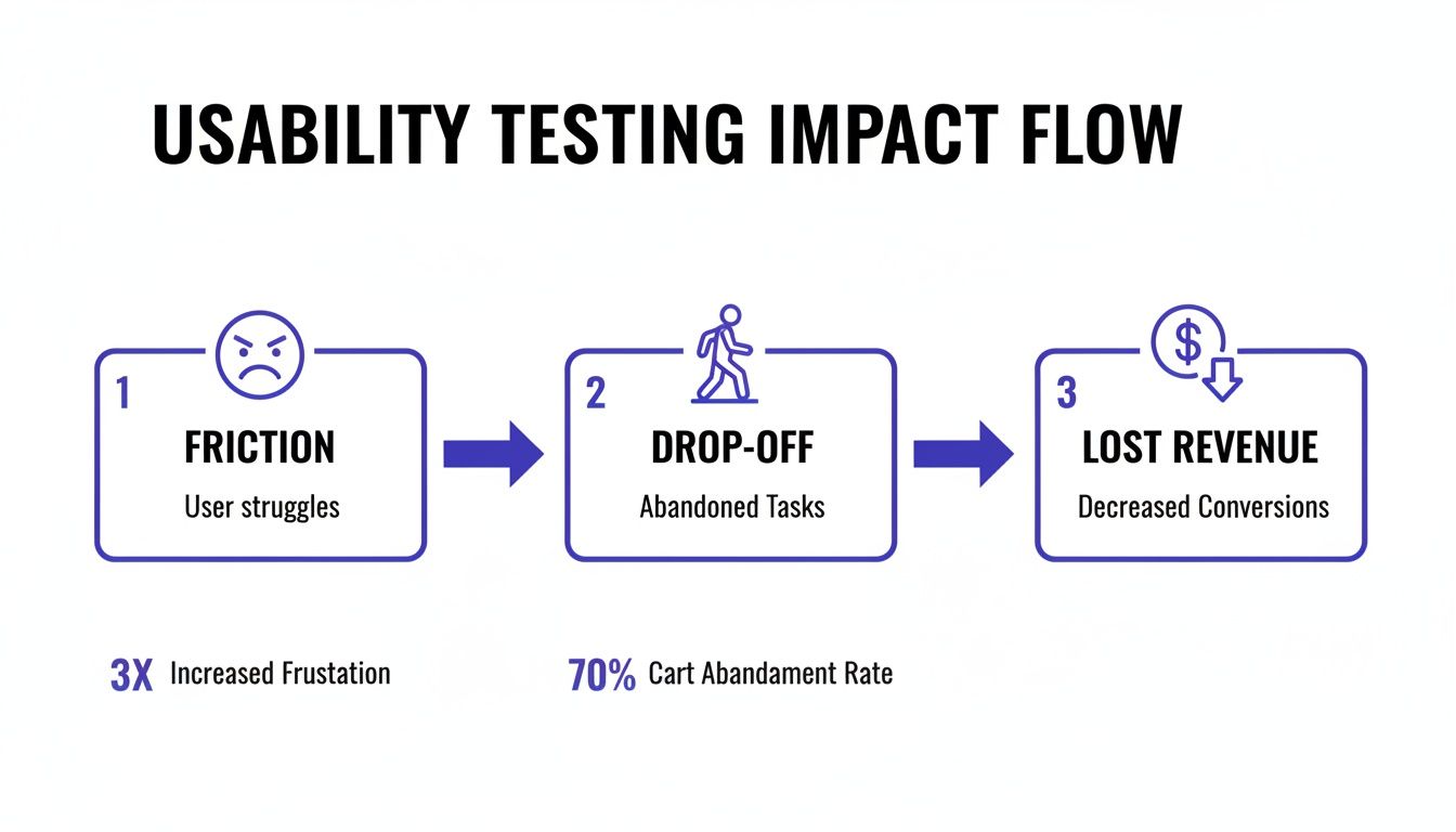
As you can see, those little points of friction add up, leading directly to users dropping off and, ultimately, lost revenue. That’s why getting ahead of these issues with testing is so important.
By combining hard data like task completion with satisfaction scores from SUS, you get a complete picture of your website’s usability. This dual-pronged approach ensures you’re not just building something that works, but something that people genuinely enjoy using. For a fantastic, deep dive into the whole process, this resource on how to conduct usability testing is one of the best out there. Nailing this foundation is what sets you up to run tests that deliver clear, actionable results every single time.
Choosing the Right Testing Method and Finding Your Users
Your web usability test is only as good as two things: the method you choose and the people you test with. Seriously, that's it. Get these two right, and you're on your way to game-changing insights. Get them wrong, and you might as well be guessing.
First up, you need to decide between a moderated and an unmoderated test. Think of a moderated test as a guided tour. You have a facilitator—either in the room or on a call—walking the participant through everything. They can ask follow-up questions, probe deeper when someone says something interesting, and really get into the "why" behind their actions. It's fantastic for digging into complex tasks or when you need rich, qualitative feedback.
Unmoderated testing is the complete opposite. It’s a self-guided experience. You send participants a link, they complete the tasks on their own time, and a tool records their screen and voice. It's way faster, cheaper, and lets you get feedback from a ton of people across different locations.
Moderated vs Unmoderated Testing Which Is Right For You
So, how do you choose? It’s not about which one is "better" but which is the right fit for what you need to learn right now. Let’s say you’re a startup and you just need to know if people understand your new landing page. Remote unmoderated tests will give you that answer quickly and cheaply. But if you’re redesigning a complex B2B portal for specialists, you’ll want moderated sessions to really understand the nuances of their workflow.
Here's a quick comparison to help you decide.
Factor | Moderated Testing | Unmoderated Testing |
|---|---|---|
Depth of Insight | High. Allows for real-time follow-up questions and clarification. | Lower. Relies on the user's ability to "think aloud" without prompting. |
Cost & Speed | Higher cost and slower due to facilitator time and scheduling. | Lower cost and much faster; tests can run simultaneously. |
Logistics | More complex, requiring scheduling with both a moderator and participant. | Simple. Send a link and participants complete it on their own time. |
Risk of Bias | Higher. A moderator can unintentionally lead or influence a participant. | Lower. The user is alone, providing more natural, unfiltered behavior. |
Honestly, there’s no single right answer. It all comes down to your project goals, your timeline, and your budget.
Your users’ location and device habits also play a huge role here. Mobile isn't just a trend; it's completely taken over, now generating 65.49% of global website traffic. It’s shocking, but 73.1% of web professionals say that a non-responsive site is the number one reason visitors bounce. This means you absolutely have to test with real users on their phones. Remote unmoderated testing is perfect for seeing how your site actually performs in the wild, on the devices people use every day. If you want to dive deeper into the numbers, HubSpot has a great roundup of web design stats.
Finding and Screening the Right Participants
Okay, so you've picked a method. Now for the hard part: finding people who actually represent your target audience. I’ve seen so many projects get derailed by feedback from the wrong users. Your goal isn't just to find people; it's to find the right people.
So, where do you find them?
Existing Customer Lists: Your email list or CRM is a goldmine. These are engaged users who already know your product.
User Panels: Services like UserTesting or UserZoom are great. They have huge pools of pre-vetted testers you can filter by all sorts of criteria.
Social Media: Got a niche audience? Targeted ads on LinkedIn or Facebook can work wonders for reaching specific professionals or interest groups.
Guerilla Testing: This is my favorite for quick-and-dirty feedback. Head to a coffee shop and ask people for a few minutes of their time in exchange for a latte. It’s fast and cheap, but probably not the best for testing a specialized B2B tool.
The most important part of recruiting isn't where you find people—it's how you screen them. A well-crafted screener survey is your best defense against unqualified participants.
Your screener should be a handful of questions designed to weed out anyone who doesn’t fit your ideal user profile. For instance, if I’m testing a new feature for project managers, my screener might look something like this:
"Which of the following best describes your current role?" (Multiple choice, where "Project Manager" is the magic answer).
"How many years of experience do you have in this role?" (This helps me filter for seniority).
"Which project management tools have you used in the past 6 months?" (This tells me how familiar they are with competitors).
By nailing down these questions, you make sure the feedback you gather is from people whose opinions will actually drive your product forward. It's a foundational step that sets the stage for a successful test.
For a broader look at different research techniques, check out our guide on the top 10 user testing methods to refine your UX. Taking the time to get this part right ensures your test will deliver valuable, actionable results.
How to Write Tasks That Uncover Authentic User Behavior
The insights you get from usability testing are only as good as the tasks you write. Seriously. A poorly written task is like a leading question in a courtroom—it guides the user down a specific path and you completely miss out on seeing how they'd actually solve the problem on their own. The whole point is to create scenarios that feel like real life, not a sterile exam.
Think about the difference between these two prompts for a second:
Bad Task: "Find the contact page and locate the phone number."
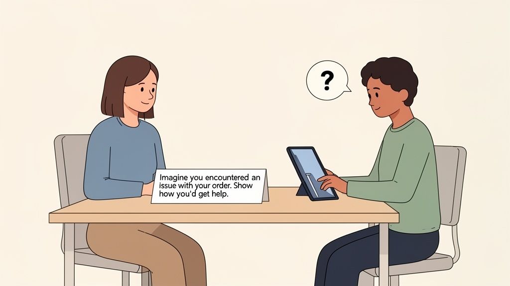
Good Task: "Imagine you just received a damaged item in your order. Show me how you would get help from customer support."
The first one is a direct command. It just tests if a user can follow simple instructions. The second one, though, is a scenario. It taps into a user's potential emotions and motivations, showing you how they really behave when faced with a common headache. This is the mindset shift you need to make.
From Instructions to Scenarios
The secret sauce is giving users a goal, not a checklist of steps. Your task should provide just enough context to set the scene and then get out of their way. People don't browse websites by following a script; they explore based on their own intent and curiosity. Your test has to reflect that reality.
A great scenario has three key ingredients:
A Motivating Context: Why is the user even on your site? Are they trying to solve a problem, research a big purchase, or just get something done?
A Clear Goal: What does "success" look like from their perspective? Frame it like, "find a gift for your friend," not "add a product to the cart."
No Specific UI Clues: This one's huge. Avoid using words that appear in your website's navigation or on its buttons. Don't say, "Click the 'Solutions' menu." Instead, try something like, "Find out if this service is a good fit for a small business like yours."
When you build your tasks around these principles, you encourage people to think aloud and act naturally. That's where the gold is.
Crafting a Complete and Balanced Script
A full usability test is more than just a list of tasks. A solid script creates a comfortable environment that encourages honest feedback and ensures you're consistent with every participant. I like to think of it as a three-act play.
Act 1: The Welcome and Warm-Up First, you set the stage. Introduce yourself, explain what's about to happen (without giving too much away), and—most importantly—reassure them they can't mess anything up. I always say something like, "Remember, we're testing the website, not you. There are no right or wrong answers." That simple sentence instantly puts people at ease. Then, ask a few easy, open-ended questions about their web habits just to get the conversation flowing.
Act 2: The Core Tasks This is the heart of your test. Present your scenario-based tasks one by one. After each one, dig a little deeper with probing, non-leading follow-up questions to really understand what's going on in their head:
"What were you expecting to see when you clicked that?"
"Was that information easy or difficult to find?"
"Tell me more about why you chose to go that way."
Act 3: The Debrief and Wrap-Up Once the tasks are done, zoom out for the big picture. Ask for their overall impressions of the website. This is also a great time to ask them to rate the experience on a simple scale or share any final thoughts. And of course, always end by thanking them for their time and valuable input.
Your script is a guide, not a straightjacket. The best moderators know when to stick to it for consistency and when to go off-road to explore an unexpected—but valuable—tangent.
This structure gives you a repeatable framework for every usability testing web session, making sure you gather both specific task data and broader qualitative feedback.
Uncovering these points of friction is critical, especially as user patience gets thinner. A recent study found that a staggering 94% of users felt websites were less reliable than the year before, which led to frustration for 71% and even anger for 26% of them. You can discover more about these user sentiment trends to see why this is so important. Poorly written tasks can completely miss these pain points. This is where a tool like Beep becomes invaluable, letting testers on remote teams pinpoint the exact element causing their frustration with a quick screenshot and comment.
Analyzing Feedback and Turning Insights Into Action
Alright, so you’ve finished your web usability testing sessions. You've got a pile of notes, recordings, and user comments. That's a huge milestone, but don't pop the champagne just yet. Collecting the data is only half the battle.
The real magic happens when you turn that mountain of raw feedback into a clear, actionable plan. If you don't have a solid process for analysis, you’ll just end up with valuable insights buried under a sea of unorganized comments. It’s a classic case of data-rich but insight-poor.
The days of wrestling with messy spreadsheets and trying to decipher cryptic, handwritten notes are thankfully behind us. Instead of puzzling over a vague comment like "the button was confusing," modern workflows let us pinpoint the exact issue with all the context we need.
This is where visual feedback tools like Beep really shine. When a user can drop a comment directly on a specific webpage element, it automatically captures a screenshot and all the technical metadata. No more guesswork. Your team instantly gets the context to understand the problem.
From Raw Data to Recurring Themes
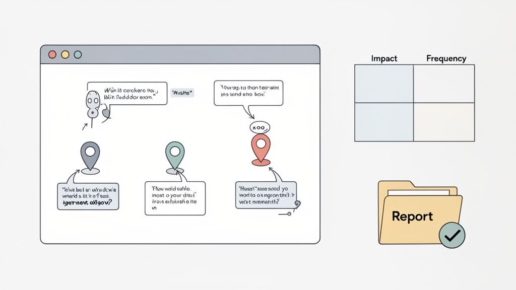
The first thing you need to do is synthesis. This just means bringing all your feedback—session recordings, survey answers, visual comments—into one central place. The goal here is to spot the recurring patterns that are tripping up multiple users, not just one-off quirks.
A fantastic and simple technique for this is an affinity diagram. Seriously, it’s powerful. Just write down each piece of feedback on a separate note (I use digital sticky notes, but physical ones work too) and start grouping them by theme.
For instance, you might find several individual notes that say things like:
"I couldn't find the shipping information anywhere."
"Where are the return policies located?"
"I wasn't sure what the final cost with taxes would be."
You can cluster these together under a bigger theme, like "Lack of Clarity in the Checkout Process." This method helps you zoom out and see the forest for the trees, making it way easier to identify the biggest usability hurdles.
Prioritizing Fixes with an Impact-Frequency Matrix
Once you’ve identified your themes, you'll probably have a laundry list of issues that's longer than your arm. You can't fix everything at once, so it's time to prioritize. Some problems are minor annoyances, while others are critical roadblocks that are actively costing you customers.
I’m a big fan of using a simple impact-frequency matrix for this. You just plot each issue on a grid with two axes:
Frequency: How many users ran into this problem?
Impact: How badly did it stop the user from completing their task?
This simple chart makes it crystal clear where to focus your energy. A high-impact, high-frequency issue (like a broken "Add to Cart" button) is obviously a top priority. On the other hand, a low-impact, low-frequency issue (like a typo on the "About Us" page) can probably wait.
The goal isn't to fix every single issue you uncover. It's to strategically address the problems that will deliver the most significant improvement to the overall user experience with the resources you have.
Creating a Compelling and Actionable Report
Your final step is to translate all your hard work into a report that actually gets things done. A good usability report doesn't just list a bunch of problems; it tells a compelling story that persuades stakeholders to take action. Keep it concise, visual, and focused on solutions.
A solid report usually includes:
An Executive Summary: A quick, one-page overview of the key findings and top recommendations. Perfect for busy execs who don't have time for the nitty-gritty.
Methodology: A short section explaining who you tested with and what tasks you had them perform.
Key Findings: A breakdown of the major themes you found, backed up with visual proof like annotated screenshots, quotes, and short video clips.
Prioritized Recommendations: A clear list of proposed fixes, neatly ordered using your impact-frequency matrix.
This kind of structured approach is especially crucial for remote teams. Remember, poor usability costs businesses billions in lost revenue every year. And with mobile traffic now accounting for 65.49% of global visits, clear feedback channels are non-negotiable. I've seen e-commerce sites boost their conversions by up to 200% just by getting rid of ambiguous feedback and fixing the right problems.
The real force multiplier is integrating your feedback tool with project management software like Jira or Notion. With a platform like Beep, for example, a designer can turn a piece of user feedback directly into a task on a Kanban board, assign it to a developer, and track it to completion without ever switching apps. This closes the loop between insight and action, making sure user feedback actually leads to a better website.
If you're looking to build out your own analysis workflow, check out our user testing feedback template to improve your UX insights.
Got Questions About Web Usability Testing?
Once you start running usability tests, you'll notice a few questions pop up over and over again. That's totally normal. Getting these fundamentals down builds your confidence and makes sure every test you run is actually worth the effort. Let's break down some of the most common ones I hear.
How Many Users Do I Really Need to Test?
This is the big one, and the answer almost always surprises people. You don’t need a massive, statistically significant sample size to find the most glaring issues.
In fact, some groundbreaking research showed that testing with just five users is enough to uncover about 85% of the usability problems on your website. Seriously, that's it. After the fifth person, you just start seeing the same frustrations on repeat, and the value you get for your time drops off a cliff.
The goal isn't perfection; it's progress. You want to find the biggest roadblocks quickly, fix them, and then test the next version. Running smaller, iterative tests is way more effective than one giant, expensive one.
What Should I Do if a Participant Is Unhelpful or Quiet?
It happens. Every so often, you’ll get someone who gives one-word answers or just silently clicks through everything without sharing what's on their mind. This is where a good moderator earns their stripes.
If someone goes quiet, you need to gently nudge them to start talking again. Try using open-ended prompts like:
"What's catching your eye on this page right now?"
"Could you walk me through what you're thinking at this moment?"
"What did you expect to happen when you clicked that?"
The trick is to avoid simple "yes" or "no" questions. You want to create a comfortable space where they feel safe sharing their stream of consciousness, not like they're being grilled.
And hey, if a participant is clearly a bad fit or just being difficult, it's perfectly fine to politely end the session early. Thank them, pay them for their time, and move on. Forcing a bad session is a waste of everyone's time and won't give you the insights you need.
How Much Should I Pay Participants for Their Time?
Paying people for their feedback is standard practice—it shows you respect their time and input. How much is fair? It really depends on the session length, how complex the tasks are, and how specific your target audience is.
For a general audience, a good starting point is around $60 per hour. But if you're trying to recruit specialized professionals—say, doctors, engineers, or senior executives—you'll need to open up the wallet. Expect to pay $150 per hour or even higher to make it worth their while.
Think of it this way: a fair incentive attracts high-quality participants who are genuinely engaged and ready to give you thoughtful feedback.
Can We Just Use Internal Employees for Testing?
I get the temptation. It seems fast, easy, and cheap. But testing with your own colleagues is almost always a bad idea for finding real-world usability issues. They simply know too much.
Internal testers are plagued by "expert bias." They already understand your company's lingo, know the product inside and out, and don't think like a first-time user. That insider knowledge completely skews the results and prevents them from getting stuck in the same places a real customer would.
The only time I'd recommend using a colleague is for a quick "pilot test" to make sure your script flows well and the tasks make sense. They should never, ever be a substitute for real, external users.
This is especially critical when it comes to performance. We know that 40% of users will ditch a site if it takes more than three seconds to load. Your team might be used to a little lag here and there, but a real customer will find it infuriating. Discover more insights about user performance expectations and you'll see why that outside perspective is so essential.
Ready to transform your feedback process and build better web experiences? With Beep, you can gather clear, contextual feedback directly on your live site, eliminating confusion and accelerating your entire workflow. Get started in under a minute and see how hundreds of teams are shipping projects faster. Visit us at https://www.justbeepit.com.
Comments