
.png)
A Practical Guide to Your First Web Site Usability Test
- shems sheikh
- Dec 21, 2025
- 13 min read

Think of a website usability test as looking over someone's shoulder while they use your site for the first time. You’re watching them interact with it in real-time to spot navigation headaches, confusing design choices, and any other little thing that makes them hesitate or get frustrated. It’s all about swapping your own assumptions for cold, hard proof of what actually works for your audience.
Honestly, this kind of direct feedback is the quickest route to a better user experience and, ultimately, hitting your business goals.
Why a Usability Test Is Your Secret Weapon
It’s time to stop guessing what your users want and start knowing. So many teams I've seen operate from an echo chamber of internal assumptions, truly believing they know their website and customers inside and out. This "we know best" attitude is a classic—and costly—mistake.
What seems completely obvious to you, like where a menu is placed or the words on a button, can be a massive source of confusion for a first-time visitor.
A proper usability test slices right through that internal bias. It gives you undeniable proof of how real people experience your platform. I like to think of it like this: looking at your analytics is like looking at a map of a city, but running a usability test is like actually walking its streets. The map shows the intended path, but only by walking it do you discover the cracked sidewalks, confusing signs, and surprise dead ends.
The Real Cost of a Clunky Experience
Those seemingly small frustrations on a website? They snowball into huge business problems. A user who can't find the "add to cart" button doesn't just get a little annoyed—they bounce. A visitor who finds your navigation baffling doesn't just leave—they lose trust in your brand and probably won't be back.
All these little usability hurdles add up to lost sales, a damaged reputation, and a conversion funnel that’s leaking money.
Analytics alone can only tell you what is happening (like a high bounce rate on a product page). But a usability test is the only thing that tells you why. You literally get to hear a user say out loud, "I thought this button would take me to checkout, but it just refreshed the page. That’s confusing." That kind of qualitative insight is pure gold.
"You can't solve a user's problem if you don't understand the 'why' behind their actions. A usability test is your direct line to that understanding, turning vague data points into clear, actionable stories."
Gaining a Competitive Edge
Even with all the obvious benefits, a surprising number of companies still skip this step. It's wild, but only about 55% of companies say they conduct any kind of user experience testing.
And yet, the upside is massive. A well-known Forrester report estimated that every $1 invested in UX can return $100. That’s a staggering 9,900% ROI. You can dig into more UX statistics and trends to see the full picture.
This gap is a massive opportunity for you. By simply listening to your users through a structured website usability test, you can pinpoint and fix the very problems your competitors are blissfully ignoring. You start making decisions based on evidence, not opinions, and that's how you build a smoother, more effective user experience that wins—and keeps—customers.
Planning a Test That Delivers Real Insights
A great usability test is won long before your first participant ever clicks a button. Trust me, success hinges on the planning phase. This is where you turn those vague business goals into a laser-focused research plan that actually gets you answers, not just a pile of opinions.
First things first: you need sharp, specific objectives. Get way past "see if the site is easy to use." That’s too broad. Instead, ask pointed questions. Is there a critical user journey that’s tanking your conversion rates? Are you trying to figure out why people bail on their shopping carts? Or maybe why your newsletter sign-up form is getting zero love?
A test without a clear objective is just a conversation. A test with a focused goal is an investigation that uncovers real evidence.
Crafting Realistic Scenarios and Tasks
Once you know what you need to learn, you can design tasks that will reveal the answers. The trick here is to create user scenarios that feel real—mimicking actual motivations and situations. You have to avoid generic or leading prompts at all costs.
For example, don't just tell a participant, "Find our pricing page." That's a scavenger hunt, not a test.
Instead, frame it with a real-world scenario: "Imagine you're a small business owner looking at our software. You need to figure out how much the 'Pro' plan would cost your team of five people for a full year." This tiny shift encourages natural exploration and shows you how people really behave.
A single point of confusion can spiral into lost trust and, ultimately, lost sales. It happens faster than you think.
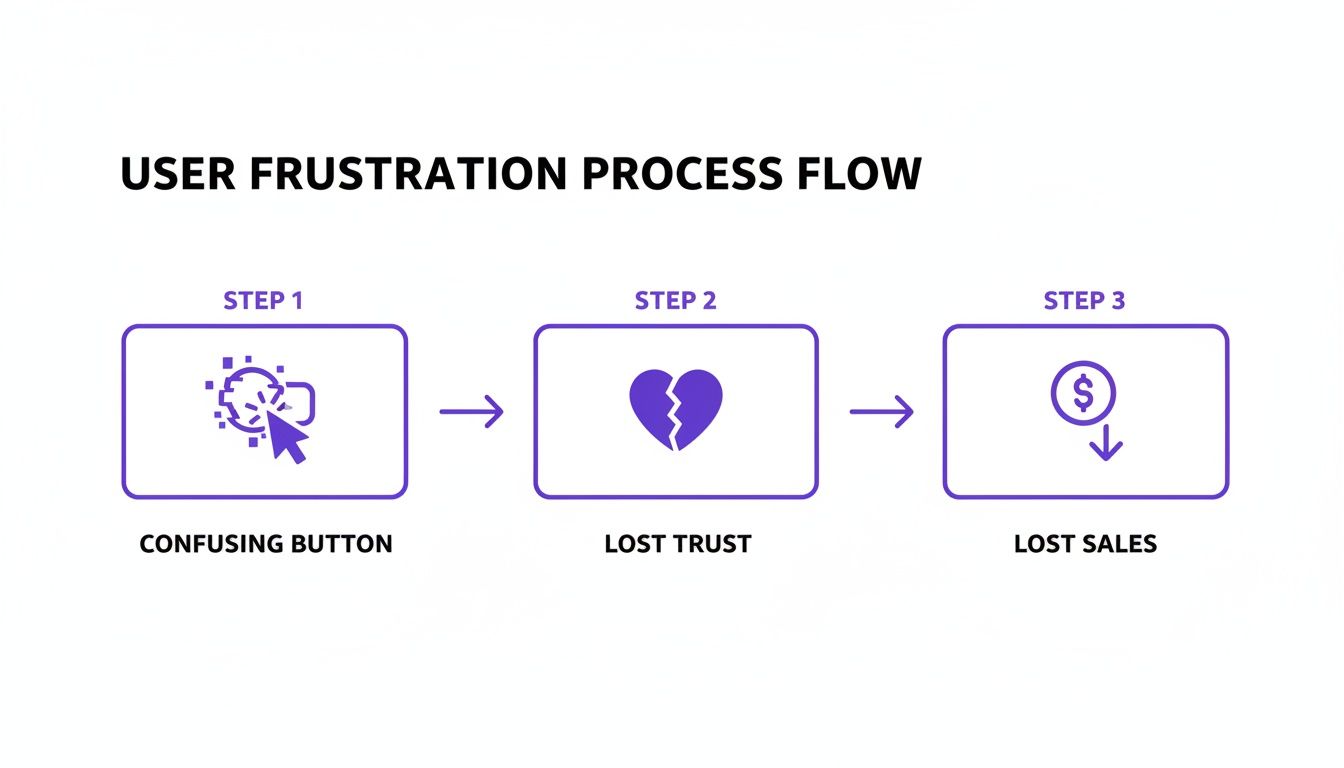
This flow isn't just about convenience; it’s a direct line to your bottom line.
Measuring What Truly Matters
To make any sense of your results, you have to define your success metrics before you start. You'll want a healthy mix of quantitative (the numbers) and qualitative (the why) data to get the full story.
To get a complete picture, you need to track a few key metrics during your usability test. This table breaks down the essentials, blending both hard numbers and user sentiment.
Key Metrics for Your Usability Test
Metric Type | Metric Name | What It Measures |
|---|---|---|
Quantitative | Task Success Rate | A simple yes/no: Did the user complete the task? The most basic measure of effectiveness. |
Quantitative | Time on Task | How long did it take the user? Shorter times often point to a more intuitive workflow. |
Quantitative | Error Rate | How many mistakes did the user make? Pinpoints specific areas of friction or confusion. |
Qualitative | System Usability Scale (SUS) | A standardized 10-question survey providing a reliable score for perceived usability. |
Tracking these metrics gives you a solid framework for analyzing what’s working and what’s not, ensuring your findings are backed by data.
Juggling all this data doesn't have to be a nightmare. Using a solid user testing feedback template can help you capture the most important insights consistently across all your test sessions. It keeps everything organized and makes sure you don't miss a thing.
And remember, usability testing is just one piece of the puzzle. A broader UX audit can add a ton of context and highlight other areas for improvement. If you're new to that, checking out a guide on How To Perform A UX Audit Of Your Website is a great starting point. When you combine direct user observation with a high-level audit, you build a much stronger understanding of your site’s true performance.
Finding the Right People for Your Test
The insights you get from a usability test are only as good as the people you test with. Seriously.
Testing with the wrong group is like asking a professional chef for their opinion on baby food. Their feedback is valid, sure, but it completely misses the point. Your goal here is to find people who actually represent your real-life users.
The quality of your participants directly dictates the quality of your findings. It's that simple.
Where to Find Your Testers
Finding the right users doesn't have to be some massive, expensive project. You've got a few solid options, depending on your budget and how quickly you need to move.
Professional recruiting services are fantastic if you're looking for very specific demographics, but they do come with a price tag.
For a more hands-on (and budget-friendly) approach, you can tap into your own community. Your email list or social media followers can be a goldmine of engaged users who already know your brand. Another great spot to look is in niche online communities, like relevant Reddit subreddits or LinkedIn groups where your ideal users are already hanging out.
Remember, you're looking for representation, not perfection. You don't need professional "testers"; you need real people who would actually use your site.
Writing Effective Screener Questions
Okay, so you've got a pool of potential candidates. Now you need to filter them. This is where screener questions come in—a short survey designed to weed out anyone who doesn't fit your target user profile.
The trick is to ask behavioral questions, not leading ones that people can easily guess the "right" answer to.
For instance, instead of asking, "Do you shop for shoes online?" (who's going to say no to that?), get more specific:
Weak Question: "Are you comfortable using online checkout?"
Strong Question: "In the last six months, how many times have you purchased clothing or shoes from a website?"
This behavioral approach gives you real data about their actual habits. It's also a good idea to toss in some questions to gauge their technical setup (like what device they'll be using) without giving away the exact nature of the test. You don't want to bias their answers before you even start.
How Many Users Do You Really Need?
This is the million-dollar question, and the answer is probably fewer than you think. The Nielsen Norman Group famously discovered that testing with just five users can uncover around 85% of the usability problems on a website.
The goal isn't to find every single flaw in one shot. The real power is in running small, quick, iterative tests.
Test with a small group, fix the most obvious issues you find, and then test again. This cycle of testing and refining is way more effective and affordable than one giant study that just leaves you with an overwhelming to-do list. It ensures your web site usability test delivers value again and again.
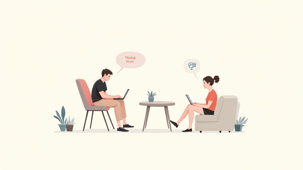
Running a Smooth and Effective Test Session
Alright, this is where all that careful planning pays off. Actually conducting the web site usability test can feel a bit like hosting a talk show. You’ve got to guide the conversation, keep your guest comfortable, and pay razor-sharp attention to every little detail. Your main job as the moderator is to create a space where the participant feels safe enough to give you their honest, unfiltered thoughts.
Kick things off with a relaxed, easy-going tone. Make it crystal clear that you're testing the website, not them, and that there are absolutely no right or wrong answers. A simple reminder that their candid feedback is gold for making things better can be the difference between a quiet, timid user and someone who gives you a running commentary of their entire experience.
A huge part of this is mastering the "think aloud" protocol. You need to actively encourage people to speak their thoughts as they click around. If they go quiet for a bit, a gentle nudge like, "What are you looking at now?" or "What's going through your mind?" can get the ball rolling again without leading them in a specific direction.
This is pretty much what remote moderation looks like in action—clear communication and sharp observation are everything when you're trying to understand the user's journey from afar.
The Art of Observation and Note-Taking
While the user is thinking aloud, your job is to become an expert people-watcher. Don't just listen to what they say; watch what they do. Are they hesitating before clicking a button? Are their eyes darting across the page, hunting for something? These little moments of friction are often where the best insights are hiding.
When you're taking notes, stick to behaviors and direct quotes, not your own interpretations. Instead of writing, "user was confused by the checkout button," jot down, "User said, 'I'm not sure if this button adds to my cart or buys it now.' Paused for 10 seconds before clicking." Trust me, that level of detail is crucial for accurate analysis later.
Your role as a moderator isn't to be a helper—it's to be a neutral observer. Resist the urge to jump in and guide them. The struggle is where you find the insights.
It can feel a little awkward when a user gets completely stuck. Let them struggle for a moment to see how they try to solve the problem on their own. If they're truly at a dead end, you can give them a gentle nudge to get them back on track, but make a big, bold note of where and why the breakdown happened. That’s a high-priority issue to dig into.
If you want to dive deeper into the nuts and bolts of facilitation, check out our guide on how to conduct usability testing with essential techniques.
Choosing Your Testing Environment
Where you conduct the test—remote or in-person—will definitely shape the session. Each has its own vibe and benefits.
Moderated Remote Testing: This is often the sweet spot. Using screen-sharing software, you can watch users in their natural habitat, on their own devices. This gives you a super realistic context and makes it way easier to find participants since geography isn't an issue.
In-Person Testing: This classic method is awesome for picking up on body language and building a strong rapport. It’s especially handy if you're testing physical devices or need to really dig into a user’s emotional reactions.
Unmoderated Remote Testing: When you need to gather quantitative data from a bigger crowd, unmoderated tools are incredibly efficient. Users complete tasks on their own time while software records their screens and clicks. You lose the ability to ask follow-up questions in the moment, but it's a fantastic way to validate findings from smaller, moderated tests.
Ultimately, the right call comes down to your specific research goals and budget. Moderated sessions give you the rich, qualitative "why" behind user actions, while unmoderated tests deliver the broader, quantitative "what."
From Observations to Actionable Changes
So, the sessions are done. You’re looking at a pile of notes, recordings, and a ton of user quotes. This is where the magic happens. It’s time to sift through all that raw data and figure out what it actually means for your website.
The first thing I always do is start grouping things together. Think of it like a detective's corkboard. Every time you spot a distinct user problem or a nugget of insight, jot it down on a virtual sticky note. Then, you start clustering them. You'll quickly see themes emerge like “checkout process is confusing,” “can’t find the contact page,” or “the mobile menu is a nightmare.”
This isn't just about tidying up your notes. It’s about spotting patterns. When three out of your five test participants get stuck on the exact same form field, that’s not a coincidence—that’s a clear signal you’ve got a problem to solve.
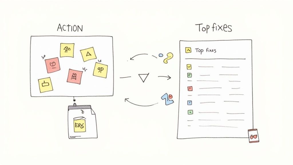
Figuring Out What to Fix First
Let's be real: you can't fix everything at once. Some usability issues are just more important than others, and you need a way to decide what gets tackled first. I find a simple matrix works wonders here. Plot each issue based on two simple things:
Frequency: How many people ran into this problem?
Severity: How badly did this mess up their ability to get something done?
The problems that are both common and severe? Those are your top priorities. For instance, a bug that completely prevented one person from making a purchase (high severity, low frequency) is a much bigger deal than a minor typo that all five users noticed but shrugged off (low severity, high frequency).
Your goal isn't to create a perfect report; it's to create change. Prioritize ruthlessly to focus your team’s energy on fixes that will deliver the biggest impact on the user experience.
Building a Report That People Actually Read
A great report tells a story. It doesn’t just list off problems; it builds a compelling case for why things need to change. Instead of just writing "the navigation is confusing," show it. Pull in a powerful quote from a frustrated user or, even better, a short video clip of someone struggling. That’s the stuff that makes stakeholders sit up and listen.
For every key insight, I make sure my report covers three bases:
The Finding: A quick, clear statement of what went wrong.
The Evidence: The proof. This could be direct quotes, success rates, or screenshots.
The Recommendation: A specific, concrete suggestion for how to fix it.
This approach transforms vague feedback into a clear to-do list for your developers and designers. It's also super important to log these issues properly. Learning https://www.justbeepit.com/post/how-to-write-bug-reports-that-get-fixed-not-ignored is a skill that pays off, ensuring your hard-earned findings actually turn into real improvements.
Finally, with all your data organized, you can start exploring practical tips and strategies to improve website user experience. This makes sure your recommendations are grounded in proven solutions, not just gut feelings. After all, the whole point of a web site usability test is to drive changes that make things better for your users and, ultimately, your business.
Still Have Questions About Usability Testing?
Even after you've run a few tests, some questions just keep popping up. It's totally normal. I've been there, and I've heard the same things from countless teams over the years. Let's clear the air and tackle some of the most common ones so you can head into your next test with confidence.
One of the biggest questions I hear is about timing. Do you need a perfectly polished, fully coded website before you can even think about testing?
Absolutely not. In fact, that’s one of the worst things you can do.
Getting feedback on low-fidelity prototypes or even basic wireframes is one of the smartest moves you can make. It lets you spot huge navigational problems or confusing concepts before a single line of code gets written. Trust me, this will save you an unbelievable amount of time and money down the road.
Isn't Usability Testing Super Expensive?
This is another big one, and it's a total myth. The fear of a massive bill often stops people from testing at all.
Sure, huge, formal studies with professional recruiters can get pricey. But you don't need all that to get powerful insights. I've seen teams uncover game-changing feedback with "guerilla testing"—just informally asking a few people at a coffee shop to try a task on their phone. The cost? A few lattes.
For something a bit more structured, you often just need a simple screen-sharing tool and a small gift card to thank participants for their time. When you think about the cost of building the wrong feature or launching a confusing design, the return on even a tiny testing investment is massive.
Quick clarification: A lot of folks mix up usability testing with user acceptance testing (UAT), but they're completely different beasts. Usability testing is all about how intuitive your design is. UAT is just a final check to confirm the software works and meets the business requirements. They are not the same thing.
Qualitative vs. Quantitative Data: Which One Matters More?
Teams often get hung up on what kind of data they should be collecting. Should you focus on the hard numbers or the fuzzy feelings?
Honestly, you need both. They tell different sides of the same story.
Qualitative Data: This is the "why." It's the rich, juicy stuff you get from watching someone use your site and hearing them think out loud. It’s about understanding their frustrations and "aha!" moments.
Quantitative Data: This is your "what" and "how many." Metrics like task success rates or the time it takes someone to complete a task give you the hard numbers to back up what you're seeing.
Relying on just one gives you a blind spot. For instance, knowing that 70% of users couldn't find the checkout button is a critical piece of data. But hearing them explain why they were looking for it somewhere else is what tells you exactly how to fix it. A blend of both is what leads to real, evidence-based improvements.
Ready to streamline how your team gathers visual feedback during your next usability test? Beep lets you comment directly on any live website, automatically capturing screenshots and organizing feedback into actionable tasks. Cut down on confusion and accelerate your workflow. Get started with Beep for free.
Comments