
.png)
Ultimate Website Accessibility Checklist for Inclusivity
- shems sheikh
- May 19, 2025
- 17 min read

Why Website Accessibility Matters
This Website Accessibility Checklist provides essential guidelines for creating inclusive online experiences. Accessibility ensures everyone, regardless of disability, can use your website effectively. Following this checklist improves usability for all users, expands your audience, boosts SEO, and minimizes legal risks. Learn how to implement key accessibility features, including keyboard navigation, alternative text for images, semantic HTML, color contrast, form accessibility, responsive design, and multimedia accessibility. This checklist also aids in reviewing websites built by developers, especially those using website feedback tools like Beep to identify accessibility issues early on.
1. Keyboard Navigation
Ensuring your website is fully navigable using only a keyboard is a cornerstone of web accessibility. This means users can access all interactive elements, content, and functionality without needing a mouse. This is crucial for people with motor impairments who may have difficulty using a mouse, individuals with visual impairments who rely on screen readers and keyboard navigation, and those who use assistive technologies. Keyboard navigation also benefits power users who prefer the speed and efficiency of keyboard shortcuts, and improves the overall usability of your site for everyone. This fundamental aspect of website accessibility deserves a top spot on any website accessibility checklist.
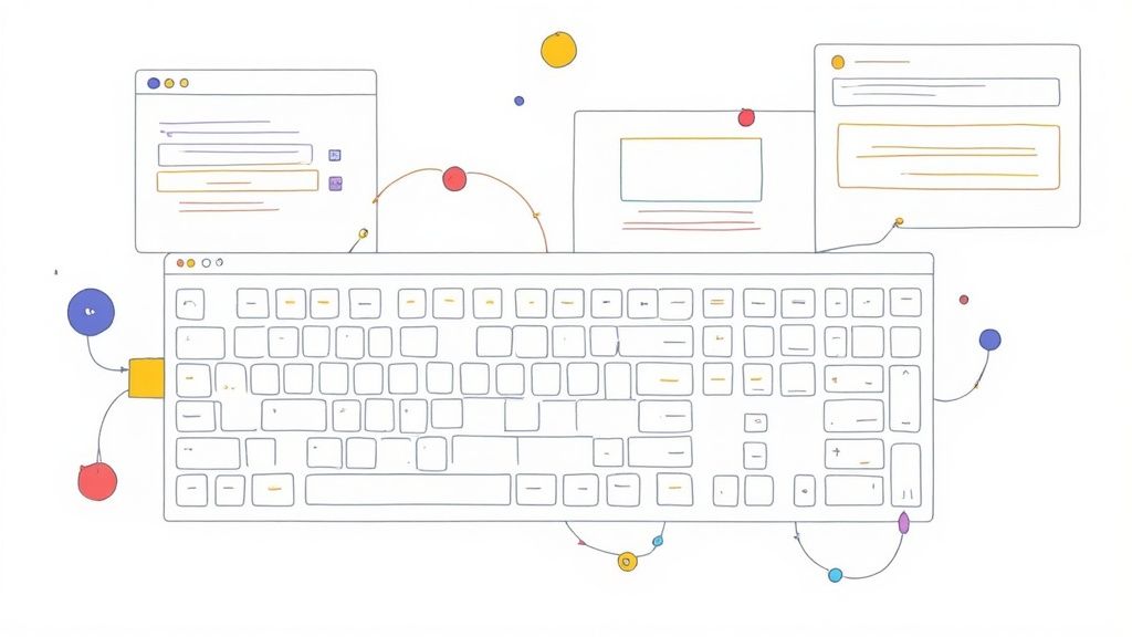
Keyboard navigation relies on several key features: clearly visible focus indicators (a visual cue showing which element currently has keyboard focus), a logical tab order that follows the visual layout of the page, the absence of keyboard traps (where the keyboard focus gets "stuck" on an element and the user cannot navigate away), keyboard access to all interactive elements (buttons, links, form fields, etc.), and the inclusion of skip navigation links (allowing users to bypass repetitive header navigation).
Examples of Successful Implementation:
BBC: The BBC website provides a strong example of robust keyboard navigation, featuring clear focus indicators and skip links to improve accessibility.
GitHub: GitHub's interface allows for complete keyboard navigation, enabling users to browse repositories, navigate code, and perform actions without a mouse.
Pros:
Essential for users with motor impairments: Enables full website usage for those who cannot use a mouse.
Benefits power users: Increases efficiency for those who prefer keyboard shortcuts.
Improves overall site usability: Makes navigation more predictable and efficient for all users.
Relatively straightforward to implement and test: Many aspects can be achieved with standard HTML and minimal extra coding.
Cons:
Can be challenging for complex interactive elements: Implementing keyboard accessibility for custom dropdowns, drag-and-drop interfaces, and other complex elements can require more development effort.
May require significant redesign for existing non-accessible interfaces: Retrofitting existing websites can sometimes necessitate substantial changes to the HTML structure and JavaScript.
Tips for Implementation and Testing:
Unplug your mouse: The simplest and most effective way to test keyboard navigation is to unplug your mouse and attempt to navigate your entire website.
High-contrast focus indicators: Ensure focus indicators are visually distinct and easily noticeable.
Implement skip links: Provide skip links to bypass repetitive navigation sections like headers and footers.
Use tabindex thoughtfully: Use to control the tab order, but avoid positive values unless absolutely necessary, as they can disrupt the natural flow.
Logical tab order: Ensure the tab order follows the visual flow of the page content.
When and Why to Use this Approach:
Keyboard navigation should be considered a mandatory aspect of web development, not an optional feature. Implementing keyboard accessibility is essential for complying with accessibility guidelines (like WCAG) and ensuring your website is inclusive for everyone. It's a foundational element that benefits all users, not just those with disabilities.
2. Alternative Text for Images
Alternative text (alt text) is a fundamental aspect of website accessibility. It provides a textual description of images for users who cannot see them. This includes individuals using screen readers, those with low vision, or users browsing with images disabled or on slow connections. Alt text ensures that the information conveyed by images is accessible to everyone, regardless of their abilities or browsing context. This is critical for a truly inclusive online experience and is a key component of any robust website accessibility checklist.
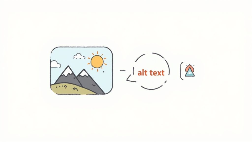
Alt text isn't just about describing what's visually present in an image. It's about conveying the image's purpose and how it contributes to the overall understanding of the page. For meaningful images, the alt text should describe the content and context in a concise and informative manner. For decorative images that add visual flair but don't convey essential information, the alt attribute should be left empty (alt=""). This tells assistive technologies to ignore the image. More complex images, like charts and graphs, require more detailed text alternatives, often provided through longer descriptions linked via the alt text or adjacent to the image. Icons, too, need descriptive alt text that clearly communicates their function (e.g., "Search," "Download PDF," "Edit").
Features:
Descriptive text for meaningful images
Empty alt attributes for decorative images
Text alternatives for complex images (charts, graphs)
Appropriate context and function description for icons
Pros:
Essential for blind and visually impaired users: Makes image content accessible.
Improves SEO: Helps search engines understand image content, contributing to better search rankings.
Provides fallback: Displays when images fail to load.
Relatively simple to implement: Adding alt text is straightforward in HTML.
Cons:
Time-consuming for large sites: Manually adding alt text to numerous images can be tedious.
Requires judgment: Determining the appropriate level of description can be subjective.
Potential for oversight: Alt text can be easily missed during content creation, particularly in content management systems.
Examples of Successful Implementation:
Wikipedia: Known for its detailed and informative image descriptions that provide both content and context.
The Accessible Platform Architectures Working Group (APAWG): Offers comprehensive guidelines on writing effective alt text, serving as a valuable resource for developers and content creators. (While a specific link wasn't provided, searching for "APAWG alt text" will yield relevant results).
Actionable Tips:
Be concise and descriptive: Aim for alt text under 125 characters while conveying the essential information.
Focus on function and purpose: Describe the image's role in the context of the webpage, not just its visual appearance.
Use empty alt attributes for decorative images: prevents screen readers from announcing unnecessary information.
Provide extended descriptions for complex images: Offer supplementary text for charts, graphs, and other visuals requiring more detailed explanation.
Avoid redundant phrases: Don't start alt text with "image of" or "picture of" as screen readers already identify the element as an image.
This attention to alt text is crucial for product managers, UX/UI designers, web developers, and marketing teams to understand and implement. It directly impacts the user experience for a significant portion of the online population and contributes to a more inclusive and accessible web. Therefore, alternative text for images rightfully earns its place on this website accessibility checklist.
3. Semantic HTML Structure
Semantic HTML is a cornerstone of website accessibility. It involves using HTML elements for their intended purpose based on their meaning, not just for their visual presentation. This means choosing elements that accurately reflect the content they contain, such as headings, paragraphs, lists, and tables, rather than relying on generic and elements styled with CSS. Semantic HTML provides a structured foundation that assistive technologies, like screen readers, can use to interpret and navigate the page, creating a more inclusive and user-friendly experience for everyone, particularly individuals with disabilities.

This approach is crucial for website accessibility because it provides a clear document outline that screen readers can follow. Imagine a book without chapter titles, headings, or page numbers – navigating it would be incredibly difficult. Similarly, a website lacking semantic structure presents a significant challenge for users relying on assistive technologies. By using semantic HTML, you create a logical hierarchy and meaningful relationships within the content, enabling screen readers to convey the structure and meaning of the page effectively. This makes it easier for users to understand the content, navigate through sections, and interact with interactive elements.
Features of semantic HTML include a proper heading hierarchy (using to tags in the correct order), semantic landmark regions (such as , , , , and ), correct usage of lists (, , ), tables (, , , ), and form elements, and the judicious application of ARIA roles and attributes where necessary to enhance accessibility further. A well-structured document built with these elements ensures a meaningful and navigable experience for all.
Examples of successful implementations:
GOV.UK: The UK government website stands as a benchmark for accessible web design, consistently employing semantic HTML for clear and effective communication of government services.
Mozilla Developer Network (MDN) documentation pages: MDN utilizes semantic HTML effectively to structure its extensive documentation, making it easily navigable and understandable for developers of all levels.
Pros:
Improved screen reader navigation: Clear document structure enhances screen reader users' experience.
SEO benefits: Search engines understand well-structured content, leading to better search engine optimization (SEO).
Maintainable code: Semantic HTML promotes cleaner and more organized code, simplifying future updates and maintenance.
Enhanced user experience: Improved accessibility leads to a better experience for all users, regardless of their abilities or devices.
Cons:
Refactoring existing code: Implementing semantic HTML in older websites might require substantial code changes.
Developer training: Developers need to understand semantic HTML principles to implement them effectively.
Complex UI patterns: Some complex UI elements may require additional ARIA attributes for complete accessibility.
Tips for implementing Semantic HTML:
Use a single element for the main page title.
Structure headings in a logical hierarchy (h1-h6) without skipping levels.
Use HTML5 semantic elements like , , , and .
Implement landmark regions to define key sections of the page.
Check the document outline using accessibility testing tools to ensure proper structure.
Semantic HTML is a fundamental requirement for any website aiming for accessibility. By prioritizing semantic structure, you're not just ticking a box on a checklist; you're building a more inclusive and user-friendly experience for everyone, while also improving SEO and code maintainability. This is why it deserves a prominent place in any website accessibility checklist. It represents a foundational step towards creating a web that is truly usable by all. The work of Steve Faulkner on HTML5 accessibility, and the HTML5 specification itself, have been instrumental in popularizing and solidifying the importance of semantic HTML for accessible web development.
4. Color Contrast Compliance
Color contrast compliance is a critical aspect of website accessibility, ensuring that sufficient contrast exists between text and background colors. This makes content readable for people with low vision, color blindness, or those using screens in bright environments. Proper contrast isn't just about aesthetics; it's fundamental for text readability and the recognition of visual elements like icons and form fields. This is a crucial item in any website accessibility checklist as it directly impacts a significant portion of users.
Color contrast is measured by a ratio. The Web Content Accessibility Guidelines (WCAG) recommend a minimum contrast ratio of 4.5:1 for normal text and 3:1 for large text (18pt+ or 14pt+ bold). Ensuring adequate contrast ratios is vital for clear readability. Features of good color contrast implementation include visible focus indicators (so users know which element is active), avoiding color as the sole means of conveying information (supplement with icons or text), and offering enhanced contrast modes. For a deeper dive into the subject, you can learn more about Color Contrast Compliance.
Pros of Implementing Proper Color Contrast:
Improved Readability for Users with Visual Impairments: This is the primary benefit, making content accessible to a wider audience.
Enhanced Usability in Varied Lighting Conditions: Whether a user is in bright sunlight or a dimly lit room, good contrast ensures readability.
Benefits All Users: Even users without visual impairments benefit from improved readability, especially older adults.
Easy Testing: Automated tools simplify the process of checking contrast ratios.
Cons of Implementing Proper Color Contrast:
Potential Conflict with Brand Colors: Existing brand colors may not meet accessibility guidelines, requiring adjustments.
Balancing Aesthetics with Accessibility: Finding the right balance between visual appeal and accessibility can be challenging.
Ongoing Vigilance: Contrast needs to be checked and maintained during design updates and content additions.
Examples of Successful Implementation:
Apple's Accessibility Guidelines: Apple provides comprehensive guidelines for contrast implementation across its products and websites, serving as a strong example for developers.
The Smithsonian Websites: The Smithsonian Institution maintains high contrast text across its digital properties, showcasing a commitment to accessibility.
Actionable Tips for Implementing Color Contrast Compliance:
Utilize Contrast Checking Tools: Tools like WebAIM's Contrast Checker or the Colour Contrast Analyser are invaluable for quickly evaluating color combinations.
Test in Grayscale: Viewing designs in grayscale can help identify potential contrast issues early in the design process.
Offer High Contrast Modes: Provide users with the option to switch to a high contrast version of the website.
Avoid Light Gray on White: This is a common contrast error that severely impacts readability.
Consider Text Over Images: Use overlays, outlines, or drop shadows to ensure sufficient contrast between text and background images.
By prioritizing color contrast compliance as part of your website accessibility checklist, you're not only adhering to best practices but also creating a more inclusive and user-friendly experience for everyone. This is a critical consideration for product managers, UX/UI designers, web developers, marketing teams, and remote teams alike, ensuring a website that reaches and engages the broadest possible audience.
5. Form Accessibility
Form accessibility is a crucial aspect of website accessibility checklist, ensuring that all users, including those with disabilities, can easily understand, navigate, and interact with web forms. This involves designing and implementing forms that are compatible with various assistive technologies, such as screen readers, and different input methods, like keyboard navigation. A website with accessible forms provides a more inclusive and user-friendly experience for everyone. This is particularly important for Product Managers, UX/UI Designers, and Web Developers striving to create websites that cater to a diverse audience, including users with disabilities. Marketing Teams and Remote Teams also benefit from accessible forms, as they broaden reach and improve overall user engagement.
How Form Accessibility Works:
Accessible forms rely on several key features:
Properly Associated Labels: Every form control (input field, checkbox, radio button, etc.) must have a clearly associated label using the element and the and attributes. This connection is essential for screen readers to convey the purpose of each field to the user.
Clear Error Identification and Suggestions: Error messages should be descriptive, informative, and easily identifiable. They should clearly indicate the problem and suggest how to correct it. Presenting errors at both the form level and the specific field level enhances clarity.
Logical Tab Order and Keyboard Accessibility: Users navigating with a keyboard should be able to tab through the form fields in a logical and predictable order. All interactive elements must be reachable and operable using only the keyboard.
No Time Limits or Adjustable Timing: Avoid imposing time limits on form completion, as this can create unnecessary pressure and exclude users who require more time. If time limits are unavoidable, provide options to extend them.
Input Assistance and Validation: Features like auto-completion, input suggestions, and real-time validation can greatly improve the user experience and reduce errors.
Examples of Successful Implementation:
Several organizations provide excellent examples of accessible forms:
Gov.UK's accessible form patterns and design system: Offers comprehensive guidance and practical examples for creating accessible forms.
Deque University's accessible form examples: Provides a range of interactive examples demonstrating accessible form techniques.
The IRS's tax filing forms with comprehensive accessibility features: Showcases how complex forms can be made accessible for a wide audience.
Pros of Accessible Forms:
Increases form completion rates for all users: Improved usability benefits everyone, leading to higher conversion rates.
Essential for users relying on screen readers: Makes forms usable for people with visual impairments.
Improves overall user experience: Creates a more intuitive and user-friendly experience for everyone.
Reduces form submission errors: Clear instructions and validation help prevent mistakes.
Cons of Implementing Accessible Forms:
Can require significant development time for complex forms: Retrofitting existing forms or building complex accessible forms from scratch can be time-consuming.
May need custom implementations for special input types: Some specialized input types may require custom accessibility solutions.
Requires careful testing across assistive technologies: Thorough testing with different screen readers and other assistive technologies is crucial.
Tips for Creating Accessible Forms:
Always use elements properly associated with inputs.
Group related form controls with and .
Provide clear error messages at the form level and field level.
Use appropriate input types (email, tel, etc.).
Test forms with keyboard-only navigation and with screen readers.
Allow users to recover from errors easily.
Learn more about Form Accessibility (Note: While the linked article discusses usability testing, which is a related topic and beneficial to form accessibility, a more specific link to form accessibility would be ideal if available.)
Form accessibility deserves its place in the website accessibility checklist because it is fundamental to ensuring an inclusive online experience. By following these guidelines and examples, you can create forms that are usable and accessible to everyone, contributing to a more equitable and user-friendly web.
6. Responsive Design and Text Resizing
Responsive design and text resizing are crucial aspects of website accessibility. This technique involves creating websites that adapt seamlessly to different screen sizes, orientations, and user preferences for text size. This ensures content remains accessible and usable regardless of the device being used (desktop, laptop, tablet, smartphone) or the user's individual needs, such as those with visual impairments requiring enlarged text. This item deserves a prominent place in any website accessibility checklist because it directly addresses a core principle of accessibility: making content perceivable and operable by everyone.
How it Works:
Responsive design leverages CSS techniques like media queries, flexible grids, and relative units to adjust the layout and content presentation based on the viewport dimensions. Text resizing allows users to increase or decrease the font size without breaking the layout or functionality of the website. When these two concepts work in harmony, users have a consistent and comfortable experience regardless of their device or visual acuity.
Features of Effective Responsive Design and Text Resizing:
Scalable Text: Text can be resized up to 200% without any loss of content or functionality. This means no text clipping, overlapping elements, or horizontal scrolling should occur.
Adaptive Layouts: Flexible layouts adapt to different viewport sizes, reflowing content to fit the available screen space.
Mobile-Friendly Interactions: Touch-friendly target sizes (at least 44x44 pixels) are essential for mobile users to easily interact with buttons, links, and other interactive elements.
Adjustable Text Spacing: Users should be able to adjust text spacing (letter-spacing, word-spacing, line-height) without breaking the layout, further enhancing readability.
Pros:
Improved Accessibility: Accommodates users who need larger text due to visual impairments.
Enhanced Usability: Ensures a positive user experience across a wide range of devices and screen sizes.
Better Readability: Improves readability for all users, not just those with disabilities.
Future-Proofing: Designs are prepared for future devices and evolving screen sizes.
Cons:
Development Effort: Implementing robust responsive design can require significant design and development effort.
Layout Complexity: Maintaining responsiveness with complex content and layouts can be challenging.
Comprehensive Testing: Thorough testing across various devices and browsers is crucial to ensure consistent functionality.
Examples of Successful Implementation:
The Washington Post: Their news site features robust text resizing capabilities alongside a responsive design.
Medium: Their clean and minimalist design maintains readability at various text sizes and across different devices.
Actionable Tips:
Use Relative Units: Employ relative units like , , and percentages for font sizes, margins, and padding instead of fixed pixel values.
Zoom Testing: Regularly test your website with text zoomed to 200% in different browsers to identify potential issues.
Content-Based Breakpoints: Implement responsive breakpoints based on content needs and layout changes, not just specific device sizes.
Adequate Touch Targets: Ensure touch targets are at least 44x44 pixels for mobile usability.
Flexible Text Spacing: Allow users to adjust text spacing without disrupting the layout.
Modern CSS Layout: Utilize CSS Grid and Flexbox for creating flexible and responsive layouts.
When and Why to Use This Approach:
Responsive design and text resizing are essential for any modern website. They are not optional extras, but fundamental components of creating an inclusive and user-friendly online experience. By prioritizing these techniques, you ensure that your website is accessible to the widest possible audience.
Learn more about Responsive Design and Text Resizing This resource can provide valuable insights into testing your website across various devices.
Popularized By:
The concept of responsive web design was popularized by Ethan Marcotte, and frameworks like Bootstrap have greatly simplified its implementation. These resources are invaluable for anyone looking to delve deeper into responsive design principles and techniques.
7. Multimedia Accessibility
Multimedia content, such as videos and audio recordings, can significantly enhance a website's engagement and convey complex information effectively. However, if not implemented with accessibility in mind, multimedia can create barriers for users with disabilities, particularly those with hearing or visual impairments. Addressing multimedia accessibility is a crucial part of any comprehensive website accessibility checklist. This ensures that all users can perceive and understand your content, regardless of their abilities.
This involves ensuring that audio and video content is accessible through features like captions, transcripts, audio descriptions, and accessible media players. This makes multimedia content perceivable to all users, regardless of disabilities.
How it Works:
Multimedia accessibility relies on providing alternative ways to access the information conveyed through audio and visual channels. For video content, this means:
Accurate Closed Captions: These provide a text equivalent of spoken words and other important audio cues, such as music or sound effects, synchronized with the video. They are crucial for users who are deaf or hard of hearing.
Audio Descriptions: These narrate the important visual elements of a video, such as actions, body language, scene changes, and on-screen text, for users who are blind or have low vision.
Accessible Media Players: These players provide keyboard navigation and other accessibility features, allowing users to control playback without a mouse.
For audio content, accessibility means providing:
Descriptive Transcripts: These go beyond verbatim transcriptions by including descriptions of any non-speech sounds, speaker identification, and other contextual information.
Examples of Successful Implementation:
YouTube: Offers both automatic and manual captioning systems, allowing creators to add and edit captions for their videos.
Netflix: Provides comprehensive closed captioning and audio descriptions for a vast library of content, making their platform accessible to a wide audience.
TED Talks: Offers high-quality transcripts and translations for their talks, increasing accessibility and searchability.
Why Multimedia Accessibility Matters:
Including multimedia accessibility in your website accessibility checklist is essential for several reasons:
Inclusivity: It ensures that individuals with hearing or visual impairments can fully engage with your content.
Improved User Experience: It benefits users in noisy environments or those who prefer to consume content without audio.
SEO Benefits: Transcripts and captions improve content searchability and indexing by search engines.
Global Reach: Captions and transcripts can be translated, making your content accessible to a wider international audience.
Pros and Cons:
Pros:
Makes content accessible to deaf and hard of hearing users.
Benefits users in noisy environments or those who can't use audio.
Improves content searchability and SEO.
Helps non-native language speakers understand content.
Cons:
Can be time-consuming and costly to implement properly.
Requires ongoing maintenance as content updates.
May require specialized skills for quality captioning and descriptions.
Actionable Tips for Implementation:
Caption Videos Accurately: Include speaker identification and relevant non-speech sounds.
Provide Descriptive Transcripts: Include all audio and visual information.
Use Media Players with Keyboard-Accessible Controls: Ensure users can control playback without a mouse.
Include Audio Descriptions for Important Visual Information: Describe actions, scene changes, and on-screen text.
Avoid Auto-playing Content: Or provide clear and easy-to-use controls to stop playback.
Consider Using Platforms with Built-in Accessibility Features: Leverage existing tools and services to simplify the implementation process.
By following these guidelines and prioritizing multimedia accessibility, you can create a more inclusive and engaging online experience for everyone. This commitment to accessibility not only demonstrates social responsibility but also broadens your audience and strengthens your website's overall effectiveness.
Website Accessibility 7-Point Checklist Comparison
Accessibility Feature | Implementation Complexity 🔄 | Resource Requirements ⚡ | Expected Outcomes 📊 | Ideal Use Cases 💡 | Key Advantages ⭐ |
|---|---|---|---|---|---|
Keyboard Navigation | Medium - straightforward but tricky for complex elements | Moderate - development and testing needed | Improved site usability and accessibility for motor-impaired users | Sites with interactive content needing keyboard control | Essential for motor impairments, enhances power user efficiency |
Alternative Text for Images | Low - simple to add but time-consuming for many images | Low - mainly content creation effort | Access to image content for visually impaired users and better SEO | Image-heavy sites, content requiring descriptive media | Essential for screen reader users, improves SEO and fallback |
Semantic HTML Structure | Medium to High - may require refactoring and training | Moderate - developer knowledge needed | Better screen reader navigation and SEO, cleaner code | Content-rich sites needing structured navigation | Improves accessibility and maintainability, SEO benefits |
Color Contrast Compliance | Low to Medium - design adjustments required | Low - can be automated with tools | Readable content for low vision and colorblind users | Any visual content needing improved readability | Enhances readability and usability, simple to test |
Form Accessibility | Medium to High - careful labeling and error handling | Moderate to High - testing across assistive tech required | Increased form completion, fewer errors, better UX | Any site with user input forms | Essential for screen readers, improves error recovery |
Responsive Design and Text Resizing | High - significant design and testing effort | High - cross-device testing and flexible coding | Usability across devices, accessible enlarged text | Multi-device sites, users with visual impairments | Future-proofs design, enhances readability and usability |
Multimedia Accessibility | High - captioning, transcripts, and descriptions needed | High - ongoing content updates and specialized skills | Accessible audio/video for deaf, hard of hearing, and others | Video/audio content sites, educational and media platforms | Critical for diverse users, improves SEO and engagement |
Start Building a More Accessible Web Today
This website accessibility checklist provides a crucial foundation for creating inclusive online experiences. From ensuring seamless keyboard navigation and providing alternative text for images to adhering to color contrast compliance and building accessible forms, each item plays a vital role. Remember the importance of semantic HTML structure for assistive technologies and responsive design for users on various devices. Don't forget multimedia accessibility with captions and transcripts, making audio and video content accessible to everyone. Mastering these concepts is not just about checking boxes; it's about building a web that welcomes and empowers all users.
For developers, integrating accessibility checks into your workflow is crucial. Platforms like GitHub offer powerful tools and integrations to streamline this process. Resources like 7 Pro Tips for Checklist Markdown GitHub Mastery from Pull Checklist offer valuable insights into optimizing your workflow, including using checklist markdown on GitHub for efficient accessibility tracking. By incorporating these practices early in the development lifecycle, you can avoid costly retrofits and build accessibility into the core of your projects.
By addressing these seven key areas, you contribute to a more equitable and user-friendly digital world. The impact extends beyond individual users, benefiting businesses by expanding their reach and fostering a positive brand image. Accessibility isn't a one-time fix, but an ongoing commitment. Regular audits and updates are essential to maintaining an inclusive online presence. Start making a difference today – create websites that everyone can enjoy. Ready to streamline your accessibility efforts and ensure your website meets the highest standards? Explore Beep, a tool designed to gather visual feedback on websites and assist with website accessibility reviews.
Comments