
.png)
Usability Testing for Website A Practical UX Improvement Guide
- shems sheikh
- Jan 31
- 17 min read

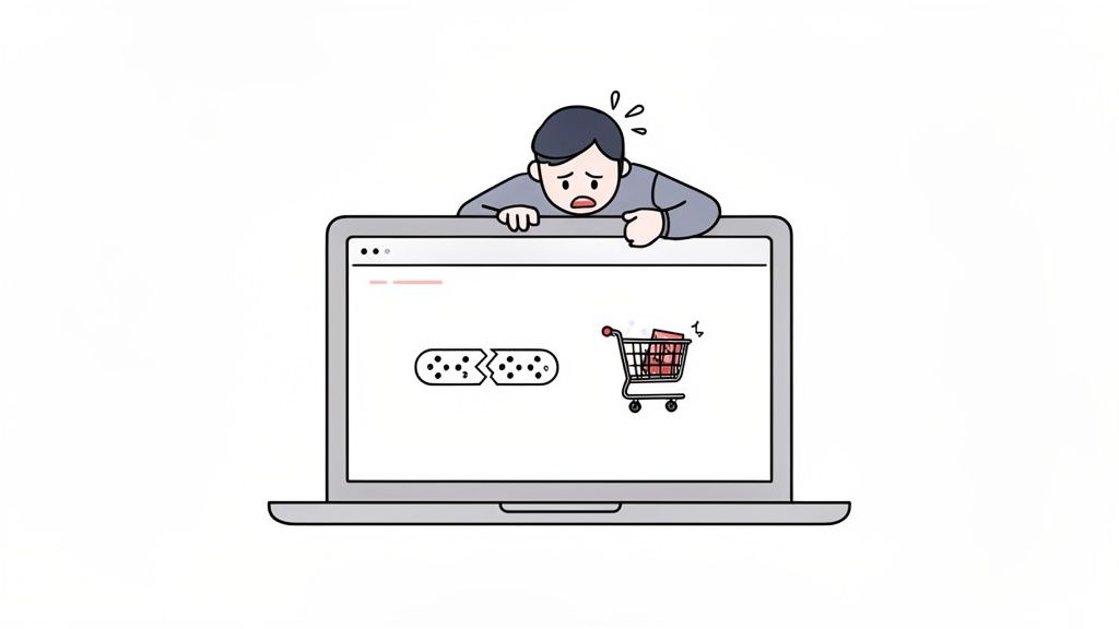
Ever get that sinking feeling when you launch a beautifully designed website, only to watch the bounce rate climb and shopping carts get abandoned? It’s a story I’ve heard (and lived) a thousand times. The culprit is almost always a gap between how your team thinks the site works and how real people actually try to use it.
We get so close to our own projects that we build what makes sense to us, completely forgetting that we aren't the end-user. That's when the trouble starts.
Why Most Websites Secretly Frustrate Their Users
This blind spot is where usability problems love to hide. Think of them as invisible hurdles—confusing navigation, vague button labels, or a clunky checkout process—that create friction and send visitors packing. Unless you're watching people use your site, these issues stay buried, leading to expensive development rework and a ton of missed opportunities.
The Real Cost of Untested Assumptions
Flying blind with user experience isn't just a design misstep; it's a massive business risk. Every point of friction is a potential lost sale or a user who vows never to return. You'd be surprised how common this is. In fact, only 55% of companies are doing any kind of online usability testing at all. That means nearly half are making critical decisions based on pure guesswork instead of solid user evidence. If you're curious, you can explore the full research on usability testing statistics to see just how big the problem is.
Usability testing isn’t about finding someone to blame for a bad design. It’s about collaboratively finding opportunities to make the user’s life easier, which in turn helps the business succeed.
Watching even a handful of users interact with your site can uncover game-changing insights. It’s the key to understanding the "why" behind what your analytics data is telling you, leading directly to happier users and healthier business outcomes.
More Than Just Bug Hunting
Let's get one thing straight: usability testing is not the same as Quality Assurance (QA). While QA is crucial for technical checks—does the button work?—usability testing answers a much more human question—can the user find and understand the button in the first place?
Running even simple usability tests for your website helps you:
Boost Conversions: By smoothing out the bumps in critical journeys, like signing up for a trial or completing a purchase.
Reduce Development Costs: Catching a design flaw early on is exponentially cheaper than fixing it after it’s been fully coded and launched.
Build User Loyalty: An intuitive, frustration-free experience is what makes people want to come back again and again.
And the best part? You don't need a huge budget or a fancy lab to get started. The core principle is beautifully simple: watch, listen, and learn.
Planning Your Usability Test to Get Actionable Insights
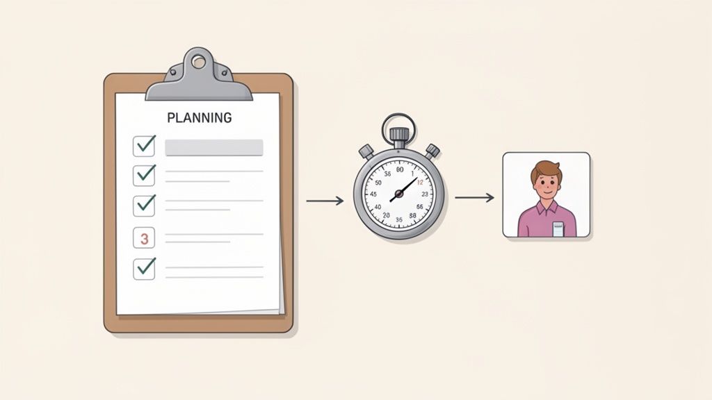
Let's be honest, a usability test is won or lost long before you ever sit down with your first participant. I’ve seen teams jump into testing too quickly, and they always end up with a pile of vague feedback that’s interesting but totally useless for making real improvements. You can't just "see what users think." You have to go in with a rock-solid plan.
The key is moving from a fuzzy worry to a focused, measurable investigation. This all starts with a sharp, specific goal. Vague objectives like "see if the homepage is user-friendly" will only get you vague answers. You've got to frame it as a question you can actually test.
For example, instead of a goal like "improve the checkout process," a much stronger objective is: "Can a first-time user add an item to their cart and complete a purchase in under 90 seconds without help?" Now we're talking. This gives you a clear pass/fail scenario and a specific metric to track.
Setting Clear Objectives and User Scenarios
Once you've nailed down your core objectives, you need to translate them into realistic user scenarios and tasks. These aren't just a list of instructions; they're mini-stories that give the user real context and a goal that feels like something they'd actually do. A weak task is just a command, like "Click on the 'Products' menu." That tells you nothing.
A strong scenario, on the other hand, provides a backstory. Try something like this: "Imagine your old running shoes are totally worn out and you're looking for a new pair. You just landed on our homepage. Show me how you would find and buy a pair of men's size 10 running shoes." This approach encourages natural exploration, not just robotic box-ticking.
A well-crafted scenario doesn't lead the user. It sets a stage and lets their natural behavior tell the story, revealing the true usability of your website.
To come up with effective scenarios, think about the main jobs your users are trying to get done. Are they hunting for information? Comparing products? Trying to manage their account? Each of these core needs is a goldmine for powerful testing scenarios.
Choosing the Right Metrics to Measure Success
With your objectives and scenarios locked in, you need to decide what you'll actually measure. Metrics are what give your qualitative observations a quantitative backbone, turning subjective feedback into hard data that your team can't argue with.
Here are the metrics I always keep an eye on:
Task Completion Rate: This is the big one. Did the user actually complete the task? A simple yes or no.
Error Rate: How many times did the user slip up, like clicking the wrong link or entering data in the wrong format? This helps you pinpoint exact moments of friction.
Time on Task: How long did it take them? This is super useful for benchmarking improvements over time—you can literally prove your redesign is faster.
System Usability Scale (SUS): This is a go-to for a reason. It's a simple, 10-question survey you give after the test to gauge a user's overall feeling about the site's ease of use. The average score is 68, which gives you a solid benchmark to aim for.
Combining these metrics is where the magic happens. You might find that everyone completes a task (100% completion rate), but it takes them five minutes and they make a ton of errors along the way. That’s a huge red flag for a frustrating experience, even if they eventually succeeded. This is the kind of insight a strong plan uncovers. It shows you that while a path exists, it's a rocky one, giving your team a clear target for improvement.
Look, the insights you get from a usability test are only as good as the people you test with. It’s a simple truth I’ve seen play out time and time again.
If you test with the wrong crowd—like asking your internal marketing team to poke around a developer-focused API site—you’ll get feedback that’s not just unhelpful, but flat-out misleading. You'll end up chasing phantom problems and wasting a ton of time.
Finding participants who are a dead ringer for your actual users is the absolute cornerstone of a good study. You don't need a massive budget for this, just a smart way of reaching the right people where they already hang out.
How to Actually Find Good Participants
You've got a few paths you can take here, each with its own perks. A lot of teams jump straight to thinking about expensive recruiting agencies, but honestly, the best people are often closer than you think.
Your own audience is a goldmine. Seriously. Tapping into your customer email list or pinging your social media followers can land you some highly relevant folks who are already invested in what you do. It’s cheap, and it connects you with people who have real-world context for your product.
But if you need to cast a wider net or just want some fresh eyes, here are a few other solid options:
Specialized Recruiting Platforms: Services like UserTesting, UserZoom, or Respondent have massive panels of people ready to go. You can filter by demographics, job titles, and even technical skills to find your perfect match pretty quickly.
Social and Pro Networks: A well-worded post on LinkedIn or in a niche Facebook group can work wonders. For instance, if you’re testing a new feature for project managers, dropping a post in a PM group is a direct line to the right kind of attention.
Your Personal Network (But Be Careful): Asking friends or family is fine for a quick, informal "friends and family" round. Just remember they come with a built-in bias. They know you, and they probably won't want to hurt your feelings, so they might hold back on the critical feedback you really need. Use this one for early-stage stuff only.
Writing Screener Questions That Don't Suck
So you've got a pool of potential testers. Now you need to weed out the wrong ones. This is where screener questions come in. Think of a good screener as your study's bouncer—it only lets the right people in.
The trick is to ask questions about behaviors and situations, not just simple yes/no stuff. Instead of asking, "Are you a small business owner?" (which is super easy to lie about), try something more specific like, "Which of the following best describes how you've managed your business finances in the last six months?" This makes them think and gives you a much more honest answer.
A well-designed screener doesn't just check a demographic box; it confirms that someone has the right experience. It’s your first and best line of defense against bad data that could send your whole usability testing effort off the rails.
So, How Many Users Do You Really Need?
This is the million-dollar question, but the answer is surprisingly straightforward. For most qualitative usability tests—where you're looking for problems—you don't need a huge group.
The legendary usability expert Jakob Nielsen famously showed that testing with just five users will uncover about 85% of the usability problems on a website.
The logic is pretty simple: your first couple of users will stumble over the most obvious, glaring issues. After that, you'll start seeing the same problems pop up again and again. You get diminishing returns. It's way more effective to run a small test with five users, fix the stuff you find, and then test the new version with another five. This iterative loop is so much more agile and impactful than one giant, expensive study.
Of course, if you're trying to get statistically significant quantitative data—like comparing two designs to see which one performs 15% better—then yes, you’ll need a much larger sample size. But for the core goal of finding and fixing what frustrates your users? Five is the magic number.
Running Your Test: Moderated vs. Unmoderated Methods
You've got your plan and your participants are lined up. Now for the main event—actually running the usability test. This is where you finally get to see your website through a fresh pair of eyes.
Your approach will boil down to two main choices: moderated or unmoderated. Picking the right one is a huge deal because it dictates the kind of feedback you'll get. Are you trying to uncover the "why" behind what users are doing? Or do you just need hard numbers from a big group on a tight budget? Let’s get into the weeds of each method.
The Art of Moderated Usability Testing
Think of moderated testing as having a co-pilot. You're right there with the user, either in the same room or on a video call, watching them go through the tasks live. This is my go-to method when I need deep, qualitative insights because it’s a real conversation.
The secret to a great moderated session is getting the user to think aloud. You want a constant stream of their thoughts, frustrations, and "aha!" moments as they click around. A simple prompt like, "Just talk me through what's going through your head right now," works wonders.
Your role as the moderator is to be a neutral observer, not a helpful guide. It's so tough, but you absolutely have to resist the urge to jump in and say, "Oh, the button you need is right over there!"
When a user inevitably gets stuck, lean on open-ended questions instead:
"What were you expecting to happen there?"
"If you were looking for that, where would you go first?"
"Tell me more about what you're seeing on this page."
These kinds of questions keep the participant talking without leading them to the answer, which is how you find the real gaps in your design's logic. I've found that the rich, contextual feedback from a single moderated session can be more valuable than a pile of automated test results.
Navigating the World of Unmoderated Testing
Unmoderated testing is the complete opposite—it's a hands-off approach. You give participants a script and a set of tasks, and they complete the test on their own time, usually with software recording their screen and voice.
This method is a lifesaver when you need speed, scale, and a friendly budget. You can collect feedback from people all over the world without scheduling a single meeting.
But here's the catch: you lose that real-time interaction. Since you’re not there to clarify anything, your instructions have to be crystal clear. I once ran a test where a vaguely worded task sent half the participants down a totally wrong path, making their feedback useless. That was a painful lesson in the importance of being precise.
Pro-Tip: Always, always run a quick pilot test with a coworker before you launch a full unmoderated study. A five-minute check can save you from realizing there’s a massive flaw in your instructions after you’ve already blown your budget on ten participants.
When you're writing tasks for an unmoderated test, write them for someone who knows nothing about your project. Ditch the internal jargon and spell everything out. The clearer you are, the better your data will be. If you want to dig deeper, check out our guide on other great user testing methods to refine your UX.
This flowchart maps out the two main paths for finding participants, depending on whether you have an existing user base to tap into.
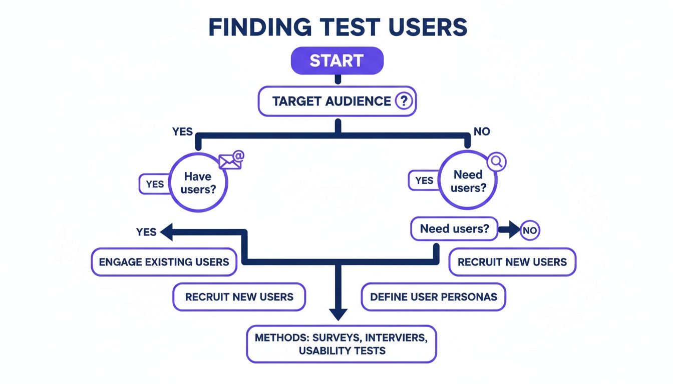
As the visual shows, it all starts with your target audience. From there, you can either reach out to your current users or find new ones through different channels.
Making the Right Choice for Your Project
So, which one is right for you? Honestly, it's not always an either/or situation. A lot of projects benefit from a hybrid approach. You could start with moderated tests to explore big, fuzzy problems and then switch to unmoderated tests to validate your findings with a larger crowd.
To help you decide, here’s a quick rundown of how the two methods stack up.
Moderated vs Unmoderated Usability Testing
Here’s a clear comparison to help you choose the right testing method based on your project needs, budget, and timeline.
Factor | Moderated Testing | Unmoderated Testing |
|---|---|---|
Depth of Insight | High. You can ask follow-up questions and dig into motivations. | Low to Medium. You get what you get; there's no chance for clarification. |
Speed & Scale | Slow. Sessions are scheduled and run one by one. | Fast. You can get data from tons of users at once, often in just a day. |
Cost | Higher. You're paying for a moderator's time and often higher incentives. | Lower. Platforms automate everything, making it cheaper per user. |
Natural Environment | Less natural. Users can feel like they're being watched (the "Hawthorne effect"). | More natural. Users are in their own space, acting more like they normally would. |
Best For | Discovering the "why," testing complex flows, and exploring early-stage ideas. | Benchmarking, A/B testing, and validating simple tasks with a bigger group. |
Ultimately, the best method comes down to what you need to learn. If you're doing a deep dive into a complicated user journey, moderated is your best bet. If you need quick data on a simple task from a broad audience, go with unmoderated.
Turning User Feedback into Concrete Design Fixes
Alright, you've wrapped up your usability tests. You've got a pile of recordings and a mountain of notes. It feels like a win, but let's be real—the hard part is just getting started. Raw data is just noise. The real magic happens when you turn those scattered observations into a clear, actionable game plan your design and dev teams can actually run with. This is part analysis, part storytelling: finding the patterns in the chaos and presenting them in a way that gets people excited to make changes.
First thing I always do is get everything organized. I'll re-watch the session recordings and start pulling out key moments, both the good and the bad. Set up a shared space—a digital whiteboard like Miro or even a simple spreadsheet works great—and just start logging every single observation. Don't even think about themes yet. Just capture it all.
This initial pass is all about detail. "User struggled with the menu" is useless. A much better note is, "User #3 spent 45 seconds hovering over the 'Solutions' menu before finding 'Pricing,' and said out loud, 'I thought pricing would be at the top.'" That's the kind of granular detail you need to spot the real pain points later on.
Finding Themes in the Feedback
Once you've got a long list of individual data points, it's time to start synthesizing. This is where you group related observations into bigger themes. I think of it like sorting puzzle pieces by color before trying to fit them together. This process, often called affinity mapping, is how you go from isolated incidents to seeing the systemic issues plaguing your site.
You'll quickly start to see patterns emerge. Maybe three different users couldn't find the contact info, or four of them paused for a long time before clicking your main call-to-action. Boom, those are your themes.
I find that themes usually fall into a few common buckets:
Navigation Issues: People are literally lost and can't find key pages or figure out the site structure.
Clarity of Content: The labels, headings, or instructions are just plain confusing. Jargon is a common culprit here.
Workflow Friction: A process with multiple steps, like checkout or signup, is clunky or has frustrating, unnecessary steps.
Expectation Mismatches: Something looks clickable but isn't, or a button does something totally unexpected.
The goal isn't just to make a laundry list of problems. It’s to get to the root cause. A theme isn't 'users clicked the wrong button'; it's 'the visual hierarchy of the buttons is misleading, causing users to click the wrong one.'
Benchmarking with Quantitative Data
While all that qualitative feedback tells you why users are struggling, quantitative data tells you how much they're struggling. This is where metrics like the System Usability Scale (SUS) are absolute gold. The SUS is a super quick, 10-question survey that spits out a single score for your site's overall usability.
This score gives you crucial context. The average SUS score, based on thousands of tests, is a 68. Think of it as a C grade—barely passing, and definitely not something to brag about. For some perspective, anything below a 56 is a D, which means you're delivering a frustrating experience. You can learn more about these usability benchmarks and findings to see how your site stacks up.
Prioritizing Fixes for Maximum Impact
After your analysis, you're going to have a long list of things to fix. Let's face it, you can't tackle everything at once. This is where you need to get ruthless with prioritization. Not all usability issues are created equal. A typo on the "About Us" page is an annoyance; a bug that stops people from buying something is a five-alarm fire.
Over the years, I've landed on a simple but incredibly effective framework to prioritize: Severity x Frequency.
Severity: How badly does this problem torpedo a user's ability to complete a key task? I usually rank this as Low, Medium, High, or Critical.
Frequency: How many of your test participants actually ran into this specific issue? (e.g., 1/5, 3/5, 5/5)
A high-severity issue that tripped up every single user (5/5) goes straight to the top of the list. A low-severity issue that only one person even noticed? It can probably wait. This simple grid turns a subjective list of complaints into an objective, evidence-backed roadmap. It gives your team a clear place to start and helps you manage expectations with stakeholders. If you need a solid framework for this, our guide on creating a bug reporting template that actually solves problems can be a great starting point.
From Test Findings to Faster Fixes with Visual Feedback
Alright, you've run your tests and gathered some incredible insights. This is the moment of truth. But let's be honest, those insights are worthless if they just die in a static report, lost in someone's inbox. The real challenge is turning those findings into actual tasks for your dev team without losing all momentum.
This is where things usually fall apart. A finding like “users struggled with the dropdown menu” is way too vague. It’s a one-way ticket to endless clarification meetings, confusing email chains, and a frustrating game of telephone between researchers and developers. That friction can delay critical fixes by weeks.
Pinpointing Problems With Visual Context
This is where modern tools completely change the game. Instead of describing a problem in a document, you can visually pin it directly onto the UI element that’s causing trouble. This simple shift transforms abstract feedback into a precise, actionable ticket.
Imagine a tool that lets you and your team drop comments right on your live website. Each comment automatically grabs a screenshot, browser details, and all the other technical data a developer needs. This is how you completely bridge that communication gap.
Here’s exactly what I mean. A piece of feedback gets attached directly to the dropdown menu that was causing issues.
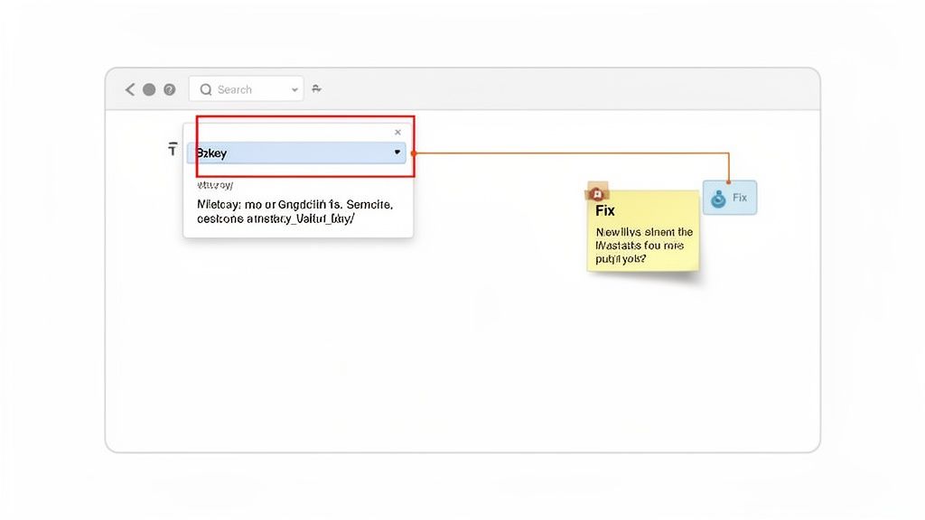
This image nails it. A fuzzy problem becomes a concrete task, complete with visual proof. There’s just no room for misinterpretation when you can show the problem instead of just talking about it.
Integrating Feedback Into Your Workflow
The best visual feedback tools don’t just capture issues; they plug right into your project management workflow. That means a comment left on your site can instantly become a task in the tools your team already uses every day.
Think about how this plays out for a remote team:
A UX researcher spots a confusing button during a moderated test.
Instead of just writing it down, they hop onto the live URL and use a tool like Beep to leave a comment right on the button: “User expected this to say ‘View Demo,’ not ‘Learn More.’”
That comment, with its screenshot, instantly zaps over to the team's Jira or Notion board as a new ticket.
A developer grabs the ticket, sees the exact UI element and the user feedback, and knows immediately what needs to be fixed.
This approach cuts out the middleman entirely. It gives developers everything they need—the visual, the context, and the tech data—all in one neat package. It just kills the ambiguity and speeds up the whole fix cycle.
Ultimately, this seamless flow from finding to fixing is what drives real business results. Pairing effective usability testing with visual feedback is a core part of strategic UX optimization. If you want to dig deeper, you can learn more about how to master UX with a website feedback tool in our detailed guide.
Got Questions About Website Usability Testing?
When teams first dip their toes into usability testing, the same practical questions always seem to surface. I've been there. Let's walk through some of the common hurdles that can feel like roadblocks but are really just small bumps in the road.
What if I Have a Small Budget or No Budget at All?
This is easily the number one concern I hear, but it should never be a showstopper. Seriously. Usability testing for a website doesn't have to drain your bank account. You can kick things off with some "guerilla testing" – just grab a colleague from another department for 15 minutes and watch them use your prototype. Even asking a friend can yield some quick insights (just be careful they don't hold back to spare your feelings!).
For more structured, low-cost approaches, try these:
Tap into your email list: A small gift card or a discount can be a huge motivator for your existing customers. You'd be surprised how many are happy to help out.
Hit up social media: Post in relevant professional groups or on your own company page to find volunteers.
Look for free tools: Many testing platforms have free tiers that are perfect for running a few small, unmoderated tests to get started.
Remember, the goal here is progress, not perfection. A handful of scrappy, low-budget tests are infinitely better than doing no testing at all.
Is Usability Testing Only for Finished Websites?
Absolutely not! In fact, that’s one of the biggest misconceptions out there. Testing before a single line of code is written is one of the smartest moves you can make. You can run usability tests on just about anything, from a rough sketch on a piece of paper to a fully interactive prototype.
Testing early and often is the whole game. Catching a major design flaw on a wireframe is a ten-minute fix. Finding that same issue after the site has been built and launched? That could mean weeks of developer time and thousands of dollars down the drain.
This iterative approach saves a mind-boggling amount of time and money. It’s all about making sure you’re building the right thing from the get-go.
How Does This Fit with Other UX Practices?
Usability testing is a vital piece of a much larger puzzle. To really get the full picture, you need to understand the broader world of User Experience (UX) design. While usability testing hones in on how easy a product is to use, UX design encompasses a user's entire journey—their emotions, their perceptions, and their overall feeling about your product and brand.
I like to think of it like this: good usability is the foundation for a good user experience. You simply can't create a delightful, memorable experience if the site is confusing, broken, or frustrating to use.
Ready to turn your test findings into fast, actionable fixes? With Beep, you can pin feedback directly onto your live website, instantly creating visual tasks for your team. Eliminate confusion, speed up your workflow, and start building better websites today. Get started for free at justbeepit.com.
Comments