
.png)
Your Essential Website Redesign Project Plan
- shems sheikh
- Nov 24, 2025
- 16 min read

A solid website redesign plan doesn't kick off with choosing a color palette or writing a single line of code. Nope. It starts way earlier, with a strategic foundation built on hard data, crystal-clear objectives, and getting everyone in the same room, rowing in the same direction. The very first question you need to answer is why you're even doing this, and what "success" actually looks like in numbers.
Building Your Redesign Foundation
Jumping straight into design without a clear strategy is a surefire way to blow your budget, miss deadlines, and end up with a site that doesn't actually help the business. The bedrock of any good redesign plan is a deep understanding of your current site's performance, setting goals you can actually track, and aligning your whole team. This isn’t just about making a list of things you don't like; it's a deep dive into your analytics and user behavior to find the real pain points.
Think of it like building a house. You wouldn't start ordering couches before you have the blueprints, right? This initial discovery and strategy phase is your blueprint. It makes sure every decision that follows—from the sitemap to the final design flourishes—has a purpose and ladders up to your main goals.
Start with a Comprehensive Website Audit
Before you can build the future, you have to get brutally honest about the present. A real website audit is more than a quick glance at your homepage. It’s an investigation to pinpoint what's working, what's flat-out broken, and where your biggest opportunities are hiding.
To get the full picture, you need to look at a few key areas:
Performance and SEO Audit: Get cozy with tools like Google PageSpeed Insights and Google Search Console. You’re looking for loading times, mobile-friendliness, and any technical SEO gremlins. A slow, clunky site is a dead end for users and a red flag for search engines.
User Experience (UX) Audit: This is where you put on your user's shoes. Use heatmaps and session recordings to see how people actually use your site. Are they clicking where you expect? Bailing on their shopping cart at a specific step? These insights are pure gold.
Content and Conversion Audit: Time to review your content. Is it still relevant? Is it pulling its weight? Figure out which pages are bringing in traffic and conversions and which ones have bounce rates so high they're practically in orbit. This will tell you what to keep, what to kill, and what to create.
Set Clear and Measurable Goals
With your audit done, you can finally move past vague wishes like "we want a more modern look" and set some concrete, measurable goals. This is probably the most important step for tying your redesign to real business results. A goal without a number is just a dream.
Let’s get specific. Ditch the generic aims for KPIs that matter. For example:
Vague Goal: "Improve lead generation."
Specific Goal: "Increase marketing qualified lead (MQL) form submissions by 20% within six months of launch."
Vague Goal: "Make the site easier to use."
Specific Goal: "Decrease the user drop-off rate during the checkout process from 30% to 15%."
Pro Tip: Your redesign goals should be a direct line to your company's bigger objectives. If the business is trying to break into a new market, then a primary website goal has to be creating a killer experience for that new audience.
Align Stakeholders for a Unified Vision
A website redesign touches pretty much every department—marketing, sales, IT, product, and the C-suite. Trust me, they all have their own priorities and opinions. If you don't get these folks aligned from day one, you're signing up for endless scope creep and internal battles down the line.
The best way to handle this? A kickoff workshop. Get everyone in a room to agree on the project’s goals, target audience, and what success will be measured by. This isn’t just another meeting; it’s a strategy session to make sure the final product is a win for the entire company, not just one department's pet project.
This kind of data-driven planning really works. Just look at Staples—after a strategic redesign, they saw an 80% increase in visitors and a 67% spike in repeat customers. There's a reason 73% of businesses invest in design: it's how you stand out and get results. You can find more insights on data-driven redesigns from Crazyegg.
Getting this alignment right from the start ensures your website redesign project plan is built on a shared purpose. It makes every single phase that follows worlds easier and way more effective.
Alright, you've got your strategy hammered out. That's a huge step. But a brilliant plan is just a piece of paper without the right people to bring it to life and a solid timeline to keep everyone on track. This is where we move from the what to the who and when, turning your vision into a concrete roadmap.
Success isn't about just filling seats with generic job titles. It’s about getting the right specialists for your specific goals. I've seen projects go sideways because the team didn't match the mission. For instance, if your site audit flagged a massive cart abandonment problem, you don't just need a "designer"—you need a UX/UI pro who's obsessed with e-commerce and knows exactly how to build a frictionless checkout flow.
It all starts with a clear process: audit what you have, define your goals based on that audit, and then get everyone aligned.
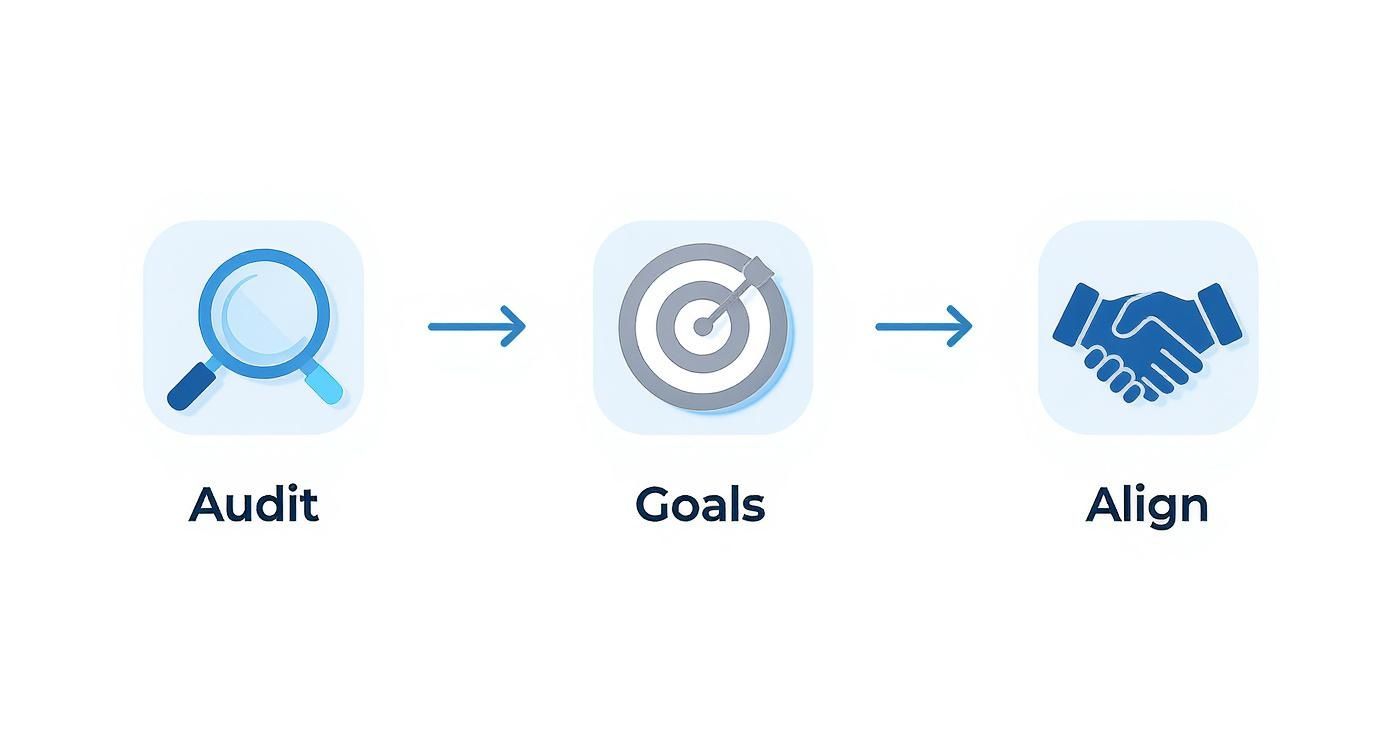
This workflow is critical. A deep audit feeds your goals, which then makes it possible to get genuine stakeholder buy-in before a single wireframe is drawn.
Defining Roles with a RACI Matrix
To keep confusion and bottlenecks out of the picture, you absolutely need a RACI matrix. RACI stands for Responsible, Accountable, Consulted, and Informed, and this simple chart is a lifesaver for clarifying who does what.
Here’s a quick breakdown of what each role means in the real world:
Responsible: These are the doers—the people with their hands on the keyboard. For a task like "Create Homepage Wireframes," your UX Designer is the one responsible.
Accountable: This is the single person who owns the final outcome and has the ultimate say-so. It’s usually the Project Manager. There should only ever be one "A" per task to avoid chaos.
Consulted: Think of these folks as your subject matter experts. Your SEO Specialist, for example, would be consulted on the new site architecture to make sure it's search-friendly.
Informed: These are the people you keep in the loop on progress, but they aren't directly involved. This might be your CEO or the Head of Sales who just needs a high-level update.
A classic mistake I see all the time is packing the "Consulted" column with too many people. This creates a feedback nightmare and can paralyze decision-making. Keep this group lean and focused only on those whose expertise is absolutely essential for that specific task.
Crafting a Realistic Project Timeline
A timeline is what grounds your project in reality. It breaks a massive undertaking down into digestible phases and milestones. To keep things from going off the rails, you need to lean on effective website design project management from day one. This is way more than just picking a launch date and hoping for the best.
Start by mapping out the major phases and giving each one a realistic time block. A typical redesign timeline might look something like this:
Phase | Estimated Duration | Key Milestone |
|---|---|---|
Discovery & Strategy | 2-4 Weeks | Finalized project brief and goals |
UX/UI Design | 4-6 Weeks | Approved high-fidelity mockups |
Content Creation | 4-8 Weeks (overlaps) | All final copy and assets delivered |
Development & SEO | 6-10 Weeks | Staging site ready for QA |
Quality Assurance (QA) | 2-3 Weeks | All critical bugs resolved |
Launch | 1 Week | Go-live and post-launch checks |
This high-level view helps every stakeholder understand the project's flow. But here’s the pro tip: you must build in buffer time. I always recommend adding at least 15-20% to your estimates. This buffer is your safety net for the inevitable hiccups, like a technical snag or a key stakeholder getting sick. It's what keeps a small delay from turning into a full-blown crisis that tanks your entire launch schedule.
This is where the magic really starts to happen. All that strategic groundwork is about to become a real, tangible experience for your users. The design phase is so much more than making things look pretty; it’s about turning a deep understanding of your audience into an interface that just works. We're shifting from data and spreadsheets to a design that people can actually connect with.
It all begins with giving your target audience a face and a story. We take all that rich data we collected during discovery and shape it into user personas. These aren't just vague descriptions. I'm talking about detailed profiles of your ideal customers—giving them names, goals, motivations, and frustrations. So instead of targeting "small business owners," you create "Elena, the E-commerce Entrepreneur," who's sharp and tech-savvy but always short on time and needs to reorder supplies with zero friction.
Once you know who Elena is, you can start mapping out her journey on your new site. A user journey map does just that—it visualizes the exact path she’d take to, say, make a purchase. This simple exercise is a goldmine for spotting potential roadblocks and finding opportunities to make her experience smoother, long before a single line of code gets written. If you really want to nail this, you have to master the UX research process to make sure your personas are built on solid evidence, not just guesswork.
Building the Architectural Blueprint
Before you can even think about paint colors, you need to frame the house. In the world of web design, that frame is your information architecture (IA). It's all about organizing your site’s content so it feels completely logical and intuitive to your users. A solid IA means people can find what they’re looking for without thinking twice, which has a massive impact on satisfaction and conversions. Trust me, a confusing navigation menu is the fastest way to send a potential customer packing.
This work usually results in a sitemap and some low-fidelity wireframes.
Sitemap: This is your site's family tree—a diagram showing the structure and how all the pages connect.
Wireframes: Think of these as basic, black-and-white blueprints. They focus purely on structure, where content goes, and how things work, deliberately leaving out colors and images for now.
By focusing on the structure first, you get stakeholders to agree on the user flow and content hierarchy before they get distracted by fonts and colors. This one move can save you from a world of painful and expensive revisions later on.
Creating an Efficient Feedback Loop
The jump from wireframes to high-fidelity mockups is where so many projects grind to a halt in endless, painful feedback cycles. We've all been there—drowning in emails with vague comments like "make it pop" or "I just don't like this button." It's inefficient and demoralizing. This is exactly where modern collaboration tools prove their worth.
Using a visual feedback platform like Beep lets stakeholders click directly on any part of a design and leave a comment right there. Instead of a messy email chain, you get clear, actionable feedback tied to a specific element. A marketing manager can click on a button and type, "Let's change this copy to 'Get Your Free Trial' to match the new campaign." That kind of clarity is a game-changer for speeding up approvals.
This approach turns feedback from a chaotic mess into a clean, organized to-do list for your designers.
Finalizing Visuals with a Style Guide
Once the core structure is locked in, it's time to bring the visual identity to life. This is where you create high-fidelity mockups that show exactly how the final website will look and feel—we're talking colors, typography, imagery, the works.
But the single most important thing you'll create in this phase is a comprehensive style guide, or even better, a design system. This isn't just a doc with your brand colors. It’s the living, breathing rulebook for your website’s entire visual language. A good style guide defines:
Typography: The specific fonts, sizes, and weights for every heading (H1, H2, H3) and all body text.
Color Palette: Your primary, secondary, and accent colors, complete with their hex codes.
UI Components: The exact design and states (default, hover, active) for buttons, forms, icons, and anything else users interact with.
Imagery Guidelines: Rules for photography, illustrations, and icons to keep everything looking consistent.
Creating this guide is non-negotiable. It’s what guarantees brand consistency on every single page and makes the handoff to developers incredibly smooth, because they have a clear reference for every element they need to build.
Alright, let's get into the nitty-gritty. Your designs are signed off, looking sharp, and now it's time to turn those beautiful pixels into a real, working website. This is where the magic happens, but it's also where a project can easily go off the rails if you're not careful.
The handoff from your design team to the developers is a make-or-break moment. Seriously. Just slinging a Figma file over the wall and hoping for the best is a recipe for disaster. A good handoff is a full package deal: the final style guide, high-fidelity mockups, and—this is key—detailed notes on every interactive element and animation. You need to remove all the guesswork for the dev team. It’ll save you days, maybe even weeks, of painful rework down the line.
To keep things moving and avoid that "are we there yet?" feeling, most dev teams work in sprints. These are short, focused bursts of work, usually lasting one or two weeks, each with a clear set of goals. This approach keeps progress steady and gives everyone regular checkpoints to catch issues before they snowball.
Setting the Stage for a Flawless Build
You wouldn't rehearse a play on opening night, right? Same logic applies here. Before a single line of code touches your live site, it needs a safe place to be built and tested. That's what a staging environment is for—it's a perfect carbon copy of your live server.
Working on a staging site is completely non-negotiable. It's your private sandbox where developers can build features, squash bugs, and let the QA team run wild without any risk to your actual, customer-facing website. Everything gets perfected here before the big reveal.
Don't Let Your SEO Disappear Overnight
One of the scariest—and most common—risks of a redesign is accidentally torpedoing years of hard-earned SEO equity. Two things are absolutely critical to make sure that doesn't happen: migrating your content and setting up 301 redirects.
Content Migration: This is the process of moving all your existing stuff—blog posts, product pages, you name it—from the old site to the new one. You have to be meticulous. Every piece of valuable content needs to be moved over and formatted correctly in its new home.
301 Redirects: If your URLs are changing (and they probably are), you need to set up 301 redirects. Think of them as a permanent "we've moved!" notice for search engines. They pass all the SEO juice from your old page to the new one. If you skip this, search engines see a bunch of broken links, and your rankings will tank. Fast.
A well-documented redirect map is your best friend here. It’s just a simple spreadsheet listing every old URL and its new counterpart. Make this a required deliverable in your project plan. It’s the ultimate safety net for your SEO.
Running the Quality Assurance Gauntlet
Quality Assurance (QA) is so much more than just "bug hunting." It's about making sure the final product is polished, works flawlessly, and actually achieves the goals we set out in the beginning. This needs to be a systematic process, not just random clicking around.
A thorough QA process means testing the site against a strict set of criteria. The whole point is to find the problems before your visitors do. Because let's be real, a bad experience travels fast—44% of users will tell their friends about it.
To help you nail this part, we’ve put together a resource that covers all the bases. Check out our ultimate website QA checklist to make sure nothing slips through the cracks.
Your testing should hit on several key areas:
Functional Testing: Does everything actually work? We're talking every link, every form, every button, and especially the checkout process if you're running an e-commerce site.
Cross-Browser and Device Testing: The site has to look and feel great everywhere. That means testing on Chrome, Safari, and Firefox, plus on desktops, tablets, and a range of smartphones.
Performance Testing: How fast is it? Pages that take forever to load are a top reason people leave a site. Slow speed kills conversions and hurts your search rankings.
Accessibility Testing: Can people with disabilities use your site? This means checking for things like proper alt text on images, keyboard-only navigation, and readable color contrast. It's not just a nice-to-have; it's essential.
Pushing the Big Red Button: Launch and Post-Launch Success
After months of hard work, you've finally reached the launch phase. This is the moment everyone's been waiting for, and it can feel like a mad dash to the finish line. But this is precisely where a solid project plan proves its worth. Launching your redesigned site isn't just about flipping a switch; it's a carefully planned event to make sure everything goes off without a hitch.
This is where the project officially moves from a safe, private staging environment to a live, public-facing asset. A systematic approach is everything here, starting with one last, exhaustive check.
The Final Countdown: Your Pre-Launch Checklist
Before you even think about going live, the team needs to run through a final pre-flight checklist. Seriously, this is your last chance to catch any gremlins while the stakes are still low. I've seen teams rush this part, and it almost always leads to user frustration and a hit to the brand's credibility right out of the gate.
Your final review needs to hit a few critical points:
Final SEO Sweep: Are all 301 redirects mapped out and ready to go? Are the meta titles and descriptions looking sharp? Is your XML sitemap prepped for submission? Don't stumble on the SEO front after all this work.
Performance Stress Test: Use a tool to throw some serious traffic at the staging site. You need to know if the server can handle the heat without slowing to a crawl. A site that’s zippy in a development environment can easily crumble under real-world pressure.
Security Lockdown: Run one last vulnerability scan and triple-check that the SSL certificate is installed correctly. Security is one area you absolutely cannot afford to skimp on.
For a super-detailed walkthrough, our comprehensive website launch checklist will make sure you don't miss a thing.
Engineering a Smooth, Low-Stress Deployment
The actual moment of deployment is all about precision. The best move is to schedule the launch during your site's quietest hours—often late at night or over a weekend. This way, you minimize the number of users who might run into a bug if something unexpected happens.
Just as important is having a rollback plan. Think of it as your emergency escape hatch. If a critical, show-stopping bug appears right after launch, a rollback plan lets you quickly switch back to the old site while your team figures out what went wrong. It turns a potential disaster into a manageable hiccup.
From Launch Day to Continuous Improvement
Once the new site is live, your work isn’t done—it’s just shifted gears. The first few weeks are all about monitoring performance and gathering real user data. This is when you find out if the assumptions you made during the design phase were on the money.
Your launch day isn't the finish line; it's the starting pistol for optimization. The data you collect in the first month is invaluable for prioritizing future enhancements and proving the redesign's ROI.
Start tracking the Key Performance Indicators (KPIs) you defined way back at the start. Keep a close eye on:
Conversion Rates: Are more people filling out forms, signing up, or making purchases?
Engagement Metrics: How are the bounce rate and time on page looking? Are people sticking around longer?
Page Load Speed: Is the site performing well for users on different networks and devices?
Organic Traffic: Are your SEO efforts starting to pay off with better keyword rankings?
Beyond just numbers, I’m a huge fan of using tools like heatmaps and session recorders. They let you see exactly how real people are interacting with the new design, revealing usability quirks that analytics alone can't explain. Creating a rhythm for analyzing this data and rolling out iterative improvements is what truly separates a good website from a great one.
Redesign FAQs: Your Burning Questions Answered
Even with the tightest project plan, you’re going to have questions. Everyone does. Let's tackle some of the most common ones that pop up for project managers and stakeholders, so you can navigate those final hurdles with confidence.
How Long Does a Website Redesign Really Take?
Ah, the million-dollar question. The honest-to-goodness answer is... it depends. I’ve seen small business sites with a dozen or so pages wrap up in a neat 3 to 6-month window. That’s pretty standard.
But for bigger, beastlier projects—think custom features, e-commerce, or a web of third-party integrations—you’re easily looking at 9-12 months, sometimes even longer.
The timeline always comes down to the project's scope, your team's bandwidth, and how snappy your feedback and approval process is. A solid project plan is your best friend here. It forces everyone to get real about the work involved and sets a timeline grounded in reality, not just wishful thinking.
What Are the Biggest Risks in a Redesign Project?
Every project has its booby traps, and with website redesigns, a few usual suspects always show up to the party. Knowing what they are is half the battle.
Here are the big ones I see time and time again:
Scope Creep: This is the silent killer. It starts with small, "can you just add this?" requests that snowball. Your best defense? A rock-solid scope document that everyone signs off on in the strategy phase, plus a formal change request process for anything new.
Budget Overruns: This usually happens because the initial scope wasn't detailed enough to begin with. Get itemized quotes and always, always build in a contingency fund of 10-15%. Trust me, you'll be glad you did when an unexpected issue pops up.
Missed Deadlines: Delays can come from anywhere—technical snags, a key stakeholder going on vacation, slow feedback. Build some buffer days into your timeline and have regular check-in meetings. You want to spot a delay when it's a small problem, not when it's already derailed the entire launch.
How Do You Actually Measure Redesign Success?
Success isn't about whether the team likes the new design. It's about whether the new site actually hits the business goals you defined way back at the start. You've got to be data-driven about this. Before you touch a single line of code, you need to benchmark your current site's performance.
Once the new site has been live for a few months, you circle back and compare the new numbers to those original benchmarks. That's how you prove the project's ROI.
The only way to prove a redesign worked is to compare post-launch data against the pre-launch benchmarks you established in your initial audit. Without that baseline, you're just guessing.
Keep a close eye on these key metrics:
Conversion Rate: Are more people filling out forms, making purchases, or taking whatever key action matters to you?
User Engagement: Are people sticking around longer? Look at metrics like bounce rate, time on page, and pages per session.
SEO Performance: How are your organic traffic and keyword rankings looking? Are they trending up or down?
Technical Health: What are tools like Google PageSpeed Insights telling you about your site's speed and mobile experience?
Why is a RACI Chart So Important for a Redesign?
On a project as complex as a redesign, with designers, developers, copywriters, and stakeholders all in the mix, a RACI chart is your best tool for keeping things from turning into chaos. It spells out exactly who is Responsible, Accountable, Consulted, and Informed for every single task.
This simple grid clears up any confusion about who owns what. The content writer knows they are Responsible for writing the copy. The Project Manager is Accountable for getting it approved. And the Head of Sales just needs to be Informed when it's live. A well-made RACI chart is the secret to smooth sailing and avoiding those frustrating bottlenecks where a task gets stuck because nobody knows who’s supposed to take the next step. If you want a full breakdown of every task you'll need, check out this ultimate website redesign checklist for a super structured guide.
A killer website redesign can be a game-changer for your business, but managing the process is everything. Want to simplify your feedback and approval cycles? Give Beep a try. Our platform lets your team drop visual, contextual comments right on the live site, turning messy email chains into clear, actionable tasks. You can streamline your entire website redesign project plan and get to launch day faster. See how much time you can save by visiting us at https://www.justbeepit.com.
Comments