
.png)
13 Best UX Design Practices to Elevate Your Product in 2025
- shems sheikh
- Dec 22, 2025
- 18 min read

In a crowded market, a visually appealing product is no longer enough. The true differentiator lies in creating intuitive, efficient, and delightful user experiences. Moving from a good product to a great one requires mastering the core principles that govern effective human-computer interaction. This isn't about chasing trends; it's about building a solid foundation that respects the user's time, cognitive load, and goals. When a product feels effortless, it’s because a team rigorously applied these foundational concepts.
This article cuts through the noise to provide a definitive, actionable roundup of the best UX design practices that high-performing product teams rely on. We will explore 13 essential practices, moving beyond theory and into practical application. Each section is structured to provide clear, actionable insights for product managers, designers, and developers alike. You will find real-world examples, step-by-step implementation tips, common pitfalls to avoid, and notes on enhancing cross-functional collaboration. Think of this as your playbook for building products that users not only need but genuinely love.
While these practices are universal, their application can vary depending on the platform. For those keen on exploring a broader spectrum of website creation and design principles, we invite you to explore our web design category for more specialized resources. Whether you're refining an existing application or starting from scratch, the principles outlined here will help you make smarter, more user-centric decisions. Let's dive in and transform your design process to deliver exceptional, lasting value.
1. User-Centered Design
User-Centered Design (UCD) is an iterative design philosophy that places the end user at the core of every stage of the product development lifecycle. Instead of relying on internal assumptions, this approach prioritizes understanding user behaviors, needs, and motivations through research and feedback. This foundational principle is one of the best UX design practices because it directly links the product's success to its ability to solve real-world problems for its intended audience.
The core of UCD is a continuous feedback loop: build, measure, learn. This process ensures the final product isn't just functional but also intuitive and valuable to the people who use it. Apple’s evolution of the iPhone is a prime example, where each iteration reflects deep analysis of user interaction data and feedback. Similarly, Airbnb's platform redesign was heavily guided by extensive ethnographic research into how hosts and guests truly interact.
Implementation Tips
To effectively implement User-Centered Design, your team should:
Conduct Research: Start with user interviews, surveys, and contextual inquiries to gather qualitative and quantitative data. A solid understanding of the UX research process is essential for better design.
Create Personas: Develop detailed user personas based on your research. These fictional characters represent your key user segments and help keep the team focused on their needs.
Prototype and Test: Build low-fidelity wireframes or interactive prototypes and test them with actual users. This step should happen early and often to catch usability issues before development begins.
Iterate Based on Feedback: Systematically collect and analyze user feedback. Use tools to capture contextual insights on prototypes and live products, then translate those findings into actionable design improvements.
2. Information Architecture (IA)
Information Architecture (IA) is the structural design of shared information environments. It focuses on organizing, labeling, and navigating content in a way that helps users find information and complete tasks intuitively. A strong IA is one of the best UX design practices because it creates a clear, logical foundation, preventing users from getting lost and ensuring the product feels predictable and easy to use.
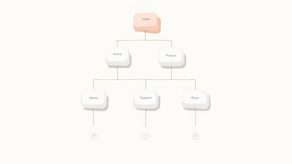
Effective IA acts as a digital blueprint, guiding the user's journey. Amazon's meticulously organized category navigation is a classic example, allowing millions of users to effortlessly locate specific products among a massive inventory. Similarly, Wikipedia's internal linking system and well-defined content categories enable users to explore complex topics seamlessly. A well-thought-out IA doesn't just organize content; it makes it discoverable.
Implementation Tips
To build a solid Information Architecture for your product, your team should:
Use Card Sorting: Conduct card sorting exercises with real users to understand their mental models. This helps you group and label content in a way that aligns with their expectations.
Create Sitemaps and User Flows: Develop visual sitemaps and user flow diagrams early in the process. These artifacts define the site’s hierarchy and map out critical user journeys before any UI design begins.
Test Navigation: Validate your navigation structure with first-time users through usability testing. Their ability (or inability) to find key information will reveal any flaws in your IA.
Implement Consistent Labeling: Ensure that terminology and labels are used consistently across all pages, menus, and interactive elements to create a cohesive and predictable user experience.
3. Usability Testing
Usability Testing is a crucial research methodology where actual users interact with a product or prototype to identify usability issues and validate design decisions. Rather than guessing how a design will perform, this empirical approach uncovers real-world problems that designers and developers, with their inherent biases and deep product knowledge, might easily overlook. This method is one of the best UX design practices because it provides direct, observable evidence of how well a system supports user goals.
The process involves observing participants as they attempt to complete tasks, revealing where they struggle, become confused, or get frustrated. Google's continuous A/B testing of its search results page is a large-scale example, but the principle is the same: watch real users and learn. Similarly, Microsoft has long utilized dedicated usability labs to refine products like Windows and Office, ensuring features are intuitive for a global audience.
Implementation Tips
To run effective usability tests, your team should:
Create Realistic Scenarios: Develop task scenarios based on key user goals, not just feature lists. Give users a reason to perform the task, such as "Find and book a hotel in Paris for next month."
Recruit the Right Participants: Find users who match your target personas. Testing with the wrong audience can lead to irrelevant and misleading feedback.
Test Early and Often: Conduct multiple rounds of testing throughout the design process, starting with low-fidelity prototypes. This is more effective than one large test at the end. For a complementary evaluation method, you can also explore how to conduct a heuristic evaluation.
Record and Share Sessions: Record sessions (with permission) to analyze later and share clips with stakeholders. Seeing a user struggle firsthand is more powerful than any summary report.
4. Responsive Design
Responsive design is an approach that ensures websites and applications provide an optimal viewing and interaction experience across a wide range of devices, from desktop monitors to mobile phones. It uses fluid grids, flexible images, and CSS media queries to automatically adapt the layout to different screen sizes. This practice is crucial for user experience because it meets users wherever they are, providing a seamless and accessible interface regardless of their device.
The core principle is creating a single, flexible design that works everywhere. The Boston Globe’s website was a pioneering example, showcasing how a content-heavy site could adapt fluidly. More recently, Starbucks has perfected a mobile-first responsive experience that makes ordering on-the-go effortless. These companies understand that failing to provide a consistent cross-device experience can frustrate users and lead to lost engagement, making responsive design one of the best UX design practices today.
Implementation Tips
To effectively implement a responsive design strategy, your team should:
Adopt a Mobile-First Approach: Design for the smallest screen first and then progressively enhance the experience for larger screens. This prioritizes core content and functionality.
Utilize Flexible Grids: Use modern CSS like Flexbox or Grid to create layouts that can dynamically resize and reflow content based on the available viewport space.
Optimize Media: Implement techniques like responsive images (using ) and video optimization to ensure fast load times and crisp visuals on all devices.
Test on Real Devices: While emulators are useful, always test your design on a variety of actual physical devices to catch platform-specific quirks and interaction issues. To see how these principles are applied in practice, explore some great examples of responsive website design.
5. Accessibility (A11y)
Accessibility (often abbreviated as A11y) is the practice of designing digital products to be usable by everyone, regardless of their abilities. It ensures that users with visual, auditory, motor, or cognitive impairments can navigate, understand, and interact with your product effectively. Integrating accessibility from the start is one of the best UX design practices because it not only expands your potential user base but also improves the overall experience for all users by promoting clearer, more flexible design.
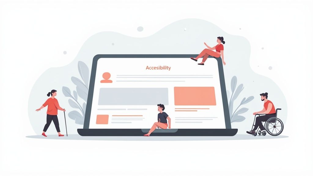
This inclusive approach means going beyond basic compliance to genuinely empathize with diverse user needs. For example, Microsoft’s Inclusive Design methodology has produced features like the Xbox Adaptive Controller, making gaming accessible to more players. Similarly, Target's website redesign focused on accessibility, which led to better navigation and clarity for all shoppers, not just those using assistive technologies. Embracing accessibility is a commitment to creating equitable digital experiences.
Implementation Tips
To effectively implement accessibility, your team should:
Follow WCAG Guidelines: Adhere to the Web Content Accessibility Guidelines (WCAG) 2.1 Level AA as a minimum standard for design and development.
Use Semantic HTML: Write clean, semantic HTML and use ARIA (Accessible Rich Internet Applications) attributes correctly to provide context for assistive technologies like screen readers.
Test with Assistive Tech: Regularly test your product using screen readers (e.g., NVDA, VoiceOver), keyboard-only navigation, and other assistive tools to identify real-world barriers.
Ensure Proper Contrast: Make sure text and interactive elements have sufficient color contrast. Don't rely on color alone to convey important information. A comprehensive website accessibility checklist can help ensure inclusivity.
Include Diverse Users: Involve people with disabilities in your user research and usability testing phases to gather direct feedback and uncover insights your team might miss.
6. Consistency and Standards
Consistency and Standards are a cornerstone of effective UX, focusing on uniformity in design elements, interaction patterns, and terminology across a product or platform. This practice reduces the user's cognitive load by making the system predictable; once they learn how one part works, they can apply that knowledge everywhere. Following established platform and industry standards is one of the best UX design practices because it aligns the product with users' pre-existing mental models, making it feel intuitive and familiar from the first interaction.
This principle is about creating a coherent and reliable user experience. A consistent interface allows users to develop usage habits, leading to faster task completion and increased satisfaction. Google’s Material Design system is a masterclass in this, providing a unified set of guidelines that ensure a consistent look and feel across all Google products, from Gmail to Google Maps. Similarly, Apple’s Human Interface Guidelines ensure that apps on iOS and macOS feel like they belong to the same ecosystem, simplifying the learning curve for users.
Implementation Tips
To effectively implement Consistency and Standards, your team should:
Create a Design System: Develop and maintain a comprehensive design system that serves as the single source of truth for UI components, patterns, and visual styles.
Document Everything: Clearly document all design patterns, interaction guidelines, and naming conventions to ensure everyone on the team is aligned.
Use Component Libraries: Leverage UI component libraries in both design and development to build interfaces with pre-approved, consistent elements.
Conduct Regular Audits: Periodically review your product to identify and correct inconsistencies that may have emerged over time. This helps maintain a high-quality, cohesive user experience.
7. Minimalist Design
Minimalist Design is a powerful philosophy centered on the principle of 'less is more'. This approach involves intentionally removing unnecessary elements, features, and visual noise to focus the user’s attention on what truly matters: completing their primary tasks. By prioritizing simplicity and clarity, minimalist design enhances usability and reduces cognitive load, making it one of the best UX design practices for creating efficient and elegant digital experiences.
This design approach is not simply about aesthetics; it's a strategic decision to make interfaces more intuitive by stripping them down to their essential components. Google’s search page is a timeless example, presenting only the core functionality to the user without distraction. Similarly, Apple’s website uses generous whitespace and a clean layout to guide users effortlessly toward their products. This focus on essentials ensures the user journey is direct and purposeful.
Implementation Tips
To effectively implement Minimalist Design, your team should:
Prioritize Core Functionality: Identify the absolute essential features your users need to accomplish their goals. Ruthlessly question every element and remove anything that doesn't serve a critical purpose.
Use Whitespace Strategically: Leverage negative space to create visual hierarchy, improve readability, and guide the user's eye. Whitespace is an active element, not just an empty background.
Employ Progressive Disclosure: Hide complex or secondary features until they are needed. This keeps the initial interface clean while allowing users to access advanced options if they choose to.
Test for Clarity: Conduct usability tests to ensure your minimalist interface hasn't hidden essential functions or made the user journey confusing. The goal is simplicity, not obscurity.
8. User Feedback and Iteration
User Feedback and Iteration is a continuous cycle that recognizes product design is never truly finished. This practice involves systematically gathering user feedback, analyzing the insights, and using them to make incremental improvements. Instead of relying on a one-time launch, this approach treats the product as a living entity that evolves with user needs, making it one of the best UX design practices for long-term success and relevance.
This principle is rooted in Agile and Lean methodologies, focusing on a perpetual loop of feedback and enhancement. Netflix’s constantly refined UI, which is updated based on massive amounts of user behavior data, exemplifies this practice. Similarly, Slack regularly deploys UX improvements directly sourced from community feedback channels, ensuring the platform adapts to the changing workflows of its users. The goal is to create a product that not only meets initial requirements but also gets better over time.
Implementation Tips
To effectively implement User Feedback and Iteration, your team should:
Create Multiple Feedback Channels: Offer various ways for users to provide input, such as in-app feedback forms, surveys, social media, and support tickets. This ensures you capture a wide range of perspectives.
Establish a Prioritization Framework: Not all feedback is equal. Use a system like an impact/effort matrix to decide which suggestions to act on first, aligning them with your product roadmap and business goals.
Use A/B Testing to Validate: Before rolling out a significant change based on feedback, test it with a segment of your user base. A/B testing provides quantitative data to confirm that the proposed improvement is effective.
Close the Feedback Loop: When you implement a change based on user suggestions, communicate it back to them. This shows users that you value their input and encourages them to provide more feedback in the future.
9. Clear Call-to-Actions (CTAs)
A clear Call-to-Action (CTA) is a button, link, or other interactive element designed to prompt an immediate response from the user. It’s a fundamental component of effective UX, acting as a signpost that guides users toward a desired outcome, such as making a purchase, signing up for a newsletter, or downloading a resource. This practice is crucial because it eliminates ambiguity and empowers users to navigate a digital product with confidence and purpose.
Well-designed CTAs directly impact conversion rates and user satisfaction. Consider Amazon’s unmistakable "Add to Cart" and "Buy Now" buttons, which use a high-contrast color and concise, action-oriented text to drive user behavior. Similarly, Dropbox simplifies its user journey with a prominent "Sign up for free" CTA on its homepage, immediately communicating value and the next step. These examples show how a strong CTA can be the pivotal point between user consideration and action.
Implementation Tips
To create effective and clear Call-to-Actions, your team should:
Use Action-Oriented Language: Start with a strong verb that clearly communicates the outcome. "Get Started" is more compelling than "Submit," and "Create Your Account" is clearer than "Enter."
Create Visual Prominence: Make CTAs stand out from other page elements by using contrasting colors, a larger size, or strategic whitespace. The button should be instantly recognizable.
Ensure Strategic Placement: Position CTAs where users would naturally look for them, such as after a block of descriptive text, at the top of the page, or in a sticky navigation bar.
Design for Accessibility: Ensure buttons are large enough for easy tapping on mobile devices and can be navigated using a keyboard. Alt text and proper HTML tagging are essential for screen reader users.
Test and Iterate: Continuously run A/B tests on your CTA’s wording, color, shape, and placement to see what resonates most with your audience and leads to better performance.
10. Error Prevention and Handling
A superior user experience isn't just about creating smooth pathways; it's also about preventing dead ends. Error Prevention and Handling is a crucial UX design practice focused on designing systems that minimize the chance of user error and provide clear, helpful guidance when mistakes inevitably happen. This principle recognizes that users are human and designs forgiving interfaces that anticipate common slip-ups, thereby reducing frustration and building user confidence.
This proactive approach is far more effective than simply reacting to errors. Gmail's "Undo Send" feature is a classic example of error prevention, giving users a brief window to reverse a potentially costly mistake. Similarly, Stripe’s real-time, field-by-field validation during checkout prevents users from submitting incorrect information, guiding them to success before they can fail. This practice is fundamental because it makes interfaces feel robust, intelligent, and supportive.
Implementation Tips
To effectively implement Error Prevention and Handling, your team should:
Prevent Errors Proactively: Use constraints, smart defaults, and clear formatting suggestions to guide users toward correct inputs from the start. For example, disable a "Submit" button until all required fields are filled.
Write Helpful Error Messages: Avoid generic messages like "Invalid Input." Instead, write specific, plain-language messages that explain what went wrong and how to fix it, such as "Please enter a valid 10-digit phone number."
Provide an 'Undo' Option: For actions that have significant but reversible consequences, offer an easy way to undo them. This gives users the freedom to explore without fear of making irreversible errors.
Use Confirmation Dialogs: For destructive actions like deleting an account or permanently removing a file, always implement a confirmation step. This ensures the user's action is intentional and prevents accidental data loss.
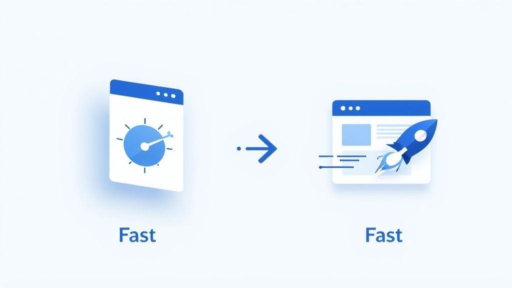
11. Performance Optimization
Performance Optimization is the practice of designing and developing digital products to be fast, responsive, and efficient. It focuses on minimizing load times, reducing latency, and ensuring smooth interactions, recognizing that speed is a critical feature, not an afterthought. This practice is one of the best UX design practices because performance directly impacts user satisfaction, engagement, and conversion rates; a slow or clunky experience can drive users away, regardless of how beautiful the interface is.
The core principle is that a user's perception of speed is a fundamental part of their overall experience. Google's extensive research has shown that even millisecond delays can negatively affect user behavior and business metrics. Similarly, Amazon famously calculated that every 100ms of latency cost them 1% in sales. Pinterest improved its search engine traffic and sign-ups by 15% after reducing perceived wait times by 40%, demonstrating that performance is a powerful lever for growth.
Implementation Tips
To effectively implement Performance Optimization, your team should:
Monitor Core Web Vitals: Track Google's key performance metrics: Largest Contentful Paint (LCP), First Input Delay (FID), and Cumulative Layout Shift (CLS). These provide a clear picture of the real-world user experience.
Optimize Media Assets: Compress and resize images for different devices and resolutions without sacrificing quality. Use modern formats like WebP and implement lazy loading for content that appears below the fold.
Streamline Code: Minify and compress crucial files like CSS, JavaScript, and HTML to reduce their size. This speeds up download, parsing, and execution times for the browser.
Leverage Caching and CDNs: Use browser caching to store static assets locally on a user's device and employ a Content Delivery Network (CDN) to deliver content from a server geographically closer to the user, reducing latency.
12. Mobile-First Design
Mobile-First Design is a strategic approach that flips the traditional design process on its head. Instead of designing for a large desktop screen and then stripping features away for smaller devices, this methodology begins with the most constrained environment: the mobile screen. This forces designers to prioritize core content and functionality, resulting in a cleaner, more focused experience that scales effectively to larger screens. This is one of the best UX design practices because it directly addresses the modern reality of user behavior, where mobile traffic often surpasses desktop.
This content-first philosophy ensures the most critical user tasks are effortless on the go. Instagram is a quintessential example; its entire experience was conceived for mobile, making photo sharing immediate and intuitive. Similarly, Uber's service is fundamentally mobile-centric, with every design decision optimized for a user needing a ride right now. This approach eliminates clutter and ensures the primary user goals are met efficiently, regardless of the device.
Implementation Tips
To effectively implement Mobile-First Design, your team should:
Prioritize Ruthlessly: Start with the absolute essential content and features that users need to accomplish their primary goal on a small screen. Everything else is secondary.
Design for Touch: Ensure all interactive elements like buttons and links are large enough for easy tapping. A minimum target size of 44x44 pixels is a common best practice.
Start with a Single Column: Use a vertical, single-column layout as your baseline. This is the most natural and user-friendly pattern for scrolling on mobile devices.
Optimize for Performance: Mobile users are often on slower networks. Compress images, minify code, and defer loading of non-essential resources to ensure fast load times.
13. Prioritizing Website Performance and Speed
Website performance and speed are critical components of the user experience that directly impact user satisfaction, engagement, and conversion rates. In a digital environment where users expect instant results, a slow-loading page can lead to frustration and high bounce rates. Prioritizing performance means optimizing every element, from images to code, to ensure the interface loads quickly and responds instantaneously to user input. This practice is essential because speed is often the first impression a user has of your product; a fast, seamless experience feels professional and respectful of the user's time.
Google's emphasis on Core Web Vitals as a ranking factor underscores the importance of performance. Sites that load faster and provide a smoother interactive experience are rewarded with better search visibility. For example, Walmart found that for every one-second improvement in page load time, conversions increased by up to 2%. This demonstrates that optimizing for speed is not just a technical task but a core tenet of effective UX design. It ensures the design is not only beautiful and functional but also accessible and efficient for everyone.
Implementation Tips
To effectively prioritize performance and speed, your team should:
Optimize Assets: Compress all images, videos, and graphics without sacrificing too much quality. Use modern image formats like WebP and implement lazy loading for content that appears below the fold.
Minimize Code: Minify CSS, JavaScript, and HTML files by removing unnecessary characters, comments, and spaces. Work with developers to eliminate render-blocking resources that delay page content from loading.
Leverage Caching: Implement browser caching so that repeat visitors can load the site much faster. Use a Content Delivery Network (CDN) to distribute assets across geographically diverse servers, reducing latency for users worldwide.
Test and Monitor: Regularly use tools like Google PageSpeed Insights, Lighthouse, and GTmetrix to audit your site's performance. Set performance budgets and monitor key metrics to catch regressions before they impact users.
13-Point UX Best Practices Comparison
Technique | 🔄 Complexity | ⚡ Resource needs | 📊 Expected outcomes | 💡 Ideal use cases | ⭐ Key advantages |
|---|---|---|---|---|---|
User-Centered Design | High — iterative research & testing cycles | High — researchers, prototypes, time | Higher satisfaction & adoption; fewer redesigns | New products, major UX overhauls, customer-facing apps | Aligns product with real user needs; reduces risk |
Information Architecture (IA) | Medium–High — structure & taxonomy work | Medium — content strategists, card-sorts, testing | Improved findability, SEO, fewer support queries | Content-rich sites, e‑commerce, knowledge bases | Makes content discoverable and logical |
Usability Testing | Medium — planning, moderation, analysis | Medium — participants, moderators, recording tools | Reveals real usability issues; validates decisions | Prototypes, pre-launch validation, feature changes | Empirical evidence to guide design choices |
Responsive Design | Medium–High — CSS complexity & device testing | Medium — developers, cross-device QA | Consistent cross-device experience; SEO benefit | Public websites, multi-device web apps | Single codebase maintenance; future-proofing |
Accessibility (A11y) | High — standards compliance & testing | Medium–High — devs, testers, assistive tech | Broader audience, legal compliance, UX gains | Public services, high-traffic platforms, regulated sectors | Inclusive UX; reduces legal and reputational risk |
Consistency and Standards | Medium — governance and documentation | Medium — design system owners, libraries | Faster delivery; predictable UX; easier scaling | Large products, multi-team organizations | Speeds development and lowers cognitive load |
Minimalist Design | Low–Medium — prioritization and restraint | Low — simpler assets, focused design effort | Faster performance; clearer user focus | Landing pages, mobile interfaces, simple apps | Clarity, faster loads, reduced maintenance |
User Feedback & Iteration | Medium — continuous collection & analysis | Medium — analytics, feedback tools, team time | Ongoing improvements; higher retention | Live products, SaaS, evolving feature sets | Keeps product aligned with user needs over time |
Clear Call-to-Actions (CTAs) | Low — design, copy, and placement work | Low — designers, copywriters, A/B tools | Increased conversions and task completion | E‑commerce, onboarding, conversion funnels | Direct measurable impact on business metrics |
Error Prevention & Handling | Medium — validation, messages, recovery flows | Medium — dev effort, UX writing, testing | Fewer mistakes, lower support costs, trust | Forms, transactions, admin tools, critical flows | Reduces friction and helps users recover smoothly |
Performance Optimization | High — profiling, caching, code changes | High — engineers, monitoring tools, CDNs | Faster load times, improved retention & SEO | High-traffic sites, media-heavy apps, e‑commerce | Directly improves conversions and UX metrics |
Mobile-First Design | Medium — constraint-driven design approach | Medium — mobile testing, design & dev focus | Better mobile experience; prioritized features | Mobile-centric services, apps, social platforms | Aligns design with majority mobile usage patterns |
Integrating These Practices into Your Workflow
We've journeyed through a comprehensive roundup of the best UX design practices, from the foundational principles of user-centered design and robust information architecture to the critical nuances of accessibility, performance optimization, and mobile-first thinking. Each practice, whether it's crafting clear CTAs, implementing rigorous usability testing, or maintaining a minimalist aesthetic, represents a powerful lever you can pull to dramatically improve your user's experience.
However, the true value of this knowledge isn't in understanding these concepts in isolation. The transformative power lies in weaving them into the very fabric of your team's culture and daily operations. Mastering UX is not a destination you arrive at after checking a few boxes; it is a continuous, iterative process of listening, learning, and refining. It's about shifting from a feature-first mindset to a user-first obsession.
From Theory to Action: Your Next Steps
Absorbing this much information can feel overwhelming, but progress begins with a single, deliberate step. The key is to avoid trying to boil the ocean. Instead, focus on incremental improvements that build momentum and demonstrate value, fostering buy-in across your team of product managers, designers, and developers.
Here’s a practical, actionable roadmap to get started:
Conduct a UX Audit: Start by evaluating your current product against the principles we've discussed. Where are the most glaring gaps? Is your mobile experience lagging? Are your error messages confusing? Use this audit to identify 2-3 high-impact areas for immediate focus.
Champion a Single Practice: Select one practice from this list and make it your team's primary focus for the next quarter. For instance, you could commit to conducting at least one round of usability testing for every new feature launch or dedicate development sprints to improving page load times and core web vitals.
Standardize Your Process: True consistency, a cornerstone of great UX, starts with standardized tools and workflows. Begin documenting a design system, even a simple one. Standardize how you collect and process user feedback, ensuring every insight is captured and considered.
Fostering a Culture of Collaborative UX
Ultimately, exceptional user experience is a team sport. It cannot be siloed within the design department. Developers who understand accessibility (A11y) principles write more inclusive code. Product managers who champion usability testing make more informed roadmap decisions. This cross-functional synergy is where the magic happens.
A critical component of this collaboration is efficient communication. Lengthy meetings, ambiguous email chains, and scattered feedback can derail even the most well-intentioned UX efforts. This is where modern tools become indispensable. Embracing a visual feedback and collaboration platform allows your entire team, regardless of their role, to provide contextual, actionable input directly on the product itself. This shift replaces guesswork with clarity, accelerating iteration cycles and ensuring the best UX design practices are not just discussed but are effectively implemented.
By integrating these principles into your workflow, you do more than just build better products; you build a more user-centric, efficient, and collaborative organization. You move beyond creating features that are merely functional and start delivering experiences that are intuitive, delightful, and memorable, creating a loyal user base that becomes your greatest asset.
Ready to streamline your feedback process and implement these best UX design practices faster? Beep lets your team add contextual comments directly on any live website or web app, turning visual feedback into actionable tasks in seconds. Ditch the endless meetings and screenshots and start collaborating with clarity by trying Beep today.
Comments