
.png)
A Guide to Web Site Usability Testing for Modern Teams
- shems sheikh
- Jan 8
- 17 min read

At its core, website usability testing is pretty simple: you watch real people try to get things done on your website. That’s it. This process is all about uncovering those little friction points, understanding what users actually do, and getting direct insights into making your site more intuitive. It’s about observing actions, not just listening to opinions.
Why Web Site Usability Testing Is a Growth Engine
Let's cut through the jargon. Usability testing isn't just some box you check during the design phase or a "nice-to-have" activity. It's a straight-up lever for growth that hits your revenue, customer loyalty, and even how efficiently your team operates. Every broken link, confusing button, or clunky checkout form is a customer you might be losing for good.
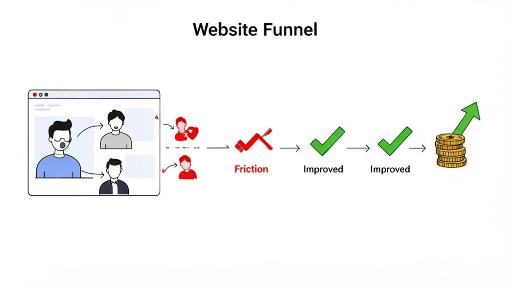
These small friction points are often totally invisible to internal teams. We know the product inside and out, but that's the problem. When a real user gets stuck, they don’t bother filing a support ticket—they just leave. They go to your competitor. Usability testing is what closes that dangerous gap between your team's assumptions and your user's reality.
The Financial Case for Understanding Your Users
The economic impact here is staggering, yet so many teams fly blind. Industry studies have shown time and again that for every $1 you invest in user experience, you can get around $100 in return. That's a mind-blowing ROI of 9,900%.
Despite that, only about 55% of companies actually conduct any user experience testing. That leaves nearly half of all businesses making huge decisions based on guesswork.
This blind spot creates a massive opportunity for you. By finding and fixing what frustrates your users, you directly boost the metrics that matter:
Better Conversion Rates: A clearer path to purchase means more people actually buy.
Higher Customer Retention: A great experience builds trust and keeps people coming back.
Lower Support Costs: When a site just works, people can help themselves instead of flooding your support team.
Stronger Brand Loyalty: An effortless, positive interaction is something people remember.
Of course, a solid grasp of the broader field of user experience design is key before you dive in. It gives you the principles to interpret what you see and make changes that count. You can also see these ideas in action in our guide on https://www.justbeepit.com/post/unlocking-growth-with-feedback-for-websites.
The Core Pillars of Website Usability
To really nail your testing, it helps to break down the fuzzy idea of "usability" into a clear framework. This gives your team a shared language and helps you define what you're actually measuring.
A usable interface has three main outcomes: It is easy for users to become familiar with and competent in using the user interface... Users have achieved their goal... Users are satisfied with the process. —Nielsen Norman Group
These outcomes are built on a few core pillars you can track and improve. Focusing your tests around these areas will ensure you get well-rounded, actionable feedback.
I've found it helpful to organize usability concepts into these key pillars. They provide a clear lens through which you can evaluate what's working and what isn't.
Key Pillars of Website Usability
Usability Pillar | What It Measures | Example Metric |
|---|---|---|
Learnability | How easily can a first-time user accomplish basic tasks? | Time to complete first purchase. |
Efficiency | Once users are familiar, how quickly can they perform tasks? | Number of clicks to find a specific product. |
Memorability | After a period of not using the site, can users reestablish proficiency? | Task success rate for returning users. |
Errors | How many errors do users make, how severe are they, and how easily can they recover? | Number of times a user clicks the back button on a form page. |
Satisfaction | How pleasant is it to use the design? | User-reported satisfaction score (e.g., on a 1-5 scale). |
Thinking in terms of these pillars helps you move from vague feedback like "the user seemed confused" to specific, measurable insights like "the error rate on the checkout page was 40% because the address field was unclear." That's the kind of data that leads to real improvements.
How to Plan a Usability Test That Delivers Results
Here’s a hard truth: a successful usability test is won long before you ever sit down with your first participant. I’ve learned this the hard way. The planning phase is where you separate game-changing insights from a pile of vague, useless noise.
Skipping this step is like starting a road trip without a map. You'll burn a lot of fuel, argue over directions, and end up somewhere you never intended to be.
The real goal here is to move from fuzzy questions to sharp, measurable objectives. Instead of asking, "Is our new checkout process easy to use?" you need to get specific. What does "easy" actually mean?
A much stronger objective would be something like: "Can a first-time user, who has never visited our site, successfully purchase a specific product in under 90 seconds with zero errors?" That kind of clarity shapes every single decision you make from here on out.
Define Your Objectives and Scope
Before you write a single task, you absolutely must know what you're trying to learn. Are you testing a brand-new feature? Validating a redesign concept? Or are you trying to figure out why users are abandoning their carts halfway through? Your objectives dictate the entire scope of the web site usability testing session.
You have to be ruthless about focus. I know it’s tempting to try and test everything at once, but that’s a recipe for shallow data. You’ll end up with a little bit of information about everything, but not enough to act on anything. Pick one or two critical user flows for each round of testing.
Here are a few examples of what focused objectives look like in the wild:
For an e-commerce site: Find out if users can easily locate the return policy and then figure out how to initiate a return for a past order.
For a SaaS product: Measure the time it takes for a brand-new user to create their first project right after signing up.
For a content-heavy site: Watch how users navigate from the homepage to find an article on a very specific, niche topic.
Getting this specific ensures that when the test is over, you have clear answers to your most pressing questions—not just a collection of random opinions.
Recruit the Right Participants
Who you test with is just as important as what you test. Your findings will only be as good as the participants you recruit, period.
One of the most common mistakes I see teams make is testing with internal staff, friends, or family. They are not your users. They already know your product, understand your internal jargon, and are almost certainly biased to be polite to you.
The key is to create a solid screener questionnaire that filters for people who truly represent your target audience. If you’re testing a power tool e-commerce site, you need people who actually buy power tools, not just anyone who happens to shop online.
Finding the right participants is about matching behaviors and motivations, not just demographics. A 25-year-old contractor and a 65-year-old DIY hobbyist might have very different needs, even if they're both buying a drill.
Since usability testing is a core part of the wider user research discipline, checking out a guide on how to conduct user research can give you a much stronger foundation for planning your tests. It helps you get into the right mindset for crafting screener questions and understanding what really drives your participants.
Craft Realistic Task Scenarios
The final piece of the planning puzzle is writing your task scenarios—the instructions you give to participants. The goal here is to encourage natural behavior, not to lead them down a specific path. A bad task script basically gives away the answer.
Don't just create a simple to-do list. Instead, build a short, relatable story around the task.
Weak task: "Click on the 'Shop' button, find the 'Men's T-Shirts' category, and add a blue shirt to your cart."
Strong scenario: "Imagine you have a friend's birthday coming up. You know they like casual clothes. Using the website, find a blue t-shirt for them that would make a good gift and get it ready for purchase."
See the difference? The second example provides context and a goal, which lets the user think and navigate the site just as they normally would. This is how you uncover the genuine friction points in their journey.
Of course, planning your test this way is just one of many approaches. You can dive into other options in our guide to the top 10 user testing methods to find what works best for your team. By putting in the time on these three planning pillars—objectives, participants, and scenarios—you set the stage for a usability test that delivers results you can actually use.
Running Your Usability Test With Confidence
Okay, you've got your objectives nailed down, you know who you're testing with, and your scenarios are ready to go. Now it's time to step into the role of facilitator. This is where all that careful planning meets a real, live human being, and trust me, how you handle this interaction directly impacts the gold you'll dig up.
Your main job here? Make your participant feel comfortable enough to act naturally and, most importantly, think out loud.
The way you run the session will really depend on the method you've picked. There are four common ways to tackle web site usability testing, and each has its own quirks, pros, and cons.
Choosing Your Testing Method
Picking the right method boils down to your budget, your timeline, and what you’re trying to learn. If you're exploring a really complex user flow, having a moderator there to guide things is invaluable. But if you're just trying to validate a simple design change, you can often get away with an unmoderated test.
To help you decide, think about the most common approaches and what they're best for.
Choosing Your Usability Testing Method
Method | Best For | Key Challenge |
|---|---|---|
Moderated Testing | Deep, qualitative insights and complex tasks where you need to ask follow-up questions. | Can be time-consuming and expensive; the facilitator can unintentionally influence the participant. |
Unmoderated Testing | Quick validation, gathering quantitative data, and testing with a larger, more diverse group of users. | You can't ask "why?" in the moment, so you might miss some of the deeper context behind a user's actions. |
In-Person Testing | Observing body language and non-verbal cues that you'd miss on a screen. | Logistically complex and more expensive to organize, limiting your geographic reach. |
Remote Testing | Maximum flexibility, cost-effectiveness, and the ability to test with users from anywhere in the world. | Potential for technical glitches and you miss out on some of the in-person nuances. |
Ultimately, the best method is the one that fits your specific goals and constraints. Don't overthink it; just pick the one that gets you the answers you need.
This little decision tree can be a great guide during your planning, making sure your goals, participants, and scenarios are all aligned before you press go.
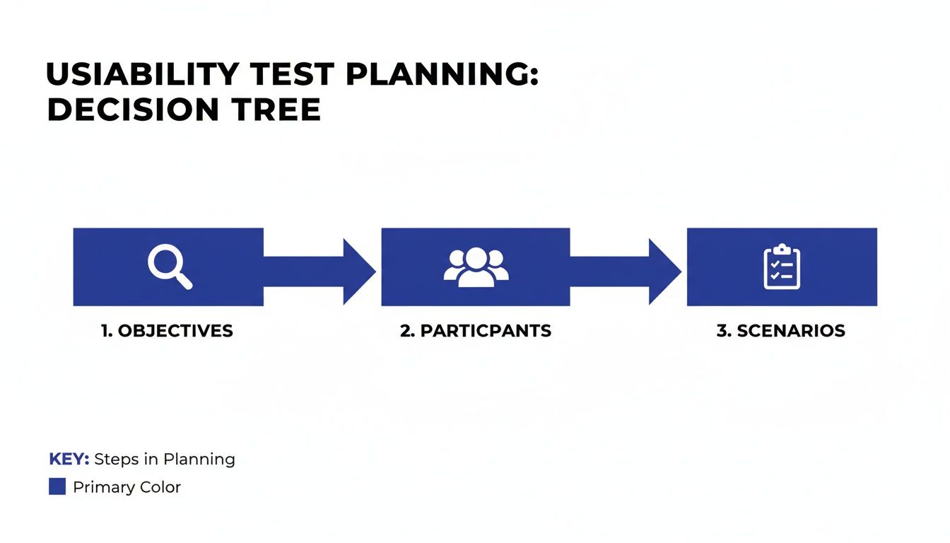
As you can see, getting your objectives, participants, and scenarios lined up is the foundation for everything that follows.
Facilitation Techniques for Uncovering Deep Insights
Your most powerful tool as a facilitator is something called the "think-aloud" protocol. It sounds formal, but it's simple. At the start of the session, just ask the participant to speak their thoughts as they go through the tasks. If they get quiet, give them a gentle reminder. "What are you thinking now?" works wonders.
Another secret weapon is asking neutral, open-ended questions. It's so easy to accidentally lead the witness and get the answer you want to hear, not the one you need to hear.
Instead of asking, “Was that button easy to find?” which just begs for a "yes," try asking, “Tell me about your experience finding that button.” The first question is a dead-end. The second one opens the door to a story.
This is how you get to the why behind their actions, and that's where the real magic happens.
The Rise of Asynchronous Visual Feedback
Let's be real: modern web projects move fast. Scheduling a bunch of live sessions just isn't always practical. This is why asynchronous feedback tools are becoming so popular—they give you the best of both worlds.
Platforms like Beep let users drop comments and visual feedback right onto a live website or staging environment. It's a game-changer.
This kind of tool empowers you to collect feedback from a wider group over time, minus the scheduling headaches. Users can flag issues as they naturally come across them, giving you a much more authentic peek into their actual experience.
Technical Considerations and Performance
No matter which method you go with, don't forget about technical performance. It's a huge—and often overlooked—part of the user experience. We've all been there, waiting for a page to load and getting more frustrated by the second.
The numbers don't lie. Studies show that 53% of mobile users will ditch a site if it takes more than three seconds to load. And even a tiny 1-second delay in page response can cause a 7% drop in conversions. You can find more stats like these and see their impact by checking out this great guide to UX statistics on UserGuiding.
What does this mean for you? Your test environment needs to mimic your live site's performance. A slow-loading test site can completely skew your results, masking other serious usability issues because users are too annoyed by the speed to notice anything else.
Turning Raw Feedback Into Actionable Insights
Collecting feedback is a huge milestone, but it's just the raw material. The real magic in web site usability testing happens when you turn that mountain of observations, quotes, and metrics into a clear, strategic action plan. This is where you transform what you saw into what you’ll actually do next.
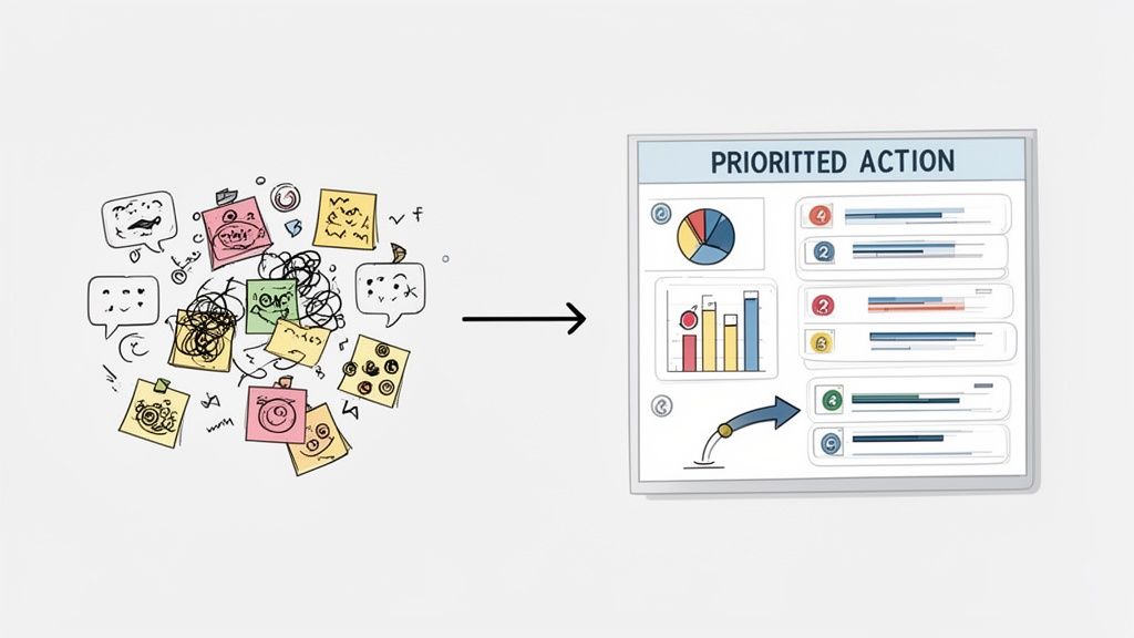
Without a solid process for making sense of it all, even the best feedback can get lost in a forgotten document or a messy spreadsheet. Your goal is to move from individual data points to big-picture patterns that tell a compelling story about your user experience.
This means you’ll be blending two different types of information. You've got your quantitative data—the hard numbers like task completion rates and error counts—and your qualitative data, which is all the juicy stuff like user quotes, sighs of frustration, and moments of confusion. Both are critical for painting the full picture.
Synthesizing Quantitative and Qualitative Data
First things first, you need to get organized. A simple spreadsheet or an affinity diagramming exercise works wonders here. The whole idea is to group similar observations together so you can spot the issues that popped up over and over again across different participants.
An affinity diagram, for example, is just a fancy way of saying you write each observation on a virtual sticky note and then cluster them into themes. You might notice three different users grumbled about finding the search bar. Boom. That’s not three separate issues; it’s one recurring pattern you need to dig into.
Once you have these themes, you can beef them up with your quantitative metrics.
Task Success Rate: What percentage of users actually managed to complete a given task?
Error Rate: How many mistakes did users make, on average, while trying to get something done?
Time on Task: How long did it take users to finish a specific scenario?
Combining these gives you a seriously powerful narrative. For instance, you might find that the theme "Checkout process is a nightmare" is backed up by a dismal 40% task success rate and an average of three errors per user. Suddenly, you've got a data-backed story that’s hard to ignore.
Identifying Patterns and Prioritizing Issues
With your findings grouped and quantified, it's time to prioritize. Let's be real: not all usability problems are created equal. A typo on a marketing page is annoying, sure, but a broken "Add to Cart" button is a five-alarm fire that's actively costing you money.
To prioritize effectively, you need a framework that looks at both how severe the problem is and how often it happened. A common approach is to score each issue based on its impact.
A simple prioritization matrix can be a lifesaver. Plot issues on a grid with "User Impact" on one axis and "Frequency" on the other. The problems that are high-impact and high-frequency are your top priorities.
This method helps you focus your team’s limited time and energy on the changes that will deliver the most value to your users and the business. It shifts the conversation from personal opinions to a structured, objective discussion about what to fix first.
Creating a Findings Report That Drives Action
The final step is to package your insights into a report that stakeholders will actually read and act on. The biggest mistake you can make is dropping a dense, 50-page document in someone's inbox. Keep it concise, visual, and focused on solutions.
A great findings report does more than just list problems; it inspires action. I’ve found that a well-structured report typically includes these key pieces:
An Executive Summary: Start with the big picture. What were the top 3-5 most critical findings from the test? Make it scannable for busy execs who only have five minutes.
Methodology Overview: Briefly explain who you tested with and what you asked them to do. This builds credibility and gives context to your findings.
Detailed Findings: For each major issue, bring the receipts. Include a clear problem statement, juicy user quotes, and supporting data points (like success rates). Trust me, video clips of users struggling are incredibly persuasive here.
Actionable Recommendations: Don't just point out what’s broken. For each problem, suggest a clear, specific solution. This turns you from a critic into a problem-solver, which is exactly where you want to be.
Presenting your findings this way makes it dead simple for product managers and designers to turn your research directly into tickets for the development backlog. To help streamline this, you might find it useful to start with a structured framework. For instance, our guide on creating a user testing feedback template can give you a great head start on organizing and presenting your insights effectively.
Sidestepping the Usual Usability Testing Traps
I've learned that one of the fastest ways to get good at something is to learn from everyone else's screw-ups, and web site usability testing is no different. You can have the best intentions in the world, but a few common traps can sink your study and send your team chasing ghosts. It's less about having a flawless process from day one and more about knowing where the landmines are buried.
One of the biggest blunders I see teams make over and over is testing way too late. They wait until a feature is polished and nearly ready to ship before getting it in front of a real user. By then, any meaningful feedback feels like a personal attack because making changes is a massive headache—it's expensive, throws off timelines, and developers get (understandably) grumpy.
The real magic happens when you test early and often. Use scrappy, low-fidelity prototypes to see if an idea even has legs before a single line of code gets written.
You're Recruiting the Wrong People
Your insights are only as good as your participants. Period. It's shockingly common for teams to just grab whoever is available—employees, friends, their cousin who's "good with computers." It’s convenient, sure, but this group is the absolute worst representation of your actual users.
They’re biased from the get-go. They already know your product (or you), and they'll almost always try to be nice rather than brutally honest.
You have to be ruthless with your recruitment criteria to avoid this. The goal is to find people whose real-life situations and needs mirror your target audience.
Screen for Behavior, Not Just Demographics: Don't just look for "women aged 25-40." Instead, find "people who have bought furniture online in the last six months." Behavior tells you so much more.
Use a Screener Survey: A quick survey is your best friend for weeding out people who aren't a good fit. A few well-phrased questions can save you from a completely useless session.
Pay People What Their Time is Worth: Good participants are worth their weight in gold. Fair compensation attracts people who are serious, engaged, and will give you the thoughtful feedback you need.
Testing with the wrong people gives you more than just bad data—it gives you a false sense of security that can lead to some seriously expensive mistakes down the road.
You're Asking Leading Questions and Killing Objectivity
The way you word your questions can completely change how a user behaves. As facilitators, we naturally want to be helpful, but that instinct can backfire, nudging users toward the "right" answer. And just like that, you've defeated the whole purpose of the test.
A leading question basically has the answer baked into it. For instance, asking, "Was that new checkout button easy to find?" just begs for a simple "yes" and implies it should have been easy.
A much better, more neutral way to phrase it is: "Talk me through what you did when you were ready to buy the item." This opens the door for them to share their actual, unfiltered thought process.
Your main job here is to be a neutral observer. Fill your script with open-ended prompts like, "What's going through your mind right now?" or "What do you expect to happen if you click that?" This is how you get the real dirt—the authentic, unbiased insights that actually help you build better products.
You're Ignoring How Insanely Complex Websites Have Become
Another blind spot I see is underestimating just how complicated modern websites really are. We’re not dealing with simple pages of text and pictures anymore. Today's sites are intricate ecosystems of interactive components, dynamic forms, and third-party tools all mashed together. This density can hide some major usability and accessibility nightmares that you'll only find through testing.
The WebAIM Million 2025 study blew my mind with this statistic: the home pages of the top one million websites now have an average of 1,257 elements. That number has skyrocketed by 61% in just the last six years. More elements mean more things that can break and more places for users to get hopelessly lost.
This growing complexity really raises the stakes for good usability testing. It's not enough to test simple flows anymore. You have to design tasks that push users to interact with all the tricky parts of your site. What seems obvious to your team might be a complete dead end for someone who doesn't live and breathe your product every day. Proactively hunting for these hidden roadblocks is how you make sure your site stays usable for everyone, no matter how much stuff you pack into it.
Got Questions About Usability Testing? We've Got Answers
When you're first dipping your toes into website usability testing, it's totally normal for a bunch of questions to bubble up. You might be wondering about the nitty-gritty details, the real value, or how to even start without a massive budget or a dedicated research team.
Let's cut through the noise and tackle some of the most common hurdles. The good news? The answers are usually a lot simpler than you'd think.
How Many Users Do I Really Need for a Test?
This is the big one, the question I hear all the time. And the answer is refreshingly simple: for most qualitative tests, you just need 5 users.
I know, it sounds crazy low. But groundbreaking research from the legends over at Nielsen Norman Group showed that this magic number is enough to uncover about 85% of the major usability roadblocks on your site. Once you get past that fifth person, you just start seeing the same issues crop up again and again. It's the point of seriously diminishing returns.
But hold on, there's a big asterisk here.
For finding why (Qualitative): That "rule of five" is perfect when your goal is to find friction points and understand why users are getting stuck. It’s about insights, not stats.
For hard numbers (Quantitative): If you're running tests to gather statistics—like comparing the success rate of two different checkout flows—you'll need a much bigger pool. Think 20 or more participants to get data that’s statistically sound.
For most of us just getting started, the best move is to be iterative. Test with a small group of 3-5 users, fix the most glaring problems you find, and then test the new-and-improved version with a fresh set of eyes. Rinse and repeat.
What’s the Difference Between Usability Testing and UAT?
They sound similar, I get it. But confusing usability testing with User Acceptance Testing (UAT) is a classic mistake. They serve completely different purposes and happen at totally different times in a project. Mixing them up can mean shipping a product that technically works but is a nightmare to actually use.
Think of it like this: Usability Testing is all about watching real people interact with your design to see if it’s intuitive and easy to use. You do this throughout the design and development process to catch friction early. The core question you're answering is, "Can people figure this thing out?"
On the other hand, User Acceptance Testing (UAT) is the final boss battle right before launch. Its job is to confirm that the product meets all the business requirements and functions correctly from a technical perspective. UAT answers the question, "Did we build what we said we were going to build?"
Both are absolutely critical, but they aren't interchangeable. Usability testing is all about the user's experience; UAT is all about business validation.
Can We Do This on a Shoestring Budget?
You bet. You do not need a fancy lab with two-way mirrors to get incredible insights. In fact, some of my biggest "aha!" moments have come from quick-and-dirty, low-cost methods. The most important thing is simply to get your site in front of real people who aren't on your team and don't already know how it's supposed to work.
One of the most powerful budget-friendly methods is called guerilla testing.
Seriously, just go to a coffee shop where your target users might hang out. Ask someone if they have five minutes to try something out on your laptop in exchange for their latte. It’s fast, cheap, and gives you raw, unfiltered feedback that can save you thousands in development costs down the line.
Even five of these quick, informal sessions can expose critical flaws that you and your team have become completely blind to.
Ready to stop guessing and start seeing your website through your users' eyes? With Beep, you can gather clear visual feedback directly on your live site, turning user insights into actionable tasks in minutes. Cut down on endless meetings and start building better products today by visiting https://www.justbeepit.com to get started for free.
Comments