
.png)
A Practical Guide to Usability Testing of a Website
- shems sheikh
- Jan 4
- 16 min read

Think of usability testing as letting real people take your website for a test drive. You watch them interact with it, see where they get stuck, and find out what makes them frustrated. It’s the single best way to trade guesswork for actual data, making sure your site isn't just nice to look at, but genuinely easy to use. The insights you get are gold—they're what you need to make users happy and hit your business goals.
Why Usability Testing Is Your Competitive Edge
Let's be real: a beautiful website that people can't figure out is just a digital paperweight. It might have once been a final "quality check," but today, usability testing is a core business strategy. It's what separates a site that turns visitors into loyal fans from one that sends them running straight to your competition.
Ignoring how people actually use your site has a real financial impact. Every abandoned cart, every failed sign-up, every visitor who leaves in a huff—it all chips away at your revenue and your brand's credibility. Investing in understanding your users isn't just a line item on a budget; it's a direct investment in your success.
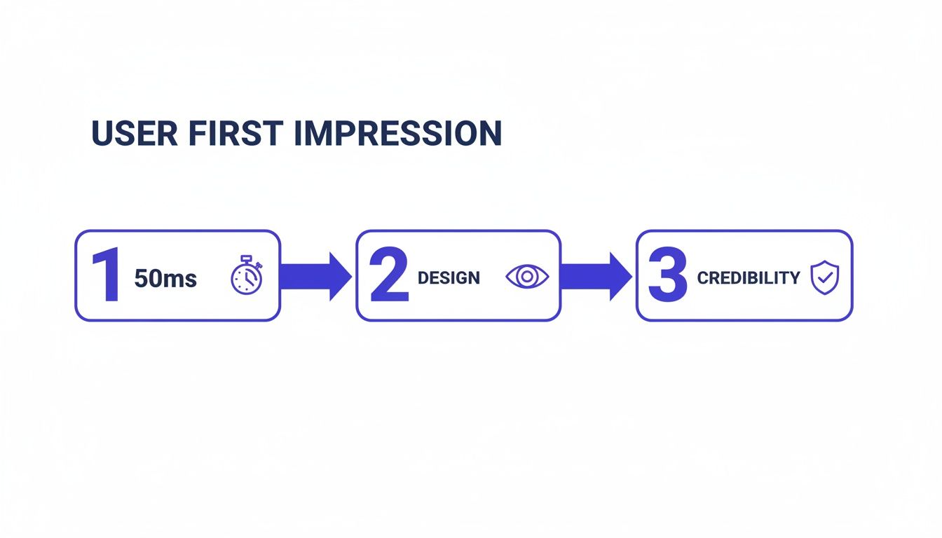
First Impressions Happen in a Flash
You have a shockingly small window to win someone over. It takes a visitor a mere 50 milliseconds—literally the blink of an eye—to form an opinion about your website's design. That first gut reaction is what determines if they’ll stick around or bounce.
And that lightning-fast judgment is almost entirely visual. A massive 94% of first impressions are design-related. That means your layout, colors, and fonts matter more than your carefully crafted copy in those first critical moments. The stakes are sky-high, as 75% of users admit they judge a company's credibility based on its web design. If you're curious, you can dig into more UX statistics to see just how pivotal these initial seconds are.
Move Beyond Guesswork to Build Loyalty
Without testing, you're building your website on a pile of assumptions. You assume people will get your navigation. You assume they'll find the CTA. You assume they'll follow the exact path you mapped out. But let's face it, assumptions are risky and often dead wrong.
"Usability testing is the practice of seeing your website through another person’s eyes. It’s the single most effective way to stop debating opinions and start making decisions based on real user behavior."
By watching actual users, you get to replace those endless internal debates with undeniable proof. You see exactly where the friction is, which lets you:
Slash development waste: It's way cheaper to fix a problem in the design phase than it is to re-code a live feature. Trust me on this one.
Boost your conversions: A smooth, intuitive journey leads directly to more sales, sign-ups, and inquiries. It's a straight line.
Build a brand people trust: A website that just works makes people feel confident and encourages them to come back.
In the end, companies that truly listen to their users aren't just building better websites; they're building stronger relationships. They get that a great user experience is the bedrock of a loyal community that will champion their brand. That commitment is what creates a real, lasting edge over everyone else.
How to Plan a Usability Test That Gets Results
A great usability test starts long before your first participant ever clicks a button. Trust me, solid planning is the difference between collecting a bunch of fuzzy, debatable opinions and gathering undeniable proof of what you need to fix. It’s all about creating a blueprint so that every minute of your testing time delivers clear, actionable insights.
Without a plan, you're just guessing. Think of it like trying to find a specific restaurant in a new city without a map versus using Google Maps. Your plan is the map that guides you straight to your users' biggest headaches.
Define Crystal Clear Objectives
First things first, you need to move from a vague goal like "test the homepage" to something sharp and measurable. A weak objective always leads to weak results. Instead, get specific about user actions and where you think people might get stuck. Your goal is to frame a question that the test can actually answer.
For instance, "See if users like the new design" is way too broad. A much stronger objective would be, "Determine if first-time visitors can find our pricing page and understand our three main subscription tiers within 60 seconds." Now that gives you a clear pass/fail metric.
Good objectives are:
Specific: They target a particular feature, flow, or user task.
Measurable: They involve hard numbers like time on task, success rates, or the number of errors.
Action-Oriented: They focus on what a user does, not just what they think or feel.
Choose the Right Testing Method
Once you know what you want to learn, you have to decide how you'll learn it. The method you pick really depends on your goals, your budget, and how much time you have. There's no single "best" method; it's all about context.
Picking the right approach is crucial; exploring various essential user experience testing methods can help make sure you get results you can actually use. It’s about matching the tool to the job. For a deeper dive, check out our guide on the top user testing methods to refine your UX.
A quick comparison table can really help clarify your options.
Choosing the Right Usability Testing Method
Here’s a breakdown of the most common methods to help you decide which is best for your specific goals, budget, and timeline.
Method | Best For | Pros | Cons |
|---|---|---|---|
Moderated (Remote/In-Person) | Deeply understanding the "why" behind user actions. | Ability to ask follow-up questions in real time; captures rich qualitative data and non-verbal cues. | More expensive and time-consuming; requires a trained facilitator. |
Unmoderated (Remote) | Gathering quantitative data and validating issues at scale. | Faster, cheaper, and allows for a larger, more diverse sample size; great for benchmarking. | Lacks the ability to probe deeper; relies on crystal-clear instructions. |
I like to think of moderated tests as having an intimate conversation, which is perfect for digging into complex tasks. Unmoderated tests are more like sending out a survey—excellent for getting quick feedback on straightforward tasks from a whole lot of people.
Recruit Participants Who Reflect Your Audience
Who you test with is just as important as what you're testing. Seriously, testing with the wrong people can give you totally misleading data and send your team sprinting in the wrong direction. If you sell high-end accounting software for enterprise clients, getting feedback from college students just isn't going to cut it.
Your focus should be on recruiting participants who are a genuine match for your target user personas. Define the key demographic and psychographic traits you're looking for.
Recruiting isn't about finding "experts." It's about finding people whose real-life needs and behaviors align with the problems your website is trying to solve. You want authentic reactions, not professional opinions.
Create a screener questionnaire to filter out the wrong candidates. You'll want to ask questions that confirm they fit your profile without giving away the exact criteria. For example, instead of asking "Do you shop online for shoes?" try "When was the last time you purchased a product online, and what was it?" This helps you weed out the professional testers and find genuine users.
This whole process matters because a user’s journey—from gut reaction to judging credibility—happens in a split second.
This just goes to show that within the first second, a visitor has already made critical decisions based almost entirely on visual design, which directly impacts whether they trust your brand.
Write Scenarios That Encourage Natural Behavior
Finally, it's time to craft task scenarios that guide participants without leading them by the nose. A bad task script tells the user exactly what to click, which just turns your test into an instruction-following exercise. A good script, on the other hand, provides context and a goal, then steps back to let the user figure out how to get there.
Try to avoid using jargon or specific language from your own website.
Weak Task: "Click on the 'Solutions' menu, then find and click on the 'Enterprise Package' link to see its features."
Strong Task: "Imagine you work for a large company and need a software solution for your entire team. Find the right plan for your business and tell me what features it includes."
See the difference? The second example gives the user a realistic motivation and lets you watch their natural navigation path. It tests whether your site's structure is actually intuitive—which is the whole point. By nailing these planning stages, you lay the foundation for a test that delivers results you can act on with total confidence.
Running Your Test and Capturing Honest Feedback
Okay, your plan is locked in. Now for the fun part: seeing it in action. This is where your carefully crafted scenarios meet real, unpredictable human behavior. Success here all comes down to one thing: creating an environment where people feel comfortable enough to give you the raw, unfiltered truth.
Remember, you're not testing the user; you're testing the website. Your main job is to make them feel at ease, listen like a hawk, and nudge them just enough to stay on track without coloring their natural actions.
Facilitating a Smooth Moderated Session
In a moderated test, you're part guide, part observer, and part therapist. The goal is to build a friendly rapport right out of the gate. Start with a casual introduction that sets a relaxed tone. I always make sure to tell them there are no right or wrong answers and that their honest thoughts—especially the negative ones—are pure gold.
One of the most powerful tools in your kit is the “think aloud” protocol. You just gently encourage participants to be your co-pilot, narrating their thoughts as they click around the site.
Ask open-ended questions like:
"Talk me through what you're looking at on this page."
"What's your goal right now?"
"What do you think will happen if you click that?"
The trick is to probe their thought process without leading them to an answer. Steer clear of questions like, "Was that easy to find?" which just gets you a "yes" or "no." Instead, try something like, "Tell me about your experience finding a way to check out." It opens the floodgates.
A great facilitator knows when to talk, but more importantly, when to embrace the silence. Letting a few seconds of awkward quiet hang in the air often prompts participants to fill the void with their most candid thoughts.
This approach turns a simple click into a deep dive into the user's mind.
Setting Up Unmoderated Tests for Success
For unmoderated tests, you don't get the luxury of asking follow-up questions in real-time. This means your instructions have to be absolutely crystal clear. Any hint of confusion can send users down the wrong path or cause them to give up entirely, which is a waste of everyone's time and your budget.
Before you launch, do a quick "pilot test." Grab a coworker (or even a friend) and have them run through your instructions. Ask them to explain the tasks back to you in their own words. You’ll immediately spot any confusing language.
Also, break down your tasks into smaller, logical steps. Instead of one giant, intimidating task, create several bite-sized ones. This makes it easier for users to follow along and gives you much more specific data on exactly where things go wrong.
Capturing Feedback with Precision
The days of relying on messy notes and trying to remember what a user said are long gone. Modern tools have completely changed how we capture feedback, turning vague complaints into specific, actionable tickets. This is exactly where a visual feedback tool like Beep becomes your secret weapon.
Instead of a user vaguely saying, "The checkout button didn't work," they can drop a pin right on the element causing them grief.
Check it out—a user can leave a specific comment directly on the webpage, and a screenshot is automatically attached.
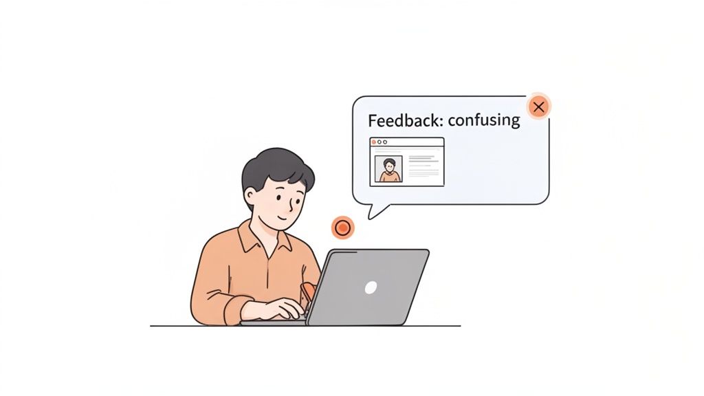
This method captures the exact moment of frustration and provides undeniable visual proof for your design and dev teams. No more guessing games.
This immediate, contextual feedback cuts through the noise. A comment like "This button is confusing" attached directly to a screenshot is 100 times more powerful than a note scribbled on a pad. It shrinks the feedback loop and lets your team fix the problem without a dozen back-and-forth emails. To get a head start, you can grab a user testing feedback template to improve your UX insights which can help structure how you collect all this great data.
By combining empathetic facilitation with razor-sharp feedback capture, you'll make sure every minute of your usability test delivers insights that lead directly to a better website.
Turning User Feedback Into Actionable Insights
You’ve run the tests, and now you’re sitting on a mountain of feedback. So, what’s next? This is the moment that really counts—where all that raw data gets turned into a real roadmap for improvement.
Let’s be honest, without a solid process, it’s ridiculously easy to get lost in a sea of notes, video clips, and conflicting user opinions. The goal here is to move from a jumbled pile of observations to a clear, prioritized list of actions that will actually make a difference.
The first thing you need to do is pull everything together. You'll be mixing the qualitative feedback—those juicy user quotes, the sighs of frustration you witnessed, the moments of pure confusion—with the hard numbers you tracked, like task completion rates or time on task. The magic happens when you blend the "what" users did with the "why" they did it.
Spotting Patterns in the Noise
Your initial analysis is going to feel messy. That’s not just okay; it’s normal. The trick is to start grouping individual comments and observations into bigger themes.
A simple affinity mapping exercise is perfect for this. I like to take each observation, quote, or pain point and pop it onto a virtual sticky note. Then, you just start dragging them around, clustering similar ideas together.
For example, you might see a few different notes that say things like:
"User couldn't find the 'Contact Us' link."
"Participant seemed lost trying to find our phone number."
"I expected support information to be in the main menu."
Boom. All three of these point to a much larger theme: "Contact and support information is difficult to locate." When you identify these recurring patterns, you stop fixing tiny, isolated symptoms and start tackling the root cause of the friction. A big part of this process is knowing how to analyze qualitative data effectively, which is what lets you spot these trends in the first place.
Prioritizing Fixes Based on Impact
Once you’ve got a list of usability issues, you'll quickly realize you can't fix everything at once. You have to prioritize, otherwise, your team will waste weeks on changes that barely move the needle. A simple but super effective way to do this is with a severity scale.
This scale helps you categorize each issue based on how badly it messes up a user's ability to get something important done.
Severity Level | Description | Example |
|---|---|---|
Critical (Blocker) | Prevents users from completing a key task entirely. No workaround exists. | The "Add to Cart" button is broken and does not work. |
High | Causes significant frustration and slows users down, but a workaround is possible. | The shipping cost is only revealed on the final checkout step, causing frequent cart abandonment. |
Medium | A minor issue that creates some confusion but doesn't stop the user journey. | The search bar filter options are slightly confusing, leading to a few extra clicks. |
Low | A cosmetic issue or minor inconvenience with minimal impact on usability. | A typo in the footer text or a button color that is slightly off-brand. |
By slapping a severity rating on each issue, you create an instant hierarchy. This data-driven approach is your best friend for focusing your team's precious time and resources on the fixes that will give you the most bang for your buck.
Crafting a Report That Drives Action
Okay, the final piece of the puzzle is sharing your findings with stakeholders in a way that actually makes them want to do something. Trust me, a dry, 50-page document filled with spreadsheets is the fastest way to get your hard work ignored. Your report needs to be a concise, compelling story about the user experience.
Your report’s job isn’t just to present data; it's to build empathy. A powerful video clip of a user sighing in frustration is infinitely more persuasive than a chart showing a 40% task failure rate.
Focus on bringing the user's struggle to life. Here’s how I do it:
Lead with the big picture: Start with an executive summary of the top 3-5 findings and your key recommendations. Get straight to the point.
Show, don't just tell: Embed short, impactful video clips of users hitting roadblocks. Let stakeholders see the problem for themselves. It’s hard to argue with video evidence.
Use direct quotes: Pull out powerful one-liners from users that capture their emotional response. "I feel like I'm going in circles" says so much more than "navigation was inefficient."
Connect issues to business goals: Frame your recommendations around metrics that matter to the business. Explain how fixing a confusing checkout flow will directly impact the conversion rate.
When you tie usability problems to business outcomes, you're speaking a language everyone in the company understands. According to webmaster tracking data, the most important metrics for website performance are sales, leads, and conversion rates (31%), total monthly visitors (30%), and click-through rate (28%). Showing how your findings will move these numbers is the best way to get buy-in and turn your awesome insights into real, meaningful improvements.
Making Your Testing Inclusive for All Users
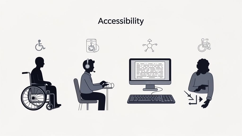
Let's be real for a second. A website isn't truly usable until it’s usable by everyone. It's way too easy to fall into the trap of designing for some imaginary "average" user, but that approach always leaves people out.
Incorporating accessibility into your usability testing of a website isn't just a box to check for compliance. It's about creating a genuinely great, equitable experience for every single person who lands on your site.
This means you have to intentionally look beyond your usual pool of participants. You need to actively find and test with people who navigate the web differently, especially those who rely on assistive technologies. Trust me, this shift in perspective is the only way you'll uncover the kind of barriers that standard tests almost always miss.
Recruiting Participants with Disabilities
So, where do you start? Finding the right people is the first hurdle. Just adding a "disability" checkbox to your screener won't cut it. You have to be more thoughtful and specific about the experiences you’re trying to understand.
Try focusing your recruitment on the tools people use or the challenges they face. For example, your goals could be to find:
Screen reader users: To hear how your website actually sounds to someone who is blind or has low vision.
Keyboard-only navigators: To see what it's like for users with motor impairments who can't use a mouse.
Users of screen magnification software: To check how your design holds up when it's zoomed in to 200% or more.
Individuals with cognitive disabilities: To test how clear your content is and how simple your user flows really are.
A great way to connect with these communities respectfully is to partner with organizations that specialize in accessibility. They can be an incredible resource.
Creating an Inclusive Testing Environment
When you run these sessions, the environment you create is just as important as the tasks you set. The goal is to make people feel comfortable and empowered to share their real experiences—not to put their abilities on display.
Keep in mind that a task might take way longer for someone using a screen reader. Don't rush them. Let them use their own devices and software setups whenever you can; they're the experts on their own tech.
Your job as a facilitator is to listen and learn. Ask about the barriers they encounter not just on your site, but across the web. Their insights often reveal systemic design issues that you can proactively solve.
The data from these sessions can be eye-opening. A comprehensive analysis of usability sessions with assistive tech users found huge usability gaps that standard metrics just don't catch. You can dig into the full research on accessibility usability benchmarking to see the data for yourself. It really drives home why this kind of dedicated testing is so crucial.
Uncovering Common Accessibility Hurdles
By focusing on inclusive testing, you’ll start spotting issues that are completely invisible to most people but are total showstoppers for others. These often include things like poorly structured headings, images without descriptive alt text, or forms that aren't labeled correctly for screen readers.
These aren't edge cases; they're fundamental cracks in your website's foundation. Fixing them benefits everyone by making your site more logical, structured, and just plain easier to navigate.
To make sure you're covering all your bases, our ultimate website accessibility checklist is a great place to start. Making your testing process inclusive transforms it from a simple check into a powerful engine for creating a truly universal design.
Your Top Website Usability Testing Questions, Answered
When you're just getting your feet wet with usability testing, a few questions always seem to come up. I've been there. Getting straight answers can be the difference between feeling stuck and confidently launching your first test. Let's clear up some of the most common head-scratchers.
How Many Users Do I Really Need for a Usability Test?
You'll be shocked by this one. The gold standard advice from usability OGs is that you only need 5 users to uncover about 85% of the usability problems on your site. Yep, just five. This is a total game-changer because it means any team, on any budget, can do this.
For qualitative tests—where your goal is to find those frustrating friction points and understand why users are struggling—this tiny sample size is incredibly powerful. Now, if you're running a big quantitative study to get hard numbers, you'll need more people, usually 20 or more. But for most of us starting out, a small group of 5-8 people is the sweet spot.
What’s the Difference Between Usability Testing and A/B Testing?
This is a big one. People mix these up all the time, but they have completely different jobs.
Usability Testing is qualitative. It’s all about watching people and figuring out the "why" behind what they do. You're looking for moments of confusion and frustration to find problems you didn't know you had.
A/B Testing is quantitative. This is all about measuring "which" performs better. You pit two versions of a page against each other (Version A vs. Version B) to see which one gets a higher click-through rate or conversion. It's about validating a solution.
Here's how I like to think about it: Usability testing is the detective work you do at a crime scene to find out what went wrong. A/B testing is the controlled lab experiment you run later to prove your theory.
They're a dream team when used together. Use usability testing to find a problem and brainstorm a fix, then fire up an A/B test to see if your fix actually works with your live audience.
How Often Should We Be Doing This?
Usability testing shouldn’t be a one-time thing you pull out for a massive redesign. The most successful teams I've seen weave it into their regular workflow. It's valuable at literally every stage.
Test your low-fidelity wireframes to catch bad ideas before a single line of code is written. Test a new feature before launch to iron out the kinks. Test your live site every few months to make sure it's still working for people as their habits change.
My rule of thumb? Run small, quick tests all the time—maybe once a month or even once every sprint. This rhythm of continuous learning is way more powerful than one huge, stressful test once a year. It keeps your whole team grounded in what the user actually needs.
Ready to stop guessing and start seeing your website through your users' eyes? Beep makes it incredibly simple to gather clear, visual feedback directly on your live site. Cut down on confusing emails and endless meetings by letting your team and testers leave contextual comments right where they spot an issue.
Comments