
.png)
A Practical Guide to Usability Tests for Websites
- shems sheikh
- Jan 20
- 17 min read

Ever had that sinking feeling when you watch someone try to use a website you built, and they just… can’t? It’s painful. But it's also incredibly valuable. That's what website usability testing is all about: getting out of your own head and seeing your site through fresh eyes.
You stop guessing and start watching as real people try to accomplish real tasks. It’s the single best way to find all the confusing parts and hidden roadblocks that are quietly killing your conversions.
Why Most Websites Fail to Connect With Users
Here’s a hard truth: most websites are built on a foundation of assumptions. Teams think they know what users want, how they’ll navigate, and what feels intuitive. It’s an “inside-out” perspective, and it almost always creates a massive gap between what the business thinks it’s offering and what the user actually experiences.
The result is a frustrating mess that sends potential customers running for the hills. It’s not that teams don’t care; it’s that they’re operating in a vacuum without any real feedback from the outside world.
When you’re making design decisions based on opinions or what a competitor is doing, you end up with a site that makes perfect sense to your internal team but feels like a confusing maze to a first-time visitor.
The Hidden Cost of a Poor User Experience
When a user gets stuck on your website, they don’t blame themselves. They blame your brand. That friction isn't just a minor annoyance; it has real, tangible consequences for your business.
Lost Revenue: If the checkout process is a puzzle, people will abandon their carts. It's that simple.
Damaged Credibility: A buggy or confusing site screams unprofessionalism and erodes trust in a matter of seconds.
Increased Support Costs: When users can't find basic information, they’ll flood your support team with questions you could have answered on the site.
The fallout from a bad experience is brutal. A staggering 88% of users are less likely to return to a site after a single frustrating visit. Yet, only 55% of companies are actually doing any user testing.
Think about that for a minute. Nearly half of all businesses are flying blind, completely unaware of the issues that are actively pushing their customers away.
Most website failures boil down to a poor user experience. Getting this right isn't just about aesthetics; it's about applying proven user experience design best practices to turn your site into a genuinely helpful tool for your customers.
Believe it or not, 94% of negative website feedback is directly related to design issues, not the underlying technology. This is precisely where usability testing becomes your secret weapon, giving you a clear, data-driven path to making things better.
How to Design Your First Usability Test
Jumping into usability testing without a plan is like trying to bake a cake without a recipe. You might end up with something, but it probably won't be what you wanted. A truly successful test is built on a solid foundation: clear goals, the right method, and the perfect group of testers.
This is the part where you go from a vague feeling of "our site could be better" to a sharp, focused question you absolutely need to answer. Without that clarity, you'll just end up with a mountain of observations and no real way to make sense of them. The goal isn't just to watch people click around; it's to gather concrete evidence that either confirms or smashes your team's assumptions.
Think of it like this: every unverified assumption is a potential roadblock for your users.
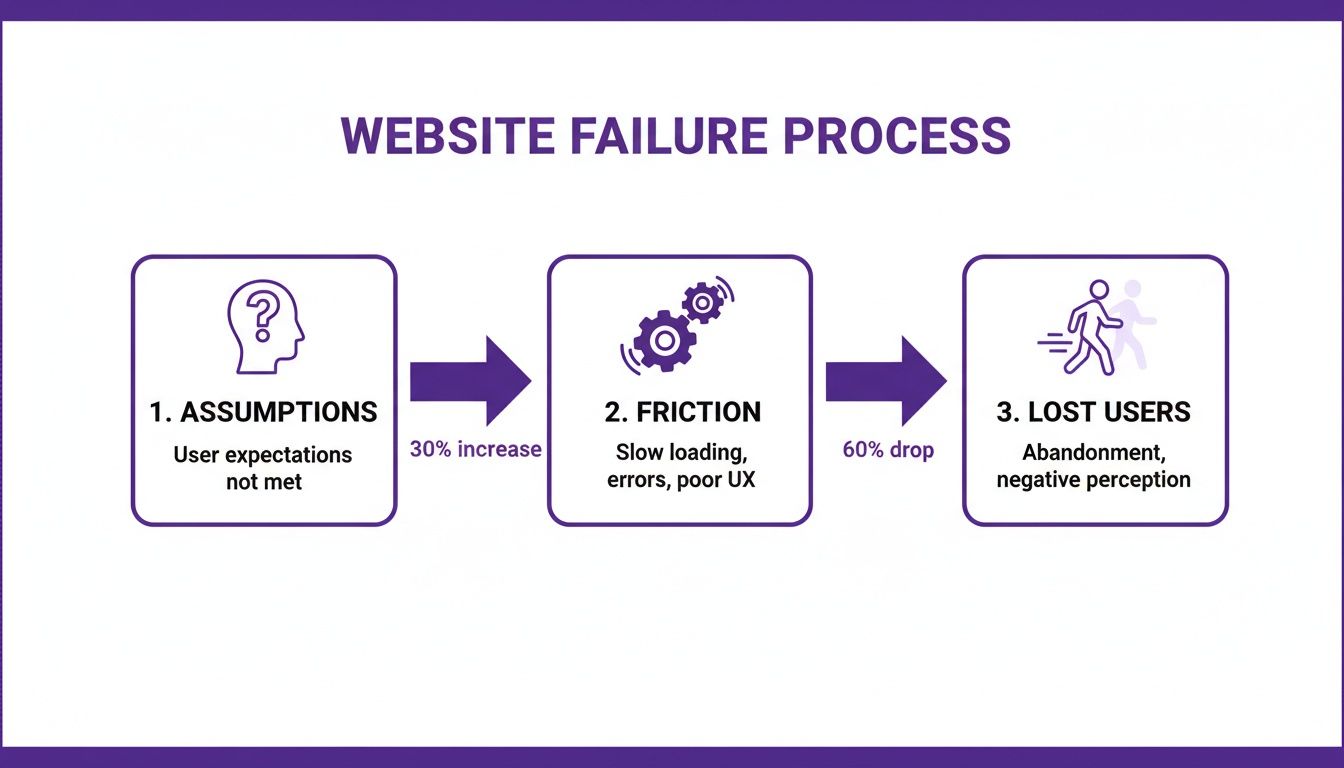
This flowchart really drives home how those internal ideas can create real-world friction, pushing people to leave long before they ever think about converting.
Start With Clear Objectives
Before you write a single task or even think about recruiting someone, stop and ask your team: "What is the most important thing we need to learn right now?" Your answer is the heart of your test objective. A strong objective is specific, measurable, and tied directly to a real business goal.
You need to get away from fuzzy goals like "see if the homepage is good." You need something you can actually act on.
Weak Objective: "Find out what users think of the new design."
Strong Objective: "Can new users successfully find our pricing and understand the differences between our three subscription tiers in under two minutes?"
This kind of specificity will guide every single decision you make from here on out. It’s the lens you'll use to analyze everything you find.
Choosing the Right Testing Method
Once you know what you need to learn, you can figure out how you're going to learn it. There are a few different ways to run usability tests, and each has its own strengths. Your final choice will probably come down to a mix of your budget, your timeline, and how deep you need the feedback to be.
The main methods fall into a couple of key categories, and they often get mixed and matched. A test can be remote and moderated, for instance. You can explore a bunch of top user testing methods to refine your UX to see what else is out there.
To make it a bit easier, I've broken down the four main types below. Each one has its place, and knowing the pros and cons will help you pick the right tool for the job.
Choosing the Right Usability Test Method
Test Type | Best For | Pros | Cons |
|---|---|---|---|
Remote Moderated | Deep qualitative insights on complex tasks when you can't meet in person. Great for understanding the "why." | - Flexible scheduling- Access a wider geographic pool of participants- Deep, qualitative feedback | - Can be time-consuming- Requires a skilled moderator- Tech issues can derail sessions |
Remote Unmoderated | Quick, quantitative feedback on simple tasks from a large number of users. Good for validating simple flows. | - Fast and affordable- Large sample sizes are possible- Participants are in their natural environment | - No ability to ask follow-up questions- Risk of low-quality or incomplete responses- Less useful for complex tasks |
In-Person Moderated | Observing body language and getting the richest possible feedback on sensitive or complex prototypes. | - Richest qualitative data- Can observe non-verbal cues- Strong rapport with participant | - Expensive and time-consuming- Geographically limited recruiting- Participants might not act naturally in a lab |
In-Person Unmoderated | Kiosk testing or situations where you need to observe users with specific hardware without a moderator's influence. | - Good for testing in a specific physical context- Can observe natural interaction with devices | - Limited use cases- Can be costly to set up- No opportunity to ask questions |
For most teams just dipping their toes in the water, a remote moderated test usually hits the sweet spot. You get the flexibility of remote testing combined with the deep, juicy insights that only a live moderator can pull out of a session.
Recruiting the Right Participants
Let’s be honest: the insights you get are only as good as the people you test with. Recruiting participants who are actually like your real customers is non-negotiable. Testing with the wrong people will send your team sprinting in the wrong direction.
The first thing you need is a screener survey. This is just a short questionnaire to filter out the wrong people based on their habits, demographics, or tech-savviness.
For example, if you're testing a website that sells high-end kitchen gadgets, your screener might ask things like:
How often do you cook meals from scratch at home?
Have you bought kitchenware online in the last six months?
What is your approximate annual household income?
These questions make sure you're talking to people whose opinions actually matter for your product.
How Many Users Do You Need?
You might be thinking you need to test with dozens of people to get valid results, but the research consistently tells a different story. For qualitative testing—where the goal is to find problems—the magic number is surprisingly small.
The Nielsen Norman Group famously found that testing with just five users typically uncovers about 85% of the usability problems. After that fifth user, you start seeing the same issues over and over again, and your return on investment drops off a cliff.
This is fantastic news! It means you can get incredibly valuable feedback without breaking the bank. Instead of running one massive study, it's way more effective to run a series of small tests with five users each, fixing and improving your design between rounds. This iterative cycle is how you build a website that people actually love to use.
Crafting Scenarios That Reveal User Behavior
The insights you get from a usability test are only as good as the tasks you give your participants. I've seen it time and time again: weak, leading tasks produce shallow, misleading feedback. But strong, realistic scenarios? That's where you strike gold. They unlock a genuine understanding of how people actually think and behave when they land on your website.
This is where you stop writing simple instructions and start telling a story. You're not just checking if a feature works; you're testing if your website can solve real-world problems for your users.
From Vague Instructions to Realistic Scenarios
The biggest mistake I see teams make is writing tasks that basically give away the answer. When you do that, you end up testing a user’s ability to follow directions, not their natural intuition. The real magic happens when you provide motivation and a goal, then just step back and watch.
Let's look at a concrete example. Imagine you’re testing an e-commerce site for pet supplies.
Weak Task: "Find the 'Dog Food' category and add a bag of kibble to your cart."
Strong Scenario: "You just realized you're running low on food for your golden retriever. Show me how you would find and purchase his favorite brand."
See the difference? The first one is a simple command. The second one gives the user context, mirrors a real-life situation, and forces them to think. This subtle shift is what separates basic feedback from game-changing insights.
Building Your Complete Test Script
A good test script is so much more than a list of tasks. Think of it as your roadmap for the entire session. It ensures every participant gets a consistent experience and, just as importantly, helps them feel comfortable. A solid script keeps you on track and makes sure you don't forget to gather any critical information.
Here are the key pieces your script absolutely needs:
The Welcome: First thing's first, put the participant at ease. Reassure them that they can't do anything wrong and you're testing the website, not them. This is so vital for getting honest, unfiltered behavior.
Background Questions: Ask a few easy, open-ended questions about their habits related to your product. For our pet supply site, you might ask, "Tell me a little about your pets" or "How do you typically shop for pet supplies?" This warms them up and gives you valuable context.
The Scenarios: This is the heart of your test. Aim for 3-5 key scenarios that tie directly back to your test objectives. Don't try to test every single thing; focus on the most critical user journeys.
Post-Task Probes: After each scenario, ask a few clarifying questions. Simple prompts like, "Was that what you expected to happen?" or "How did that compare to how you normally do this?" can reveal a ton about a user's mental model.
The Debrief: Once all the tasks are done, ask for their overall impressions. I love asking things like, "What was the most frustrating part of that experience for you?" It can surface some powerful summary insights.
The Thank You: Always end by sincerely thanking them for their time and feedback. Don't forget to explain how they'll get their promised incentive!
This structure turns what could be an awkward interaction into a smooth, productive conversation.
Choosing the Right Prototype Fidelity
You don't need a fully coded, pixel-perfect website to start getting feedback. In fact, some of the most valuable tests I've ever run were on early, low-fidelity prototypes. Testing early and often can save you countless hours of development rework down the line. The trick is matching the prototype's level of detail—its fidelity—to the kind of feedback you're looking for.
Testing with a low-fidelity wireframe allows you to get feedback on core navigation and information architecture before a single line of code is written. I've found that users are much more likely to give honest feedback on layouts when they aren't distracted by colors and branding.
Here’s a simple way I think about it:
Low-Fidelity (Sketches or Wireframes): I pull these out in the earliest stages to validate the overall structure, flow, and layout. They're perfect for answering big-picture questions like, "Can users find the main navigation?" or "Do they even understand what this page is for?"
High-Fidelity (Interactive Mockups): Once the basic structure feels solid, I'll move to a more polished prototype. This is where we can test specific interactions, visual design elements, and copy. Now we can ask, "Is this button clear?" or "Does this branding resonate with you?"
Using the right prototype at the right time ensures you’re getting the most relevant feedback for where you are in the project. This iterative approach is really the cornerstone of effective usability testing.
Moderating Sessions and Capturing Key Insights
Alright, you've got your script, your prototype is ready, and your first participant is logged in. It's go-time. Now you’re not just a researcher; you're a moderator, and your main job is to be a neutral, reassuring guide. It's a bit of an art form, really—making someone comfortable enough to be brutally honest without accidentally leading them down a certain path.
Your most powerful tool for this is the think-aloud protocol. It sounds technical, but it’s simple: you just ask the participant to speak their thoughts out loud as they go through the tasks. This is where the gold is. Hearing their internal monologue—the confusion, the "aha!" moments, their expectations versus reality—gives you insights you could never get from just watching clicks.
The Art of Neutral Guidance
Your goal here is to observe, not to teach or defend the design. When a user gets stuck, every fiber of your being will scream, "Help them! The button is right there!" You have to fight that urge. Let them struggle a little bit. Those moments of friction are exactly what you’re here to uncover.
Instead of jumping in to help, use open-ended, non-judgmental questions to dig a little deeper into what’s happening in their head.
Instead of: "Did you not see the 'checkout' button?"
Try this: "What were you expecting to see on this page?"
Instead of: "The menu is over here on the left."
Try this: "Tell me what's going through your mind right now."
These subtle shifts in how you phrase your questions keep the focus entirely on the user's experience, not your own knowledge of the product. You’re there to understand their mental model, not to correct it.
Capturing Quantitative and Qualitative Data
As you run these sessions, you'll be gathering two very different, but equally important, types of data. You need both to paint the full picture.
Quantitative data is the "what." It's the hard numbers, the stuff you can measure and stick in a spreadsheet.
Task Success Rate: Did they actually complete the task? (A simple Yes/No)
Time on Task: How long did it take them, from start to finish?
Error Count: How many times did they click on the wrong thing?
Qualitative data is the "why." This is the rich, observational feedback that breathes life into the numbers.
Direct Quotes: "I thought this button would take me to my cart, not back to the homepage."
Body Language: A frustrated sigh, a furrowed brow, a lean-in moment of concentration.
Observed Hesitation: That long pause before they finally decide where to click next.
A classic rookie mistake is to focus only on task completion. Sure, a user might have eventually bought the product, but if it took them five minutes and three wrong turns, that's not a win. The qualitative context tells you the real story behind the experience.
It’s also crucial to remember how people are using your site. Mobile isn't just a "nice to have" anymore; it's everything. Mobile devices drive the majority of global internet traffic, and patience on a small screen is incredibly thin. In fact, mobile users are 5 times more likely to abandon a task if a site isn’t optimized. Want more proof? UserGuiding has a great breakdown of the stats that show just how critical mobile UX has become.
Turning Vague Feedback Into Actionable Insights
This is where the right tools can make all the difference. When a user says, "this is confusing," that's a signal, but it's not an actionable insight. To make that feedback truly useful, you need to capture the exact moment of confusion, visually.
Modern tools let you drop comments directly onto a webpage, automatically snagging a screenshot with every single note you make.
This screenshot from a tool like Beep shows you exactly what I mean. The comment is tied directly to a visual element, which completely eliminates any guesswork. It transforms a vague complaint into a precise, visual piece of feedback that a designer or developer can understand and act on immediately. When your team can see what the user saw, right when they got stuck, the path to a fix becomes crystal clear. You can find more tips on structuring this kind of feedback with our user testing feedback template to improve UX insights.
Alright, the tests are wrapped up. You’re now looking at a mountain of notes, session recordings, and a whole lot of observations. This raw data is gold, but it’s not an action plan. The real work starts now: sifting through all that feedback to find the patterns and turn those individual comments into a clear, prioritized list of fixes your team can actually tackle.
This is where you connect the dots between what you saw users do and what your team needs to do next. The goal is to move from a messy pile of problems to a strategic roadmap that will genuinely improve your website's user experience.
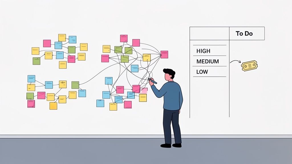
From Raw Notes to Actionable Themes
First things first, you need to get all your feedback in one place. Transcribe those killer quotes, log the task success rates, and pull out any of those telling moments of hesitation or confusion you witnessed. Once everything’s documented, it’s time to start making sense of it all.
A powerful and wonderfully low-tech way to do this is affinity mapping. It’s a simple, collaborative method for grouping related observations and spotting the bigger themes.
Here’s how I like to run it:
Write Down Observations: Take every distinct finding—a direct quote, an error, a point of confusion—and jot it down on its own sticky note.
Cluster the Notes: Get the team together and start grouping the notes into related piles. Don't try to label the groups just yet; just let the themes emerge naturally. You’ll quickly see a cluster forming around "checkout confusion" or another around "unclear navigation labels."
Name the Themes: Once the clusters feel solid, give each one a descriptive name. These names become your core usability themes, like "Payment Anxiety" or "Difficulty Comparing Products."
This whole process turns a chaotic heap of notes into an organized set of core problems that are so much easier to talk about and act on.
Prioritizing What to Fix First
You can't fix everything at once, and honestly, you shouldn't even try. The key is to focus your energy where it’s going to make the biggest difference. A simple but incredibly effective way to prioritize is by mapping each issue based on its frequency (how many users ran into the problem) and its severity (how badly it blocked them from doing what they wanted to do).
This helps you separate the minor annoyances from the critical, experience-breaking flaws. For instance, a typo seen by one user is a low-frequency, low-severity issue. But a broken checkout button that blocked all five of your users from making a purchase? That’s high-frequency and high-severity—a clear P1 ticket.
A simple matrix can help visualize this process and get everyone on the same page.
Usability Issue Prioritization Matrix
Priority Level | Frequency | Severity | Example Action |
|---|---|---|---|
High | Multiple users encountered it | Prevents task completion (e.g., can't check out) | Fix immediately |
Medium | Some users encountered it | Causes frustration but is recoverable (e.g., confusing form field) | Schedule for the next sprint |
Low | Few users encountered it | Minor annoyance (e.g., typo, inconsistent icon) | Add to the backlog to fix when time allows |
Using a framework like this removes a lot of the guesswork and helps the team rally around the most impactful changes.
The ultimate goal here is to build a clear, evidence-backed story for each fix you decide to tackle. Instead of just saying, "We should change the button color," you can say, "Four out of five users hesitated here because they didn't realize the button was clickable, which stopped them from adding the item to their cart."
This evidence-based approach shuts down subjective debates and keeps everyone focused on the user. You can find more advice on this in our guide covering the best design practices for websites to boost UX.
Turning Insights Into Development Tickets
With your prioritized list ready, the final step is to translate each issue into a crystal-clear, actionable ticket for your design and development teams. A good usability ticket does more than just state the problem; it gives the team the context they need to solve it the right way.
Each ticket should include:
A Clear Title: "Users cannot find the return policy link on the product page."
The Problem: Briefly describe the issue from the user's perspective and what they were trying to do.
The Evidence: This is the most powerful part. Include a direct quote, a short video clip, or an annotated screenshot showing the problem in action.
The Impact: Explain why this actually matters (e.g., "This leads to cart abandonment and increases calls to our support team.").
This closes the loop, turning a user’s moment of frustration directly into a task in your team’s workflow. Once you have your insights, the next step is implementation and measurement, focusing on areas like these proven CRO tips to boost conversions.
Common Questions About Website Usability Testing
Even with a solid plan, kicking off your first usability test can feel a bit like jumping into the deep end. It's totally normal to have questions pop up. I've been there, and I've heard them all.
Let’s go through some of the most common ones I hear from teams just starting out. Getting these sorted now will save you a ton of headaches later and make sure your testing actually delivers the goods.
How Many Users Do I Really Need for a Test?
This is, without a doubt, the number one question people ask. You'd think you need a massive sample size to get anything useful, but for most qualitative tests, the magic number is surprisingly small: five users.
Yep, that's it. Years of research has shown that testing with just five people will uncover about 85% of the usability problems on your site. After that, you just start seeing the same issues over and over again. It's a classic case of diminishing returns.
The one big exception? If you’re building for totally different groups of people—say, buyers and sellers on a marketplace—you’ll want to test 3-5 users from each group. Their needs and pain points will be unique.
What Is the Difference Between Usability and A/B Testing?
This one trips up a lot of people, but the distinction is super important. They’re both meant to improve your website, but they solve very different problems.
Usability Testing is qualitative. It’s all about the "why." You're watching a small number of people to see where they get stuck, confused, or frustrated. The goal here is to find problems you didn't even know existed and get ideas on how to fix them.
A/B Testing is quantitative. This is all about the "which." You take two different versions of a page (A vs. B), show them to a huge amount of live traffic, and measure which one performs better against a specific goal, like getting more sign-ups.
Think of it like this: Use usability testing to find the problems. Then use A/B testing to validate which of your proposed solutions works best at scale. They're two sides of the same coin, not competing ideas.
Can We Test a Competitor's Website?
Absolutely! In fact, you totally should. This is a killer strategy often called a competitive usability test, and it's one of the smartest moves you can make. You just ask your participants to complete the same key tasks on a competitor's site that you’d ask them to do on yours.
Doing this gives you incredible context. You'll quickly:
Pinpoint industry conventions users just expect.
See what features or flows genuinely delight (or enrage!) people.
Spot gaps in their experience that you can turn into your advantage.
It's a powerful shortcut to understanding user expectations in your market. You get to learn from their successes—and their mistakes—without having to make them all yourself.
How Do I Convince Stakeholders to Invest in This?
Getting buy-in can feel like an uphill battle, especially if your company is new to this stuff. The secret is to stop talking about fuzzy concepts like "user frustration" and start speaking the language of business results.
Frame your pitch around the metrics your stakeholders actually care about. Connect the dots between poor usability and real-world problems like high cart abandonment rates, leaky conversion funnels, or an overwhelmed customer support team.
The best trick I've found? Propose a small, quick-and-dirty pilot test. Grab just three users and see what happens. There is nothing more persuasive than a video clip of a real customer struggling to do something simple on your website. It instantly transforms the problem from a number on a spreadsheet into a real, human experience that’s impossible to ignore.
Stop guessing and start seeing your website through your users' eyes. With Beep, you can gather clear, visual feedback directly on your live site, turning moments of user confusion into actionable tickets for your team. Streamline your usability tests for websites and build better products, faster. Get started with Beep for free today.
Comments