
.png)
Best design practices for websites to boost UX, accessibility, and conversions
- shems sheikh
- Jan 9
- 19 min read
In today's crowded digital landscape, a website is more than just an online brochure; it's your most powerful tool for connection, conversion, and communication. What separates an adequate website from an exceptional one often comes down to a deliberate application of core design principles that govern user experience, performance, and accessibility. Overlooking these fundamentals can lead to high bounce rates, lost conversions, and a tarnished brand reputation, directly impacting your bottom line. This foundation underscores a deeper truth about modern business: understanding the importance of web design for business growth is the first step toward building a successful digital presence.
This guide moves beyond theory to provide a comprehensive, actionable roundup of the best design practices for websites. We will dissect the ten most critical pillars of modern web design, covering everything from mobile-first responsiveness and intuitive navigation to performance optimization and WCAG-compliant accessibility. For each practice, we'll explore not just the what but the why and the how, offering concrete implementation tips, common mistakes to avoid, and examples of how to execute them effectively.
Whether you are a product manager coordinating a team, a UX/UI designer crafting interfaces, or a developer bringing concepts to life, these insights will equip you to build websites that are not only visually appealing but also strategically effective. This listicle is designed to be your definitive resource for creating digital experiences that captivate users, drive engagement, and deliver measurable results. Let's dive into the practices that will define high-performing websites.
1. Mobile-First Responsive Design
Mobile-first responsive design is an essential strategy that flips the traditional design process on its head. Instead of designing for a large desktop screen and then scaling down, this approach prioritizes the smallest screen first, typically a smartphone. By focusing on core content and functionality for the most constrained environment, you ensure a solid, streamlined user experience that can then be progressively enhanced for tablets and desktops.
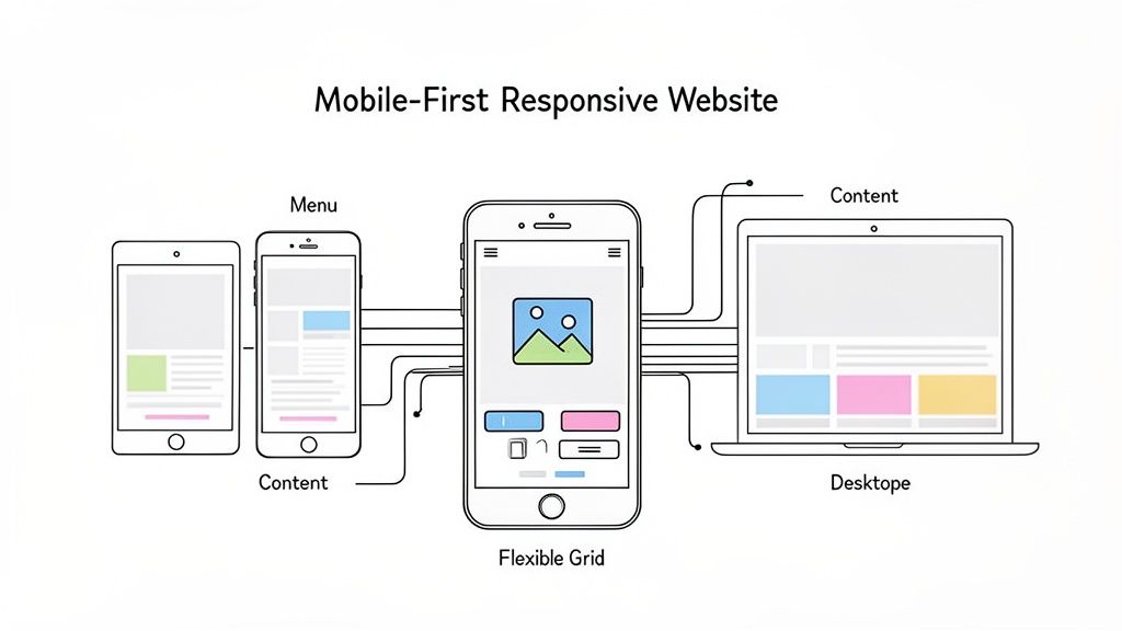
This method is no longer optional; it's a core component of modern web design best practices. With mobile devices now accounting for the majority of global web traffic, a site that isn't optimized for mobile is a site that's failing its users and its search engine ranking.
Why It Matters
A mobile-first approach directly impacts user experience and business goals. It forces designers to prioritize essential content, leading to a cleaner, more focused design that benefits users on all devices. This also significantly improves site performance, as mobile-first builds are inherently lighter. Search engines like Google use mobile-friendliness as a key ranking factor, making this practice critical for SEO.
How to Implement It
Prioritize Touch Targets: Ensure all interactive elements like buttons and links are at least 44x44 pixels. This accommodates finger taps and prevents frustrating misclicks.
Optimize Performance: Use techniques like lazy loading for images and minimize code to ensure fast load times on mobile connections, which can be less reliable than broadband.
Simplify Navigation: Mobile screens have limited real estate. Opt for clear, concise navigation patterns like a hamburger menu or a streamlined bottom navigation bar.
Test on Real Devices: Browser emulators are useful, but they don't replicate the nuances of a real device. For a comprehensive overview of your site's performance across different screens, you need a solid testing strategy. You can learn more about how to test your website on different devices here.
Streamlining Feedback with Beep
A major challenge in responsive design is identifying and communicating bugs that only appear on specific screen sizes. Tools like Beep simplify this process by allowing teams to add visual feedback directly onto a live website or staging environment. A QA tester can simply take a screenshot of a layout issue on their iPhone, add a comment, and share it instantly with the development team, eliminating ambiguity and speeding up the revision cycle.
2. Clear and Intuitive Navigation
Clear and intuitive navigation is the backbone of a strong user experience, acting as a roadmap that guides visitors through your website efficiently. A well-designed navigation system reduces cognitive load, allowing users to find the information they need without frustration. This critical element encompasses everything from the main menu structure and information architecture to breadcrumbs and search functionality, directly impacting user satisfaction and bounce rates.
If users can't find what they're looking for, it doesn't matter how great your content or products are. Confusing navigation is a primary reason users abandon a site. Implementing clear navigation is one of the most fundamental best design practices for websites, ensuring visitors can accomplish their goals and you can achieve your business objectives.
Why It Matters
Effective navigation directly correlates with higher engagement, longer session durations, and better conversion rates. It builds trust by making your website feel predictable and reliable. For larger sites, a logical structure and a robust search function are essential for usability and also help search engines crawl and index your content more effectively, providing a tangible SEO benefit.
How to Implement It
Limit Menu Items: Keep your main navigation menu concise, ideally with 5-7 top-level items. This avoids overwhelming the user with too many choices.
Use Descriptive Labels: Avoid vague terms. Use clear, descriptive language for your navigation links that accurately reflects the content of the destination page (e.g., "Contact Us" instead of "Talk").
Maintain Consistency: Your navigation bar should look and behave the same way on every page of your site. This consistency creates a predictable user experience.
Implement a Search Function: For websites with a large amount of content, a prominent and effective search bar is non-negotiable.
Use Breadcrumbs: On complex sites, breadcrumb trails show users their current location within the site's hierarchy, allowing them to easily navigate back to previous levels.
Streamlining Feedback with Beep
Finalizing a website's navigation structure often involves multiple stakeholders with differing opinions. Using a tool like Beep, designers can share wireframes or live prototypes and collect targeted feedback directly on the navigation elements. A project manager can add a comment to a specific menu item, suggesting a name change, while a UX researcher can highlight a confusing user flow, ensuring all feedback is contextual and actionable before development begins.
3. Fast Page Load Speed and Performance Optimization
Page load speed is a non-negotiable factor in modern web design that directly influences user satisfaction, conversion rates, and search engine ranking. In an era of high-speed internet, users expect near-instantaneous results; even a one-second delay can lead to a significant drop in engagement. Performance optimization involves a set of techniques aimed at reducing the time it takes for a web page to load and become interactive for the user.
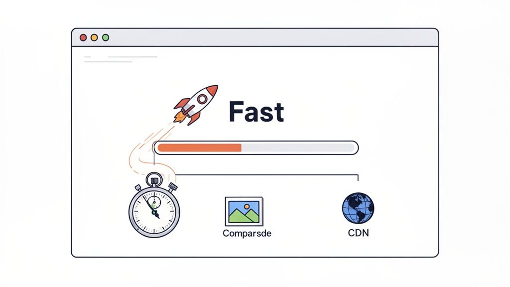
This practice is critical because slow websites frustrate users, leading to higher bounce rates and abandoned shopping carts. Conversely, a fast, responsive site like Google or Shopify feels professional and reliable, building user trust. Optimizing performance is a core tenet of the best design practices for websites because it serves both the user and business objectives simultaneously.
Why It Matters
A fast-loading website provides a superior user experience, which is a powerful competitive advantage. It directly impacts your bottom line by improving conversion rates and keeping users on your site longer. Furthermore, search engines like Google use page speed and Core Web Vitals as key ranking signals. A slow site will struggle to rank well, reducing its organic visibility and traffic potential.
How to Implement It
Monitor Core Web Vitals: Regularly track Google's key performance metrics: Largest Contentful Paint (LCP), First Input Delay (FID), and Cumulative Layout Shift (CLS) to diagnose issues.
Compress and Optimize Images: Use modern image formats like WebP and tools like TinyPNG to reduce file sizes without sacrificing quality. This is often the quickest win for performance.
Minimize and Consolidate Files: Reduce the size of your CSS and JavaScript files through minification. Combine multiple files into one to decrease the number of HTTP requests the browser needs to make.
Enable Caching and Compression: Use browser caching to store static assets on a user's device for faster subsequent visits. Enable GZIP compression on your server to shrink file sizes before they are sent.
Streamlining Feedback with Beep
Identifying performance bottlenecks often requires clear communication between developers, designers, and QA teams. When a page element is causing a slow load time, a team member can use Beep to take a screenshot of the offending element, annotate it with performance metrics or observations, and instantly assign it to a developer. This visual context eliminates guesswork, ensuring that optimization efforts are targeted and efficient.
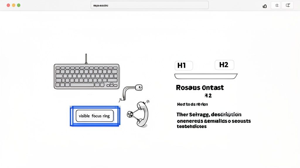
4. Accessible Design (WCAG Compliance)
Web accessibility is the practice of ensuring websites are designed and developed so that people with disabilities can use them effectively. This means creating experiences that are perceivable, operable, understandable, and robust for everyone, regardless of physical or cognitive abilities. Adhering to the Web Content Accessibility Guidelines (WCAG) is not just a moral imperative; it's a legal requirement in many regions and a fundamental part of inclusive, high-quality web design.
An accessible site benefits all users, not just those with disabilities. Clear structure, high-contrast text, and keyboard navigability improve the experience for mobile users, people in low-light environments, and those with slow internet connections. Sites like the BBC and various government (.gov) platforms are excellent examples of WCAG AA standards in action.
Why It Matters
Implementing accessible design practices broadens your audience reach to include the over one billion people worldwide with disabilities. It enhances your brand's reputation by demonstrating social responsibility and inclusivity. Furthermore, many accessibility best practices, such as semantic HTML and alt text for images, directly overlap with SEO best practices, improving your site’s visibility in search results. For a deeper dive into making your website universally usable, consider exploring further resources on Mastering Accessibility Website Design.
How to Implement It
Use Semantic HTML: Structure your content with proper HTML5 elements like , , , and . This provides context for assistive technologies like screen readers.
Ensure Sufficient Color Contrast: Text and interactive elements must have a color contrast ratio of at least 4.5:1 against their background to be legible for users with low vision.
Enable Keyboard Navigation: All interactive elements, including links, buttons, and form fields, must be fully operable using only a keyboard. This includes a visible focus indicator.
Provide Alt Text for Images: Add descriptive alternative text to all meaningful images to convey their content and purpose to users who cannot see them.
Conduct Audits: Regularly test your site using automated tools and manual checks with screen readers like NVDA or JAWS. For a comprehensive guide, you can review this detailed website accessibility checklist.
Streamlining Feedback with Beep
Identifying accessibility issues, such as poor focus states or insufficient contrast, can be complex. Beep empowers teams by allowing accessibility experts and QA testers to visually report these problems directly on a live site. A tester can screenshot an element that fails a contrast check, annotate the exact WCAG violation, and share it with developers instantly. This visual, context-rich feedback loop eliminates confusion and accelerates the process of building a truly inclusive website.
5. Consistent Branding and Visual Hierarchy
Consistent branding and a clear visual hierarchy are foundational elements that separate professional websites from amateur ones. Branding consistency ensures that your logo, color palette, and typography are applied uniformly, building brand recognition and user trust. Visual hierarchy, on the other hand, strategically arranges elements like headings, buttons, and images to guide the user's eye, making content scannable and intuitive.
Together, these principles create a cohesive and effortless user experience. When users instinctively know where to look for important information and feel a consistent brand presence, their confidence in your organization grows. This combination is a core tenet of the best design practices for websites, turning a simple collection of pages into a memorable brand experience.
Why It Matters
A strong visual hierarchy reduces cognitive load, allowing users to find what they need without conscious effort. Consistent branding reinforces your identity, making your site feel reliable and professional, which is crucial for conversions and user retention. From a development standpoint, these practices, often codified in a design system, create efficiency and prevent inconsistencies as a site scales.
How to Implement It
Create a Style Guide: Document your brand's typography (H1-H6 sizes, weights), color palette, spacing rules, and component styles. This guide should be the single source of truth for all designers and developers.
Establish Clear Hierarchy: Use size, color, and placement to create contrast. Your most important element, like a call-to-action button, should stand out immediately. For example, make your H1 heading significantly larger than your H2.
Use Spacing Deliberately: Employ consistent padding and margins around elements to create a sense of order and group related items. This whitespace is critical for readability and visual organization.
Test Contrast Ratios: Ensure your text and background colors meet accessibility standards (WCAG AA or AAA). This not only helps users with visual impairments but improves readability for everyone.
Streamlining Feedback with Beep
Maintaining brand consistency across dozens of pages can be challenging, especially with multiple contributors. Beep provides a vital solution for brand and design reviews. When a designer spots an incorrect color hex code or an off-brand font on a staging site, they can use Beep to capture a screenshot, annotate the exact deviation, and assign it to the developer. This visual, context-rich feedback eliminates guesswork and ensures every page perfectly aligns with the established brand guidelines.
6. Clear Call-to-Action (CTA) Design
A Call-to-Action (CTA) is more than just a button; it's the pivotal element that guides users from passive browsing to active engagement. Effective CTA design involves a strategic combination of compelling copy, visual prominence, and thoughtful placement to direct users toward key conversion goals like signing up, making a purchase, or learning more. Without clear and persuasive CTAs, even the most beautifully designed website will fail to convert visitors into customers.
This practice is fundamental to a goal-oriented website. It bridges the gap between user intent and business objectives, making it one of the most impactful elements to optimize. A well-designed CTA reduces friction and makes the desired user journey feel intuitive and effortless, directly impacting conversion rates and overall business success.
Why It Matters
Strong CTA design is a cornerstone of conversion rate optimization (CRO). It provides clear direction, preventing user confusion and reducing bounce rates. By making CTAs visually distinct and using action-oriented language, you create a clear path for users to follow, which is essential for lead generation, sales, and user engagement. Ultimately, optimizing CTAs is one of the highest-leverage activities in web design.
How to Implement It
Use High-Contrast Colors: Your CTA button should pop. Choose a color that stands out from the page's background and surrounding elements but still fits within your brand's color palette.
Write Action-Oriented Copy: Use strong, clear verbs that tell users exactly what will happen when they click. Phrases like "Get Started Free," "Claim Your Discount," or "Download Now" are far more effective than vague words like "Submit."
Ensure Strategic Placement: Position primary CTAs in prominent locations, such as above the fold on a landing page or within a sticky navigation bar, so they are always visible and accessible.
Design for Interaction: A button should look and feel clickable. Use visual cues like shadows, gradients, and clear hover/click states to provide immediate feedback to the user.
Streamlining Feedback with Beep
Debating the perfect CTA color, placement, or copy can lead to endless back-and-forth. Beep simplifies this feedback loop by allowing designers and marketers to drop visual comments directly onto a live site or staging environment. You can take a screenshot of a CTA, annotate it with a suggestion like "Let's test this in our brand's secondary color," and share it instantly with the team, ensuring design decisions are made quickly and collaboratively.
7. User-Centered Design and Testing
User-centered design (UCD) is a design philosophy that places the end-user at the heart of the entire creation process. Instead of designing based on assumptions, UCD relies on research and real user feedback to inform every decision. This iterative approach involves understanding user behaviors, needs, and motivations through activities like research, persona creation, and usability testing.
This methodology is fundamental to creating products that people not only can use but want to use. Companies like Notion and Slack have built loyal followings by actively incorporating community feedback into their feature development, ensuring their products evolve in line with user expectations. This commitment to the user is a cornerstone of the best design practices for websites today.
Why It Matters
A user-centered approach dramatically reduces the risk of building the wrong product. By validating ideas with actual users early and often, you create a website that is intuitive, effective, and enjoyable. This leads to higher user satisfaction, increased engagement, and better conversion rates. It shifts the focus from "what we think users need" to "what we know users need," which is a far more reliable path to success.
How to Implement It
Conduct User Research: Start with user interviews and contextual inquiries to understand your audience’s goals and pain points in their own environment.
Create Detailed Personas: Synthesize your research into detailed user personas that represent your target audience segments. Use these personas to guide design decisions.
Run Usability Tests: Regularly test your designs with real users to identify friction points and areas for improvement. You can learn more about how to run effective usability tests here.
Analyze User Behavior: Implement analytics tools to track how users interact with your live site, providing quantitative data to complement your qualitative research.
Establish Feedback Loops: Create clear channels for users to provide ongoing feedback and ensure that this information is systematically tracked and shared with the design team.
Streamlining Feedback with Beep
User testing sessions can generate a massive amount of qualitative feedback that is difficult to organize. Beep streamlines this process by allowing test participants to provide visual feedback directly on the website. A user can screenshot a confusing navigation element, add a comment explaining their issue, and share it instantly. This captures in-the-moment feedback with precise context, making it easier for designers to understand the problem and iterate quickly.
8. SEO-Optimized Content and Structure
SEO-optimized design is not an afterthought; it’s a foundational principle that weaves search engine visibility directly into the fabric of a website. It goes beyond simply adding keywords, focusing on a site's technical structure, content hierarchy, semantic HTML, and meta tags to ensure that search engines can easily crawl, understand, and rank the content. A well-optimized site acts as a magnet for organic traffic, providing sustainable growth and reducing customer acquisition costs.
This approach ensures that your beautifully designed website is actually discoverable by its intended audience. By aligning design and content with what search engines and users are looking for, you create a powerful synergy that boosts authority and drives conversions. It's a critical component of any list of best design practices for websites because even the most brilliant design is ineffective if no one can find it.
Why It Matters
Integrating SEO from the start of the design process ensures that your site is built on a solid foundation for discoverability. This practice directly impacts your ability to generate qualified organic traffic, which is often the most valuable source of leads. A proper SEO structure also improves user experience by organizing information logically, making content easier to navigate and digest. This leads to lower bounce rates and higher engagement, which are positive signals to search engines.
How to Implement It
Structure Content Logically: Use a clear heading hierarchy (H1, H2, H3) to organize your content. This helps both users and search engine crawlers understand the structure and importance of the information on each page.
Write Compelling Meta Data: Craft unique and descriptive title tags and meta descriptions (around 155-160 characters) for every page. This is your chance to make a strong first impression in search results and improve click-through rates.
Optimize Images: Use descriptive, keyword-relevant file names and alt text for all images. This not only aids visually impaired users but also gives search engines context, helping your images rank in search results.
Build an Internal Linking Strategy: Link relevant pages and posts within your site to distribute page authority and help users discover more of your content. This creates a cohesive site structure that search engines favor.
Streamlining Feedback with Beep
Achieving the perfect content structure and readability for SEO can be a collaborative challenge. Beep simplifies this by allowing SEO specialists and content writers to provide visual feedback directly on a live or staging page. An editor can highlight a paragraph, for example, and suggest restructuring it for better keyword flow, or point out a heading that needs re-optimization. This visual, context-rich feedback loop ensures SEO guidelines are implemented accurately and efficiently.
9. Trust Signals and Social Proof
Trust signals and social proof are powerful psychological cues that build credibility and reassure users, encouraging them to take a desired action. This involves strategically displaying elements like customer testimonials, reviews, case studies, security badges, and partner logos. By demonstrating that other people and reputable organizations trust your brand, you leverage a principle popularized by Robert Cialdini: people are more likely to do something if they see others doing it.
In a digital world where skepticism is high, these signals are not just nice-to-haves; they are essential for conversion. For e-commerce, SaaS, or any service-based website, establishing trust is the first step toward turning a visitor into a customer. A site lacking social proof feels empty and unproven, which can deter potential clients.
Why It Matters
Implementing trust signals directly impacts conversion rates by reducing user anxiety and building confidence. When visitors see that you have satisfied customers, secure payment processes, and industry recognition, their perceived risk of engaging with you decreases. This is a critical component of the best design practices for websites because it bridges the gap between user interest and user action, leading to more sign-ups, sales, and inquiries.
How to Implement It
Feature Authentic Testimonials: Collect and display genuine quotes, photos, or even video testimonials from real customers. Authenticity is key, so avoid generic or overly polished statements.
Showcase Customer Logos: Prominently display the logos of well-known companies you have worked with. This is a quick, visual way to borrow credibility from established brands.
Display Security Badges: If you handle payments or sensitive data, feature security badges like SSL certificates or PCI compliance logos, especially near forms and checkout areas.
Integrate Third-Party Reviews: Use widgets from trusted platforms like Trustpilot or G2 to show unbiased, aggregated reviews. You can learn more about leveraging G2 for B2B marketing here.
Streamlining Feedback with Beep
Determining the most effective placement and design for trust signals can be subjective. Beep allows marketing and design teams to collaborate visually on this process. A product manager can screenshot a landing page and use Beep to annotate it with a question like, "Should we move the customer logos above the fold for more impact?" This enables stakeholders to provide precise, contextual feedback, ensuring trust signals are placed where they will be most effective.
10. Simplified Forms and Streamlined Checkout
Forms are the final frontier between a user's intent and a successful conversion. Whether it's a signup form, a contact form, or a checkout process, complexity is the enemy of completion. Simplified forms and streamlined checkouts reduce friction by removing unnecessary steps and making the process feel effortless for the user, which directly boosts conversion rates and user satisfaction.
This practice is one of the most impactful best design practices for websites because it directly correlates to business goals. A cumbersome form is a common reason for cart abandonment and lead drop-off. By focusing on clarity and ease of use, you respect the user's time and guide them smoothly toward their goal.
Why It Matters
Every field you add to a form increases cognitive load and the potential for user frustration or abandonment. A simplified process not only improves conversion rates but also builds trust. When a user sees a clean, logical form, it signals a professional and user-centric experience. This is especially critical in e-commerce, where a streamlined checkout can be the deciding factor between a sale and a lost customer.
How to Implement It
Ask Only What's Necessary: Scrutinize every field. Is "phone number" absolutely essential for a newsletter signup? If not, remove it.
Use Smart Defaults and Autofill: Pre-fill information you already know and leverage browser autocomplete for addresses and payment details to save users time.
Provide Clear, Inline Validation: Don't wait until a user submits the form to tell them there's an error. Provide instant feedback right next to the field so they can correct it immediately.
Offer Guest Checkout: Forcing users to create an account is a major conversion killer. Always provide a guest checkout option and offer the chance to create an account after the purchase is complete.
Show Progress: For multi-step forms, use a progress bar to show users where they are in the process and how much is left. This manages expectations and reduces the feeling of being overwhelmed.
Streamlining Feedback with Beep
Gathering feedback on form usability can be difficult, as issues like confusing field labels or awkward mobile inputs are experiential. With Beep, stakeholders and testers can directly address these problems. A user can take a screenshot of a confusing field on a checkout form, add a comment like "This label is unclear, suggest changing to 'Card Security Code (CVV)'", and share it with the team. This visual, in-context feedback loop makes it simple to pinpoint and fix sources of friction.
Top 10 Website Design Best Practices Comparison
Item | 🔄 Implementation Complexity | ⚡ Resource Requirements | 📊 Expected Outcomes | 💡 Ideal Use Cases | ⭐ Key Advantages |
|---|---|---|---|---|---|
Mobile-First Responsive Design | Medium — progressive enhancement & cross-device testing | Moderate — CSS grid/flexbox, device testing | Improved mobile UX, higher conversions & SEO | Mobile-heavy sites, blogs, e‑commerce | Scalable cross-device UX; better SEO; future-proof |
Clear and Intuitive Navigation | Low–Medium — IA and menu design | Low — content planning, simple dev work | Lower bounce, faster task completion | Large content sites, marketplaces, documentation | Faster findability; improved engagement; accessibility |
Fast Page Load Speed & Performance Optimization | High — technical optimizations and monitoring | Moderate–High — CDN, tooling, dev expertise | Better SEO, retention, conversions; lower server cost | Media sites, high-traffic e‑commerce, SaaS | Faster UX; reduced bounce; cost-efficient delivery |
Accessible Design (WCAG Compliance) | Medium–High — semantic HTML, ARIA, testing | Moderate — accessibility expertise, assistive testing | Legal compliance, wider audience, SEO lift | Government, enterprise, public-facing services | Inclusive UX; reduced legal risk; improved reputation |
Consistent Branding & Visual Hierarchy | Low–Medium — design system and guidelines | Low–Moderate — design tokens, documentation | Strong recognition, trust, predictable UX | Multi-product brands, marketing sites | Faster design scale-up; brand credibility; clarity |
Clear Call-to-Action (CTA) Design | Low — copy, placement, visual styling | Low — design and A/B testing resources | Increased conversions; measurable lift | Landing pages, signup funnels, paid campaigns | Clear user direction; higher conversion rates |
User-Centered Design & Testing | High — research, usability tests, iteration | High — participants, tools, time | Better product-market fit; less rework; higher retention | New products, major redesigns, complex flows | Data-driven decisions; higher satisfaction & retention |
SEO-Optimized Content & Structure | Medium — technical SEO + content strategy | Moderate — content creators, SEO tools | Increased organic traffic; long-term growth | Content hubs, SaaS blogs, product pages | Sustainable organic growth; lower acquisition cost |
Trust Signals & Social Proof | Low — collect and surface testimonials/case studies | Low–Moderate — case development, review systems | Higher conversions; reduced purchase anxiety | E‑commerce, SaaS, financial services | Greater credibility; conversion uplift |
Simplified Forms & Streamlined Checkout | Medium — UX, validation, payment integration | Moderate — dev work, payment/providers | Higher completion rates; lower abandonment | Checkout flows, signups, lead-gen forms | Improved conversion; better data quality |
Building Better Websites, Together
The journey through the best design practices for websites reveals a fundamental truth: great design isn't a single, isolated act but a continuous, interconnected process. We've explored ten critical pillars, from the structural necessity of mobile-first responsiveness and intuitive navigation to the performance imperatives of fast page load speeds. Each practice is a piece of a larger puzzle, working in harmony to create a seamless, effective, and enjoyable user experience.
Adopting these principles is not merely about aesthetic appeal or technical proficiency. It's about empathy. When you prioritize accessible design, you are building a more inclusive digital world. When you simplify forms and streamline checkouts, you are respecting your user’s time and reducing friction. When you establish trust signals and a clear visual hierarchy, you are building a relationship based on clarity and reliability.
From Theory to Tangible Results
The real challenge lies in translating these best practices from a theoretical checklist into a living, breathing digital product. This is where the discipline of user-centered design becomes paramount. The insights gained from consistent testing, feedback loops, and iterative refinement are what elevate a good website to a great one. The difference is often found in the small details that only emerge when you actively listen to your users and observe their behavior.
Remember, these practices are not static rules but dynamic guidelines that evolve with technology and user expectations. The core principles, however, remain constant:
Prioritize the User: Every decision, from typography choices to API integrations, should ultimately serve the end user's needs and goals.
Embrace Simplicity: Clarity trumps complexity. A straightforward, intuitive interface will always outperform a convoluted one, no matter how visually impressive.
Iterate and Improve: A website is never truly "finished." The most successful digital products are the result of ongoing testing, analysis, and a commitment to continuous improvement.
Foster Collaboration: Exceptional web design is a team sport. It requires seamless communication and alignment between designers, developers, product managers, and marketers to ensure every element works cohesively.
The Lasting Impact of Superior Design
Ultimately, mastering the best design practices for websites is about more than just avoiding common pitfalls; it's about creating value. A well-designed website drives tangible business outcomes. It improves conversion rates, boosts search engine rankings, strengthens brand loyalty, and reduces customer support costs. More importantly, it builds a foundation of trust and satisfaction that can turn casual visitors into dedicated brand advocates.
By internalizing and consistently applying these principles, you move beyond simply building websites to crafting digital experiences that resonate, engage, and deliver. The path to excellence requires dedication, a keen eye for detail, and the right collaborative tools to bring your vision to life. As you embark on your next project, use this guide as your blueprint for creating a website that is not only functional and beautiful but also profoundly effective.
Ready to streamline your design review process and implement these best practices more effectively? Beep provides a powerful visual feedback and bug reporting tool that lets your team collaborate directly on any live or staging website. Stop wasting time with endless email chains and ambiguous screenshots; start building better websites faster by visiting Beep to see how it works.