
.png)
How to Create a Send Feedback Button That Drives Real Engagement
- shems sheikh
- Dec 24, 2025
- 13 min read

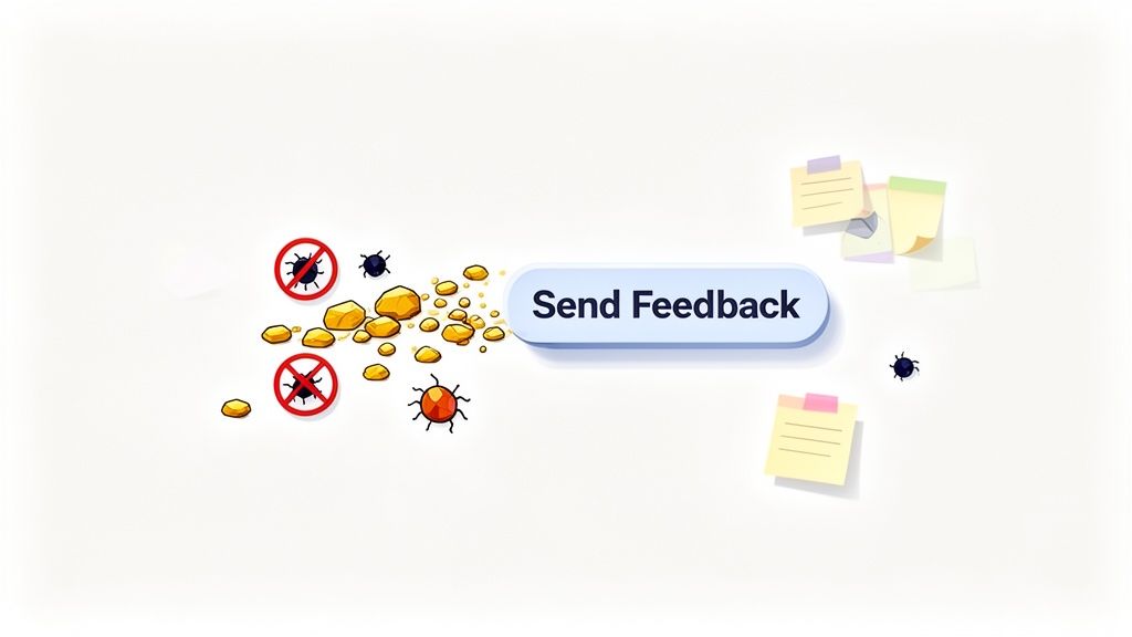
A send feedback button is so much more than just another feature on your site. I've seen teams treat it like a digital suggestion box—a place for complaints that often collects dust. But honestly, that’s a massive missed opportunity. It's a direct line to your users, a way to turn their opinions into a real driver for growth.
When you do it right, this button becomes a goldmine. It lets you capture in-context insights that can shape your product roadmap, help you squash bugs before they become a nightmare, and genuinely make your user experience better.
Why Your Send Feedback Button Is a Strategic Asset
Think of it less as a complaint channel and more as your most direct source of truth. The feedback you get is unfiltered, immediate, and comes with all the context you need. It’s your first line of defense against angry public reviews and a killer way to build user loyalty.
From Complaints to Opportunities
Every single piece of feedback, good or bad, is an opportunity staring you in the face. A bug report? That’s your chance to fix something frustrating before it affects thousands more users. A feature request? That's a peek into your future roadmap, straight from the people who will actually pay for it.
Here’s a real-world example I saw unfold: a mid-sized SaaS company started noticing a small but steady increase in customer churn. Their analytics dashboards weren't telling them why. After digging into submissions from their feedback button, they found a recurring complaint about a confusing workflow in their billing portal.
They rolled out a minor UI fix based directly on that feedback. The result? A 15% reduction in churn from that specific user segment within three months. That’s proof this button isn't just a "nice-to-have"—it's a critical business tool. Figuring out how to collect and act on these insights is key to unlocking growth with feedback for websites.
A Proactive Approach to User Experience
A well-placed feedback button lets you be proactive, not reactive. Instead of waiting for users to vent on social media or leave a one-star review, you’re giving them a private, constructive outlet. That simple act shows you're listening and that you actually value their opinion.
By treating every submission as a conversation starter, you shift the dynamic from a transactional relationship to a collaborative partnership. This builds a community of users who feel invested in your success.
Ultimately, the goal is to create a continuous loop where user insights directly influence product improvements. This not only leads to a better product but also helps improve website conversion rate by systematically getting rid of those little friction points that drive users crazy.
Designing a Feedback Button for Maximum Clicks
A great send feedback button isn't just about pretty colors or a slick icon. It’s about psychology. To get users to actually click, the button has to feel like an effortless, helpful part of their experience—not another chore they have to complete.
The whole design process really starts with one simple question: where will users naturally look for help or want to share an idea? Answering that immediately splits your options into two main camps, each with its own strategic advantages.
To really nail this and get those clicks, you need to apply some fundamental conversion-focused website design principles to its placement, look, and the words you use.
Placement and Visibility
Where you put your feedback button dramatically impacts engagement. There's no single "best" spot; the right choice is all about your user interface and what you're trying to accomplish.
I've seen two placements work wonders:
The Floating Tab: This is a persistent button that’s usually docked to the side or bottom of the screen. Its biggest win is constant visibility. No matter where a user scrolls, the option to give feedback is always right there, which is perfect for capturing those in-the-moment thoughts.
The Footer Link: Sticking a feedback link in your website's footer is a more subtle approach. It’s a classic spot where users expect to find secondary actions, making it a great fit if you're aiming for a clean, uncluttered interface.
Whichever you choose, make sure the button has enough color contrast to pop against the background. It needs to be noticeable without screaming for attention. A good tip is to use your brand's primary action color—the one you use for "Buy Now" or "Sign Up"—to visually signal that it’s a clickable element.
Comparison of Feedback Button Styles
Choosing the right style of feedback button depends on your goals and user context. This table compares the most common types to help you decide.
Button Style | Best For | Pros | Cons |
|---|---|---|---|
Floating Tab | Capturing in-the-moment feedback across the entire user journey. | Always visible, high engagement potential, doesn't disrupt user flow. | Can sometimes feel intrusive if not designed well, takes up screen real estate. |
Footer Link | Maintaining a clean UI, providing a standard location for support. | Unobtrusive, follows conventional web design patterns. | Lower visibility, users must actively seek it out, less likely to capture spontaneous feedback. |
Embedded Button | Gathering context-specific feedback on a particular feature or page. | Highly relevant feedback, clear user intent. | Only visible on specific pages, requires more implementation effort. |
Modal Pop-up | Proactively asking for feedback after a key user action (e.g., purchase). | Timely and targeted, can yield high response rates. | Can be interruptive and annoying if not timed perfectly. |
Ultimately, the best choice aligns with how your users interact with your site. A floating tab is great for general feedback, while an embedded button is better for targeted insights.
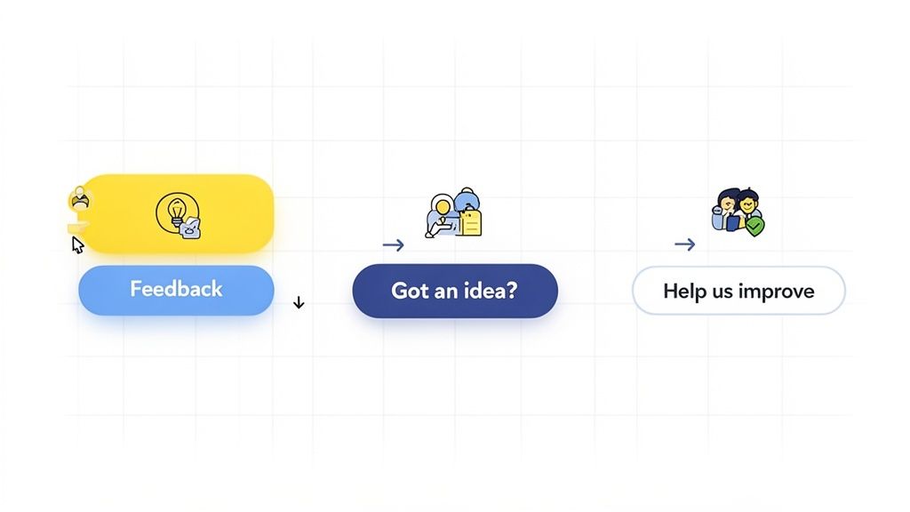
Compelling Microcopy
The words on your button matter more than you probably think. "Submit" is functional but totally uninspired. "Feedback" is a bit better, but still generic. The goal is to use microcopy that feels conversational and lines up with what the user is trying to do.
Think about these alternatives:
Got an idea? This is perfect for encouraging feature requests and positive suggestions.
Help us improve: This wording frames the user as a collaborator, which makes them feel valued.
Report a bug: Use this for specific, targeted feedback channels, like inside a developer portal.
The right phrase turns a simple button into a welcoming invitation for a chat. That approach is way more effective at getting people to click.
The best feedback button feels like a helpful conversation starter, not a formal survey. It should be an open door that invites users to share their thoughts on their own terms, at the moment inspiration strikes.
This shift in perspective is critical. In-app feedback buttons have shown engagement rates ranging from 5% to as high as 50% in some cases, blowing traditional survey methods out of the water. I once saw a retail company report a 1.23% increase in checkout conversion just from implementing fixes based on feedback. That's a real business impact.
By designing your button with the user's mindset at the forefront, you're not just collecting data; you're building a better product and a stronger relationship with your users.
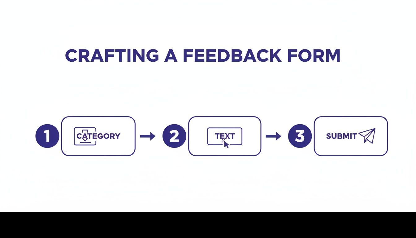
Crafting a Feedback Form Users Will Actually Complete
Getting someone to click your send feedback button is only half the battle. If they land on a form that looks like a tax return, they’re gone. The real goal is to build a form that respects their time while still capturing the juicy details your team is desperate for.
A great feedback form hits that sweet spot between being effortless for the user and data-rich for you. Every single field has to earn its place.
The Essentials of a Frictionless Form
I've learned that the best feedback forms are brutally simple. They zero in on the core information you need and get out of the user's way. Anything extra just adds friction and sends your abandonment rates through the roof.
Start with just these two fundamental pieces:
Category Dropdown: This is a quick win for everyone. A simple dropdown with options like "Bug Report," "Feature Idea," or "General Praise" instantly helps your team triage submissions. For the user, it’s a single click that helps them frame their thoughts.
A Clean Text Area: This is the heart of the form. Give users a generous, clean space to type without clutter. I like to use a simple, clear prompt like, "How can we improve?" or "Tell us what's on your mind."
This minimalist approach means that even your busiest user can fire off feedback in under 30 seconds.
The Big Question: Should You Ask for Contact Info?
One of the most common mistakes I see is making contact information mandatory. It's so tempting to require an email to follow up, I get it. But forcing it can absolutely kill your submission rate. A lot of users just want to drop some anonymous, drive-by feedback without signing up for a conversation.
The solution is simple: make contact fields optional. Add an email or name field, but be sure to label it as "(Optional)". This one small change respects user privacy and can seriously boost submissions from people who would have otherwise bailed.
This approach gives you the best of both worlds. The folks who want a follow-up can provide their details, while those who prefer to stay anonymous can still share their valuable insights.
Empowering Your Developers with More Context
While a simple form is great for the user, developers often need more context to actually do anything with the feedback. This is where you can get clever and add some powerful, automated features that collect data without asking the user to lift a finger. Just be sure you're transparent and ask for consent!
Think about adding functionality that automatically captures:
A Screenshot: A picture is truly worth a thousand words, especially for bug reports. Automatically grabbing a screenshot of the user's current page provides instant visual context. To really level up, you could even integrate a screenshot annotation tool to let users highlight specific areas.
Session Data: Technical info like browser version, operating system, and screen resolution can be a lifesaver for debugging. Capturing this metadata automatically saves the user the headache of digging it up themselves.
By pairing a simple, user-facing form with smart, automated data collection, you create a feedback system that’s both a breeze to use and incredibly powerful for your team. The user has a quick, painless experience, and your developers get the rich, actionable context they need to crush bugs and build better features.
So, What Do You Do With All This Feedback?
Getting a steady stream of submissions from your send feedback button is a fantastic problem to have, but let's be real—that’s just the starting line. The real wins come from building a smart system to manage, route, and actually do something with all that user insight. Without a solid process on the back end, even the most brilliant feedback will just turn into noise.
If you’re a lean startup or a small team just getting your feet wet, keep it simple. Seriously. Routing all submissions to a dedicated email like is a quick and surprisingly effective way to start. It gets everything into one bucket so nothing falls through the cracks while you're figuring things out.
Putting Your Feedback Workflow on Autopilot
As you grow, manually sifting through emails will quickly become a nightmare. This is the point where you need to connect your feedback tool directly into your team's existing workflow. The whole idea is to get the right information to the right person without anyone having to lift a finger.
Here’s how we’ve seen it work best:
Slack Integration: Want everyone to have a pulse on user sentiment? Pipe new feedback directly into a dedicated Slack channel. It’s perfect for sparking quick discussions around critical bugs or amazing feature ideas as they come in.
Project Management Tools: This is where things get really powerful. Automatically create tasks in tools like Jira, Asana, or Trello. A bug report instantly becomes a ticket in the engineering backlog. A feature request lands right on the product manager's board, ready for the next planning session.
Triage and Categorization Systems
A truly smart workflow doesn't just route feedback; it understands it. I worked with one product team that used automation to tag every single submission the moment it arrived. A message with words like "error" or "broken" would get tagged as a and ping the on-call developer. Something with "idea" or "feature" would be labeled and assigned to the product owner.
This all starts with how you capture the feedback in the first place.
This initial sorting on the user's end makes it a whole lot easier for your automated systems to process and route it correctly on the backend.
The end game here is to turn a raw, messy stream of user comments into an organized, actionable asset. A good automated system makes sure every piece of insight gets seen, sorted, and sent to the person who can actually do something about it.
This isn't just a "nice-to-have." With 88% of consumers trusting online reviews as much as a friend's recommendation, you absolutely want to catch and solve issues internally. A simple feedback button gives users an easy outlet, stopping a bad experience from turning into a public complaint.
If you're looking for a tool to fit your workflow, this list of the best website feedback tools for 2025 is a great place to start. A systematic approach like this is how you turn raw data into real improvements and, ultimately, happier customers.
Closing the Loop to Encourage More Feedback
So, a user clicks your send feedback button. Job done, right? Not even close. In fact, what you do next is probably the most important part of the entire process.
Users who feel like they've been heard are infinitely more likely to share their thoughts again. Get this part right, and you can turn a one-time comment into a long-term, valuable conversation. This final step is all about "closing the feedback loop."
When someone takes the time to give you feedback, they’re basically raising their hand to help you make your product better. If you ignore them, it’s like letting their submission vanish into a black hole. Trust me, they won't bother raising their hand again.
Acknowledge Every Single Submission
The first and easiest win? Just let them know you got their message. It’s that simple.
A quick, automated email or a snappy in-app message saying, "Thanks, we got your feedback!" goes a surprisingly long way. It confirms their submission wasn't lost to the digital ether and shows that you actually have a system in place to review it.
This tiny gesture sets a positive tone from the get-go. It's a low-effort way to show you respect the user's time, making them feel valued the moment they hit "send."
When users believe their feedback actually matters, they transform from passive consumers into your most valuable source of innovation and improvement. Your job is to reinforce that belief at every opportunity.
Go Beyond Automated Responses
Automation is great for that first immediate "hello," but the real magic happens when a human gets involved. Now, you don't have to write a novel in response to every single message, but a few strategic, personalized follow-ups can build some serious loyalty.
Think about these high-impact moments to reach out:
When you fix a bug they reported: A quick note like, "Hey, remember that issue you flagged? We just fixed it in our latest update. Thanks again for the heads-up!" is incredibly powerful.
When you launch a feature they suggested: Let the users who came up with the idea know it’s now live. This makes them feel like they're a real part of your product's story.
This kind of proactive communication shows you don't just listen—you act. From my experience, it’s the single most effective way to encourage a steady stream of high-quality feedback.
Ever seen those smiley-face feedback terminals in airports? There's a reason companies use them. That immediate, low-friction interaction generates a massive amount of data. The company HappyOrNot, for example, recorded over one billion presses on their terminals, with most users hitting the "Very Happy" button. It’s a perfect illustration of how a simple mechanism can generate huge response volumes.
By closing the loop with your users, you give your digital send feedback button that same sense of immediate value, encouraging them to keep the conversation going.
Getting Past the Common "What Ifs" of Adding a Feedback Button
So, you're thinking about adding a send feedback button to your project. Smart move. But as soon as you get serious about it, a few practical questions always pop up. I've been there. Teams start wondering if they're opening Pandora's box and whether the whole thing is actually worth the effort.
Let's cut through the noise and tackle those common uncertainties head-on.
One of the first things I hear is a worry about getting buried in spam or low-effort junk. It's a fair point. But honestly, a well-designed form that lets users categorize their input—think a simple dropdown for "Bug" or "Idea"—does a surprisingly good job of filtering. In my experience, the signal-to-noise ratio is much better than you'd expect. Most people who take the time to click that button have something genuine to say.
Then comes the next question: "Do I need to pull a developer off their work for this?" Not always. A custom-coded button gives you all the control in the world, sure. But tons of third-party feedback tools just give you a simple code snippet. You can literally get a button live in minutes by pasting it into your site's header. No complex dev cycle needed.
"But Won't It Slow Down My Website?"
This one's a big deal. Performance is everything, and nobody wants to add a script that bogs down the user experience. It’s a question I get asked all the time, and rightfully so.
The good news is that modern feedback tools are built to be incredibly lightweight. They almost always load asynchronously, which is a fancy way of saying they don't block the rest of your page from loading. Your content, images, and other critical stuff render first.
The actual script for a good feedback widget is tiny, and its impact on your page speed is usually negligible. You can even test it yourself with tools like Google PageSpeed Insights before and after you add the snippet. The tiny performance hit is almost always a fantastic trade-off for the insights you're about to unlock.
The whole point is to collect feedback without getting in the user's way. A solid tool should feel like a native part of your site, not some heavy, bolted-on feature that makes everything grind to a halt.
"Okay, So How Much Feedback Are We Talking About?"
This is the million-dollar question, and the honest answer is: it depends. A high-traffic e-commerce site might get dozens of submissions every single day. A niche B2B SaaS tool, on the other hand, might just get a few each week.
Here are the big factors that influence the volume:
Button Visibility: A bright, floating tab is going to get way more clicks than a quiet little link in your footer.
User Base: The more passionate and engaged your users are, the more opinions they'll have to share.
Proactive Prompts: If you set up the feedback form to appear after certain actions (like abandoning a cart), you’ll see more targeted, in-the-moment responses.
My advice? Start with the expectation of a small but steady stream. Have a basic process ready for who handles it, and be prepared to scale that process as the volume grows.
Ready to turn user insights into action? Beep lets you add a feedback button to your live website in minutes, capturing visual feedback with automatic screenshots. Stop guessing what users mean and start seeing what they see. Get started for free at https://www.justbeepit.com.
Comments