
.png)
Responsive: responsive design best practices for flawless multi-device UX
- shems sheikh
- Jan 28
- 18 min read

In a world where users switch between phones, tablets, and desktops seamlessly, a 'good enough' responsive website no longer cuts it. Today’s digital expectations demand a user experience that is not just functional but flawless, fast, and accessible on every single screen. Simply adjusting layouts at a few predefined breakpoints is an outdated approach that often leads to awkward in-between states and a compromised user journey. True success lies in a holistic strategy that combines fluid grids, lightning-fast performance, and a deep sense of user empathy.
This guide moves beyond the basics to deliver the 10 essential responsive design best practices that product managers, designers, and developers must master. We provide a prioritized, actionable roadmap for building genuinely adaptive and future-proof web experiences. Forget generic advice; we are focusing on the practical implementation details that bridge the gap between design theory and development reality. You will learn how to build not just for devices we have now, but for the countless screen sizes of tomorrow.
Our goal is to equip your team with advanced techniques to ensure your projects don't just shrink to fit a screen, but truly thrive on it. We will cover critical topics including:
Layout Systems: Mastering CSS Grid and Flexbox for truly fluid designs.
Performance: Optimizing images, media, and code to meet Core Web Vitals.
Accessibility: Ensuring your responsive design is usable for everyone.
Workflow: Integrating robust testing and collaboration from start to finish.
This is your comprehensive manual for moving past simple device adaptation and into the realm of creating exceptional, universally accessible digital products. Let's dive into the practices that separate the merely functional from the truly fantastic.
1. Mobile-First Design Approach
A mobile-first design approach is a core strategy in modern web development that reverses the traditional design workflow. Instead of designing for a large desktop screen and then scaling down, you begin with the smallest screen-mobile-and progressively enhance the experience for larger devices like tablets and desktops. This methodology, popularized by experts like Luke Wroblewski, forces teams to prioritize essential content and functionality from the start, as mobile screens have limited real estate.
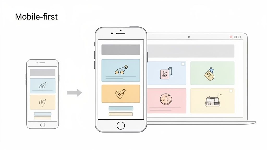
Given that mobile devices account for the majority of global web traffic, adopting this approach is no longer just a trend; it's a fundamental aspect of responsive design best practices. It directly addresses user behavior and aligns with Google's mobile-first indexing, which prioritizes the mobile version of a site for ranking and indexing.
Why It's a Best Practice
Starting with mobile constraints compels you to focus on performance, core user journeys, and clean, efficient code. It prevents the common pitfall of "graceful degradation," where complex desktop features are awkwardly hidden or removed on mobile, leading to a disjointed user experience. Instead, "progressive enhancement" ensures the core experience is solid on all devices, with features and layout complexity added as screen size allows. While many principles overlap, it's helpful to understand the nuances that separate web and native experiences. For a deeper dive into design principles that extend to mobile-first thinking, consider exploring these best practices for mobile app design.
How to Implement It
Prioritize Ruthlessly: Identify the most critical content and user actions. What must a user be able to do on their phone? Start there.
Design for Touch: Ensure buttons and interactive elements are large enough for fingertip interaction and have adequate spacing to prevent accidental taps.
Test on Real Devices: Browser emulators are useful, but nothing beats testing on actual hardware to understand performance and touch responsiveness.
Use Visual Feedback Tools: Integrate tools like Beep to capture screenshots of mobile layouts and add contextual feedback. This allows teams to annotate UI issues directly on mobile previews, streamlining the QA process for various breakpoints.
2. Flexible Grid Systems and CSS Grid/Flexbox
Flexible grid systems are the architectural backbone of responsive design, moving away from rigid, pixel-based layouts to fluid, proportional ones. By using relative units like percentages, , and , these grids allow content to reflow and resize gracefully based on the available screen space. Modern CSS technologies like Flexbox and CSS Grid have revolutionized this, providing powerful and efficient engines for creating complex, adaptive layouts without cumbersome hacks.
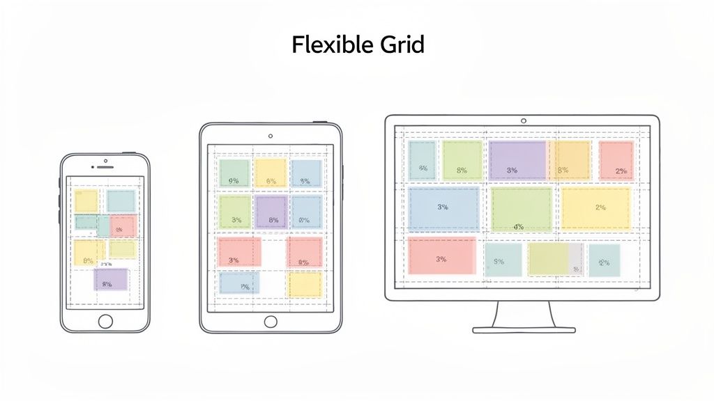
Pioneered by web standards advocates like Rachel Andrew and Jen Simmons, these layout models enable developers to build everything from simple component alignments to complex, magazine-style page structures that are inherently responsive. This shift from fixed columns to dynamic content containers is a fundamental component of modern responsive design best practices, ensuring a consistent and predictable user experience across all devices. Frameworks like Bootstrap 5 are built entirely on this principle.
Why It's a Best Practice
Using CSS Grid and Flexbox simplifies the creation of maintainable and scalable layouts. Flexbox excels at one-dimensional layouts (aligning items in a row or column), making it perfect for navigation bars and component-level alignment. CSS Grid handles two-dimensional layouts, allowing for precise control over both rows and columns simultaneously. This eliminates the need for outdated float-based layouts and complex calculations, resulting in cleaner, more semantic HTML and more robust CSS.
How to Implement It
Choose the Right Tool: Use Flexbox for content distribution and alignment along a single axis. Use CSS Grid for complex, two-dimensional page layouts that require control over both rows and columns.
Embrace Relative Units: Define grid tracks and gaps using relative units (, , ) instead of fixed pixels to ensure the layout adapts fluidly to its container.
Test with Variable Content: Stress-test your grid by populating it with varying amounts of text and different image sizes to identify potential overflow or alignment issues.
Visualize Grid Behavior with Beep: During QA, use a tool like Beep to capture side-by-side screenshots of your layout at different breakpoints. This allows designers and developers to visually annotate specific grid cells or flex containers where alignment, spacing, or wrapping issues occur, providing clear, actionable feedback.
3. Responsive Images and Media Optimization
Responsive images and media are assets that adapt their size, resolution, crop, and even format based on the user's device, screen size, and network conditions. This is a critical component of responsive design best practices because images and videos are often the heaviest parts of a webpage. Failing to optimize them leads to slow load times, high data consumption for mobile users, and a poor user experience. Techniques like the attribute, the element, and modern formats like WebP and AVIF are central to this practice.
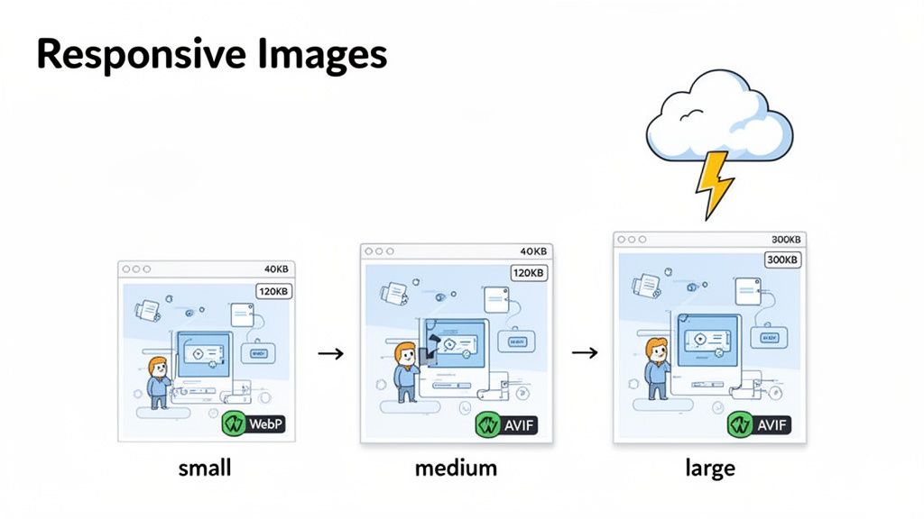
The goal is to serve the smallest possible file that still looks crisp and clear on the user's screen. For instance, a high-resolution 4K image needed for a large desktop monitor would be wasteful on a small smartphone screen over a cellular connection. Platforms like Amazon and Netflix excel at this by delivering precisely optimized product images and thumbnails that load quickly without sacrificing visual quality, regardless of the device.
Why It's a Best Practice
Implementing responsive images directly impacts core web vitals, particularly Largest Contentful Paint (LCP), a key metric for user experience and SEO. By serving appropriately sized images, you significantly reduce page weight, which speeds up load times and improves performance. This practice, advocated by the Respimg Community Group and Google, ensures that users on slow networks aren't penalized with long waits. It's about delivering a fast, efficient experience for everyone, which is the essence of responsive design.
How to Implement It
Use for Resolution Switching: Use the attribute on tags to provide the browser with multiple image sizes. The browser will then select the most appropriate one based on the device's screen density and viewport size.
Leverage the Element: For more complex scenarios, like art direction (serving different crops for different screen sizes) or format switching (serving WebP or AVIF to supported browsers), use the element.
Implement Lazy Loading: Use the attribute for images and iframes that are below the fold. This instructs the browser to defer loading these assets until the user scrolls near them, speeding up the initial page load.
Verify with Feedback Tools: During QA, use tools like Beep to capture screenshots at various breakpoints. Team members can then annotate any image rendering issues, such as incorrect sizing, pixelation, or improper cropping, ensuring visual fidelity across all devices.
4. Flexible Typography and Readable Font Scaling
Flexible typography is a crucial best practice that ensures text remains readable and aesthetically balanced across all devices. Instead of using fixed pixel values for font sizes, this technique relies on relative units like , , and viewport units (, ) to allow text to scale fluidly with the browser window. This approach, advocated by pioneers like Tim Brown, maintains the established visual hierarchy and proportions of your design, preventing awkward text wrapping or microscopic font sizes on smaller screens.
This method goes beyond simply setting a few breakpoints for text sizes; it creates a truly responsive system where typography adapts smoothly to any screen width. This is fundamental to modern responsive design best practices, as it improves legibility and user comfort, which are key components of a positive user experience. Well-implemented fluid typography, as seen on sites like Smashing Magazine and Stripe, creates a more polished and professional feel.
Why It's a Best Practice
Adopting flexible typography prevents the common problem of text becoming either overwhelmingly large on big screens or unreadably small on mobile devices. It respects accessibility guidelines by allowing users to zoom or adjust their browser's default font size without breaking the layout. By using a scalable system, designers and developers can define a typographic scale once and trust it to adapt, saving time and reducing the need for numerous media query overrides for font sizes alone.
How to Implement It
Use Relative Units: Set your base font size on the element in pixels, then use units for all typographic elements. This allows the entire type scale to be adjusted by changing a single value.
Implement Fluid Scaling: For truly fluid type, use the CSS function. For example: . This sets a minimum size, a preferred scalable size based on viewport width, and a maximum size.
Establish a Type Scale: Define a clear and consistent typographic hierarchy (e.g., for H1, H2, body text) using a modular scale. This ensures visual harmony regardless of the screen size.
Verify Legibility with Feedback Tools: Use a tool like Beep to capture screenshots of your typography at various breakpoints. Team members can then directly annotate specific text that appears too large or small, highlighting legibility issues and ensuring the scaling logic works as intended.
5. Mobile-Friendly Navigation and Touch-Optimized Interactions
Effective navigation is the backbone of a user's journey, and on mobile devices, it requires a completely different approach than on desktop. Mobile-friendly navigation prioritizes clarity and ease of use on smaller, touch-based screens. This often involves transforming complex desktop menus into streamlined patterns like the "hamburger" menu, bottom tab bars, or collapsible accordions.
Beyond just rearranging menus, this practice focuses on optimizing every interaction for touch. Unlike precise mouse clicks, fingertips are larger and less exact. Therefore, touch-optimized interactions demand larger tap targets, ample spacing between elements, and intuitive gestures. Pioneers in mobile UX like Brad Frost and research from the Nielsen Norman Group have established that these considerations are critical for preventing user frustration and ensuring a seamless experience.
Why It's a Best Practice
A clunky, non-responsive navigation system is one of the fastest ways to lose a mobile user. Optimizing for touch is a fundamental aspect of accessible and user-centric design. By creating large, clearly defined tap targets (a minimum of 48x48 pixels is often recommended), you reduce the chances of accidental taps and make the interface more forgiving. This focus on mobile-first navigation patterns forces you to simplify your information architecture, ensuring that users can find what they need quickly and efficiently.
How to Implement It
Choose the Right Pattern: Select a mobile navigation pattern that suits your content. Common choices include the hamburger menu for extensive options, a tab bar for core app sections, or a "priority+" pattern that shows key links and hides the rest.
Increase Tap Target Size: Ensure all interactive elements like buttons, links, and icons are large enough to be tapped accurately with a finger. Add sufficient padding around them to create a generous hit area.
Consider Gestures: Explore how swipe gestures can enhance navigation. For example, a user could swipe to move between tabs or dismiss a modal window, creating a more fluid and native-app-like feel.
Test Navigation States: Use a visual feedback tool like Beep to test navigation across different devices and breakpoints. Capture screenshots of menu states (both open and closed) and annotate any inconsistencies or usability issues, like buttons that are too small or hard to reach.
6. Breakpoint Strategy and Device-Specific Design
A breakpoint strategy is fundamental to responsive design, defining the specific screen widths where a website's layout adapts. These points, controlled by CSS media queries, are not about targeting specific devices but rather about ensuring the content looks its best as the viewport changes. Instead of designing for every possible screen, a thoughtful strategy focuses on a few key breakpoints that cover common device categories like mobile, tablet, and desktop.
Pioneered by figures like Ethan Marcotte, the concept of breakpoints moves away from fixed, device-centric design toward a more fluid and content-aware approach. A well-executed strategy ensures a seamless transition between layouts, preventing broken elements or awkward spacing. This is a core component of responsive design best practices because it provides a predictable and scalable framework for managing layout complexity across an infinite number of screen sizes.
Why It's a Best Practice
Designing without a clear breakpoint strategy leads to chaotic, inconsistent user experiences. A defined system ensures that every layout shift is intentional and serves the user's context. It helps teams make deliberate decisions about how content reflows, when navigation patterns change, and how interactive elements should adapt. Frameworks like Bootstrap and Material Design have popularized predefined breakpoint systems because they bring consistency and predictability to the development process, reducing guesswork and ensuring a high-quality baseline experience on all devices.
How to Implement It
Start with Content, Not Devices: Let your content dictate the breakpoints. Identify where your design starts to look stretched, crowded, or broken, and add a breakpoint there.
Establish a Standard System: Adopt a proven breakpoint system, such as those used in Tailwind CSS or Shopify Polaris, and document it in your design system for team-wide consistency.
Test Breakpoint Boundaries: Pay close attention to the pixels just before and after a breakpoint (e.g., at 767px and 768px). These edge cases are where layout issues often appear.
Systematically Review Each Breakpoint: Use visual feedback tools like Beep to capture full-page screenshots at each major breakpoint. This allows your team to annotate layout problems specific to certain screen sizes, creating an organized and actionable backlog of responsive UI bugs.
7. Performance Optimization and Core Web Vitals
Performance optimization is the practice of making a website load and respond as quickly as possible. In the context of responsive design, it means ensuring a fast, seamless experience across all devices, from a low-powered mobile phone on a slow network to a high-end desktop. A key part of this is focusing on Google's Core Web Vitals, a set of specific metrics that measure real-world user experience for loading performance, interactivity, and visual stability.
These metrics, including Largest Contentful Paint (LCP), First Input Delay (FID), and Cumulative Layout Shift (CLS), are no longer just technical jargon. They directly impact user satisfaction, bounce rates, and, crucially, your site's SEO ranking. A beautiful responsive design is ineffective if it’s too slow to load or frustrating to use, making performance a non-negotiable component of modern responsive design best practices.
Why It's a Best Practice
Prioritizing performance ensures that your design is accessible and usable for everyone, regardless of their device or network speed. It forces a disciplined approach, encouraging efficient coding, optimized assets, and a focus on what truly matters to the user's experience. A high-performing site feels more professional and reliable, building user trust. Ignoring Core Web Vitals can lead to penalties in search rankings and a poor perception of your brand, as users associate slow load times with low quality.
How to Implement It
Audit and Monitor: Regularly run performance audits using tools like Google PageSpeed Insights and Lighthouse. This provides a baseline and helps identify areas for improvement.
Optimize Assets: Compress images using modern formats like WebP, minify CSS and JavaScript files to reduce their size, and use a Content Delivery Network (CDN) to serve assets faster to users globally.
Implement Lazy Loading: Defer the loading of off-screen images and videos. This speeds up the initial page load by only loading what is immediately visible to the user.
Integrate Performance into QA: Use visual feedback tools like Beep to document performance issues directly on the page. Testers can annotate layout shifts (CLS) or report slow-loading elements, linking visual problems to underlying performance bottlenecks. This makes it easier for developers to pinpoint and fix issues.
Prioritize Above-the-Fold Content: Ensure that critical CSS and content for the visible part of the page load first, providing a near-instant rendering experience. For a comprehensive guide, use this ultimate website review checklist to ensure all performance aspects are covered.
8. Accessibility and Inclusive Responsive Design
True responsive design goes beyond adapting to screen sizes; it adapts to user needs. Accessibility and inclusive design are foundational principles ensuring that digital experiences are usable by everyone, regardless of their abilities. This means creating websites that work seamlessly for individuals using assistive technologies like screen readers, keyboard-only navigation, or voice commands across all devices, from a small phone to a large monitor.
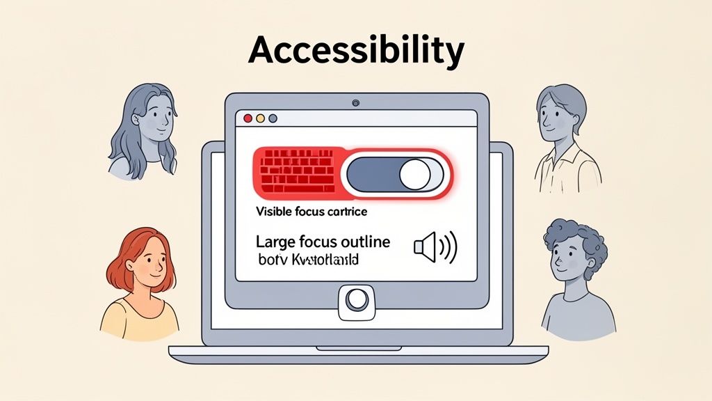
Pioneered by organizations like the W3C through its Web Content Accessibility Guidelines (WCAG), this practice is not just about compliance but about providing an equitable user experience. Integrating accessibility from the start of the design process prevents costly retrofits and ensures a better product for all users, not just those with disabilities. For example, high-contrast text benefits users in bright sunlight, and clear navigation aids everyone.
Why It's a Best Practice
An accessible design is inherently a more robust and user-friendly design. It improves SEO, as search engine crawlers can better understand well-structured, semantic content. It also expands your potential audience by removing barriers for millions of users with disabilities. By making accessibility a core part of your responsive design best practices, you build a more inclusive and effective digital product. For a comprehensive guide, refer to this ultimate website accessibility checklist for inclusivity.
How to Implement It
Use Semantic HTML: Structure content with proper HTML5 tags (, , ) so screen readers can interpret the layout and hierarchy correctly.
Ensure Keyboard Navigability: Test that all interactive elements, like links, buttons, and form fields, can be accessed and operated using only the Tab key.
Check Color Contrast: Verify that text and background colors meet WCAG contrast ratio standards (at least 4.5:1 for normal text) to ensure readability.
Integrate Accessibility into QA: Use tools like Beep to capture screenshots of accessibility issues, such as poor focus states or low contrast text. Annotate these captures with specific WCAG violations to provide clear, actionable feedback to developers.
9. Testing Across Real Devices and Network Conditions
Responsive design testing that relies solely on browser emulation is incomplete. While emulators are great for quick layout checks, they fail to replicate the nuances of real-world usage. Testing across actual devices and variable network conditions is a critical best practice that uncovers issues related to touch interactivity, hardware performance, and connectivity limitations that simulations simply cannot catch.
This practice involves using physical smartphones and tablets, or cloud-based platforms like BrowserStack and Sauce Labs, to interact with a website as a real user would. It validates not just how a design looks, but how it feels and performs under authentic circumstances. This approach ensures a robust, reliable experience for all users, regardless of their device, operating system, or network quality, making it a cornerstone of comprehensive responsive design best practices.
Why It's a Best Practice
Emulators do not accurately render fonts, account for device-specific browser quirks, or simulate the performance impact of a slow 3G network on a low-end smartphone. Real-device testing closes this gap by revealing critical usability flaws, from "fat finger" issues on tightly packed touch targets to janky animations on underpowered hardware. It ensures your meticulously crafted design doesn't fall apart when it meets reality, safeguarding the user experience and brand perception.
How to Implement It
Create a Device Matrix: Identify the most popular devices and operating systems used by your target audience. Prioritize testing on a mix of high-end, mid-range, and budget devices.
Simulate Network Conditions: Use browser developer tools or dedicated software to throttle network speeds (e.g., to 3G or slow 4G) and test how your site's performance holds up.
Document Bugs with Context: When a bug is found on a real device, use a visual feedback tool like Beep to capture a screenshot directly from the device. Annotate the issue with details about the OS version, browser, and network conditions to give developers the full context.
Leverage Cloud Testing Platforms: If a physical device lab is not feasible, use services like BrowserStack or Sauce Labs to access a vast library of real devices remotely. For an in-depth strategy, you can explore this quick guide to test a website on different devices.
10. Version Control for Design Assets and Responsive Updates
Version control is a systematic approach to managing changes to documents, code, and other collections of information. In responsive design, it provides an organized, trackable, and collaborative framework for handling the evolution of design files, CSS, and asset variations across different breakpoints. This practice ensures that every modification is documented, allowing teams to review history, revert to previous states, and work in parallel without conflicts.
Without a robust versioning system, managing responsive updates can become chaotic. Teams risk overwriting work, losing track of which design iteration corresponds to a specific code release, and struggling to debug layout issues introduced in recent changes. Implementing version control is a foundational responsive design best practice that brings order and accountability to the iterative process of creating and maintaining a fluid user experience.
Why It's a Best Practice
Version control transforms responsive design from a series of disjointed edits into a transparent, auditable process. It provides a single source of truth for both design (e.g., Figma, Adobe XD) and development (e.g., Git, GitHub). This system is crucial for debugging, as it allows developers to pinpoint exactly when a responsive layout bug was introduced. It also supports collaboration by enabling designers and developers to create separate branches for testing new responsive features without affecting the main project.
How to Implement It
Use Descriptive Commit Messages: When committing CSS changes, be specific. Instead of "UI fixes," use "Fix: Nav bar overlap on tablet breakpoint (768px)."
Branch for Responsive Variations: Create separate branches in Git to experiment with significant responsive design changes. This isolates new work, making it easier to test and review before merging.
Integrate Feedback with Version Control: Use tools like Beep to capture responsive layout issues and link them directly to tasks in systems like Jira or GitHub. This ensures every piece of visual feedback is tracked from report to resolution.
Tag Key Releases: Tag versions in your repository to mark significant milestones, such as the launch of a new set of breakpoints or a major responsive UI overhaul, for easy reference.
Automate Versioning Tasks: Leverage integrations, like Beep's Zapier connection, to automatically create version control tasks or issues from new feedback submissions, streamlining the entire responsive QA workflow.
Responsive Design — 10-Point Comparison
Title | Implementation Complexity 🔄 | Resource Requirements ⚡ | Expected Outcomes 📊 | Ideal Use Cases 💡 | Key Advantages ⭐ |
|---|---|---|---|---|---|
Mobile-First Design Approach | Moderate — requires discipline and progressive enhancement | Low–Medium — mobile testing and focused feature set | Better mobile performance, improved SEO and conversions | New projects or sites with >50% mobile traffic | Prioritizes core UX and performance on small screens |
Flexible Grid Systems (CSS Grid / Flexbox) | Moderate — learning curve for two‑dimensional layouts | Low — developer time to refactor layouts | Fluid, consistent layouts across breakpoints | Complex multi-column layouts, product catalogs | Simplifies responsive CSS and reduces code |
Responsive Images & Media Optimization | Moderate — build pipeline for multiple assets | Medium — image generation, CDN and format support | Lower bandwidth, faster load times, better Core Web Vitals | Media-heavy sites (ecommerce, publishers, portfolios) | Reduced page weight and improved real-world performance |
Flexible Typography & Readable Scaling | Low–Moderate — requires CSS techniques (vw/rem/calc) | Low — design testing across sizes | Consistent readability and preserved hierarchy | Content-first sites (blogs, documentation, apps) | Enhances legibility and accessibility across viewports |
Mobile-Friendly Navigation & Touch Interactions | Moderate — needs JS and UX considerations | Low–Medium — dev + touch testing on devices | Improved mobile usability and higher engagement/conversions | Apps, ecommerce, complex navigation structures | Reduces tap errors and cognitive load on mobile |
Breakpoint Strategy & Device-Specific Design | Low–Moderate — planning and targeted media queries | Low — focused testing at key widths | Targeted layouts optimized for common device ranges | Design systems and multi-device products | Enables targeted optimizations and simpler testing |
Performance Optimization & Core Web Vitals | High — continuous audits and mitigation work | Medium–High — tooling, CDN, build/process changes | Faster pages, better SEO, reduced bounce rates | High‑traffic sites, SaaS, publishers prioritizing metrics | Direct impact on search ranking and user retention |
Accessibility & Inclusive Responsive Design | Moderate–High — audits, ARIA, semantic updates | Medium — testing tools, training, QA time | Broader reach, legal risk reduction, improved UX | Public sector, enterprise, compliance‑focused products | Inclusive experience, better SEO and code quality |
Testing on Real Devices & Network Conditions | High — device matrix and coordination | High — device lab or cloud testing services | Accurate detection of real-world issues and regressions | Major launches, apps requiring cross-device parity | Prevents post‑launch surprises; validates true UX |
Version Control for Design Assets & Updates | Moderate — process setup and training | Low–Medium — storage, tooling and CI integration | Traceability, easy rollbacks, clearer change history | Teams with frequent responsive updates and CI/CD workflows | Improves collaboration, accountability, and rollback safety |
Building Adaptive Experiences, Not Just Responsive Layouts
The journey through responsive design best practices reveals a fundamental truth: modern web development is not about forcing a single design onto a multitude of screens. It is about creating truly adaptive experiences that respect the user's context, device, and intent. Moving beyond a simple checklist of technical fixes to a holistic, user-centric philosophy is what separates a merely functional website from a genuinely effective and delightful digital product.
We've explored the foundational pillars of this approach, starting with the non-negotiable mobile-first mindset. By designing for the smallest, most constrained environments first, we inherently prioritize content and functionality, leading to cleaner, more focused experiences that scale up gracefully. This pairs directly with the technical power of flexible grid systems. Mastering CSS Grid and Flexbox is no longer a niche skill; it is essential for building layouts that are not just fluid but also intelligently structured, maintaining integrity and hierarchy across any viewport.
From Technical Implementation to User-Centricity
The true impact of these practices comes alive when you consider the end-user. Think about responsive images and media optimization not just as a way to improve load times, but as a sign of respect for a user’s data plan and patience. Consider flexible typography not just as a scaling font, but as a commitment to readability and comfort, ensuring your message is clear whether viewed on a 4-inch phone or a 4K monitor. Every optimized image and every well-scaled heading contributes to a smoother, more accessible user journey.
Similarly, our discussion on touch-optimized interactions and mobile-friendly navigation underscores the need to design for the physical reality of how people use devices. It’s about creating interfaces that feel natural and intuitive to the touch, minimizing frustration and cognitive load. This deep empathy for the user’s experience is the common thread that ties all these responsive design best practices together. It’s the difference between a site that works on mobile and one that thrives on mobile.
A Continuous Cycle of Refinement and Testing
Ultimately, responsive design is not a one-time project; it is an ongoing commitment to quality and iteration. A strategic breakpoint strategy provides the framework, but it is rigorous testing across real devices that validates your assumptions and uncovers the real-world friction points your users face. Simulating different network conditions and using actual hardware is the only way to truly understand how your site performs under pressure.
This iterative loop is also where accessibility must be integrated from the very beginning. An inclusive design that serves all users, regardless of ability, is inherently more robust and user-friendly for everyone. As digital experiences continue to evolve, the principles discussed here will only become more critical. While many of these concepts are central to web design, they also share core principles with application development. For a deeper dive into extending responsiveness to applications, explore resources on responsive design for mobile apps to see how these fundamentals translate to different platforms.
Embracing these responsive design best practices is an investment in your product's future. It ensures your creation remains resilient, accessible, and effective in a digital landscape defined by constant change. By prioritizing the user at every step, you build more than a responsive layout; you build a lasting connection with your audience.
Ready to streamline your responsive testing and QA process? Beep provides a powerful visual feedback and bug reporting tool that lets your team annotate directly on live web pages, capture detailed technical logs automatically, and manage all feedback in a centralized Kanban board. Stop juggling spreadsheets and endless email chains; start collaborating more effectively with Beep and deliver pixel-perfect responsive experiences faster.
Comments