
.png)
Usability Testing of Website A Practical Guide to Better UX
- shems sheikh
- Jan 24
- 17 min read

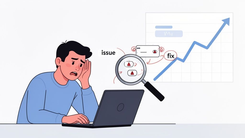
You can’t just guess what your users are thinking. That’s the core truth that makes website usability testing an absolute must-do, not just some "nice-to-have" activity.
When you skip this step, you’re basically designing in the dark. You're running on assumptions about how people behave, and those assumptions can lead directly to lost sales, terrible conversion rates, and a brand reputation that takes a nosedive.
Why Website Usability Testing Is a Game Changer
Think about it: a smooth, intuitive website builds trust. When users can effortlessly find what they need and get things done, they see your brand as competent and reliable. On the flip side, a confusing interface just creates frustration and doubt, pushing potential customers straight to your competitors.
Move Beyond Assumptions and Get the Facts
Every team thinks their website is easy to use. I've been there. But here's the hard truth: internal teams are way too close to the product. You know where everything is because you built it. It’s called the curse of knowledge, and it’s a real blind spot.
The only way to break that cycle is to sit back and watch actual users interact with your site. This process uncovers problems you would never spot on your own. I've seen it happen time and again. You might discover a critical "Add to Cart" button gets completely ignored because its color blends into the background, or that a single confusing step in your checkout flow causes 70% of users to give up and leave.
"Usability testing is the practice of getting a representative set of end-users to use your product and provide feedback. The goal is simple: identify any usability problems, collect qualitative data, and determine the participant's overall satisfaction with the product.”
These aren't just minor details—they are revenue killers hiding in plain sight.
The Clear Business Case for Testing
The numbers don't lie. A shocking 55% of companies don’t conduct any form of online usability testing, which means a huge number of businesses are flying completely blind. That's a massive risk when you consider that 75% of people judge a company's credibility based on its website design alone.
The ROI here is undeniable. We all know a mere one-second delay in page load time can cut conversions by 7%. But on the positive side, I’ve seen dedicated usability improvements deliver returns of up to 9,900%. That’s not a typo. By investing a little in understanding your users, you get a whole lot back.
To get a handle on what to measure, here are some of the key metrics that tie directly to business outcomes.
Key Usability Metrics and Their Business Impact
Tracking the right metrics is how you connect user friction to real-world financial impact. It's not just about making things "nicer"; it's about making them more effective. Here's a quick rundown of what I always keep an eye on.
Usability Metric | What It Measures | Direct Business Impact |
|---|---|---|
Task Success Rate | The percentage of users who successfully complete a defined task (e.g., making a purchase). | Higher success rates directly correlate with increased conversions, sales, and lead generation. |
Time on Task | How long it takes a user to complete a specific task. | Reduced time means less friction, a better user experience, and a lower chance of cart abandonment. |
Error Rate | The number of mistakes a user makes while trying to complete a task. | A lower error rate means fewer frustrated users, reduced support costs, and higher customer satisfaction. |
System Usability Scale (SUS) | A standardized questionnaire to measure a user's subjective perception of usability. | A higher SUS score is a strong indicator of customer loyalty and willingness to recommend your brand. |
Conversion Rate | The percentage of users who take a desired action (e.g., sign-up, purchase, download). | The ultimate measure of effectiveness. Small usability fixes can lead to significant lifts in this metric. |
By focusing on these areas, you start turning vague feedback into actionable, data-driven improvements that your stakeholders (and your bottom line) will love.
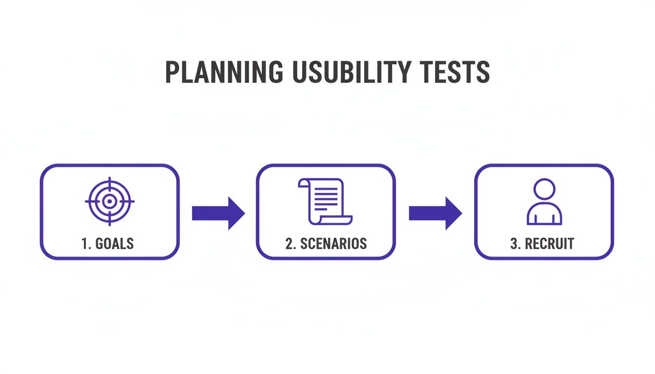
How to Plan a Usability Test That Actually Gets Results
Great website usability testing doesn't just happen when a user sits down at the computer. It all starts with a rock-solid plan. Trust me, without a clear direction, you're just setting yourself up for a pile of vague, unusable feedback. A well-thought-out plan is your blueprint, making sure every minute you spend with a participant pushes you closer to real, actionable insights.
The whole process kicks off with defining your goals. Vague objectives like "see if the website is easy to use" are a dead end. You've got to get specific and tie your goals to actual business outcomes or user problems. Are you trying to figure out why your shopping cart abandonment rate is through the roof? Or maybe you just launched a new feature and need to know if people can even find it.
Define Your Test Goals and Objectives
Before you even think about writing a single task, pull your team together and ask this one critical question: "What is the most important thing we need to learn right now?" This question is a lifesaver—it cuts through all the noise and forces you to focus. The answer becomes the heart of your entire test.
For an e-commerce site, for instance, your goals might look something like this:
Can users find a specific product category in under 30 seconds?
Pinpoint the exact moment of friction in the checkout process that's causing people to bail.
Figure out if the product filtering options are actually helpful or just confusing.
On the other hand, a SaaS platform might be more focused on:
Watching to see if a brand new user can get through the onboarding flow without any help.
Understanding how users discover and play with an advanced reporting feature.
Making sure the language used in the interface is clear and doesn't sound like corporate jargon.
A clear objective is the key to crafting the right questions and shaping a test that delivers real evidence. Without it, you're just wandering in the dark collecting opinions.
Once your goals are locked in, it's time to translate them into realistic user scenarios and tasks. This is where you bring your goals to life from the user's point of view. You're not just telling them what to click; you're giving them a real reason to be on your site in the first place.
Craft Realistic User Scenarios and Tasks
A good scenario gives the user context and motivation, which makes the whole test feel much more natural. Instead of a sterile command like, "Click on the 'Contact Us' button," you frame it as a relatable situation: "Imagine you just received a damaged product and need to get in touch with customer support to ask for a return. Show me how you'd go about doing that."
This simple shift encourages users to think and act like they would in real life. You get to see their natural navigation paths, hear their thought processes, and learn the exact words they use when they're looking for something. It’s this kind of detail that makes all the difference in a successful usability testing of website flows.
One pro tip: keep your tasks open-ended and don't lead the user. A classic mistake is using the same words in your task that are on your website. If your navigation has a link called "Learning Center," don't ask users to "Find the Learning Center." A much better approach is to ask, "Find where you would go to watch video tutorials about the product." This is how you test if your site’s structure actually makes sense to a real person.
Recruit the Right Participants for Your Test
The insights you gather are only as good as the people you test with. Seriously. Testing with the wrong audience can be worse than no testing at all—it can send your team down a completely wrong path. And no, your coworkers in the marketing department don't count as target users, no matter how convenient it is to grab them for a quick test.
Start by sketching out a simple user persona. This doesn't need to be some exhaustive, 10-page document. Just a few bullet points to define the key traits of your ideal tester will do the trick.
Demographics: What's their age, location, or occupation (if it's relevant)?
Technical Proficiency: How comfortable are they with technology or websites similar to yours?
Domain Knowledge: Are they an expert in your field or a total newbie?
Behavioral Traits: Do they shop online all the time? Are they already a customer, or are they brand new to your company?
With your persona in hand, you can write screener questions that filter out anyone who doesn't fit the profile. For example, if you need people who regularly manage team projects online, you could ask, "In the past month, how have you primarily managed your team's tasks?" and give them options like "Using a project management tool," "Using spreadsheets," or "I don't manage team tasks." This guarantees you're talking to the right folks from the get-go. Getting this part right can be tricky, so it's worth exploring the various top user testing methods available to see which approach best fits your project.
Alright, you've got your plan locked down and your participants lined up. Now for the fun part: actually gathering the feedback.
When it comes to website usability testing, you’re looking at two main flavors: moderated and unmoderated. The one you pick really boils down to your goals, your timeline, and what your budget looks like. Each method is great for uncovering different kinds of insights.
Think of moderated testing as a guided tour. You, the moderator, are right there with the participant—either in person or on a video call—guiding them, asking follow-up questions, and digging into why they do what they do. I’ve found this approach is gold when you're exploring complex tasks or just trying to get to the "why" behind a user's actions.
On the flip side, unmoderated testing is totally hands-off. Participants complete tasks on their own time while a platform records their screen and voice. This method is way faster, easier on the wallet, and perfect for getting quantitative data or quick feedback on simple tasks from a bigger crowd.
No matter which path you choose, a solid plan is your foundation.
This really drives home the point: clear goals, realistic scenarios, and the right people are the three pillars you need before you hit "go."
Mastering the Moderated Session
The whole key to a great moderated session is making your participant feel comfortable enough to be brutally honest. I always start by telling them there are no right or wrong answers and that they can't break anything. It’s crucial to emphasize that you're testing the website, not them.
A simple script helps keep you on track without sounding like a robot. I like to structure mine with a warm welcome, a few background questions to build some rapport, the core tasks, and then a quick wrap-up.
When a user gets stuck—and trust me, they will—how you react is everything. Fight that urge to jump in and rescue them. Instead, use neutral prompts to figure out what’s going on in their head:
"What are you thinking right now?"
"What did you expect to happen when you clicked that?"
"Tell me a bit more about what you're looking for here."
These kinds of open-ended questions get them talking about their confusion, which is often way more valuable than just seeing them complete the task.
The Art of Clear Unmoderated Instructions
With unmoderated tests, your instructions are doing all the heavy lifting. One confusing sentence can completely derail a session and leave you with skewed or totally useless data. Clarity is king.
Write each task as a short, self-contained instruction. My best tip is to frame it as a real-world scenario, not just a blunt command.
Poor Instruction: "Find the pricing page."
Better Instruction: "Imagine you're interested in signing up. Find out how much a monthly plan would cost."
This small tweak gives the user context and tests how intuitive your site is, not just their ability to follow directions. Before you launch the test to everyone, do a quick pilot run with a colleague. It’s a lifesaver for catching confusing questions or technical glitches before they mess with your real data.
The goal is to create instructions so clear that the user never has to guess what you mean. If you have to explain your explanation, it's not simple enough.
Choosing the Right Approach for Your Needs
So, how do you decide? It's the classic trade-off: depth versus scale.
Think about your main research question. If you need to understand complex user motivations or test a brand new, intricate prototype, the rich, qualitative feedback from a moderated test is unbeatable.
But if your goal is to validate a specific user flow, measure task completion times, or just get a quick pulse check from a large audience, the speed and low cost of unmoderated testing is the way to go. To make feedback collection even smoother, you might want to look into the best website annotation tools that can help capture and discuss findings.
Honestly, a hybrid approach often works best. I’ll often start with a few moderated sessions to uncover the biggest, most surprising issues, then follow up with a larger unmoderated test to see just how widespread those problems are. This one-two punch gives you both deep qualitative insights and solid quantitative validation.
Turning User Feedback into Actionable Insights
Alright, the usability tests are wrapped up. Now you're sitting on a mountain of raw data—recordings, scribbled notes, and user comments. This is where the real magic happens. The goal isn't just to gather feedback; it's to turn all those observations into a clear, prioritized list of fixes that will actually move the needle on your website's performance.
This whole analysis phase is a blend of art and science. You need the hard numbers to understand what's happening, but you also need the user commentary to understand why.
Decoding Key Usability Metrics
Hard numbers give your findings a ton of credibility and help you track improvements over time. They cut right through subjective opinions and give you a solid baseline for your site's usability. I always recommend starting with just a few core metrics from your test sessions.
Two of the most straightforward yet powerful ones are:
Task Success Rate: This is simply the percentage of users who managed to complete a specific task. If only 2 out of 5 people could find your store locator, you've got a 40% success rate. Boom—that's a clear signal of a major friction point.
Time on Task: How long did it take them? If your successful users took three minutes to check out, but your site analytics show the average visit is only one minute, you know there’s a serious disconnect that needs digging into.
Another metric I swear by is the System Usability Scale (SUS). It’s a standardized questionnaire that measures how users feel about your site's usability. The industry average SUS score is about 68. If you're scoring below that, you've likely got some issues to address.
Interestingly, feedback from users with lower scores often points to navigation problems. For instance, a common complaint around the 25th percentile is, 'It was really difficult to find what I was looking for because it was always unclear where on the website I was.' This kind of data really drives home why finding these exact pain points is so crucial for getting that score up.
Uncovering Patterns in Qualitative Feedback
While metrics tell you what happened, your qualitative feedback—the user quotes, the observed behaviors, the moments of hesitation—tells you the story behind the numbers. This is where you find those "aha!" moments that lead to real breakthroughs.
My advice? Don't get lost in individual comments. Instead, look for recurring themes or patterns that pop up across multiple participants. Did three out of five users pause before clicking your main call-to-action? Did a few people mention the navigation labels were confusing? These patterns are your roadmap to the most impactful fixes.
Don't just document what users did. Document their expectations. When a user says, "I expected to see my shipping options here," that's pure gold. It's a direct insight into their mental model and where your design isn't meeting it.
To keep this all organized, a good user testing feedback template can be invaluable. And remember, beyond these formal tests, it's always a good idea to have systems for collecting continuous user feedback right from your live site.
Using Visual Feedback to Eliminate Guesswork
Let's be real: sifting through hours of video or pages of notes is a massive time sink and it’s easy to miss things. This is where modern tools completely change the game. Visual feedback platforms like Beep bridge the gap between a vague user complaint and a specific, actionable task for your team.
Instead of a note that just says, "user was confused by the checkout page," you get a precise, annotated screenshot showing the exact element causing the trouble, complete with the user's direct comment.
The image below shows how testers can drop comments right onto a webpage, with the tool automatically capturing the screen for context.
This visual evidence just kills any ambiguity. A developer can immediately see the issue without needing to watch an entire video recording. It turns what used to be a long, drawn-out analysis process into a super-efficient workflow for creating and assigning bug reports or feature requests.
You've run the tests, you've gathered the feedback, and now you have a mountain of insights. Don't let it just sit there. Honestly, the hardest part of usability testing isn't running the sessions—it's getting people to actually do something about what you found. All that work is for nothing if your findings end up in a forgotten folder.
Your final mission is to turn those raw observations into a story that grabs your stakeholders’ attention and convinces them to act. Forget about writing a massive, text-heavy report. Nobody has time for that. What you need is a short, sharp, and visual summary that frames problems as opportunities, all backed up with undeniable proof.
Structure Your Report for Maximum Impact
Think of your report as a pitch, not a novel. It needs to be scannable for busy execs and team members who just want the bottom line. I've tried a bunch of different formats over the years, and this simple structure is the one that consistently gets results.
Here’s a breakdown that just works:
The One-Page Executive Summary: This goes right at the very beginning. Briefly cover the goals of the test, who you tested with, and—most importantly—the 3-5 most critical findings. Some people will only read this page, so make every word count.
Dig into the Key Findings: Give each major issue its own slide or section. This is your chance to show the user's struggle. Don’t just state a fact like, "The checkout button was hard to find." You need to bring it to life.
Provide Actionable Recommendations: For every single issue you highlight, offer a clear, specific solution. Instead of a vague suggestion like, "Improve the checkout button," be direct. Try something like, "Increase the checkout button's color contrast and move it to the top-right of the cart summary."
This approach keeps your report laser-focused on solutions, which is what everyone really cares about.
Bring Your Data to Life with Powerful Evidence
A list of problems is easy for people to argue with or ignore. But a video of a real person getting visibly frustrated? That's hard to dispute. This is where your qualitative data becomes your secret weapon for building empathy.
For each key finding, you need to back it up with hard evidence. Mix and match these to tell a compelling story:
Direct User Quotes: A single quote can be more powerful than a whole page of your own analysis. Hearing a user say, "I felt so stupid because I just couldn't find the search bar," hits differently.
Video Snippets: This is the gold standard. A short, 15-30 second video clip showing the exact moment a user gets stuck is incredibly persuasive. It eliminates any debate about how serious the problem is.
Annotated Screenshots: Sometimes, a simple visual is all you need. Use a tool to draw an arrow or a circle around the UI element causing the issue. A quick screenshot with a caption can explain a complex problem in seconds.
Your job isn't just to report data; it's to build empathy. When stakeholders can see and hear a user's struggle, they are far more likely to approve the resources needed for a fix.
When you present evidence this way, you're not just showing data points; you're sharing human stories. That’s what makes the need for change feel urgent and impossible to ignore.
Prioritize Fixes with an Impact-Effort Matrix
Okay, so you've convinced everyone there are problems that need fixing. Great! But now what? Your dev team can't tackle everything at once, so you need to help them prioritize. The best tool I've found for this is a simple impact-effort matrix.
It's just a four-quadrant grid where you plot each fix based on how much effort it will take and the impact it will have.
Quick Wins (High Impact, Low Effort): These are your no-brainers. Fix these first to build momentum and show your team some immediate results.
Major Projects (High Impact, High Effort): Think of these as your big, strategic bets. They’ll take time and resources but offer a huge payoff in the end.
Fill-Ins (Low Impact, Low Effort): These are nice-to-haves. Tackle them when the dev team has some downtime, but don’t let them get in the way of the bigger stuff.
Reconsider (Low Impact, High Effort): These are the ideas you should probably put on the back burner for now, or even discard completely.
This simple visual makes it easy to have a productive conversation about what to do next. It helps get everyone on the same page and creates a clear, prioritized roadmap. This way, your usability test doesn't just end with a report—it kicks off a real cycle of improvement.
Common Questions About Website Usability Testing
When you first dip your toes into the world of usability testing, it’s totally normal to have a few questions floating around. The whole process can look complicated from the outside, but I promise you, it's a lot simpler than it seems. Let's walk through some of the most common things that trip people up.
These are the real-world, practical questions that always come up, especially if you're working with a tight budget or a small team. Getting these sorted out can be the difference between a test that delivers gold and one that just causes headaches.
How Many Users Do I Really Need for a Usability Test?
Honestly, you need way fewer people than you think. This is probably the biggest myth in usability testing, and it stops so many teams from even starting because they imagine this massive, expensive project.
The legendary Nielsen Norman Group figured out years ago that testing with just five users will uncover about 85% of the usability problems on your site. The goal here isn't to get a statistically perfect sample like you would in a huge survey. It's all about finding the recurring spots where people get stuck.
After that fifth user, you'll notice you’re just seeing the same issues pop up over and over again. You've hit the point of diminishing returns. Bringing in more people won't teach you much more, but it will definitely cost you more time and cash.
So, what's the magic number?
For a single feature or a straightforward user flow, 3 to 5 users is the sweet spot.
If you have totally different user groups (like buyers and sellers on an e-commerce site), you’ll want to test 3 to 5 people from each group. This way, you get the full picture.
The point of this kind of testing is to find problems, not to prove something with a bunch of numbers. Five users will almost always be enough to find the most painful issues holding your website back.
This small-sample approach makes usability testing a tool that any team can use, no matter how big their budget is.
What's the Difference Between Usability Testing and A/B Testing?
This is a fantastic question because people mix these up all the time. They both help you make your site better, but they solve completely different problems and answer very different kinds of questions. Knowing when to use each one is a superpower.
Usability testing is qualitative—it’s all about the "why." You're watching a handful of users interact with your site to understand what they're thinking, what motivates them, and what’s frustrating them. The goal is to discover friction you didn't even know you had. Think of it as exploratory surgery.
A/B testing, on the other hand, is quantitative—it’s all about the "which." It’s a straight-up scientific experiment comparing two versions of a page (A vs. B) to see which one performs better on a single, specific metric, like conversion rate. For this, you need a ton of traffic to get a reliable result.
Here’s how they work together beautifully:
Discover with Usability Testing: You run a test and watch three people struggle to find the checkout button. You hear them mutter, "Where the heck do I click now?" Bingo.
Validate with A/B Testing: Based on that crystal-clear insight, you design a new page with a big, bright, unmissable checkout button. Then, you run an A/B test to prove that the new design actually gets more people to complete their purchase.
Think of it this way: usability testing finds the leaks in your bucket, and A/B testing confirms you’ve picked the right patch to fix them.
How Can I Conduct Usability Testing on a Tight Budget?
You absolutely do not need a big budget to get game-changing insights. Seriously. Some of the most valuable feedback I’ve ever gotten came from tests that cost less than a few pizzas. All you need is a bit of creativity and hustle.
One of my favorite low-budget methods is guerrilla testing. This is exactly what it sounds like. You go to a place where your target users hang out—a coffee shop, a co-working space, a park—and just ask for five minutes of their time. A cup of coffee is usually more than enough to get some quick, raw feedback on your site.
Here are a few more wallet-friendly ideas:
Recruit Internally: Grab colleagues from other departments (like sales or marketing) who aren't close to your project. Their fresh eyes are gold.
Use Social Networks: Post a call for participants on LinkedIn, Twitter, or in relevant Facebook groups or subreddits. You'd be surprised who is willing to help.
Leverage Unmoderated Tools: Many platforms for unmoderated testing have super affordable plans for running small-scale remote tests.
Focus on Efficient Tools: Adopting a tool that helps you capture and analyze feedback quickly saves you hours of tedious manual work. That time saved is money saved, making the whole thing much more cost-effective.
Stop wasting time on messy spreadsheets and endless video calls. With Beep, you can capture clear, visual feedback directly on your live website, turning user insights into actionable tasks in seconds. Get started for free today.
Comments